Les actualités du Dimanche 19 avril 2015 dans les métiers du web - Marmits.com - Reims
Découvrez les 10 articles les plus lus et/ou partagés cette semaine sur Presse-citron.
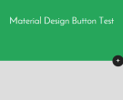
A simple button animation made in CSS and JavaScript with a Material style. The first thing you’ll see is a simple button with a plus sign that, when clicked, displays the modal with cool animations. This code snippet is free to use and modify, and it was created by XavaSoft.
The post Animated Material Design CSS & jQuery Button appeared first on ByPeople.
Pay Me...or Else! * layzr.js * Building 60 FPS Web Apps * Git Large File Storage * dragula * cta.js
Collective #164 was written by Pedro Botelho and published on Codrops.
A responsive and retina ready template created in PSD format. It is a website template with a classical style, including screens for video, gallery, product featuring, and more.This template includes several design elements, and it is totally editable. This template is free.
The post Visual Box: Free Retina Ready PSD Format appeared first on ByPeople.
Every week we tweet a lot of interesting stuff highlighting great content that we find on the web that can be of interest to web designers. The best way to keep track of our tweets is simply to follow us on Twitter, however, in case you missed some here’s a quick and useful compilation of […]
Harmon is a simple typographic scale written in Sass. It’s based on the principal that using a modular scale helps achieve visual harmony in your designs.
