jquery4u.com - Archives (février 2015)
1 jQuery Fan Blog for your Daily News, Plugins, Tuts/Tips & Code Snippets.
Animating an HTML element with CSS or JavaScript nowadays, with the help of libraries, is more or less an easy task. But you can only animate a full existing element.
This means if you want to animate a single word in a paragraph, you have to wrap the word in an individual element (like a span) and then target it accordingly.
If you have only one or two span elements like this, it is not a big deal, but what if you want to animate each character in a paragraph? For every character, you will have to create a span, which adds a lot of extra markup and makes the text difficult to edit. That’s why Blast.js exists.
What is Blast.js?
Blast.js is a jQuery plugin that allows you to animate individual characters, words, or sentences. In this article, I will present some examples so you can see how to use Blast.js. To use Blast.js and try the examples below, you will need jQuery and of course the Blast.js file, which can be found on the project website for Blast.js.
As mentioned, Blast.js lets us create elements around characters, words, or sentences, but the library isn’t only limited to those options. In the next section, we will see some concrete examples to introduce some options. The list of options we will see is not exhaustive; the full list of available options can be found on the project’s website.
Blasting our First Chunk of Text
In this first example, we will blast a title to animate each character and move them, one by one, to the right. The only HTML code needed is the following:
[code language="html"]Hello World!
[/code]After including jQuery and Blast.js, the next bit of code in this part will all be in your custom JavaScript file inside of jQuery’s ready handler, to ensure the page is ready:
[code language="javascript"] $(function() { // Animation code }); [/code]Now we can blast our title. In our example, just using $('h1') to target the element will be enough, but in your case you’ll use whatever selector is appropriate to target the element.
Continue reading %Animating Text with Blast.js%
Filtering and sorting parts of your website is a great way to organize it. Portfolios, albums, and blogs are just a few examples of things you might want to categorize. To achieve this, many jQuery plugins can help. Examples are the MixItUp, Isotope, and Quicksand plugins.
In this article, I’ll go over the basic features of MixItUp and show you all the steps needed to take advantage of it in your projects. To better demonstrate how this plugin works, I’ve also created a demo, which I’ll refer to throughout the article.
What is MixItUp?
As mentioned above, MixItUp is a jQuery plugin that allows you to filter and sort elements using CSS-based animations. You can integrate MixItUp easily into your existing layouts. All that’s needed is to target the desired elements and the plugin will do the grunt work for you.
For non-commercial projects, you can use MixItUp for free. However, a license is required if you choose to use it in a commercial project. More information is available on their licenses page.
As described on their features page, browser support is decent (including IE10+ with full functionality, and a fallback to no animations but functional in IE8+).
With that brief introduction, let’s see the required steps in order to use it.
Getting Started with MixItUp
To get started with MixItUp, you have to make sure that both the jQuery and MixItUp scripts are included in your projects. You can download them by visiting their respective websites or by using a package manager, like Bower. There’s also the option to load the necessary scripts via CDNs.
For our demo, we’ll use the third option. These scripts will be placed before the closing body tag:
Continue reading %Animated Filtering & Sorting with the MixItUp jQuery Plugin%
On the Masonry website, we read that Masonry is
… a JavaScript grid layout library. It works by placing elements in optimal position based on available vertical space, sort of like a mason fitting stones in a wall.
Bootstrap is one of the most widely adopted open source front-end frameworks. Include Bootstrap in your project, and you’ll be able to whip up responsive web pages in no time.
If you tried using Masonry together with the Tabs widget, one of the many JavaScript components Bootstrap has to offer, chances are you’ve stumbled on some kind of annoying behavior.
I did, and this article highlights what the issue is and what you can do to solve it.
Bootstrap Tabs Explained
Bootstrap’s Tabs component includes two key, related pieces: a tabbed navigation element and a number of content panels. On page load, the first panel has the class .active applied to it. This enables the panel to be visible by default. This class is used via JavaScript to toggle the panel’s visibility via the events triggered by the tabbed navigation links: if .active is present the panel is visible, otherwise the panel is hidden.
If you have some web content that’s best presented in individual chunks, rather than crammed all in one spot, this kind of tabs component might come in handy.
Why Masonry?
In some cases, the content inside each panel is suited to being displayed in a responsive grid layout. For instance, a range of products, services, and portfolio items are types of content that can be displayed in grid format.
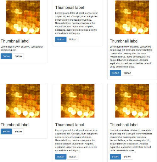
However, if grid cells are not of the same height, something like what you see below can happen.

A wide gap separates the two rows of content and the layout appears broken.
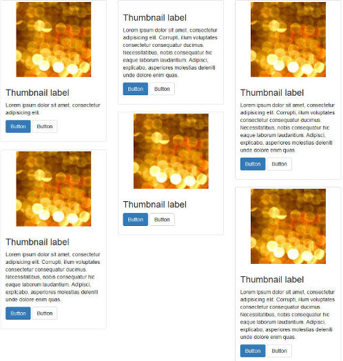
That’s when Masonry saves the day. Add some Masonry magic to the mix and your grid dynamically adapts to the screen real estate, eliminating all ghastly gaps.

Continue reading %Getting Bootstrap Tabs to Play Nice with Masonry%