jquery4u.com - Archives (février 2018)
1 jQuery Fan Blog for your Daily News, Plugins, Tuts/Tips & Code Snippets.
In a previous post, I covered the process of converting a Bootstrap carousel into a full-screen carousel with a random initial image. In this article, I’ll build on that and cover the art of animating Bootstrap carousels, drawing on the assistance of GSAP (GreenSock Animation Platform), a popular JavaScript library.

Before going any further, let’s look at what we’ll be building.
Building the Carousel
Be sure to include Bootstrap and jQuery (Bootstrap’s JavaScript components require it) in your page — for example, from a CDN:
<!DOCTYPE HTML>
<html>
  <head>
    <meta charset="utf-8">
    <title>Using GSAP to Animate Bootstrap Carousels</title>
    <link rel="stylesheet" type="text/css" href="https://maxcdn.bootstrapcdn.com/bootstrap/4.0.0/css/bootstrap.min.css">
  </head>
  <body>
    ...
    <script src="https://code.jquery.com/jquery-3.2.1.slim.min.js"></script>
    <script src="https://maxcdn.bootstrapcdn.com/bootstrap/4.0.0/js/bootstrap.min.js"></script>
  </body>
</html>
The basic structure of our carousel looks like this:
<div id="mycarousel" class="carousel slide" data-ride="carousel">
  <ol class="carousel-indicators">
    <li data-target="#mycarousel" data-slide-to="0" class="active"></li>
    <li data-target="#mycarousel" data-slide-to="1"></li>
  </ol>

  <div class="carousel-inner">

    <!-- first slide -->
    <div class="carousel-item first active" id="1">
      <!-- content here -->
    </div>

    <!-- second slide -->
    <div class="carousel-item second" id="2">
      <!-- content here -->
    </div>

  </div><!-- /carousel-inner -->

</div>
As you can see, it contains two slides. The first slide has a class of first and an ID of 1, while the second one has a class of second and an ID of 2.
Regarding their styles:
- we set their height equal to the viewport height
- we give them different background colors.
The associated CSS rules:
.item {
  height: 100vh;
}

.first {
  background: #D98F4F; /*orange*/
}

.second {
  background: #2c9cae; /*lightblue*/
}
This should be enough to give us a working carousel.
Building the First Slide
Next, we take advantage of Bootstrap’s helper classes (e.g. grid classes) to set up the contents for our slides.
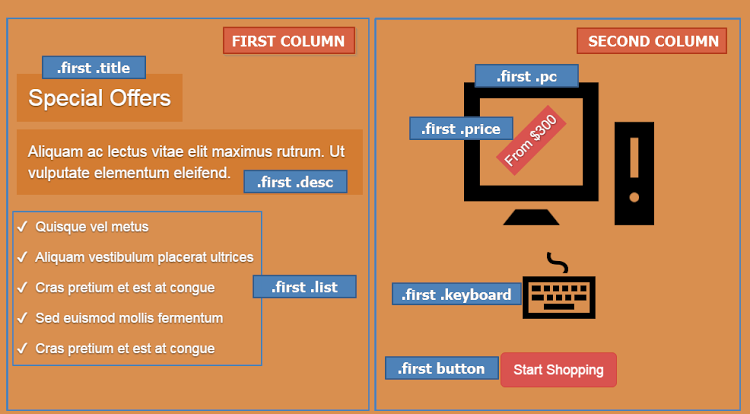
The markup for the first slide is the following:
<div class="carousel-item first active" id="1">
  <div class="carousel-caption">
    <div class="container">
      <div class="row justify-content-md-center">

        <div class="col">
          <h2 class="title">
            <!-- content here -->
          </h2>
          <p class="desc">
            <!-- content here -->
          </p>
          <ul class="list">
            <!-- list items here -->
          </ul>
        </div>

        <div class="col">
          <div class="pc-wrapper">
            <img class="pc" src="IMG_PATH" alt="" width="" height="">
            <div class="price">
              <!-- content here -->
            </div><!-- /price -->
          </div><!-- /pc-wrapper -->
          <img class="keyboard" src="IMG_PATH" alt="" width="" height="">
          <button type="button" class="btn btn-danger btn-lg">
            <!-- content here -->
          </button>
        </div>

      </div><!-- /row -->
    </div><!-- /container -->
  </div><!-- /carousel-caption -->
</div><!-- /carousel-item -->
If you’re following along, be sure to replace IMG_PATH with something sensible.
Here’s what the result looks like:
Building the Second Slide
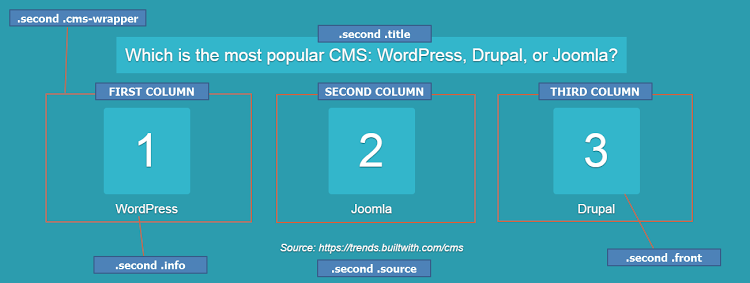
In the same way, here’s the markup for the second slide:
<div class="carousel-item second" id="2">
  <div class="carousel-caption">
    <div class="container">

      <h2 class="title">
        <span>
          <!-- content here -->
        </span>
      </h2>

      <div class="row justify-content-md-center">

        <div class="col cms-wrapper">
          <div class="cms">
            <div class="front">
              <!-- content here -->
            </div>
            <div class="back">
              <img class="img-fluid" src="IMG_PATH" alt="">
            </div><!-- /back -->
          </div><!-- /cms -->
          <p class="info">
            <!-- content here -->
          </p>
        </div><!-- /cms-wrapper -->

        <!-- two more columns here -->

      </div><!-- /row -->

      <div class="source">
        <!-- content here -->
      </div><!-- /source -->

    </div><!-- /container -->
  </div><!-- /carousel-caption -->
</div><!-- /carousel-item -->
And its visualization:
Note: For simplicity, we won’t extensively cover the styles for the inner parts of our slides. We’ll only refer to the styles that are important for the animations.
Initializing the Carousel
Next we initialize the carousel and disable default autoplay by passing interval:false to the configuration object:
var $carousel = $("#mycarousel");

$carousel.carousel({
  interval: false
});
Adding Keyboard Navigation
By default, Bootstrap carousel isn’t compliant with accessibility standards. In our case, though, let’s make the carousel a bit more accessible by adding keyboard navigation.
Here’s the required code:
$(document).keyup(function(e) {
  // right arrow
  if(e.which === 39) {
    $carousel.carousel("next");
  // left arrow
  } else if(e.which === 37) {
    $carousel.carousel("prev");
  }
});
So far, we’ve built a basic carousel which supports keyboard navigation.
Animating Bootstrap Carousels: First Animations
At this point, let’s try to make the carousel more appealing by adding some animations. To achieve this, we’ll take advantage of GSAP, one of the most powerful JavaScript animation libraries out there. If you’re looking for a thorough introduction to GreenSock, check out GreenSock for Beginners: a Web Animation Tutorial (Part 1).
Getting Started With GSAP
To incorporate GSAP into our projects, we have to visit its site and from there click the download button, which appears in the top-right corner of the page. This will open a modal dialog with a link to the project on a CDN.
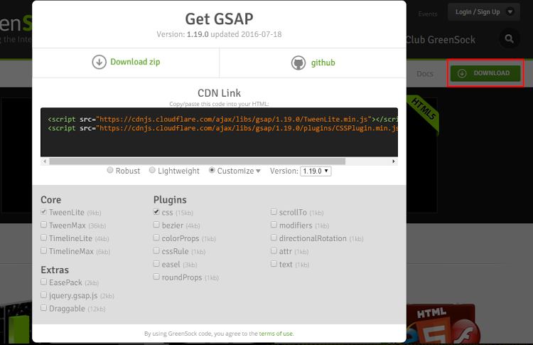
If we then select the Customize radio button, we can select the parts of the library we want to use. For our project, however, we’ll keep things simple and include just the full robust version of it.
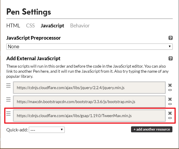
Remember that we had to add jQuery to our project because Bootstrap’s carousel depends on it. But, keep in mind that GSAP is a pure JavaScript library, and thus it doesn’t require it.
Continue reading %Animating Bootstrap Carousels with GSAP’s Animation Library%
In this article, I'm going to build two simple extensions for the Bootstrap carousel. First, I’ll create a full-screen Bootstrap Carousel slideshow, and then I’ll show you how to randomize the first slide on page load.
But before digging into those extensions, let’s start by creating a carousel based on the default styles.
Building the Carousel
To create the carousel, we’ll take advantage of the basic code for the carousel component that Bootstrap provides:
[code language="html"]
<div id="carouselExampleIndicators" class="carousel slide" data-ride="carousel">
<!-- Indicators -->
<ol class="carousel-indicators">
<li data-target="#carouselExampleIndicators" data-slide-to="0" class="active"></li>
<li data-target="#carouselExampleIndicators" data-slide-to="1"></li>
<li data-target="#carouselExampleIndicators" data-slide-to="2"></li>
</ol>
<!-- Wrapper for slides -->
<div class="carousel-inner">
<div class="carousel-item active">
<img class="d-block w-100" src="1.jpg" data-color="lightblue" alt="First Image">
<div class="carousel-caption d-none d-md-block">
<h5>First Image</h5>
</div>
</div>
<div class="carousel-item">
<!-- slide content -->
</div>
<div class="carousel-item">
<!-- slide content -->
</div>
<!-- more slides -->
</div>
<!-- Controls -->
<a class="carousel-control-prev" href="#carouselExampleIndicators" role="button" data-slide="prev">
<span class="carousel-control-prev-icon" aria-hidden="true"></span>
<span class="sr-only">Previous</span>
</a>
<a class="carousel-control-next" href="#carouselExampleIndicators" role="button" data-slide="next">
<span class="carousel-control-next-icon" aria-hidden="true"></span>
<span class="sr-only">Next</span>
</a>
</div>
[/code]
Notice that each of our images contains the custom data-color attribute. Later we’ll use its value as a fallback in case the corresponding image fails to load.
The next step is to initialize the carousel via JavaScript and modify the predefined values of the interval and pause configuration properties. Take note that we choose to set the value of the pause property to false because we always want the cycling to be active:
[code language="javascript"]
$('.carousel').carousel({
interval: 6000,
pause: "false"
});
[/code]
Having followed those simple steps (and of course imported the required files), we should now be able to build the first version of the carousel. Here’s how it looks so far:
See the Pen Basic Bootstrap Carousel by SitePoint (@SitePoint) on CodePen.
Continue reading %A Full-screen Bootstrap Carousel with Random Initial Image%
On the Masonry website, we read that Masonry is …
a JavaScript grid layout library. It works by placing elements in optimal position based on available vertical space, sort of like a mason fitting stones in a wall.
Bootstrap is one of the most widely adopted, open-source, front-end frameworks. Include Bootstrap in your project, and you’ll be able to whip up responsive web pages in no time.
If you tried using Masonry together with the Tabs widget, one of the many JavaScript components Bootstrap has to offer, chances are you’ve stumbled on some kind of annoying behavior.
I did, and this article highlights what the issue is and what you can do to solve it.
Bootstrap Tabs Explained
Bootstrap’s Tabs component includes two key, related pieces: a tabbed navigation element and a number of content panels. On page load, the first panel has the class .active applied to it. This enables the panel to be visible by default. This class is used via JavaScript to toggle the panel’s visibility via the events triggered by the tabbed navigation links: if .active is present the panel is visible, otherwise the panel is hidden.
If you have some web content that’s best presented in individual chunks, rather than crammed all in one spot, this kind of tabs component might come in handy.
Why Masonry?
In some cases, the content inside each panel is suited to being displayed in a responsive grid layout. For instance, a range of products, services, and portfolio items are types of content that can be displayed in grid format.
However, if grid cells are not of the same height, something like what you see below can happen.
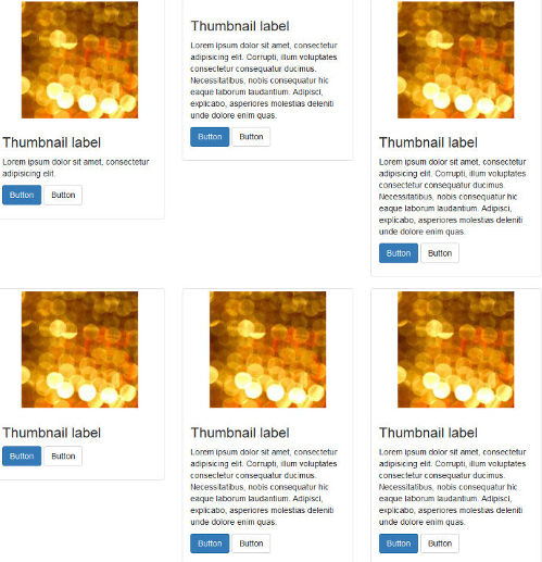
A wide gap separates the two rows of content and the layout appears broken.
Nowadays, Bootstrap solves the equal-width issue with the brand new card component, which is based on Flexbox. Just adding the card-deck class to a group of card components is sufficient to achieve equal-width columns.
If you like your cards to be of uneven length, you could use CSS3 Multi Column Layout. (After all, even though there are some browser support bugs, overall it’s quite good.) This underlies the new card columns option that comes packaged with the card component. However, if you still love the nice animation that the Masonry JavaScript library provides out of the box, and its wide browser compatibility, JavaScript is still a viable option in this case.
Setting Up a Demo Page
Getting a demo page up and running helps to show how integrating Bootstrap’s Tabs with Masonry is not as straightforward as one might expect.
This article’s demo page is based on the starter template, available on the Bootstrap website.
Below is the skeleton of the markup for the tabs component:
<ul class="nav nav-tabs" id="myTab" role="tablist">

  <!-- nav item 1 -->
  <li class="nav-item">
    <a class="nav-link active" id="home-tab" data-toggle="tab" href="#home" role="tab" aria-controls="home" aria-selected="true">Home</a>
  </li>

  <!-- nav item 2 -->
  <li class="nav-item">
    <a class="nav-link" id="profile-tab" data-toggle="tab" href="#profile" role="tab" aria-controls="profile" aria-selected="false">Profile</a>
  </li>

  <!-- nav item 3 -->
  <li class="nav-item">
    <a class="nav-link" id="contact-tab" data-toggle="tab" href="#contact" role="tab" aria-controls="contact" aria-selected="false">Contact</a>
  </li>
</ul>
The nav nav-tabs classes are responsible for giving the tabs their characteristic appearance. The value of the href attribute forms the relationship between a single tab and its corresponding tabbed content. For instance, an href value of #home creates a relationship with the tabbed content with id="home": clicking that particular tab reveals the contents inside the div with the id value of home.
Also, notice how Bootstrap pays attention to accessibility attributes like role, aria-controls, etc.
Here’s a code snippet to illustrate the tabbed content’s structure:
<!-- content 1 -->
<div class="tab-pane fade show active" id="home" role="tabpanel" aria-labelledby="home-tab">
  <h3>Tab 1 Content</h3>
<div class="card-group">

  <!-- first card -->
  <div class="card">
    <img class="card-img-top" src="path/to/img" alt="Card image cap">
    <div class="card-body">
      <h5 class="card-title">Card title</h5>
      <p class="card-text">Card text here.</p>
      <p class="card-text"><small class="text-muted">Last updated 3 mins ago</small></p>
    </div>
  </div>

  <!-- second card -->
  <div class="card">
    <!-- card markup here -->
  </div&lgt;

  <!-- third card -->
  <div class="card">
    <!-- card markup here -->
  </div>

  </div>
</div>
Just add a similar structure for each tabbed content section corresponding to the tabs elements you coded above.
For the full code, check out the CodePen demo.
Continue reading %Getting Bootstrap Tabs to Play Nice with Masonry%
In this tutorial, we’ll be talking about one of the most useful jQuery Bootstrap plugins, the Modal. The Bootstrap Modal is a lightweight, multi-purpose JavaScript popup that’s customizable and responsive. It can be used to display alert popups, videos, and images in a website. Websites built with Bootstrap can use the modal to showcase, for example, terms and conditions (as part of a signup process), videos (similar to a standard light box), or even social media widgets.
Now let’s examine the different parts of the Bootstrap Modal, so we can understand it better.
The Bootstrap Modal is divided into three primary sections: the header, body, and footer. Each has its own role and hence should be used accordingly. We’ll discuss these shortly. The most exciting thing about Bootstrap modals? You don’t have to write a single line of JavaScript to use them! All the code and styles are predefined by Bootstrap. All that’s required is that you use the proper markup and attributes and they just work.
The Default Modal
The default Bootstrap Modal looks like this:
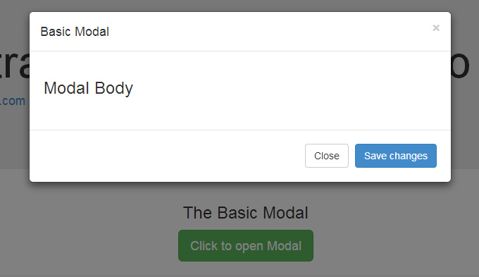
To trigger the modal, you’ll need to include a link or a button. The markup for the trigger element might look like this:
[code language="html"]
<a href="#" class="btn btn-lg btn-success" data-toggle="modal" data-target="#basicModal">
Click to open Modal
</a>
[/code]
Notice the link element has two custom data attributes: data-toggle and data-target. The toggle tells Bootstrap what to do and the target tells Bootstrap which element is going to open. So whenever a link like that is clicked, a modal with an ID of “basicModal” will appear.
Now let’s see the code required to define the modal itself. Here’s the markup:
[code language="html"]
<div class="modal fade" id="basicModal" tabindex="-1" role="dialog" aria-labelledby="basicModal" aria-hidden="true">
<div class="modal-dialog">
<div class="modal-content">
<div class="modal-header">
<h4 class="modal-title" id="myModalLabel">Basic Modal </h4>
<button type="button" class="close" data-dismiss="modal" aria-label="Close">
<span aria-hidden="true">×</span>
</button>
</div>
<div class="modal-body">
<h3>Modal Body</h3>
</div>
<div class="modal-footer">
<button type="button" class="btn btn-default" data-dismiss="modal">Close</button>
<button type="button" class="btn btn-primary">Save changes</button>
</div>
</div>
</div>
</div>
[/code]
The parent div of the modal should have the same ID as used in the trigger element above. In our case, it would be id="basicModal".
Note: Custom attributes like aria-labelledby and aria-hidden in the parent modal element are used for accessibility. It’s good practice to make your website accessible to all, so you should include these attributes since they won’t negatively affect the standard functionality of the modal.
In the modal’s HTML, we can see a wrapper div nested inside the parent modal div. This div has a class of modal-content that tells bootstrap.js where to look for the contents of the modal. Inside this div, we need to place the three sections I mentioned earlier: the header, body, and footer.
The modal header, as the name implies, is used to give the modal a title and some other elements like the “x” close button. This should have a data-dismiss attribute that tells Bootstrap to remove the element.
Then we have the modal body, a sibling div of the modal header. Consider the body an open canvas to play with. You can add any kind of data inside the body, including a YouTube video embed, an image, or just about anything else.
Lastly, we have the modal footer. This area is by default right aligned. In this area you could place action buttons like “Save”, “Close”, “Accept”, etc., that are associated with the action the modal is displaying.
Now we’re done with our first modal! You can check it out on our demo page.
Continue reading %Understanding Bootstrap Modals%