jquery4u.com - Archives (mai 2018)
1 jQuery Fan Blog for your Daily News, Plugins, Tuts/Tips & Code Snippets.
Bootstrap comes packed with tons of ready-to-use jQuery-powered plugins. The beauty of Bootstrap’s plugins is that you can slot them into your project, write the appropriate markup using data- attributes, and the JavaScript kicks in automatically. No need to write any JavaScript code.
There may be times when you’d like to add your own customizations to Bootstrap’s plugins to fit your project’s requirements.
If this is you, read on. I’m going to show you one way in which you can do just that.
How to Customize Bootstrap a Plugin’s Appearance
You can customize Bootstrap plugins’ look and feel by working with CSS. On the other hand, if you’d like to modify the plugin’s functionality, you’ll need to write some JavaScript code.
Customizing Bootstrap CSS should be done in your own custom file, whether you’re working with the Sass source code or with the compiled version.
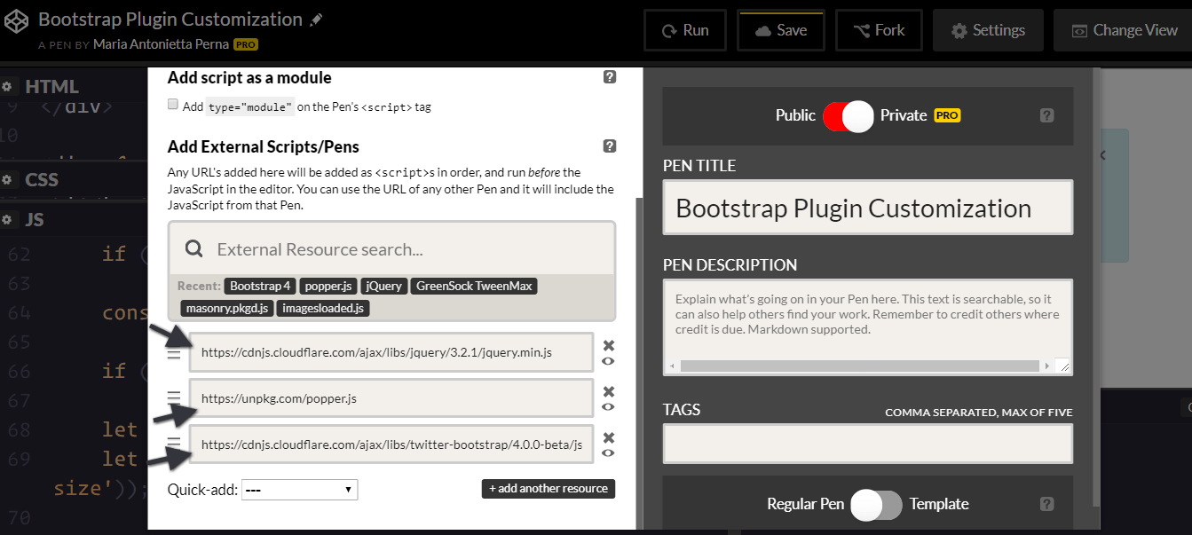
To keep things simple and CodePen-friendly, pull the precompiled Bootstrap package from the CDN.
This includes both the stylesheet …
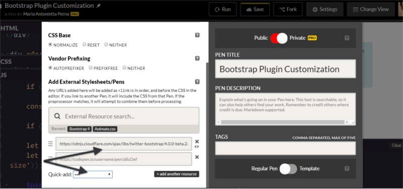
… and the JavaScript file. Also, don’t forget to include jQuery and, if you plan to use dropdowns, Popper.js too:
To make it even easier to modify CSS code, the developers behind Bootstrap have included a list of CSS variables for colors and breakpoints inside the :root element at the top of the stylesheet.
For example, the variable for the green success color is --success: #28a745;
To change this into a different shade of green, replace the variable’s color value in your own stylesheet and add this code to your chosen selector:
selector {
  background-color: var(--success);
}
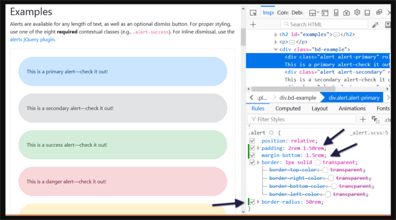
To change the look and feel of a specific plugin, the easiest way is to find the Bootstrap styles using your browser’s devtools and overriding them with your own styles.
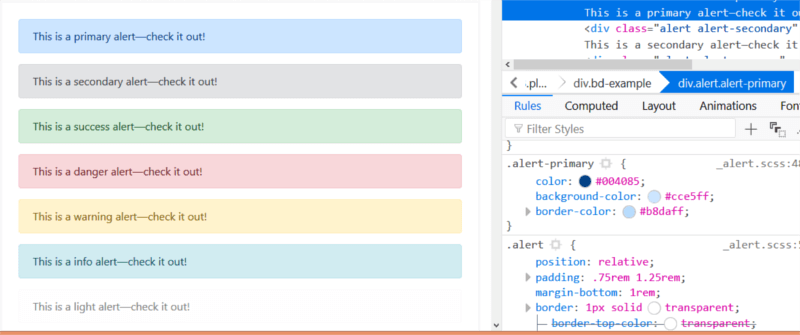
Let’s focus on the simple alert component in this article.
For instance, try changing the alert’s original values for the padding, margin-bottom, and border-radius in your custom CSS document:
.alert {
  padding: 2rem 1.50rem;
  margin-bottom: 1.5rem;
  border-radius: 50rem;
}
Now, all elements with the .alert class will look like this:
Next, let’s move on to extending the Bootstrap alert’s functionality.
Customizing a Bootstrap Plugin’s Functionality
Modifying Bootstrap plugins’ functionality often involves working both with the CSS and JavaScript document.
Most dynamic effects are produced by adding and removing CSS classes, and overall the functionality is quite simple.
In this article, I’m going to add some extra functionality to the Alert component.
Alerts display a piece of information and users can remove them from the page at the click of a button.
I’m going to add zoom in and zoom out buttons to the alert, which enable users to make the alert bigger or smaller respectively. I’m also going to include a high contrast button to allow users to view the alert contents in high contrast mode, i.e., inverting the background color and the text color.
Let’s get to work!
The Alert’s Structure
To follow along, start by adding the markup for the alert:
<div class="alert alert-info alert-zoom-in-out">
  <a href="#" class="close" data-dismiss="alert" aria-label="close">×</a>
  <a href="alert" class="close zoomIn" data-zoomIn="alert" aria-label="zoom in">+</a>
  <a href="alert" class="close zoomOut" data-zoomOut="alert" aria-label="zoom out">-</a>
  <a href="alert" class="close high-contrast" data-highContrast="alert" aria-label="high contrast mode"><i class="fa fa-adjust"></i></a>
  <p><strong>New Bootstrap Alert</strong></p>
  <p>Zoom in and out, or enable contrast mode.</p>
</div>
Above is a simple alert box with three links: the first one is a native Bootstrap dismiss alert link. This serves as template for the custom three links you’re going to create. The - link lets users shrink the size and contents of the alert box, while the + link does the exact opposite — that is, enlarge the alert box and the text inside it.
The contrast link enables high contrast mode on the alert.
Notice the data-zoomIn, data-zoomOut, and data-highContrast on each custom link’s markup. These are our hooks for the click event: a button with those custom data types will be responsible for triggering the actions on the alert box.
Modifying the CSS
The next step is to create your own custom CSS file for the alert plugin and add the following code:
.alert-zoom-in-out {
  font-size: 16px;
  height: auto;
  top: 20px;
  color: rgb(12, 84, 96);
  background-color: rgb(209, 236, 241);
}

.high-contrast-on,
.high-contrast-on a,
.high-contrast-on i {
  background-color: rgb(12, 84, 96);
  color: rgb(209, 236, 241);
}
alert-zoom-in-out is the class I’ve chosen for the alert box. Because the functionality you’re building includes modifying the size and color combination of the alert box, you need to set those for the alert-zoom-in-out class.
The high-contrast-on class on the alert box will be added and removed dynamically using JavaScript. When added, color and background-color values are inverted. When removed, the alert box will get back to its default appearance.
Continue reading %Customizing Bootstrap jQuery Plugins%