Web Design Shock - Archives (avril 2018)
Design resources and high quality articles

Journal-inspired theme focused on showcasing your content in diverse, daring, and bold ways. It has clean type smart layouts and a design flexibility that makes it perfect for publishers of all kinds.
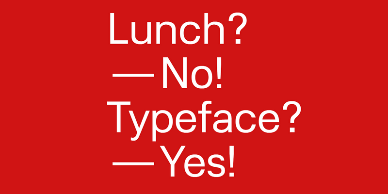
LunchType is a contemporary typographic design experiment from Stefan Wetterstrand. It features 4 variations with 4 weights each, a total of 16 weights that provide it with great versatility, and offers glyph support for central and northern European as well as Southeast Asian languages, with full characters & special characters sets. Released completely free under a SIL Open Font License.
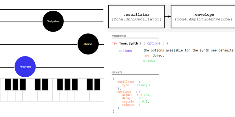
Tone.js is a framework for creating interactive music in the browser. It provides advanced scheduling capabilities, synths and effects, and intuitive musical abstractions built on top of the Web Audio API.
Claim The Stylish Look Your Business Deserves
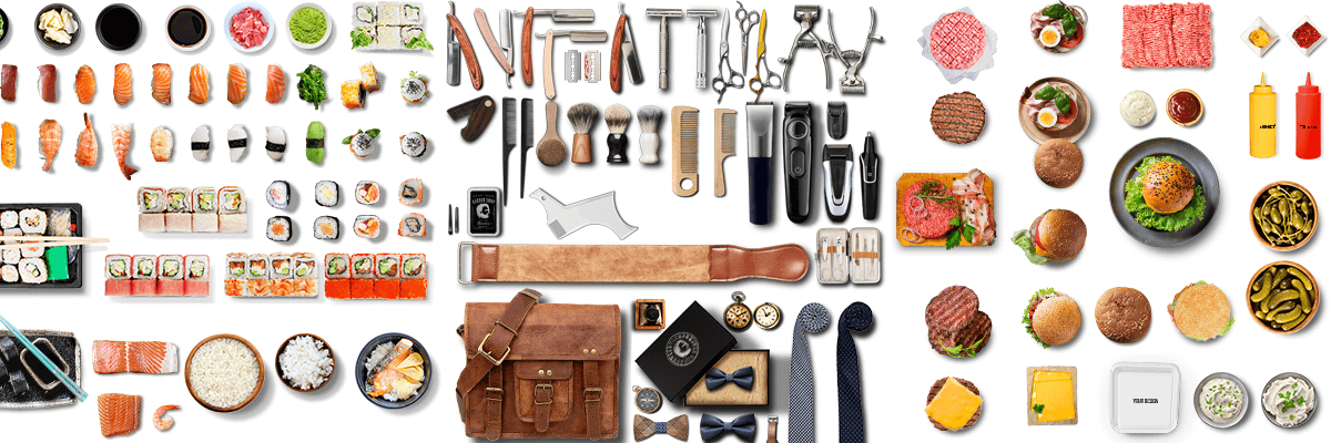
A bundle containing 3 thematic scene creators: Burger Bar, Sushi Bar & Barber Shop, gathering over 828 unique isolated objects with amazing detail and quality, more than 45 premade scenes & 38+ vector background textures. An amazing package normally priced up to $870 if purchased separately, for just $19, thats a shocking 98% discount on the regular price!
The Bundle Contains:
- 828 Isolated Objects: All items were chosen to help to combine any graphic in relation to burger bars, barber shops and sushi restaurants.
- 30 changeable background textures + 8 grunge vector textures: Change and choose textures that fit best to your hero image or mock-up. We choose and prepared them to be in trend with new web design tendencies. Or put some of your textures as background if you want. All is possible.
- 45 premade scenes Print ready high resolution – to make all this easier for you. In this premade scenes just add your graphic, your/client logo over double-click smart object, export it for web or print and you are done.
- Hero images scene generators, isolated objects, in 3 Different mock-up creator, fully editable assets to suit your needs!
- You don’t need to be expert in Photoshop to make Hero images. Just drag & drop isolated objects, choose one of the backgrounds by your wish and you are done. A lot of objects in the generator are also editable mockups and you can add your design in branding mockups to make a presentation of your own work.
- All objects are photographed from the top view. It’s best for presentation, can be used for websites like restaurants sites, food order sites, restaurant banners, ads and even presenting on social networks. When it comes to it, it contains Pre-made Instagram banners & Posts too. Boom, even more cool, isn't it?
- They're also great for making printing graphics like posters, flyers, editorials and a lot more.
- Branding mockups with smart objects included. If you are a designer and you want to present your work this is for you. Over double-click smart object you can put your design in few minutes. Just drag & drop your design in smart object, save it and your beautiful design will look even more beautiful in our scene generator.
Check out the packs (Back to Top)
- Barber Shop Mockup & Scene Creator
- Burger Bar Mockup & Scene Creator
- Sushi Bar Mockup & Scene Creator
Barber Shop Mockup & Scene Generator (Back to Top)
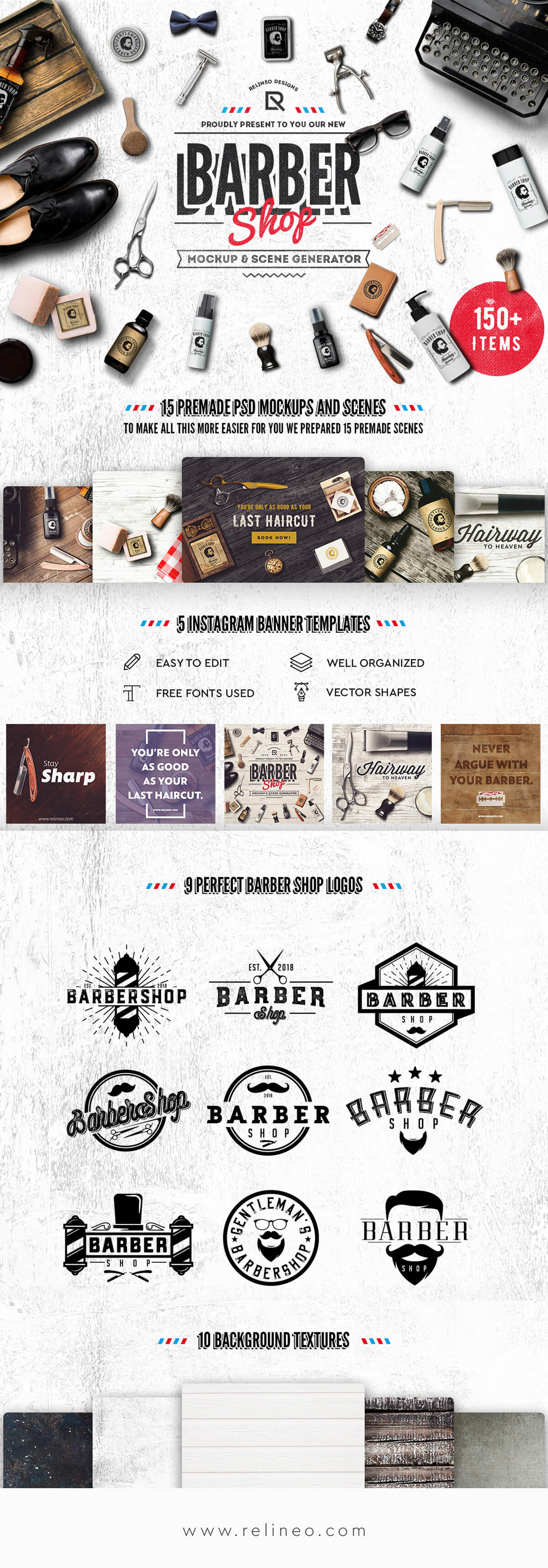
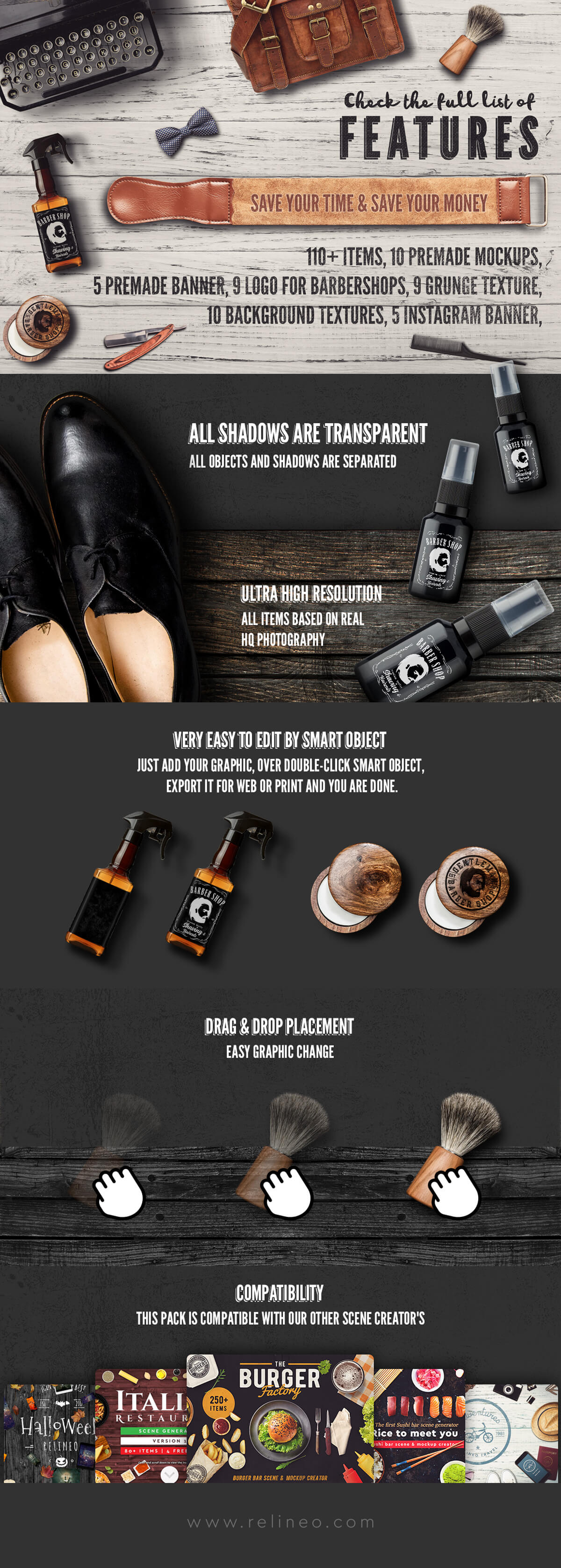
Barber Shop is a scene and mock-up generator that will make your project look awesome in just few minutes of working. You just need to drag & drop the included HQ original objects, rearrange them as you wish, replace the smart objects on mock-ups with your graphic, and done!


Burger Bar Scene & Mockup Generator (Back to Top)
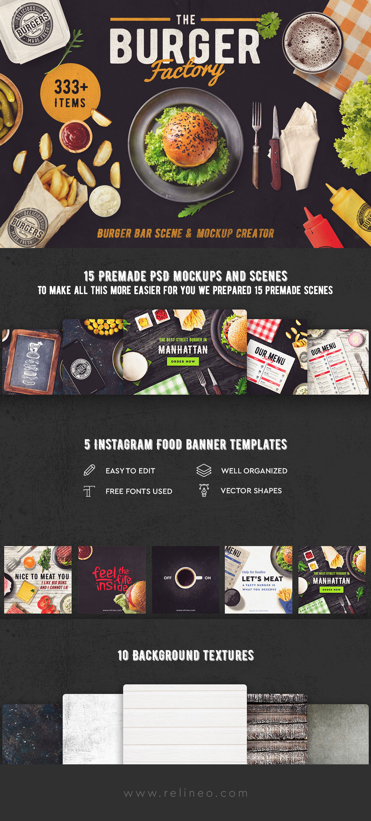
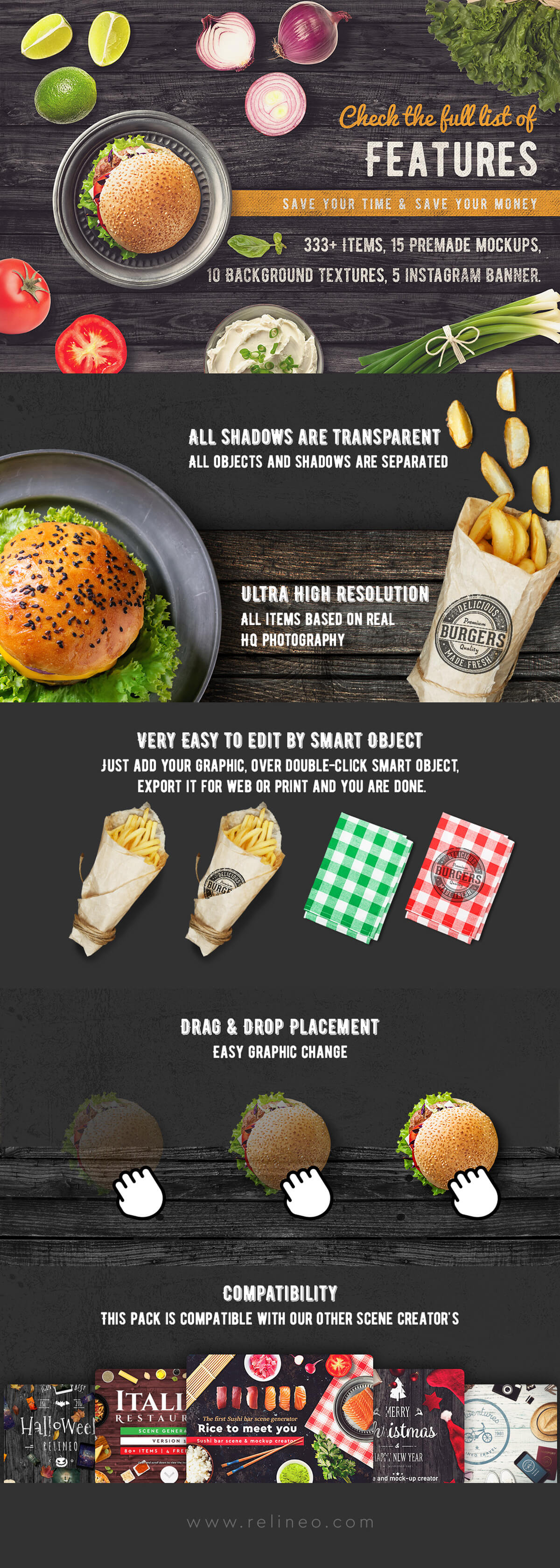
Burger Bar is a scene and mock-up generator that will make your web site or print graphics look awesome in just few minutes of working. You just need to drag & drop HQ original objects, rearrange them as you wish, replace the smart objects on mock-ups with your graphic. Just can't not to love these things!


Sushi Bar Scene & Mockup Generator (Back to Top)
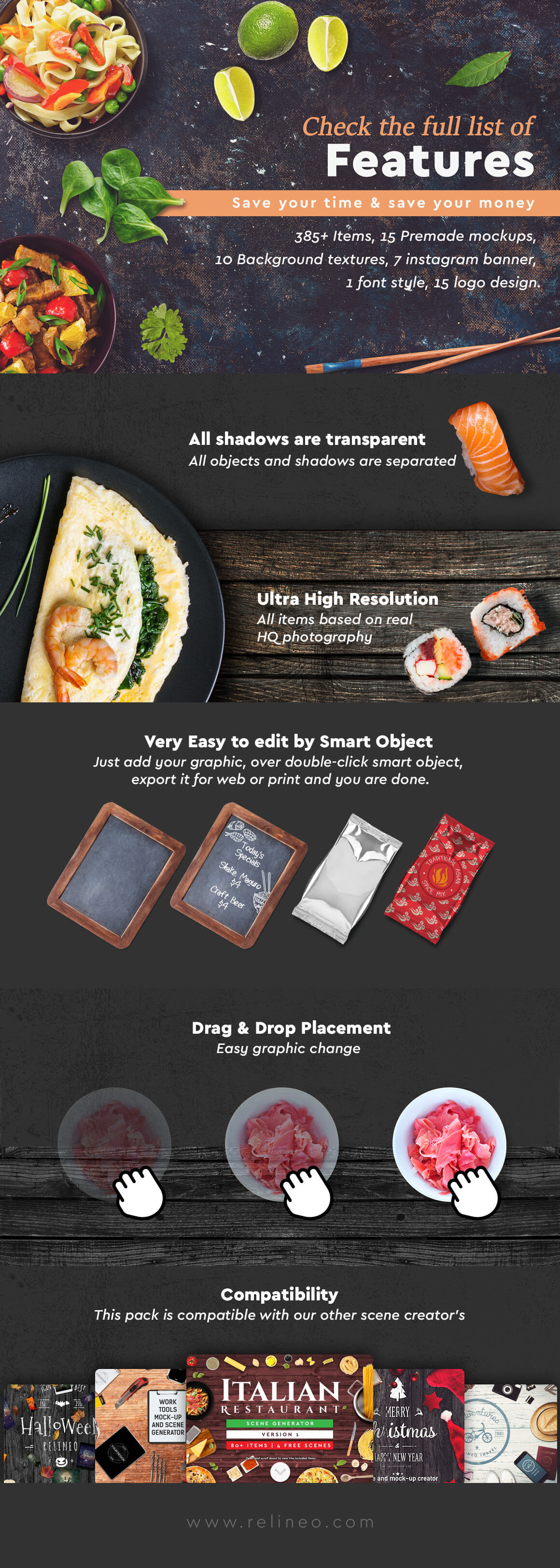
Sushi Bar is a scene and mock-up generator that will make your web site or print graphics look awesome in just few minutes of working. You just need to drag & drop HQ original objects, rearrange them as you wish, replace the smart objects on mock-ups with your graphic. Just can't not to love these things!



Claim The Stylish Look Your Business Deserves
A bundle containing 3 thematic scene creators: Burger Bar, Sushi Bar & Barber Shop, gathering over 828 unique isolated objects with amazing detail and quality, more than 45 premade scenes & 38+ vector background textures. An amazing package normally priced up to $870 if purchased separately, for just $19, thats a shocking 98% discount on the regular price!
The Bundle Contains:
- 828 Isolated Objects: All items were chosen to help to combine any graphic in relation to burger bars, barber shops and sushi restaurants.
- 30 changeable background textures + 8 grunge vector textures: Change and choose textures that fit best to your hero image or mock-up. We choose and prepared them to be in trend with new web design tendencies. Or put some of your textures as background if you want. All is possible.
- 45 premade scenes Print ready high resolution – to make all this easier for you. In this premade scenes just add your graphic, your/client logo over double-click smart object, export it for web or print and you are done.
- Hero images scene generators, isolated objects, in 3 Different mock-up creator, fully editable assets to suit your needs!
- You don’t need to be expert in Photoshop to make Hero images. Just drag & drop isolated objects, choose one of the backgrounds by your wish and you are done. A lot of objects in the generator are also editable mockups and you can add your design in branding mockups to make a presentation of your own work.
- All objects are photographed from the top view. It’s best for presentation, can be used for websites like restaurants sites, food order sites, restaurant banners, ads and even presenting on social networks. When it comes to it, it contains Pre-made Instagram banners & Posts too. Boom, even more cool, isn't it?
- They're also great for making printing graphics like posters, flyers, editorials and a lot more.
- Branding mockups with smart objects included. If you are a designer and you want to present your work this is for you. Over double-click smart object you can put your design in few minutes. Just drag & drop your design in smart object, save it and your beautiful design will look even more beautiful in our scene generator.
Check out the packs (Back to Top)
- Barber Shop Mockup & Scene Creator
- Burger Bar Mockup & Scene Creator
- Sushi Bar Mockup & Scene Creator
Barber Shop Mockup & Scene Generator (Back to Top)
Barber Shop is a scene and mock-up generator that will make your project look awesome in just few minutes of working. You just need to drag & drop the included HQ original objects, rearrange them as you wish, replace the smart objects on mock-ups with your graphic, and done!


Burger Bar Scene & Mockup Generator (Back to Top)
Burger Bar is a scene and mock-up generator that will make your web site or print graphics look awesome in just few minutes of working. You just need to drag & drop HQ original objects, rearrange them as you wish, replace the smart objects on mock-ups with your graphic. Just can't not to love these things!


Sushi Bar Scene & Mockup Generator (Back to Top)
Sushi Bar is a scene and mock-up generator that will make your web site or print graphics look awesome in just few minutes of working. You just need to drag & drop HQ original objects, rearrange them as you wish, replace the smart objects on mock-ups with your graphic. Just can't not to love these things!


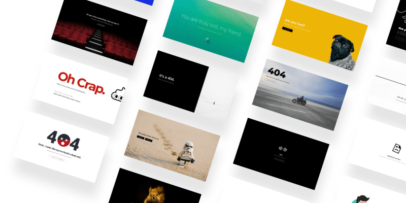
Over 20 creatively designed 404 error pages, all in a single Sketch file. Freebie by Dribbble user Kishore.
![]()
200+ easily customizable outline art icon set, optimized for use on the web as SVG. Open source project by Mikolaj Dobrucki.
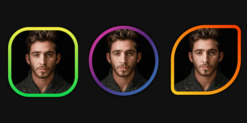
This is a set of 3 frames showing how CSS gradients can be applied to a rounded border. Created by Codepen user George W. Park.
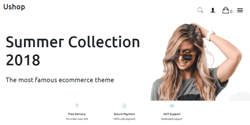
Clean eCommerce WordPress theme, with a drag and drop editor to make easy and fast the way you build your website. The theme is compatible with WooCommerce and is fully responsive, supporting every device.
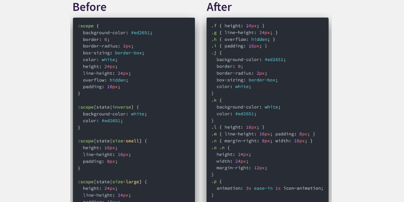
CSS-Blocks is an adaptable, component-oriented CSS authoring system that compiles to high-performance stylesheets. it employs an opinionated authoring system, build-time analysis, and a new type of CSS optimizer.
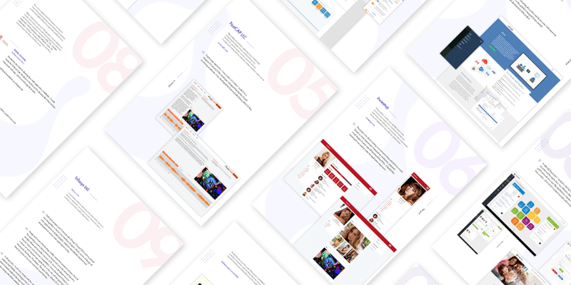
12 highly editable portfolio templates for printable media, perfect to showcase your designs with a clean, minimal style. Available in PSD format. Templates by Behance user Sovon Halder.
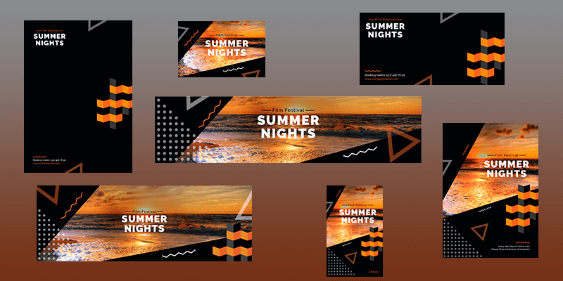
A New Exclusive Branding Pack from our friends at Amber Graphics: 34 Different Templates, including Envelopes, folders, notebooks, letterheads, business cards, social media headers & more, all easy to customize to your liking.
Ready to use for all your personal and also commercial needs, present your business in the cleanest and professional way. Delivered as vector EPS files, fully layered PSD & also PNG.
See all the formats and sizes below:
19th Century Styles
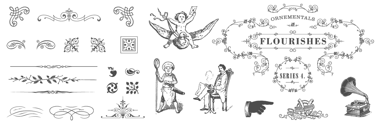
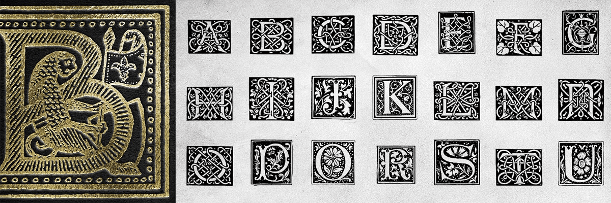
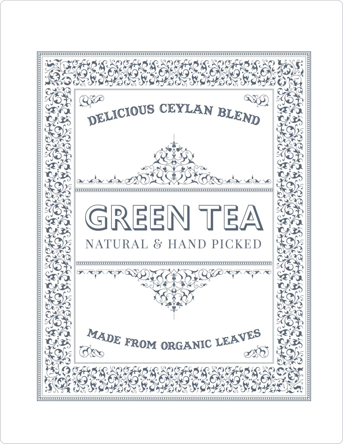
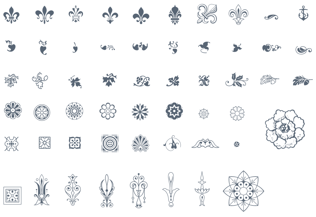
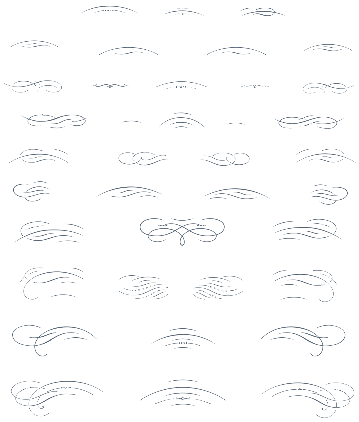
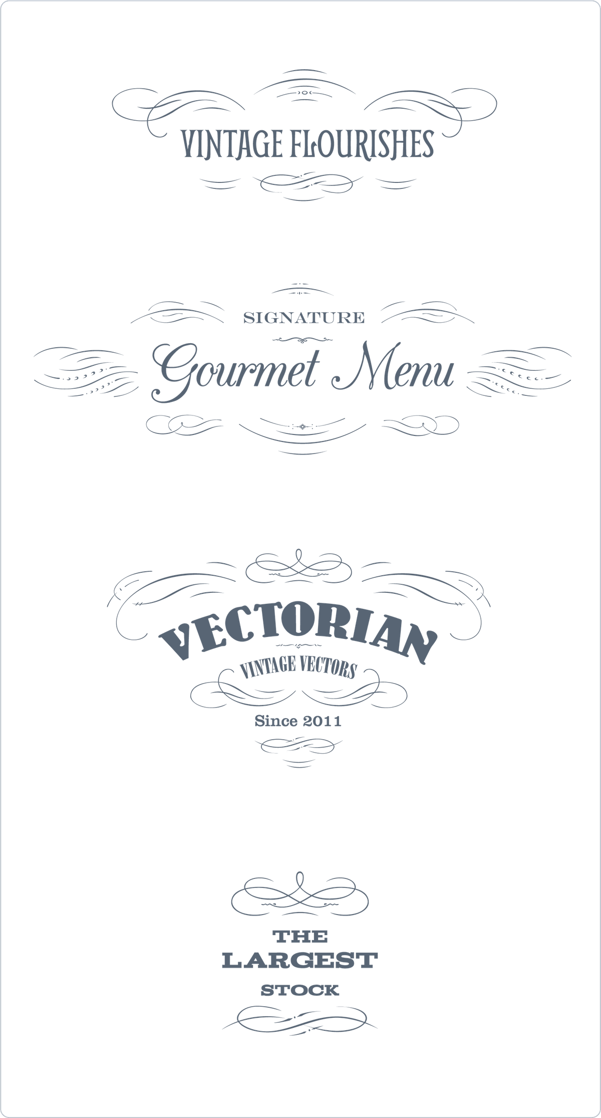
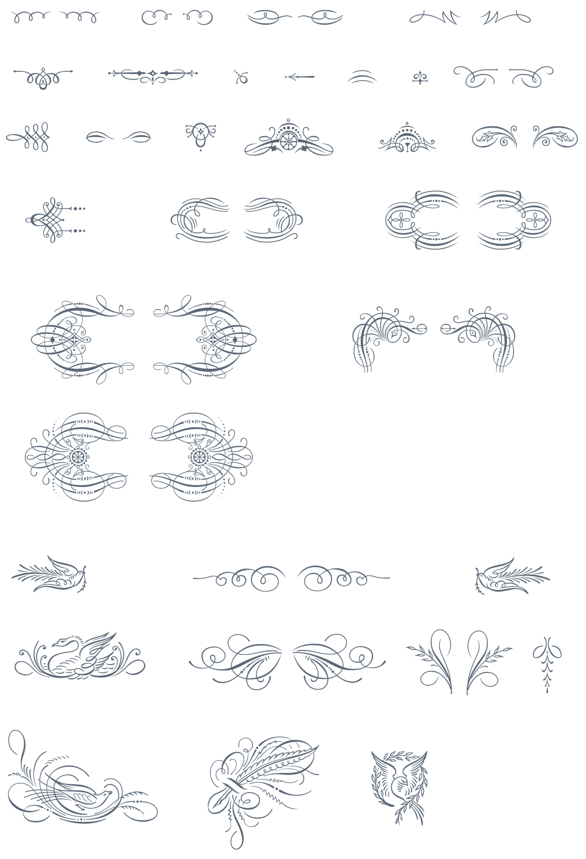
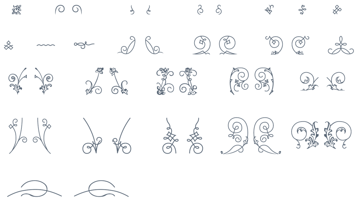
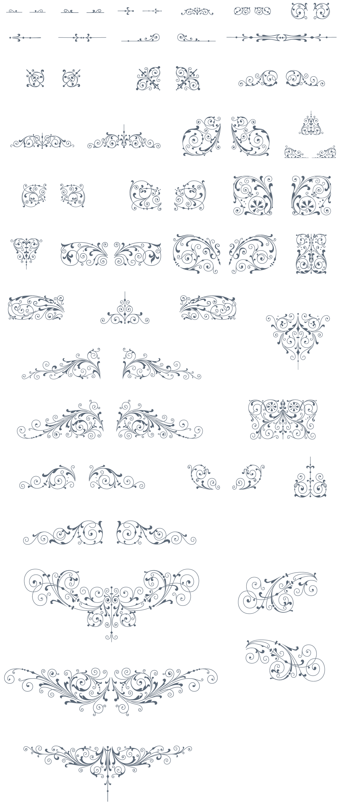
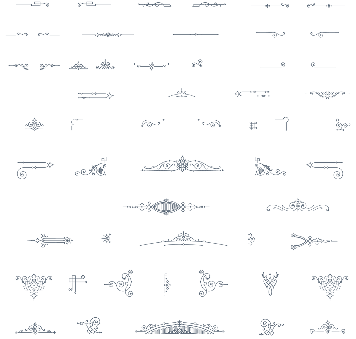
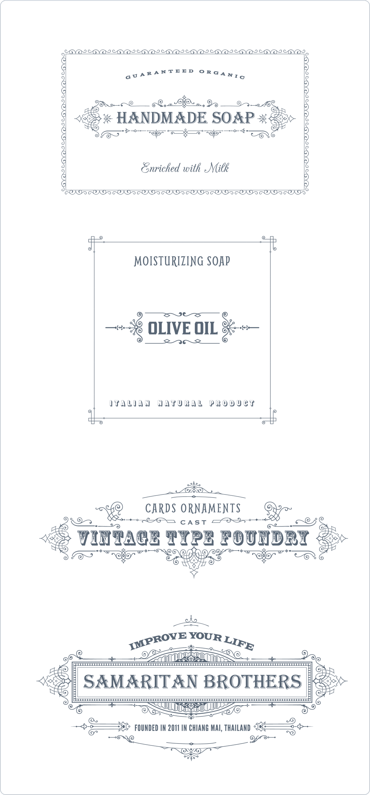
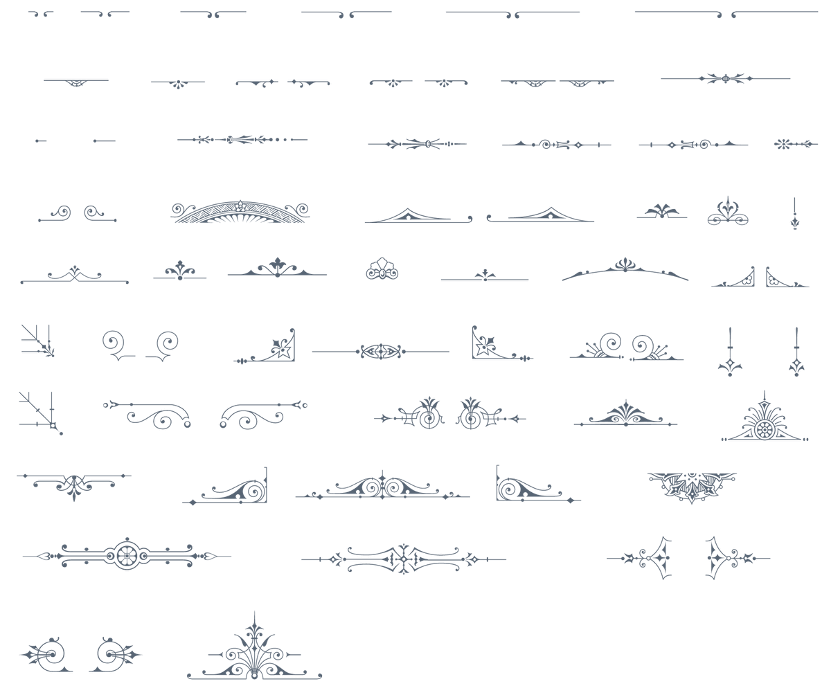
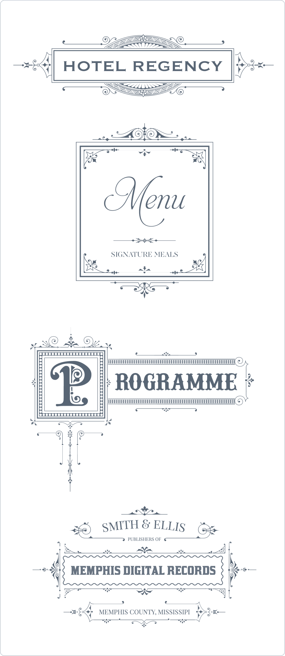
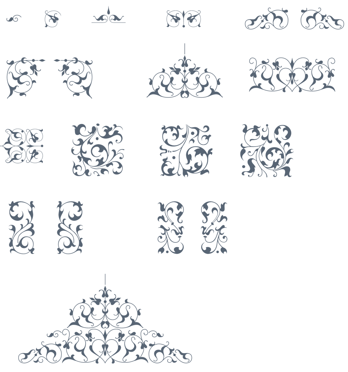
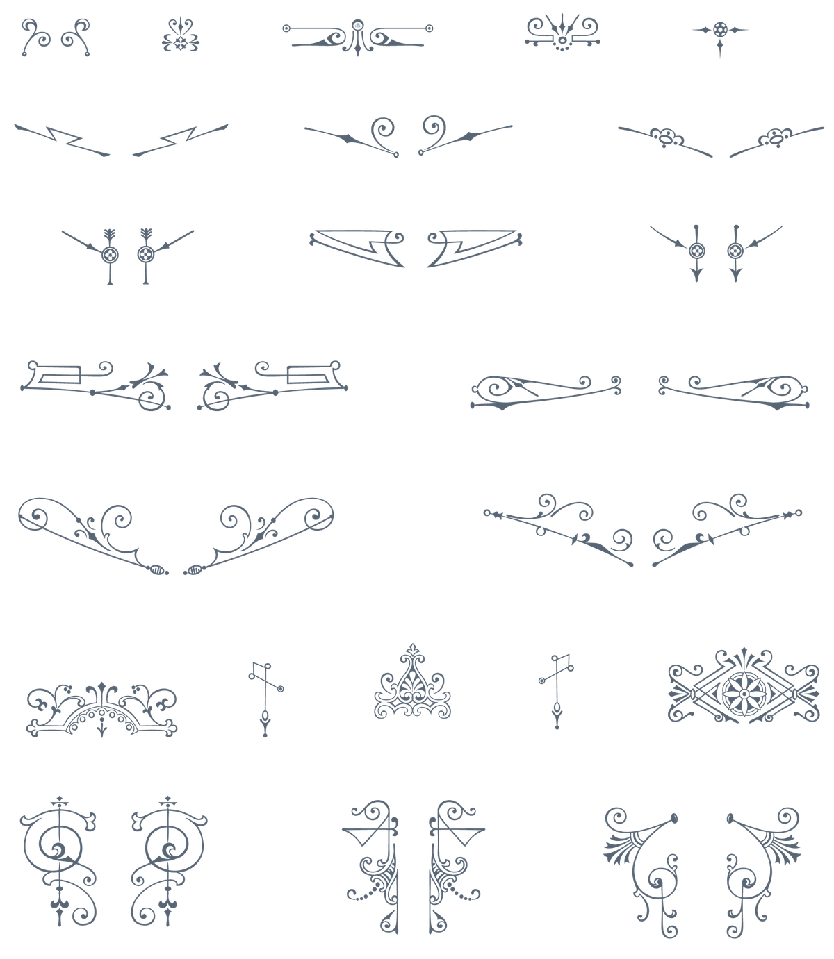
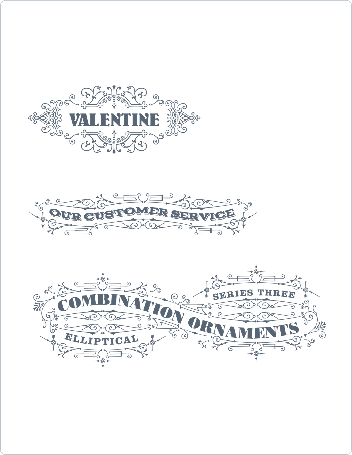
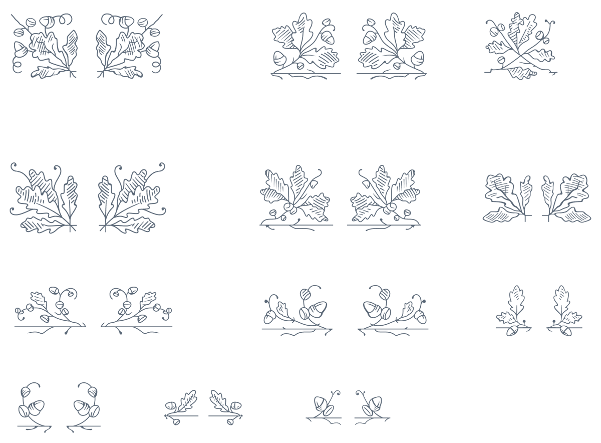
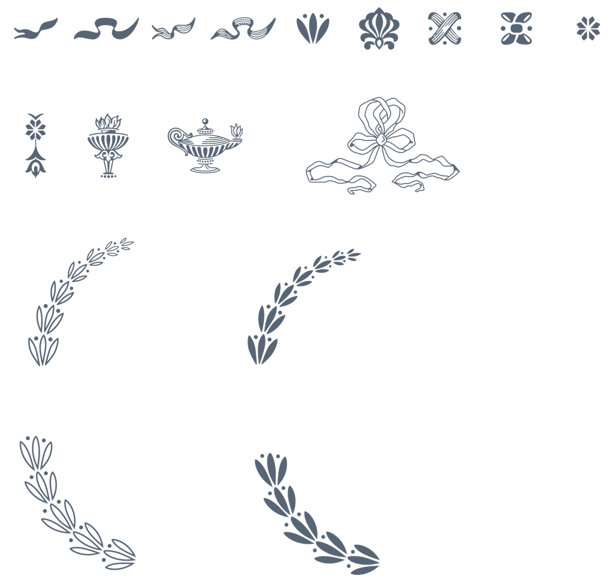
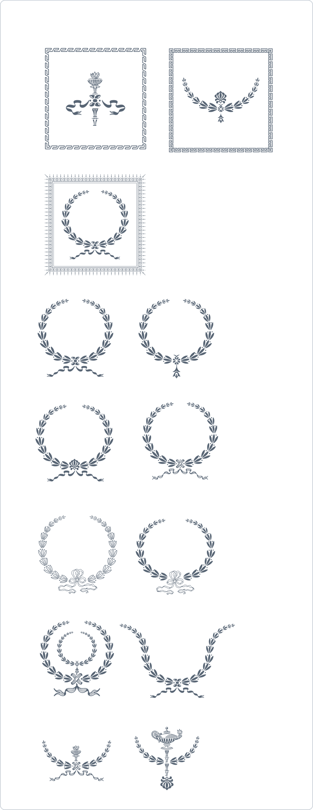
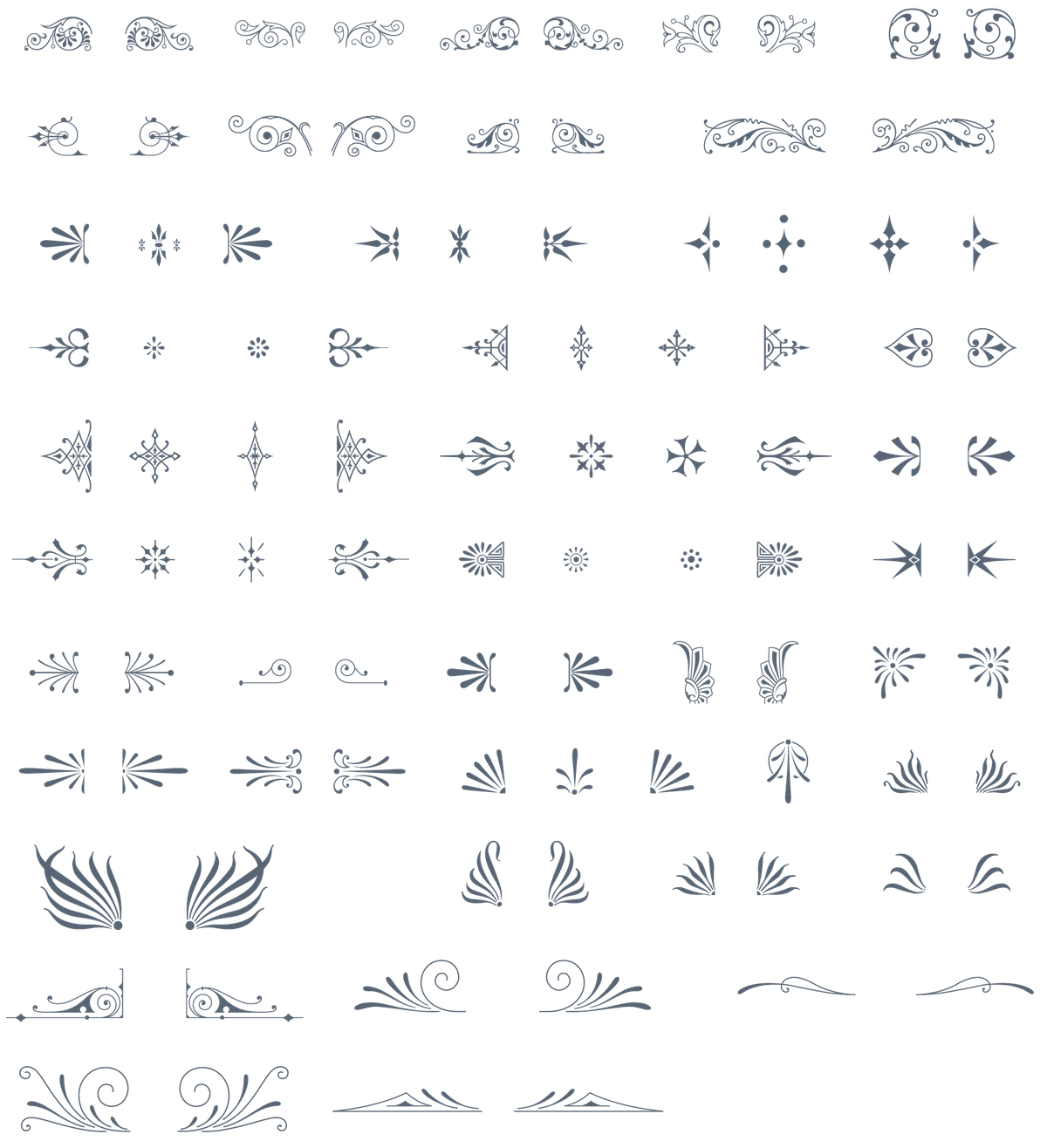
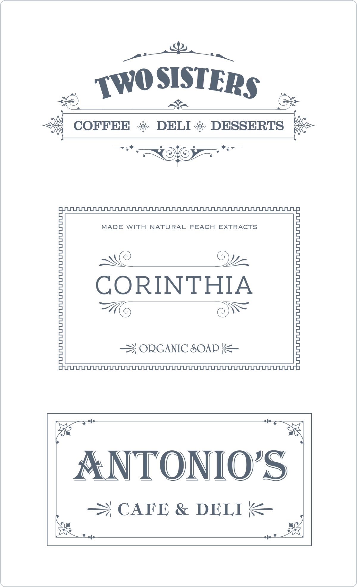
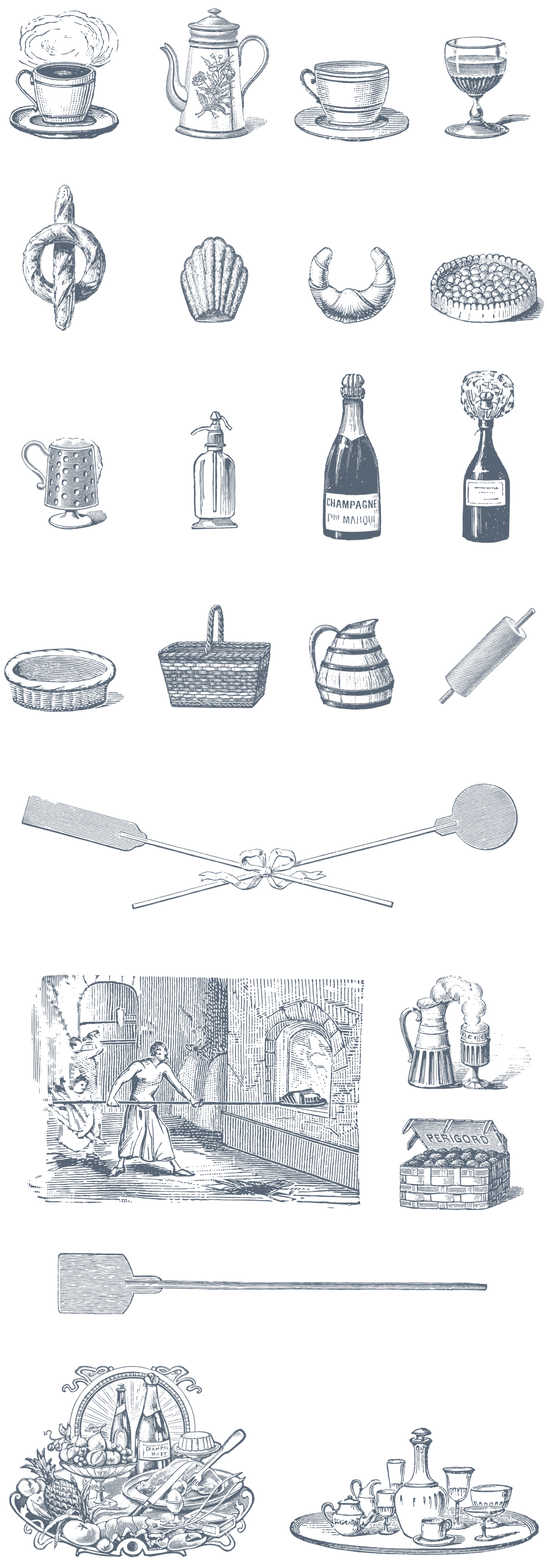
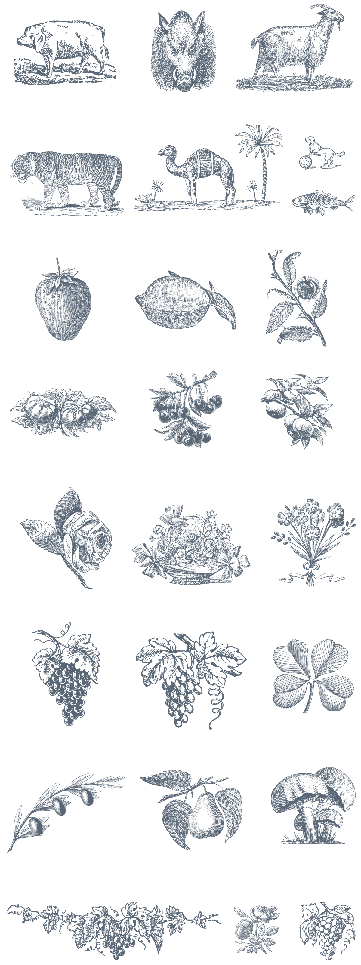
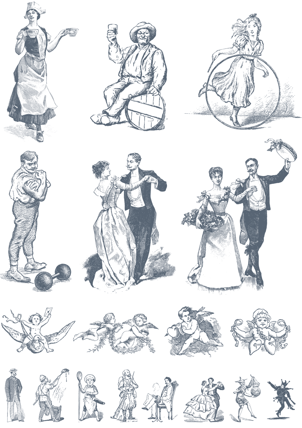
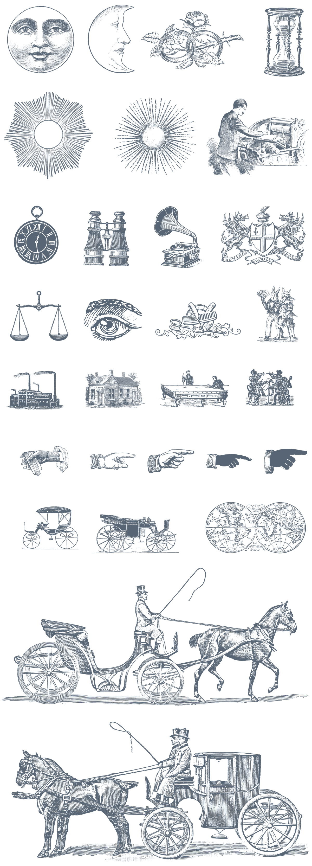
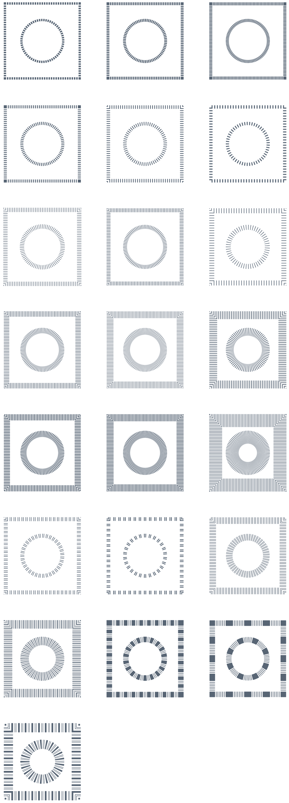
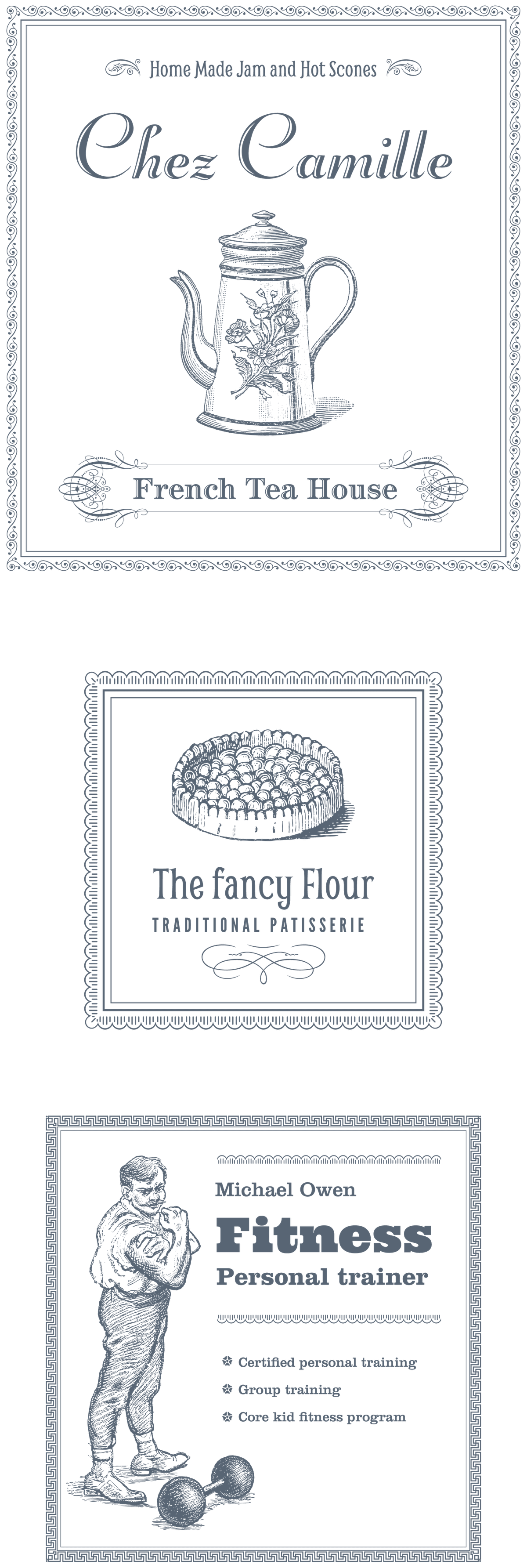
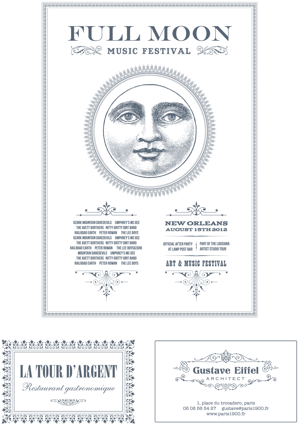
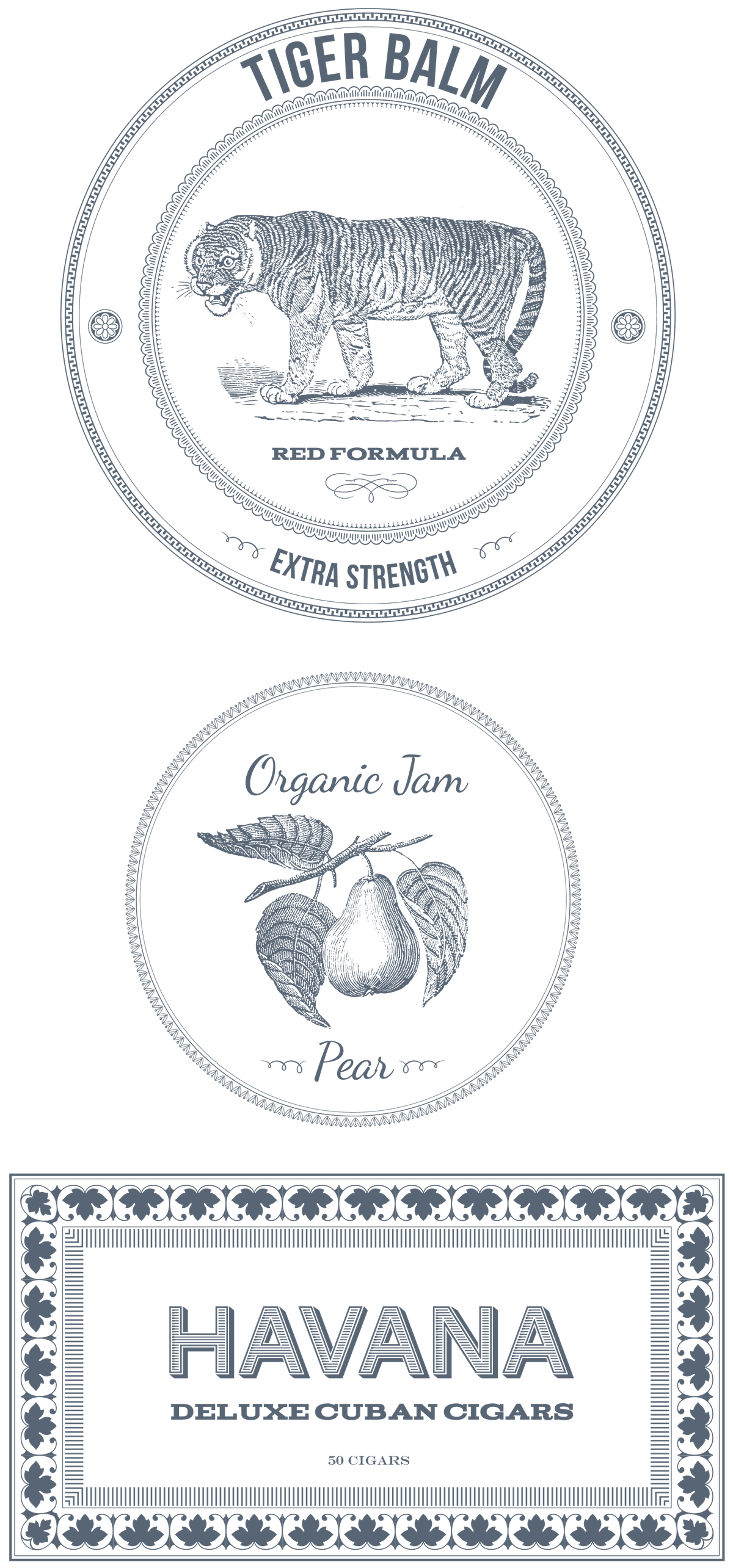
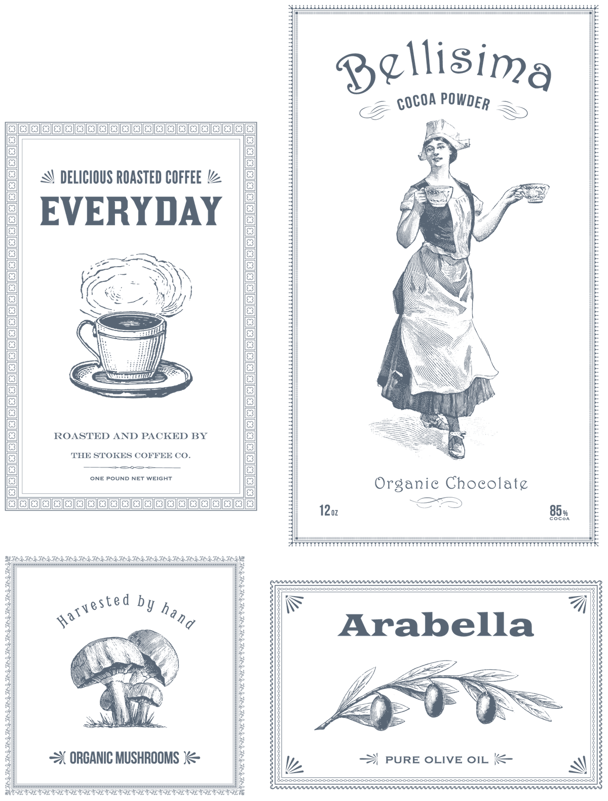
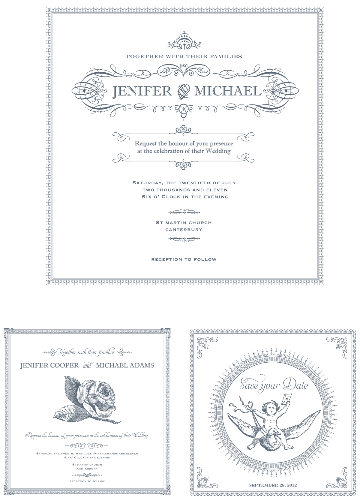
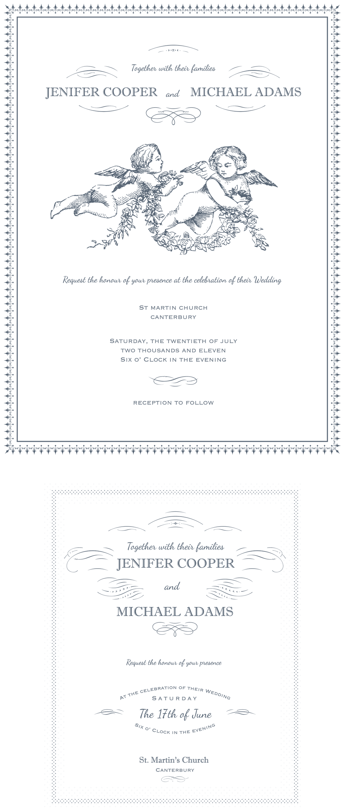
From typographic ornaments and pen flourishes to swirly curls and intricate floral ornaments, this enormous pack has you covered, containing over 900 Vintage Ornaments, 109 Illustrations, 465 Decorative Borders, and 18 Premade Design Samples to draw inspiration from. The assets in this bundle were all carefully hand-made with the highest possible quality, and come in Ai and EPS formats! Save time and create distinctive and elegant menus, posters, retro labels, wrappings, refined wedding invitations and elegant stationary designs. The possibilities are endless with this oversized library of vector ornaments, vintage frame borders, and antique illustrations, all hand-picked from nineteenth-century type foundry catalogs. Regularly priced at $69, you can get this stunningly beautiful vectors pack for just $29!
Full Features Listing:
The Pack Includes:
- 1500+ Total Elements
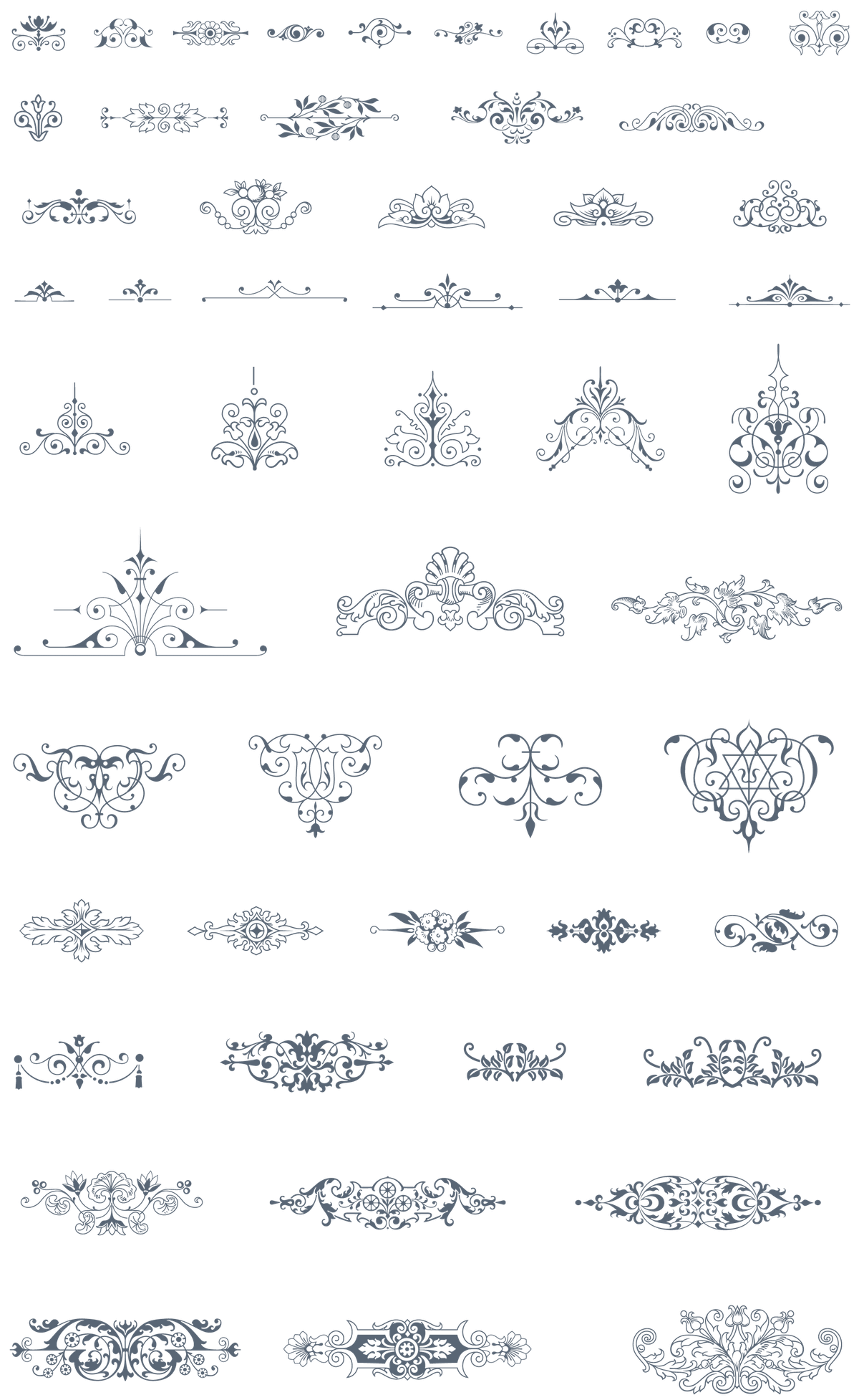
- 930 Vintage Vector Ornaments. Jump to Previews.
- 109 19th Century Vector illustrations. Jump to Previews.
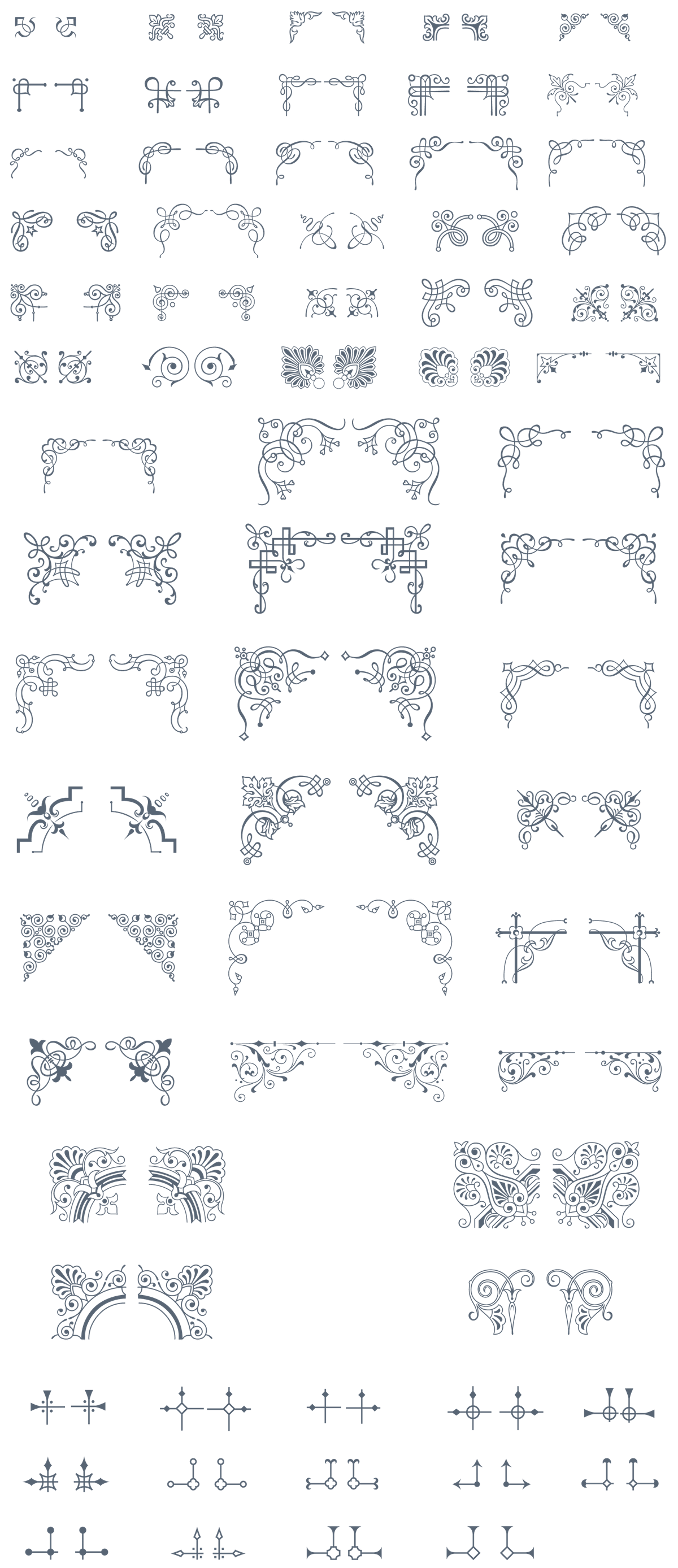
- 465 Decorative Borders. Jump to Previews.
- 18 Premade samples. Jump to Previews.
- File Formats Ai and EPS.
Vintage Ornaments. (Back to Top)









19th Century Illustrations (Back to Top)
Vintage Decorative Borders (Back to Top)




Premade Sample Products (Back to Top)
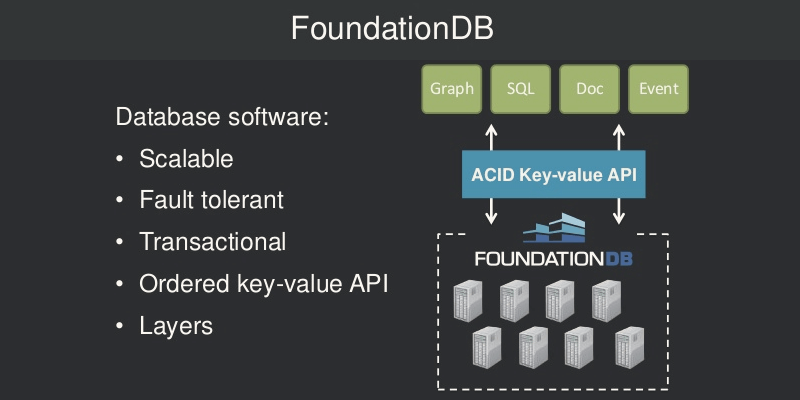
FoundationDB is now Open Source, and for those who doesn't know, this is a distributed database that offers ACID (atomicity, consistency, isolation, durability) levels of reliability with NoSQL's scaling properties and a layered design to build higher-level data storage systems that can be adapted to your specific needs, matching the best data model and running less infrastructure to reduce your operational and technical overhead.
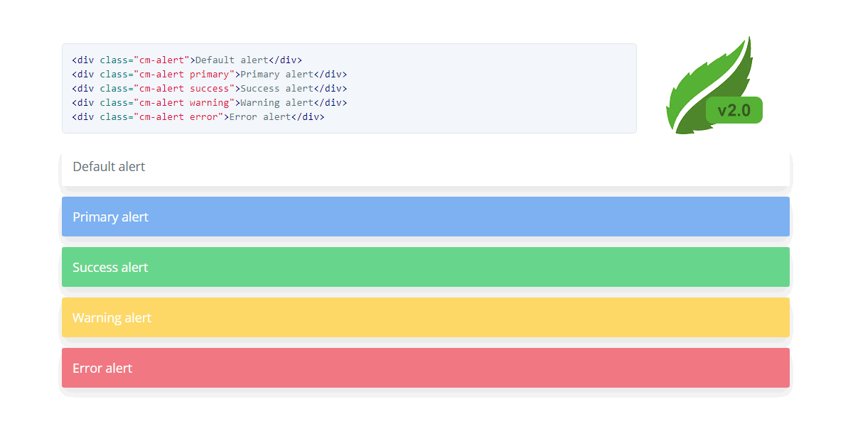
CSS Mint is an Open Source and lightweight UI kit built over Normalize.css to handle cross-browser inconsistencies, aiming to reduce markup and to make easy the structure and layout of your web application.
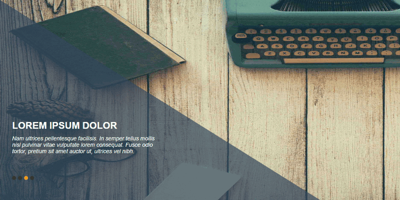
A CSS slider with multiple animation options, featuring 4 slides with linear transitions handled entirely with CSS. This image slider was created by Codepen user aladin ben sassi.
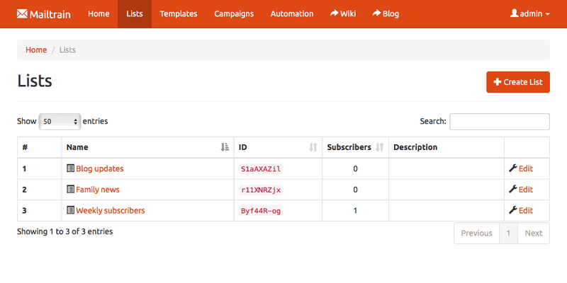
Open source newsletter application like Mailchimp; Runs on your own server and is completely open source. Built on Node.js (v7+) and MySQL (v5.5+ or MariaDB). Featuring an easy list management, list segmentation, GPG encryption and more. Mailtrain allows you to use any provider that supports SMTP protocol to send newsletters and define automation triggers to send specific messages when a user activates the trigger.
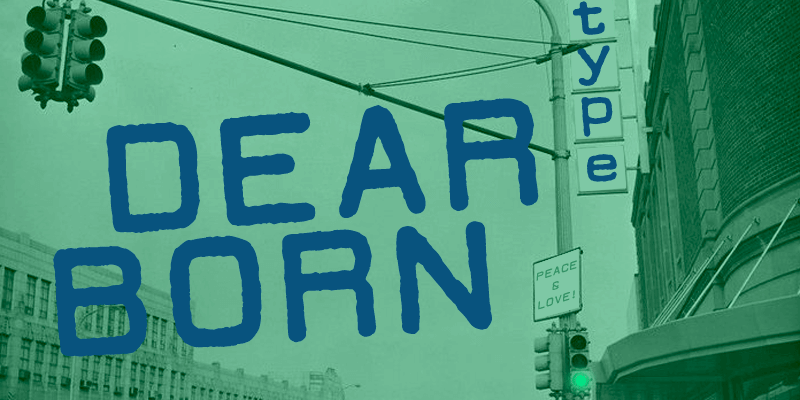
Fancy typewriter font style, rounded and with slightly rough edges. It contains uppercase, lowercase, numbers and some special characters. This font was created by Lukas Krakora and is free for personal use only.
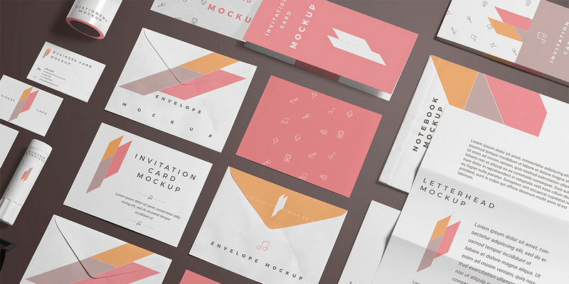
This branding stationery mockup scene is perfect for showcasing your company brand. It includes bottle, business cards, gum stick, card stand, flyers, envelopes, invitation cards, letterhead and notepad for your presentation needs; All items separated and layered in PSD format. Created by Zippy Pixels.
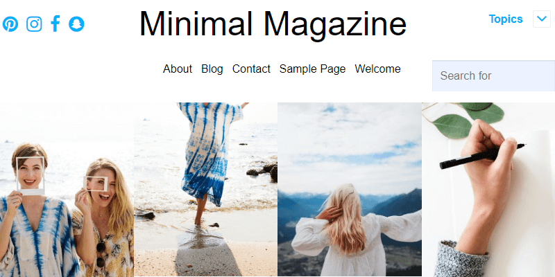
Built for magazine and publishers. It follows all the cutting edge JSON-LD news article structured data, used by renowned websites like NYTimes, Guardian and Independent. It showcases a big header featuring post sections and smooth easy-in transitions on scrolling. Created by Atlantis Themes.
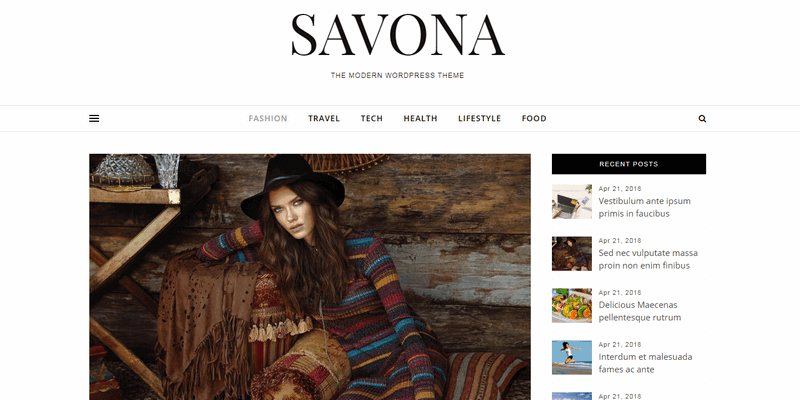
Savona is a free multi-purpose WordPress theme, perfect for any kind of blog or website. It's fully responsive and retina display ready. It features a clean, modern, minimal design with a scrollable sticky element on the right side and a toggleable fixed left sidebar. It has RTL language support and is compatible with WooCommerce.
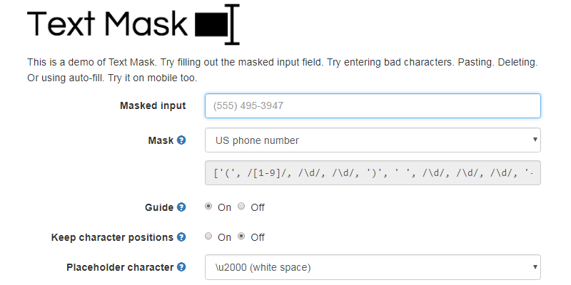
Text Mask is an input mask library. It can create input masks for phone, date, currency, zip code, percentage, email, and more. Works with React, Angular, Ember, Vue and Vanilla JS.
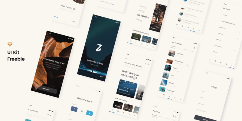
Simple free iOS mobile UI Kit based on a travel social network. It has 15 screens, each carefully layered, grouped and named. 100% vector shapes and HQ images, all in one Sketch file. Created by Dribbble user Kishore.
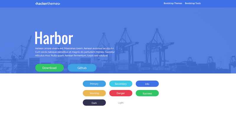
Harbor is an open source Bootstrap4 business skin theme that came to bring freshness to your designs. Made by HackerThemes.
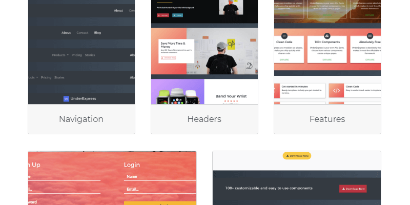
This is a completely customizable HTML UI Kit that includes 8 website landing page templates built with Bootstrap 4. UnderExpress has over 100 custom UI components to make stunning web projects. Use it to save time and create the best home for your idea on the web.

This is a card UI, designed by taking the concept of material colour and general aesthetics. It must be used in conjunction with jQuery, being that the last control its motions and transitions. Also, jQuery is the easiest way for managing events and all customizable options. Created by Codepen user David Foliti.
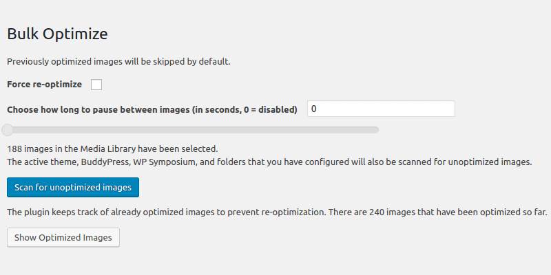
This, as its name implies, is a free image optimization plugin for WordPress and unlike other similar plugins, Ewww Image Optimizer does it on your server side, just beware of its high memory usage. Its dashboard show system status as well as all possible options for image optimization. It does lossy/lossless, JPG, PNG, and GIF.
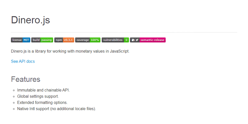
Dinero.js carries its own currency and makes sure you can't perform illegal manipulations (add dollars and euros for example), etc. It comes with a whole set of additional methods and assertions related to the business logic of a monetary entity.
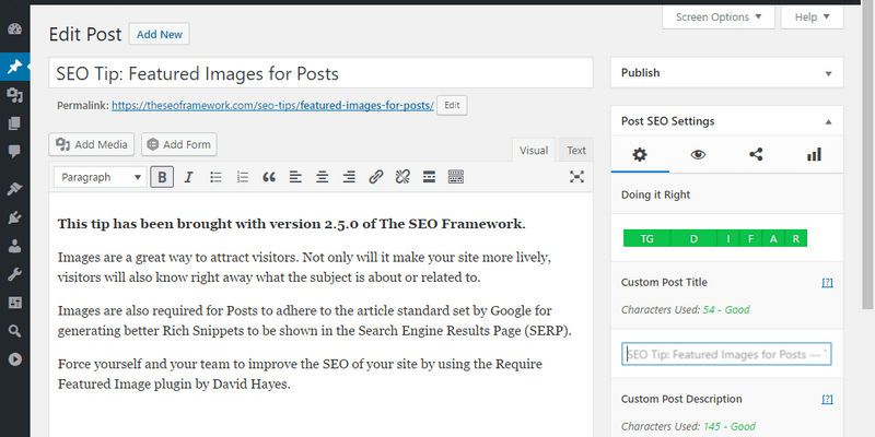
The SEO Framework is the free all in one automated SEO plugin for WordPress, it provides an automated, accessible, unbranded and extremely fast SEO solution for any WordPress website. Works by generating descriptions titles and shows you where you can improve your SEO. One of the best SEO plugin for WordPress.
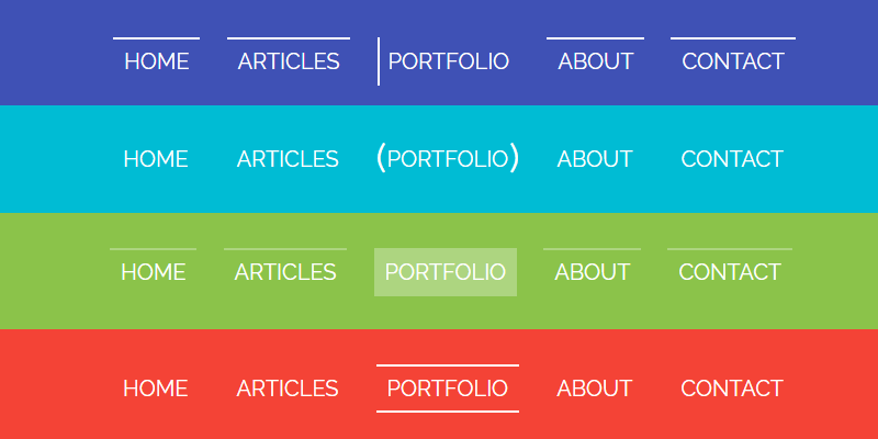
This is a set of multiple animation examples for navbars. In total the creator developed 15 navbars, differentiated by colour and each one with a different set of animations when on hover. The motions are generated from CSS and each navbar container is set in HTML.
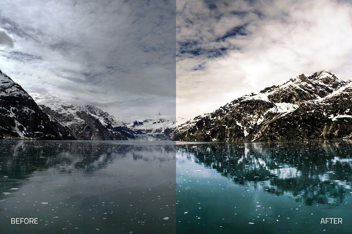
720+ Lightroom Presets, 690+ Photoshop Actions. 17 Collections. A Photographer’s Best Friend Bundle!
Pro Photographer's Bundle With A Crazy Discount
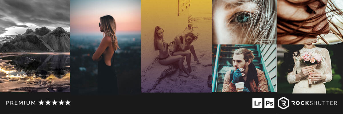
A professional photographer's best friend, this bundle contains 17 collections of awesome Lightroom Presets and Photoshop Actions. More accurately 690+ Photoshop Actions and 720+ Lightroom Presets to help you find new inspiration for your professional or amateur photography projects. Compatible with both Mac and PC for Adobe CS4, CS5, CS6, and CC. Each element in this collection has been carefully created and adjusted to produce amazing results, and they are easy to use so you can cut the time you spend retouching photographies by using these awesome, fully adjustable, and non-destructive assets. All presets & actions have been tested individually with hundreds of different photos! The bundle includes full documentation & installation instructions. Normally, this bundle would make your wallet take a $331 hit, but for a limited time, you can get the bundle complete with an extended license for just $19! A whopping 95% discount on the original price!
Check out a Listing of Features
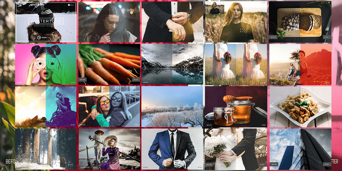
Features Digest: (Back to Top)
- 17 collections
- 690+ Photoshop Actions
- 720+ Lightroom Presets
- Non-Destructive
- Compatible with Adobe Photoshop CS4, CS5, CS6 and CC.
- Compatible with both Mac and PC
- Works on RAW and JPEG images
- Fully adjustable settings
- Each element in this collection has been carefully created and adjusted to produce professional and amazing results. We test all our products individually with hundreds of different photos.
- Compatible: Adobe® Photoshop CS4, CS5, CS6 & CC. OSX & Win.
- This product is available for download immediately after purchase.
- Extended License!
Collections Listing
LR Presets:
- Uber Grads
- Silverlight B&W
- Zinepress
- Bistrology Food
- Pastel Dreams
- Wintertone
- Radiance
- LR Ultra-Landscapes
PS Actions
- Prism I
- Retro Prime
- Duotone
- Duotone II
- Infinity
- PS Ultra-Landscapes
- Weddingful
- Foodie Pro
- Silvercore
Photoshop Actions: Collections Full Descriptions & Previews
Below you will find previews and features of each individual collection of Photoshop Actions included in this pack!
Prism Collection (Back to Top)
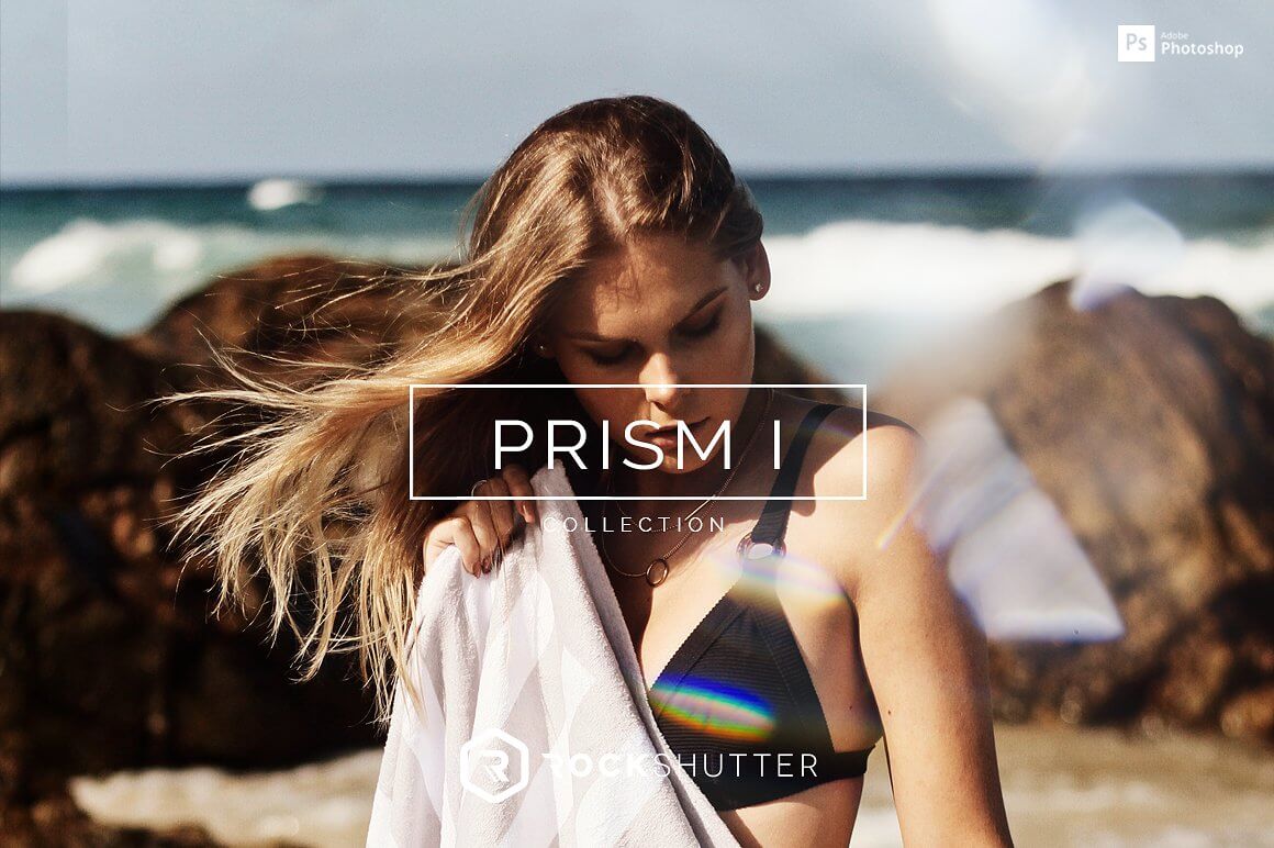
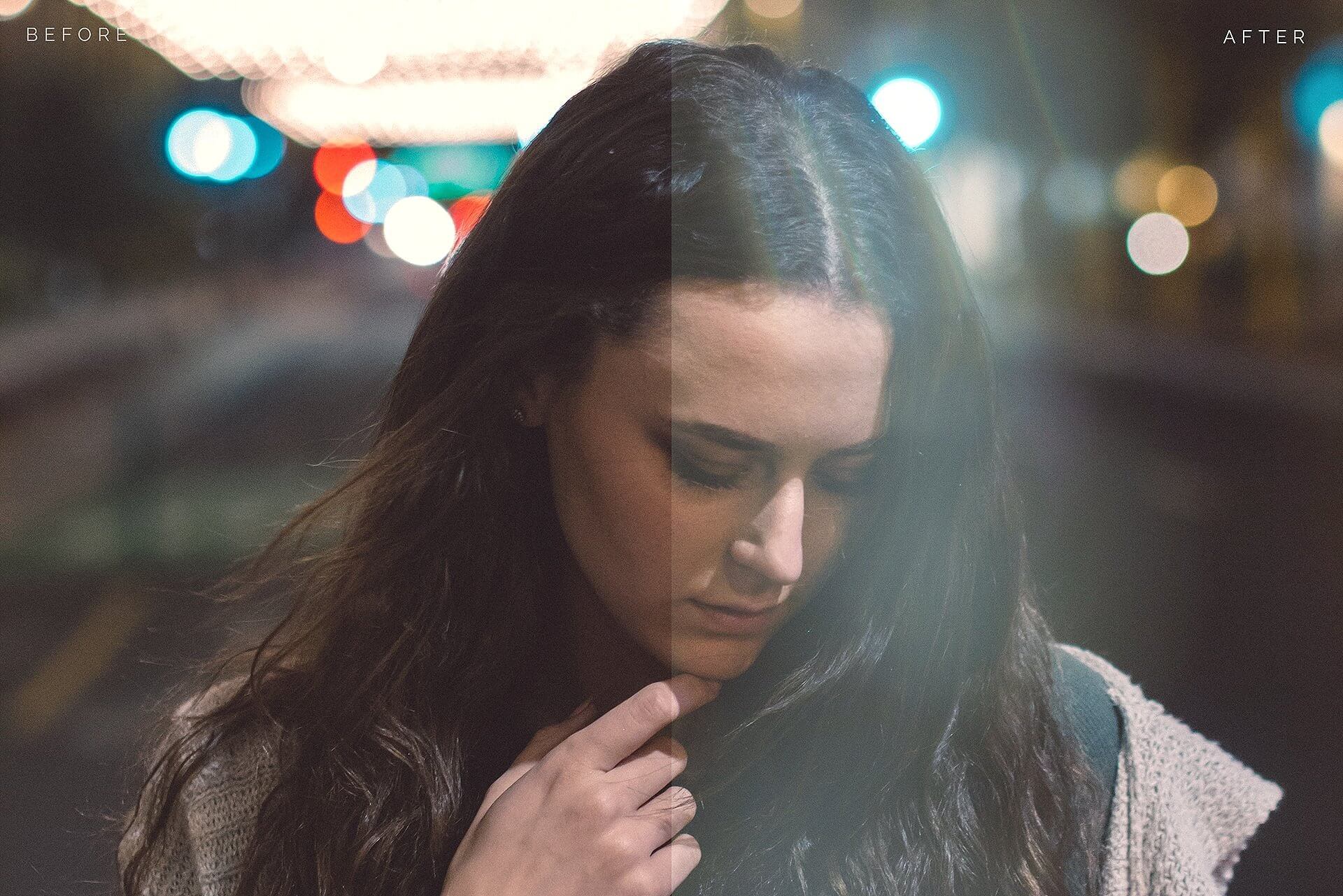
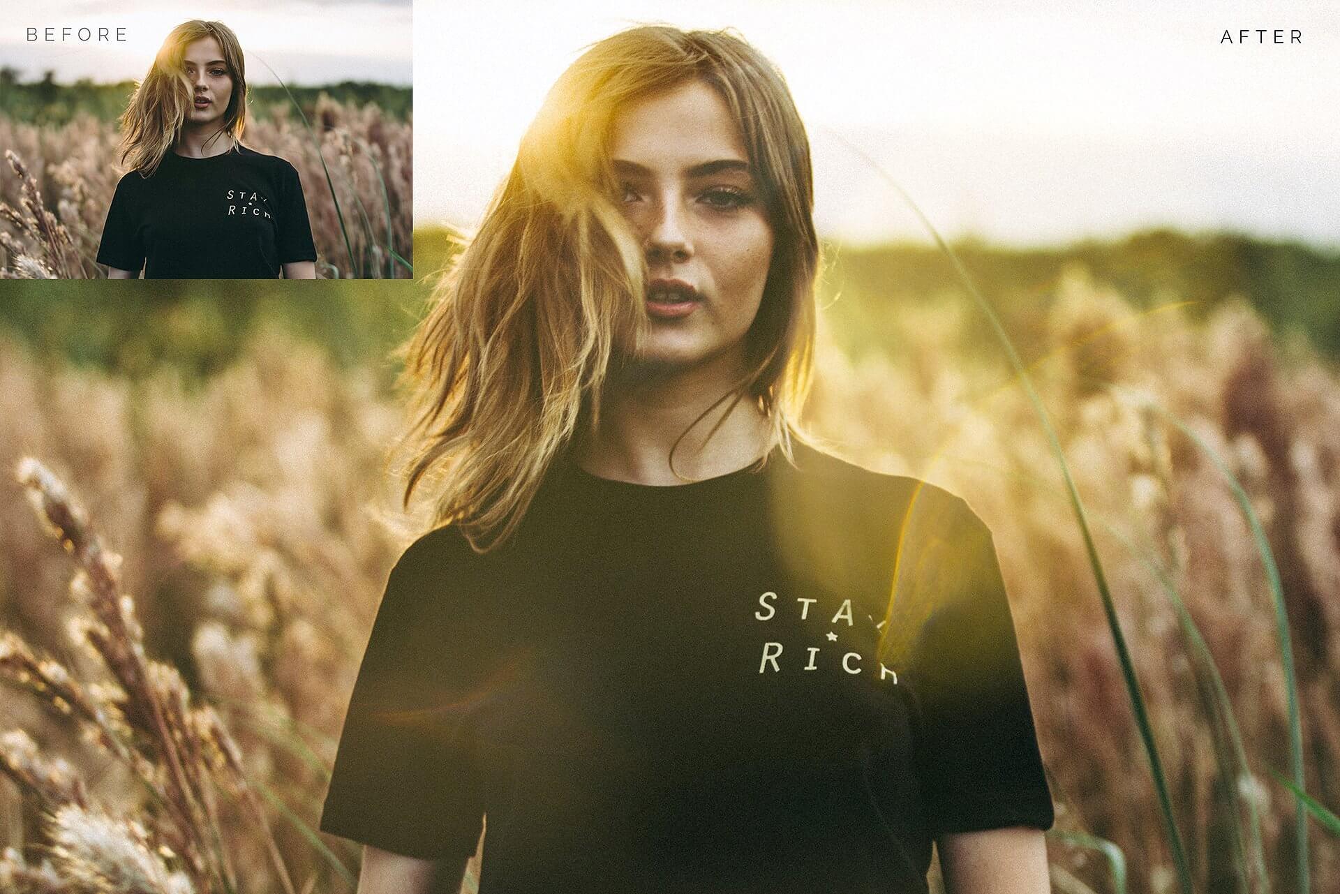
Optically captured crystal effects and bokeh. Prism is a high quality photo effects collection of complex crystal elements and beautiful bokehs. Choose from a wide variety of effects. From soft, blurry and clean to complex, vivid and rich. Used by professionals all over the world. From awarded wedding photographers to high profile commercial photography studios. Optically captured from all sorts of glass and crystal materials to create real and natural looks. Includes 50 drag and drop organic crystal effects + 10 Color Effects actions
WHAT'S INCLUDED
- 50 High Resolution PNG crystal effect element files + Base and enhancement actions. 10 special effect actions.
- 01 ELEMENTS - High resolution, naturally captured crisp, colorful and sharp crystals with big bokehs.
- 02 BASE ACTION - Easy to use 1-click Photoshop action to easily apply the effects. Includes adjustment layers to customize the effect.
- 03 ENHANCEMENT ACTIONS - Easily add sharpness and grain to the effect, comes with 3 strengths.
- 04 SPECIAL EFFECT ACTIONS - Customize your photos and effects by adding special color and light effects.
FEATURES
- Non-Destructive
- Compatible with Adobe Photoshop CS4, CS5, CS6 and CC.
- Compatible with both Mac and PC
- Works on RAW and JPEG images
- Fully adjustable settings
- Each element in this collection has been carefully created and adjusted to produce professional and amazing results. We test all our products individually with hundreds of different photos.
- Compatible: Adobe® Photoshop CS4, CS5, CS6 & CC. OSX & Win.
- This product is available for download immediately after purchase.


(Back to Top)Retro Prime Collection
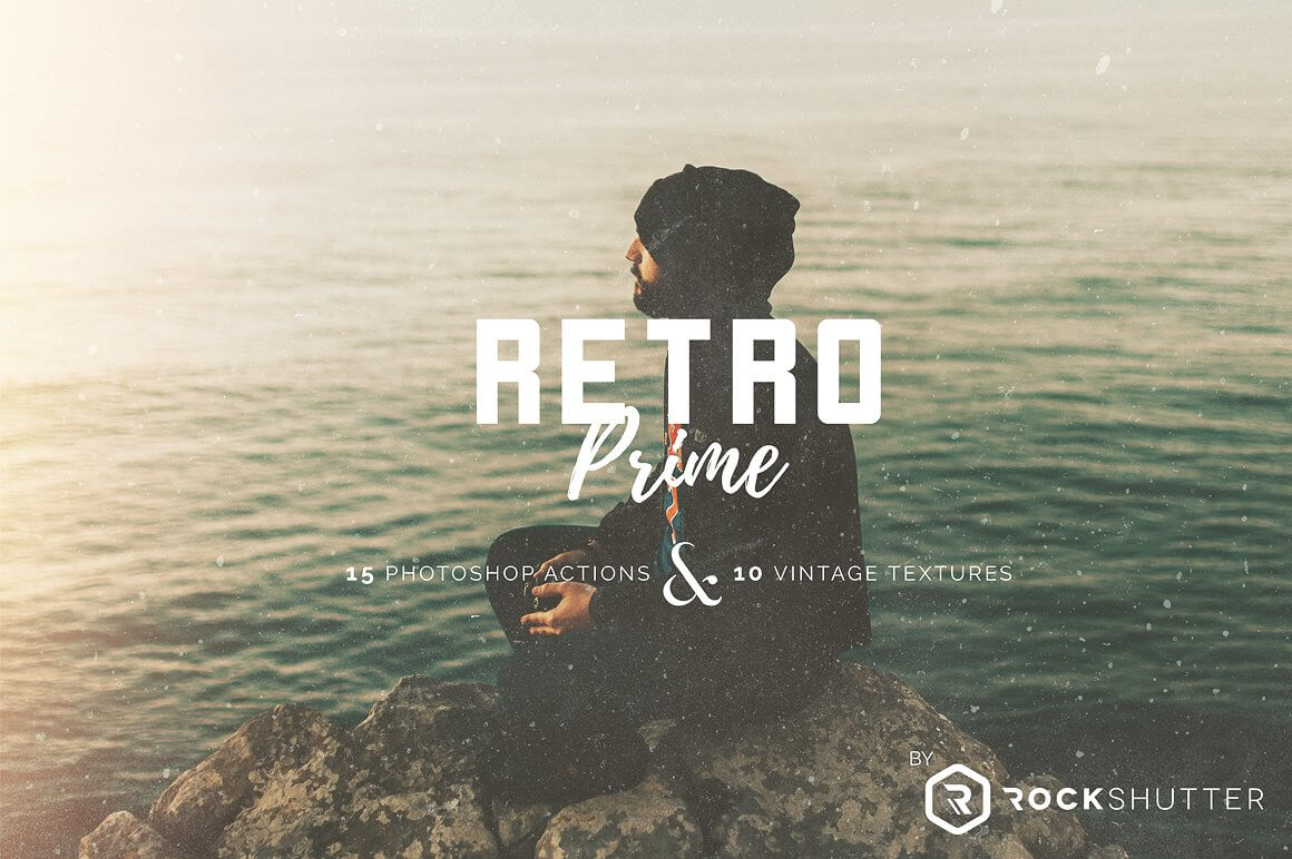
Dramatic, nostalgic and old. Looking for realistic vintage and retro effects? Then Try Retro Prime, an easy to use collection of Photoshop Actions that will transform your photos into authentic retro shots, emulating the dramatic and nostalgic effect of old film.
WHAT'S INCLUDED
- 25 Photoshop Actions created and used by professionals
- 10 High Resolution handcrafter vintage textures
- 15 Retro Effect Actions
- 10 Vintage Gradient Actions
FEATURES
- Non-Destructive
- Compatible with Adobe Photoshop CS4, CS5, CS6 and CC.
- Compatible with both Mac and PC
- Works on RAW and JPEG images
- Fully adjustable settings
- Each element in this collection has been carefully created and adjusted to produce professional and amazing results. We test all our products individually with hundreds of different photos.
- Compatible: Adobe® Photoshop CS4, CS5, CS6 & CC. OSX & Win.
This product is available for download immediately after purchase.



Duotone Collection (Back to Top)
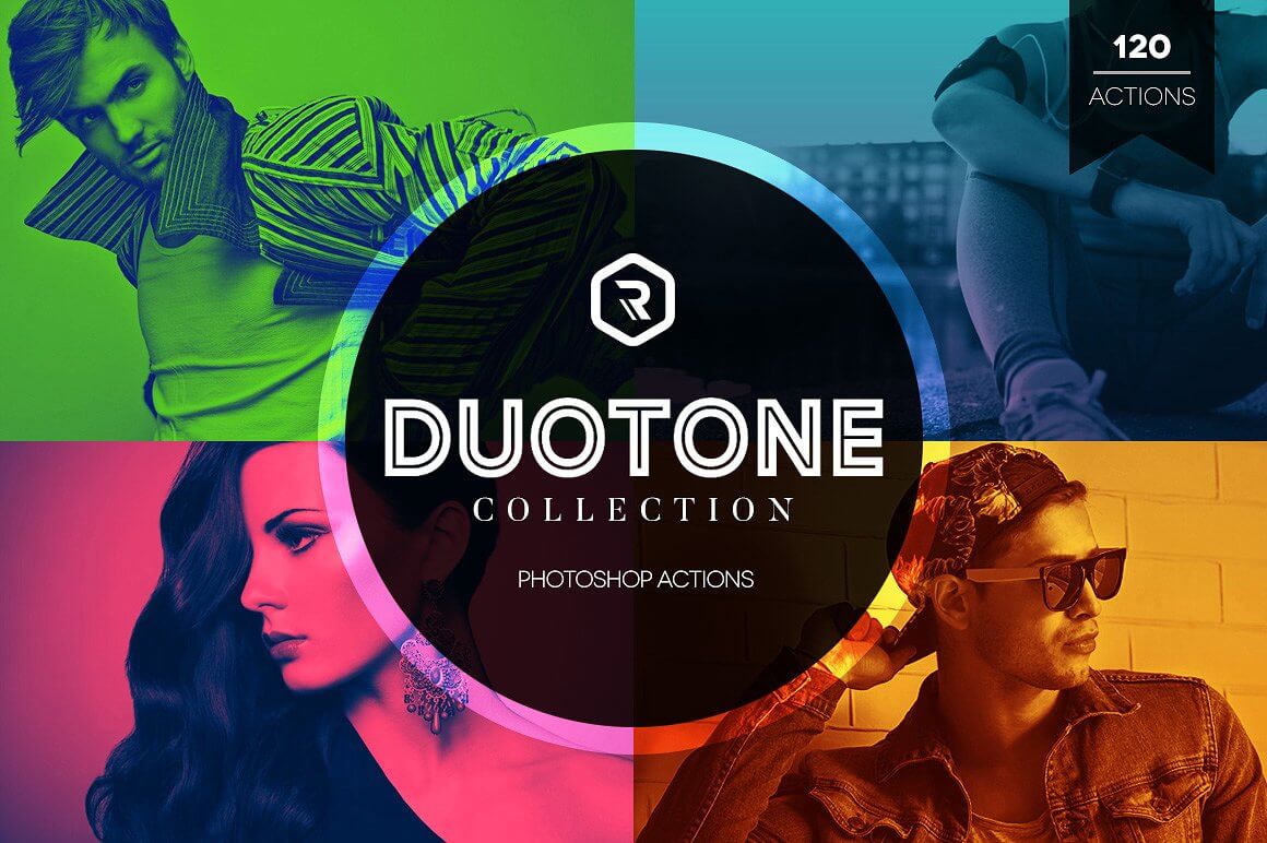
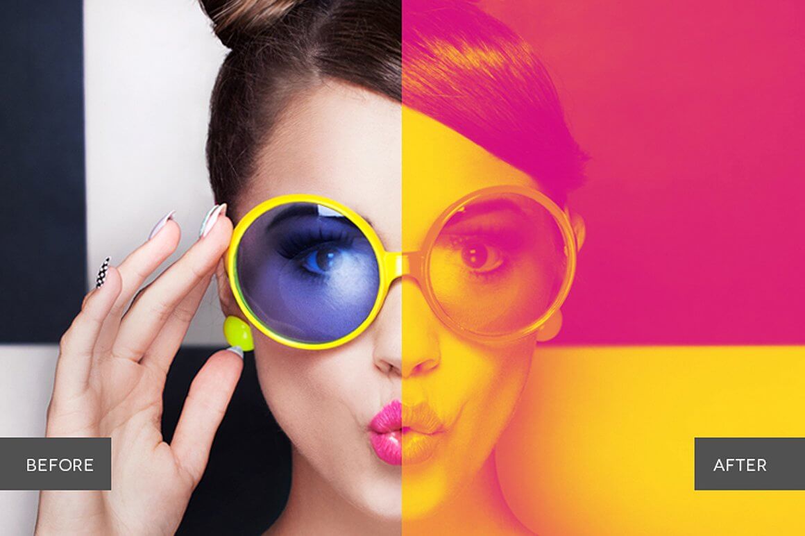
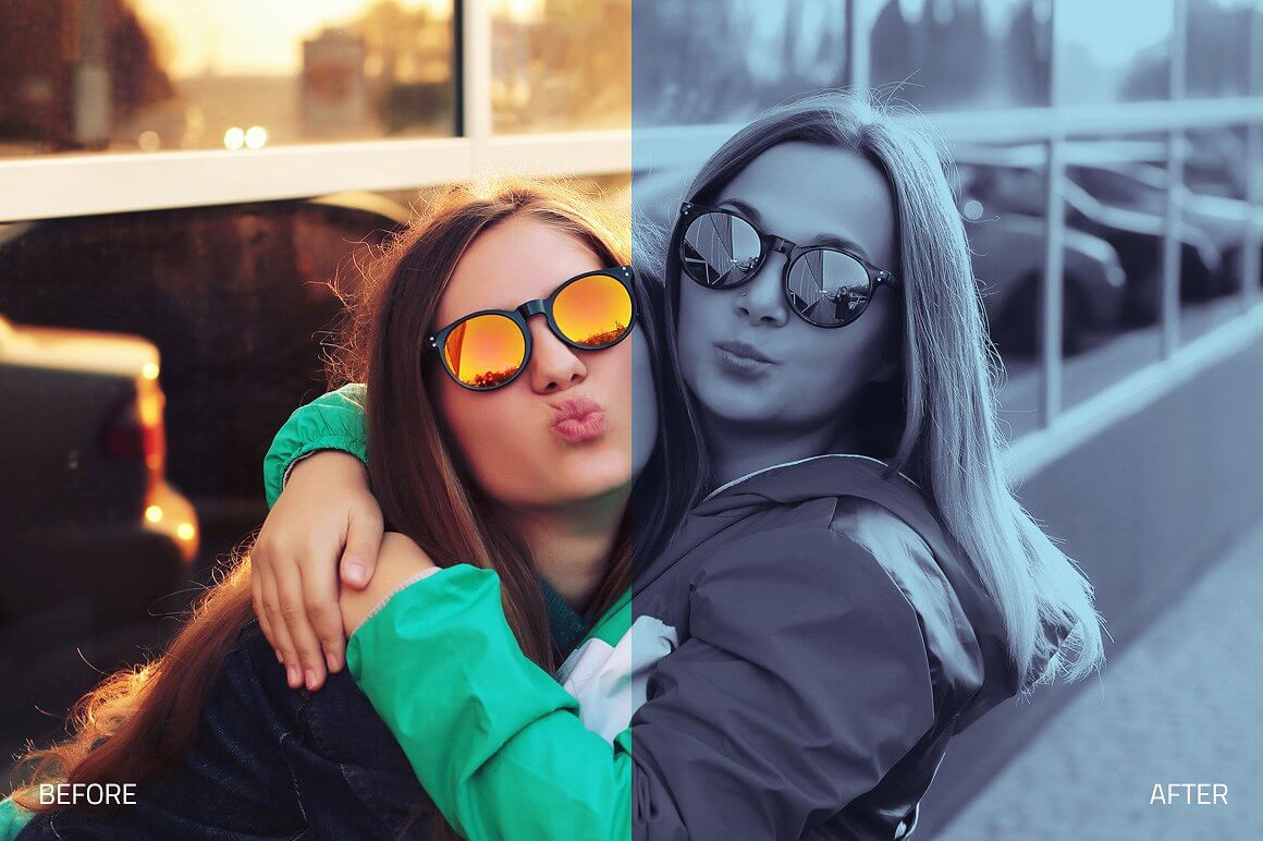
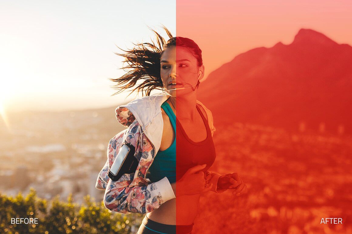
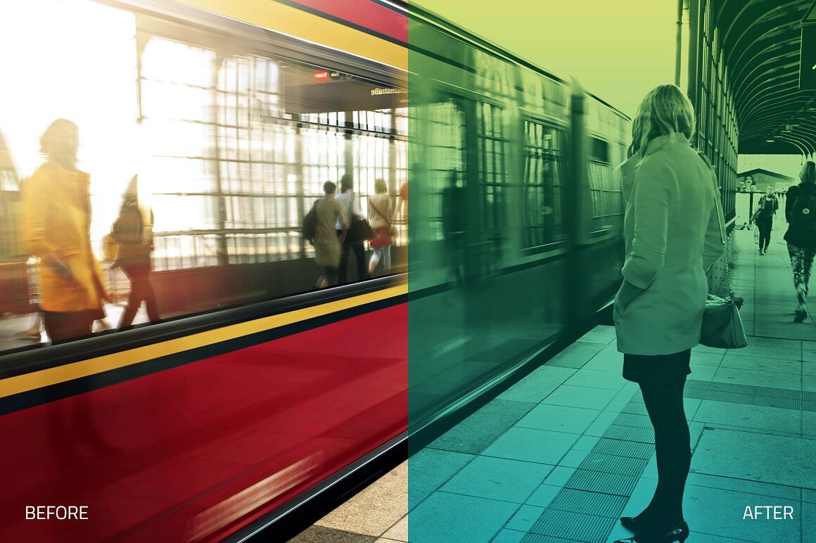
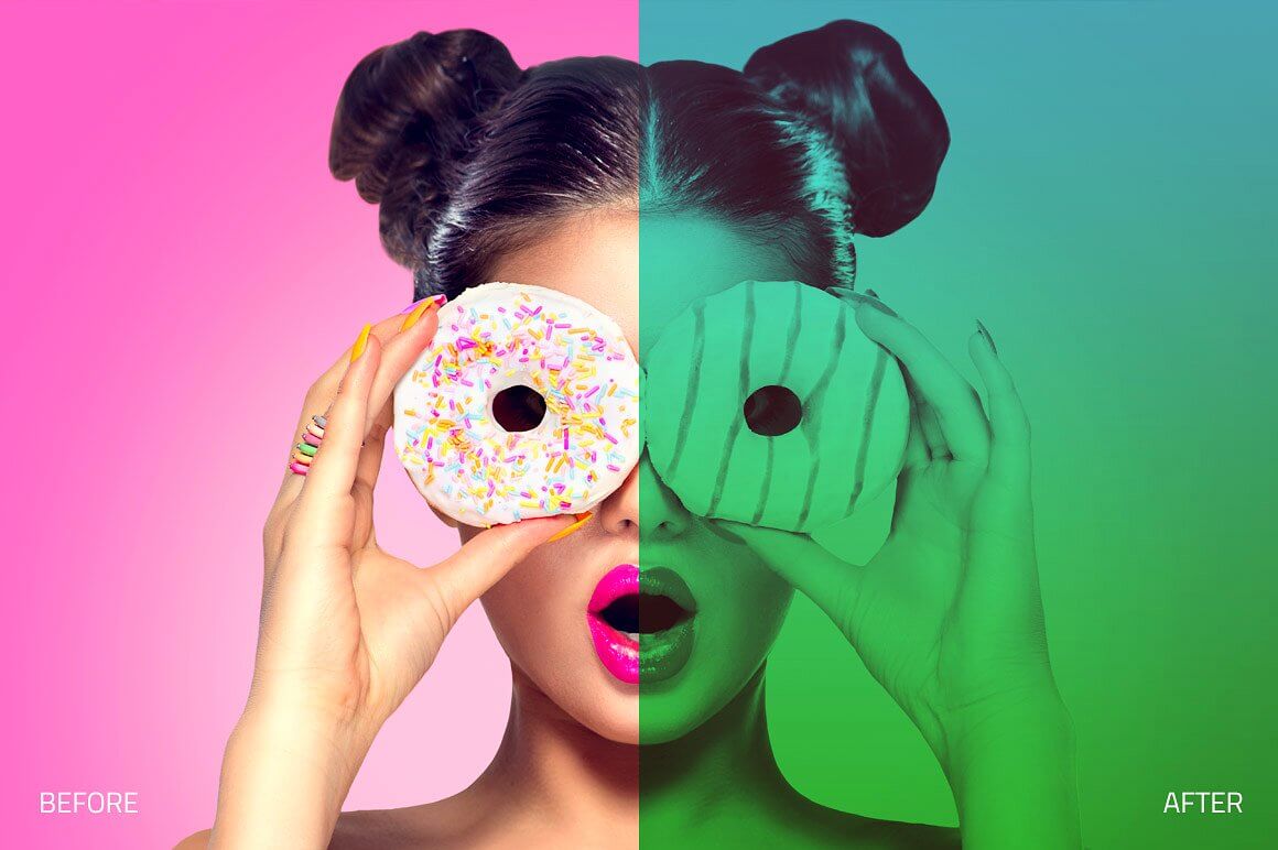
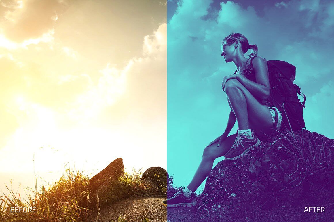
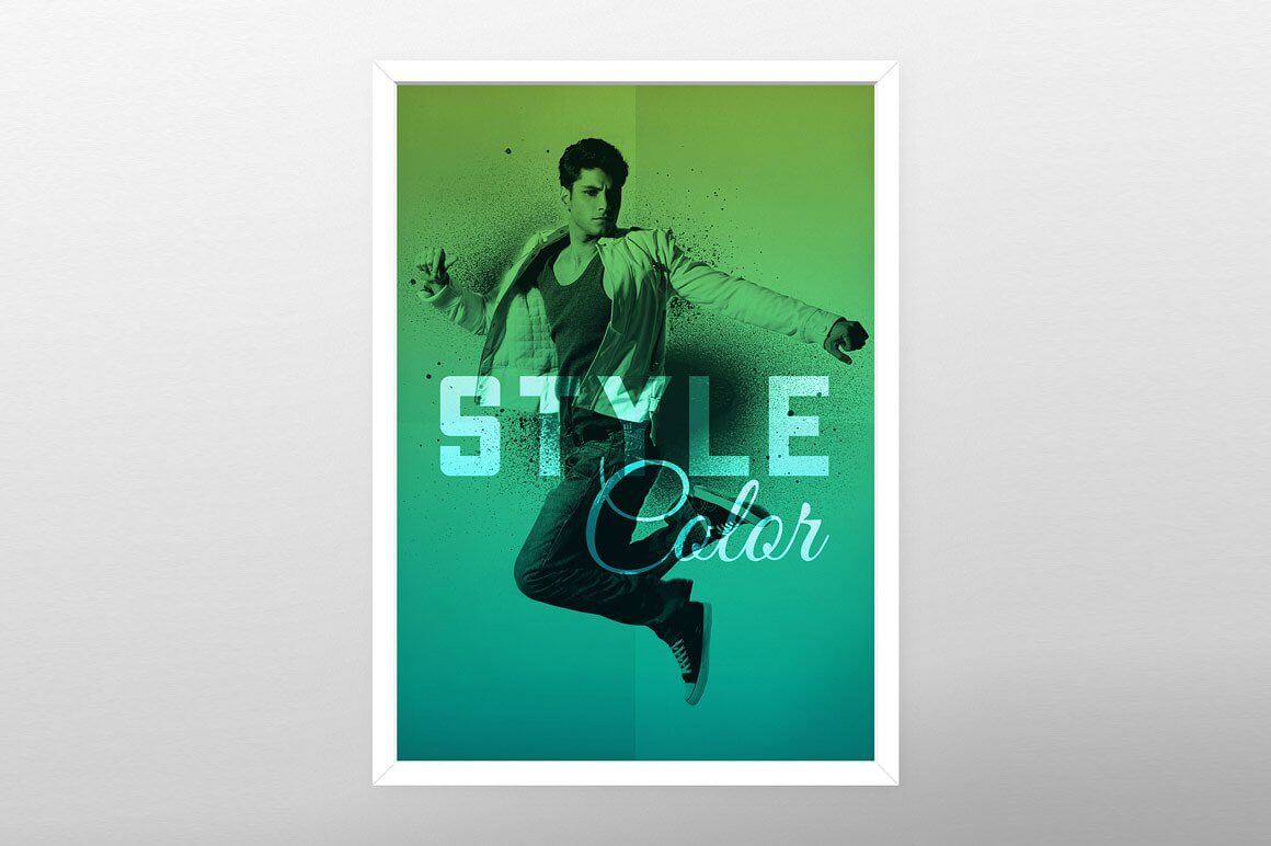
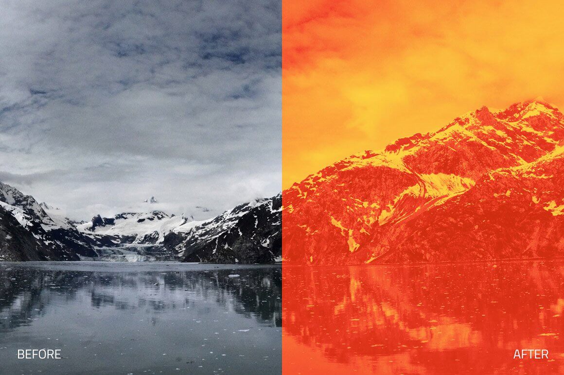
WORLD'S LARGEST & MOST PROFESSIONAL DUOTONE COLLECTION. Looking for a more artistic approach to your portraits? Look no further than Duotone Collection. Add a burst of vibrant color with a duotone effect that is perfect for magazines, commercial work, advertising, etc. Easy to use, with quick results - your photos will be an instant work of art. Each element in this collection has been carefully created and adjusted to produce professional and amazing results. We test all our products individually with hundreds of different photos.
WHAT'S INCLUDED
- 120 Premium Photoshop Actions created and used by professionals!
- 30 Duotone Prime Color Actions
- 30 Duotone Flat Color Actions
- 20 Duotone Matte Actions
- 20 Duotone Pastel Actions
- 20 Duotone Gradient Actions
FEATURES
- Two Contrast Adjustments
- Non-Destructive
- Compatible with Adobe Photoshop CS4, CS5, CS6 and CC.
- Compatible with both Mac and PC
- Works on RAW and JPEG images
- Fully adjustable settings
- Compatible: Adobe® Photoshop CS4, CS5, CS6 & CC. OSX & Win.
- This product is available for download immediately after purchase.



Duotone Collection II (Back to Top)
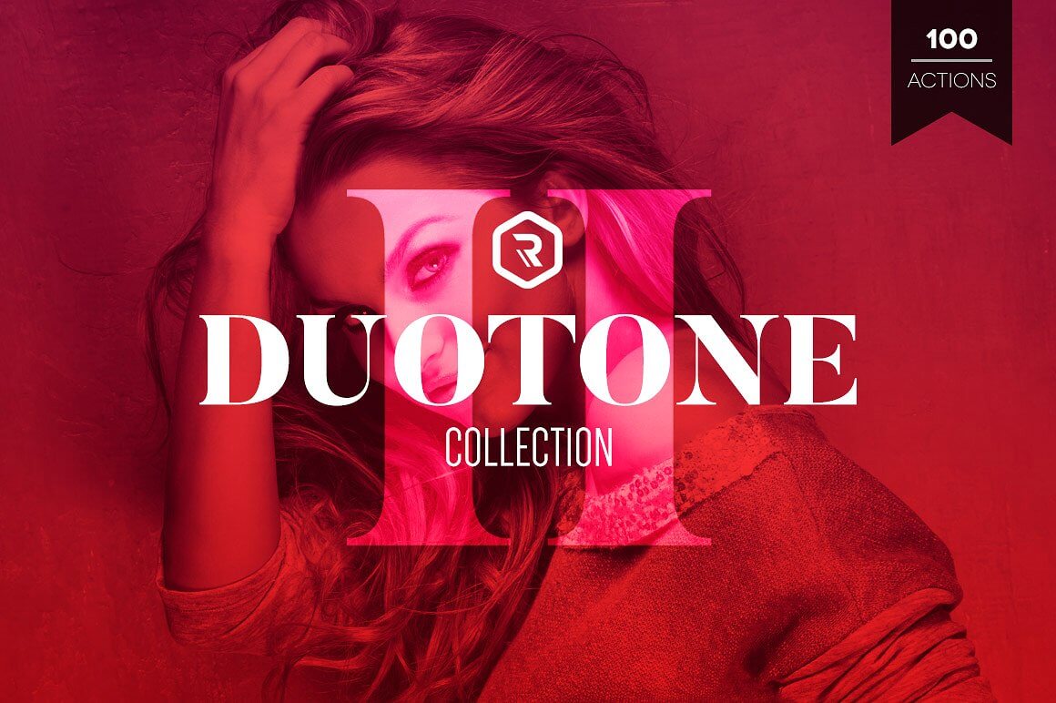
VERSION II - WORLD'S LARGEST & MOST PROFESSIONAL DUOTONE COLLECTION. The second version of our popular Duotone Collection is finally here! More duotone effects, more colors and even more amazing gradients! Turn your photos and images in eye-catching pieces. Perfect for commercial or creative work.
WHAT'S INCLUDED
- 100 Premium Photoshop Actions created and used by professionals!
- 25 Duotone Solid Color Actions
- 25 Duotone Retro Color Actions
- 30 Duotone Gradient Actions
- 20 Duotone Subtle Gradient Actions
FEATURES
- Two Contrast Adjustments
- Non-Destructive
- Compatible with Adobe Photoshop CS4, CS5, CS6 and CC.
- Compatible with both Mac and PC
- Works on RAW and JPEG images
- Fully adjustable settings
- Compatible: Adobe® Photoshop CS4, CS5, CS6 & CC. OSX & Win.
- This product is available for download immediately after purchase.

Infinity Collection (Back to Top)
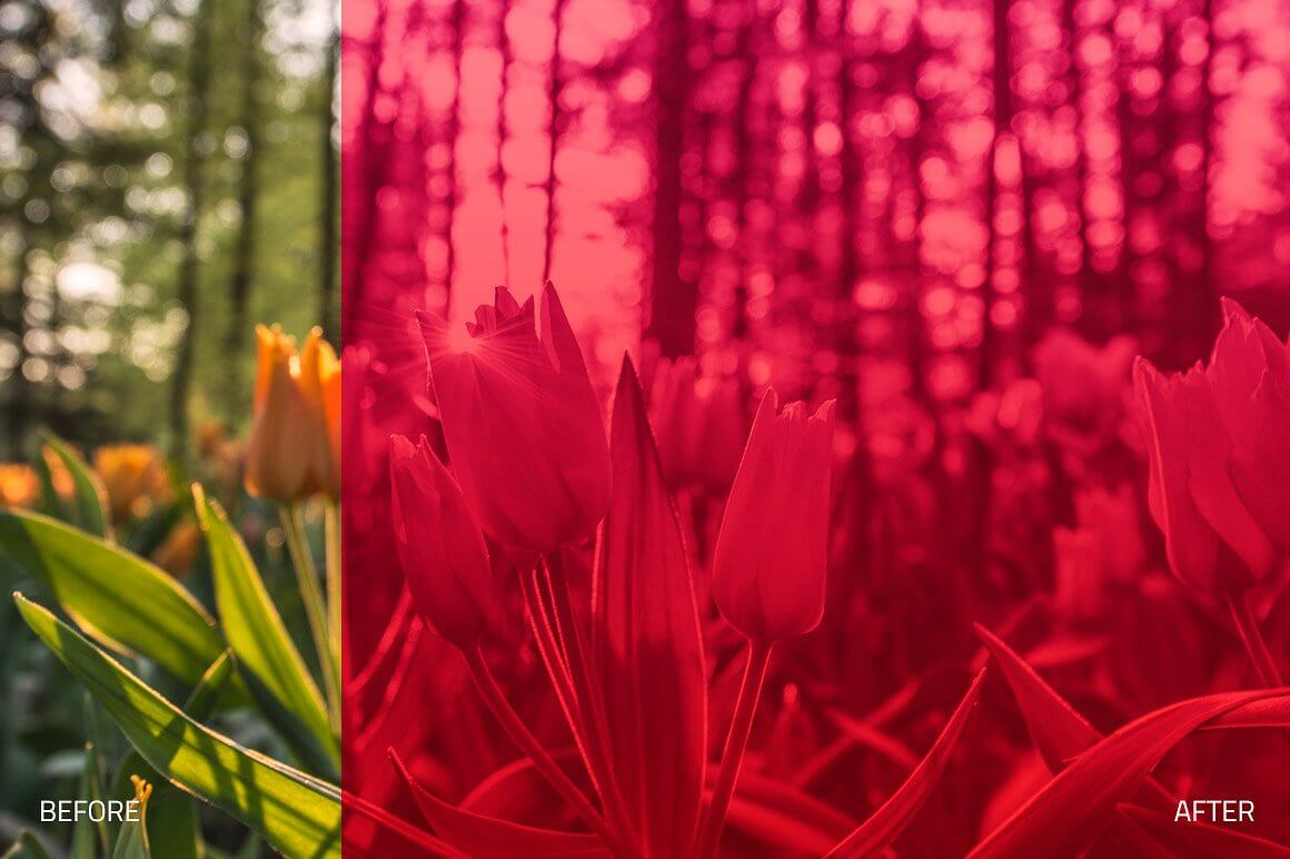
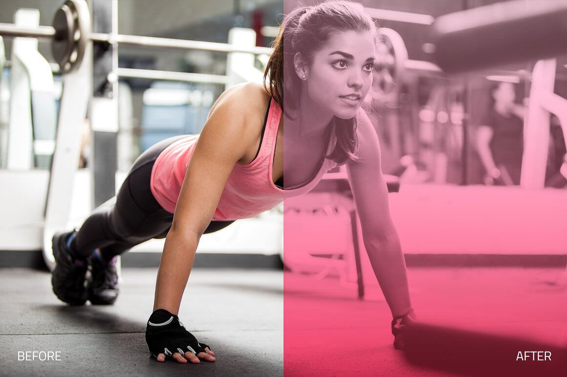
Immerse yourself in a world of breathtaking and outstanding effects with the Infinity Collection of Professional Photoshop Actions. A huge set of actions that include beautiful colors, haze, blurs, realistic lights and many retouch tools. This collections is divided in 13 modules that will improve your workflow and make editing easier, each with handcrafted, realistic and professional tools that will take your editing to the next level. Infinity Collection is being used by professional creatives and photographers all over the world and it's now available at a discounted price.
WHAT'S INCLUDED
- 140 Premium Photoshop Actions created and used by professionals!
- 13 Modules
- 01 BASIC - 7 Actions: Basic settings and adjustments.
- 02 RETOUCH - 14 Actions: Use stunning brush effects to retouch your images.
- 03 FOUNDATIONS - 6 Actions: Clean edits and base effects.
- 04 TONES - 18 Actions: Change the overall tone of your image.
- 05 TONE BRUSHES - 14 Actions: Use brushes to add selective tonning.
- 06 SHADOWS & HIGHLIGHTS - 13 Actions: Add color and tone to highlights and shadows.
- 07 HAZE - 11 Actions: Realistic and natural haze effects.
- 08 BLURS - 8 Actions: Add depth and perspective with different blur effects.
- 09 COLOR FX - 11 Actions: Creative and artistic color effects.
- 10 SUN SPOTS - 5 Actions: Add a touch of sun light.
- 11 LIGHT FX - 15 Actions: Realistic light effects, with sunlight, rays etc.
- 12 FLARES - 10 Actions: Realistic light and lens flare effects.
- 13 ENHANCE - 8 Actions: Final touches and details.
FEATURES
- Non-Destructive
- Compatible with Adobe Photoshop CS4, CS5, CS6 and CC.
- Compatible with both Mac and PC
- Works on RAW and JPEG images
- Fully adjustable settings
- Each element in this collection has been carefully created and adjusted to produce professional and amazing results. We test all our products individually with hundreds of different photos.
- Compatible: Adobe® Photoshop CS4, CS5, CS6 & CC. OSX & Win.
- This product is available for download immediately after purchase.

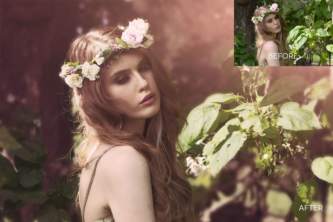
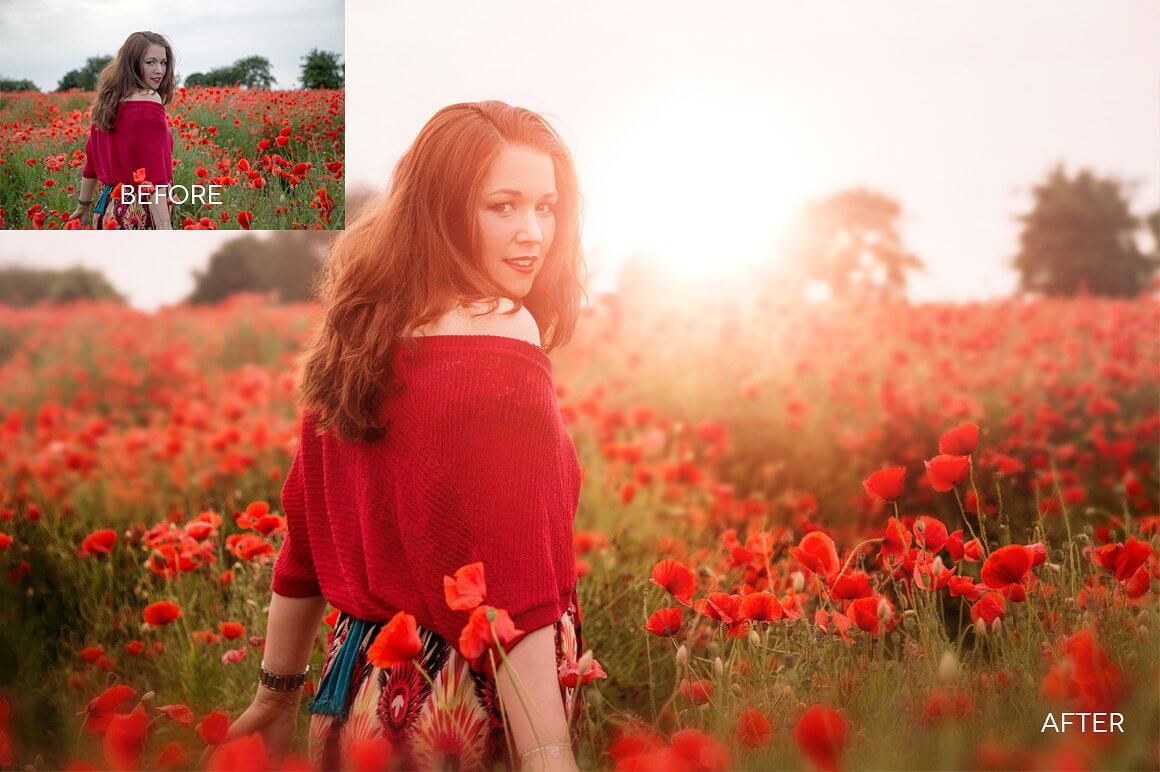

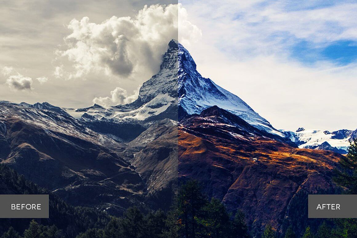
Ultra Landscapes Photoshop Collection (Back to Top)

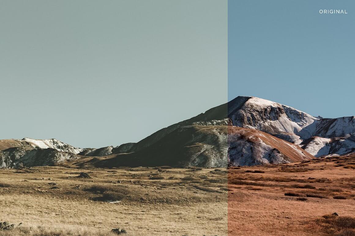
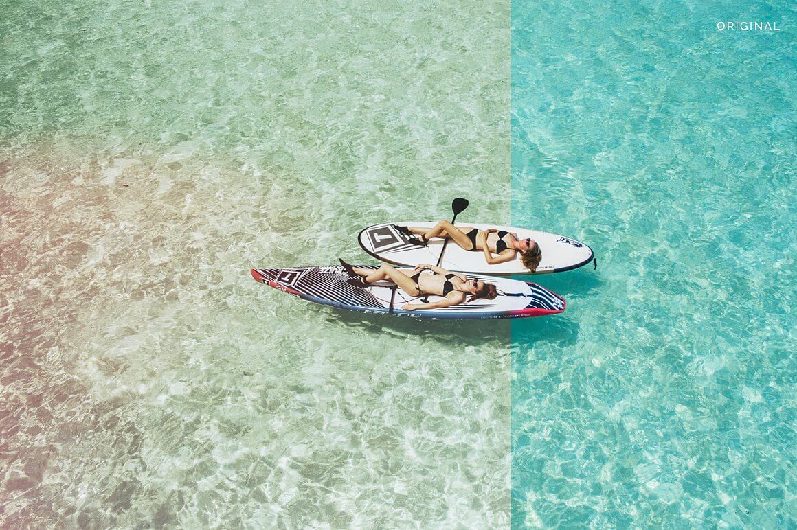
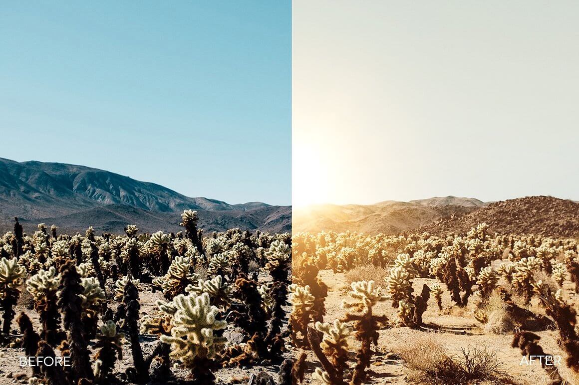
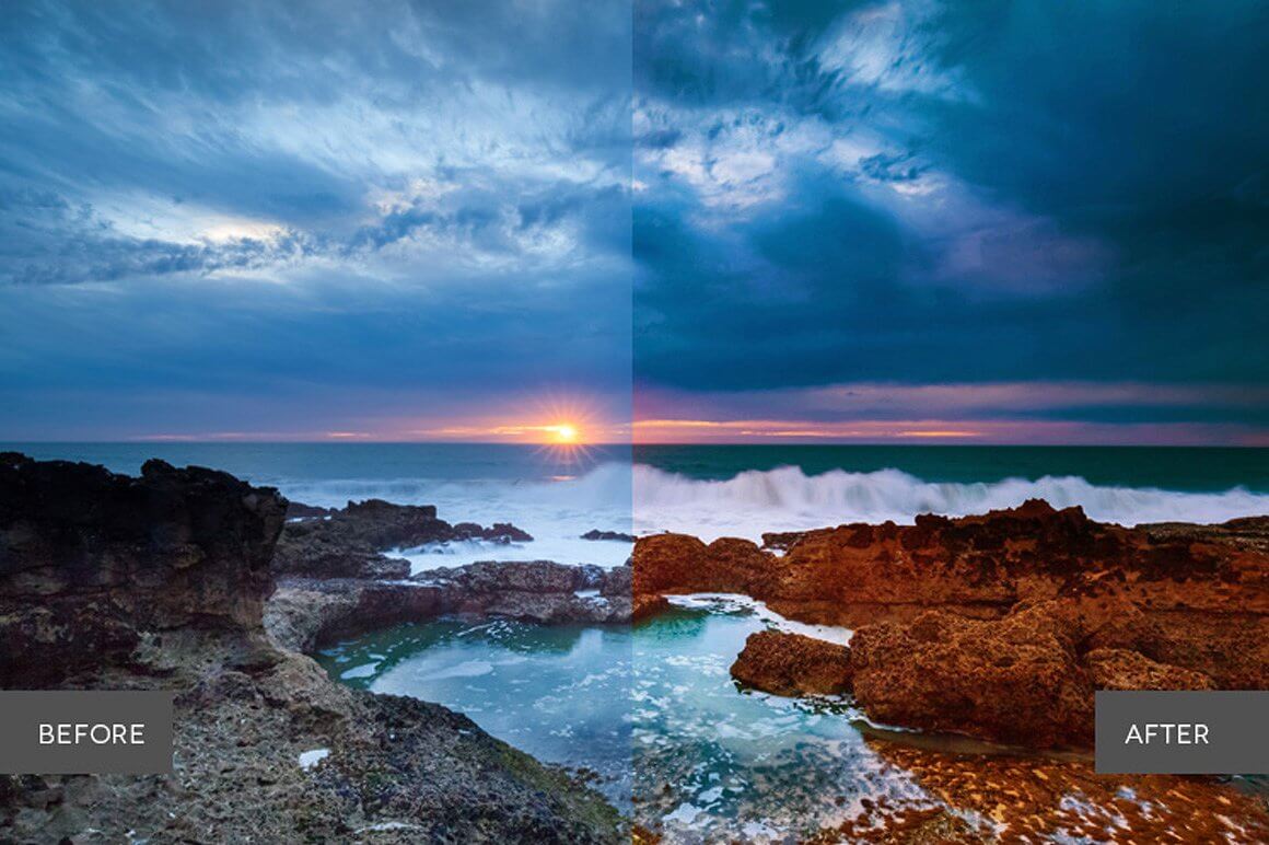
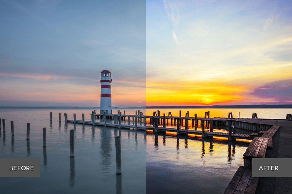
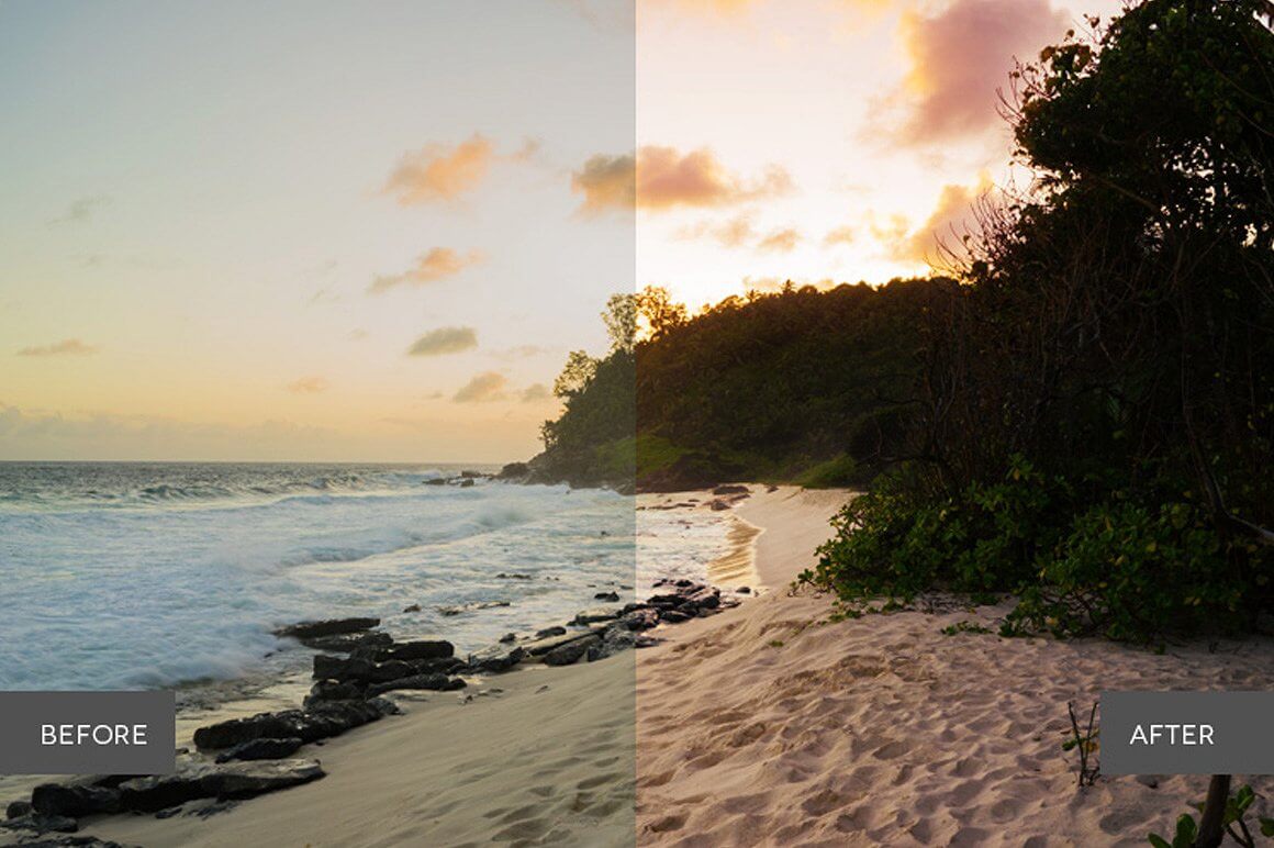
Breathtaking, majestic & colorful. There’s so much natural beauty and mystery in everyday scenery - why not bring it to life? Ultra Landscapes sharpens the world around us with contrast, bright colors, light, and focus that adds a natural facelift to any landscape.
WHAT'S INCLUDED
- 42 Photoshop Actions created and used by professionals
- 10 Basic Adjustment Actions
- 10 Retouch Actions
- 8 Color Tone Actions
- 12 Creative Effects Actions
- 2 Lights Actions
FEATURES
- Stackable effects
- Non-Destructive
- Compatible with Adobe Photoshop CS4, CS5, CS6 and CC.
- Compatible with both Mac and PC
- Works on RAW and JPEG images
- Fully adjustable settings
- Each element in this collection has been carefully created and adjusted to produce professional and amazing results. We test all our products individually with hundreds of different photos.
- Compatible: Adobe® Photoshop CS4, CS5, CS6 & CC. OSX & Win.
- This product is available for download immediately after purchase.
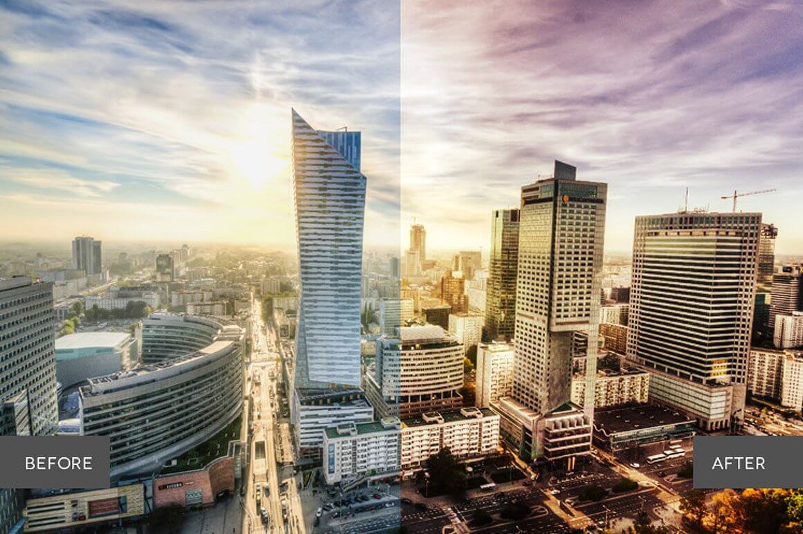
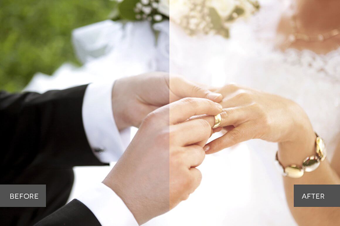
Weddingful Actions Collection (Back to Top)
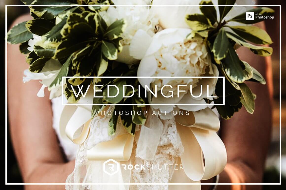
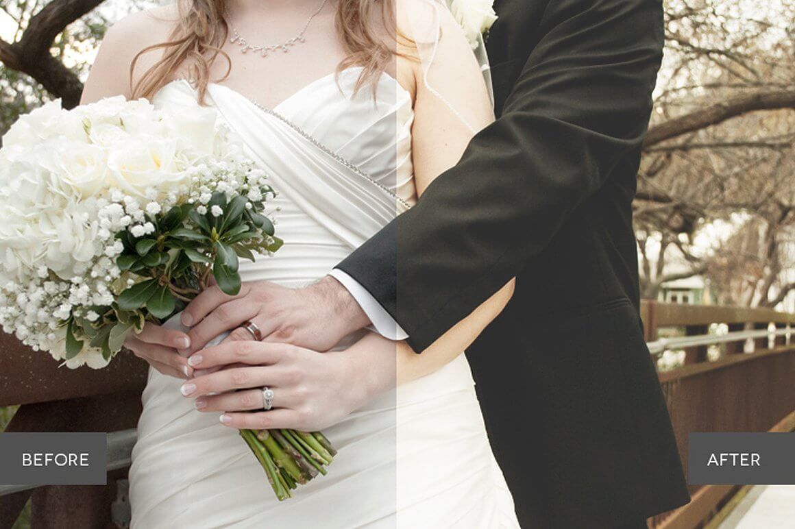
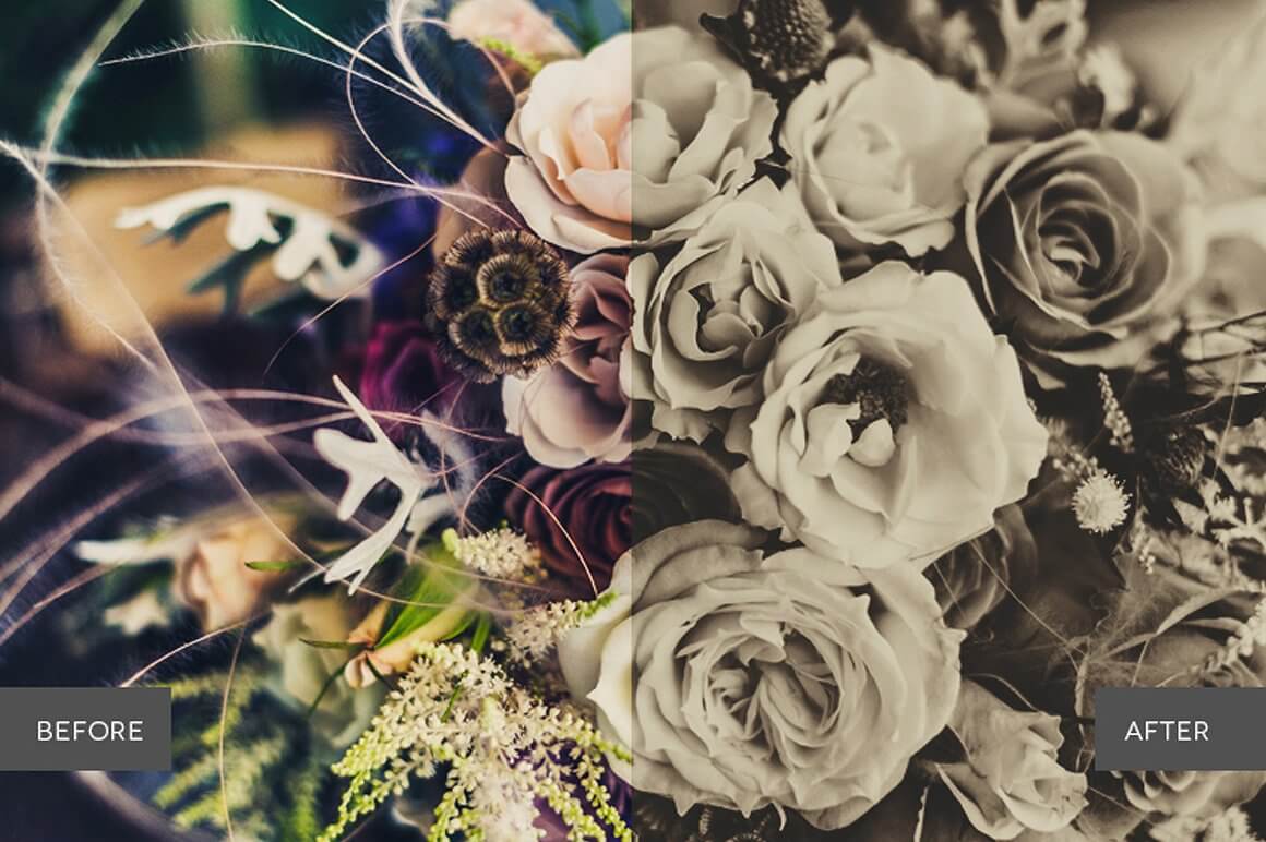
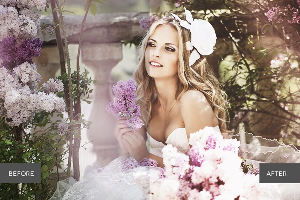
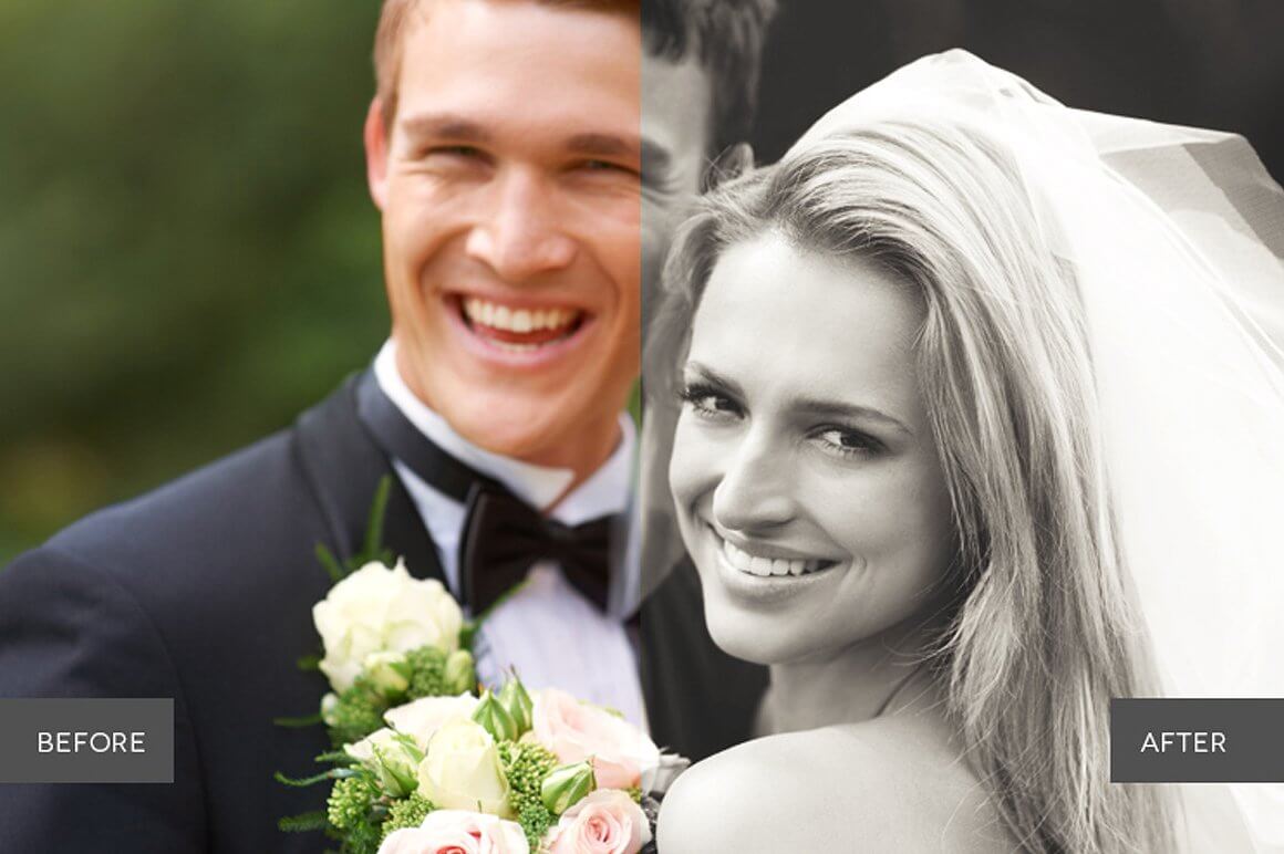
Lovely, memorable and stunning. Make beautiful wedding memories even more special by adding breathtaking effects, touch of light and contrast to every photo. Weddingful makes it easy to bring out the magic of anyone’s big day, for photos they’ll be proud to display for years.
WHAT'S INCLUDED
- 83 Photoshop Actions created and used by professionals
- 8 Basic Adjustment Actions
- 7 Retouch Actions
- 4 Foundation Actions
- 10 Color Tone Actions
- 25 Creative Effects Actions
- 12 Haze & Blur Actions
- 4 Lights Actions
- 13 Black & White Actions
FEATURES
- Stackable effects
- Non-Destructive
- Compatible with Adobe Photoshop CS4, CS5, CS6 and CC.
- Compatible with both Mac and PC
- Works on RAW and JPEG images
- Fully adjustable settings
- Each element in this collection has been carefully created and adjusted to produce professional and amazing results. We test all our products individually with hundreds of different photos.
- Compatible: Adobe® Photoshop CS4, CS5, CS6 & CC. OSX & Win.
- This product is available for download immediately after purchase.
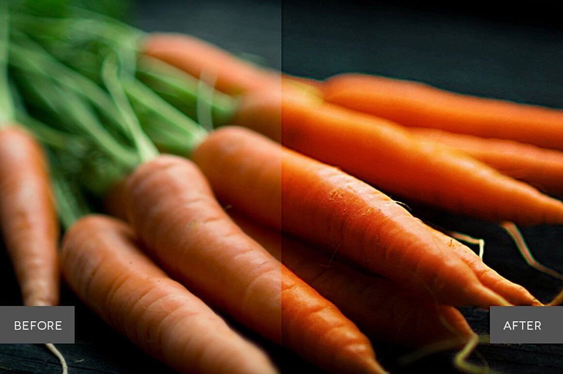
Foodie Pro Collection (Back to Top)
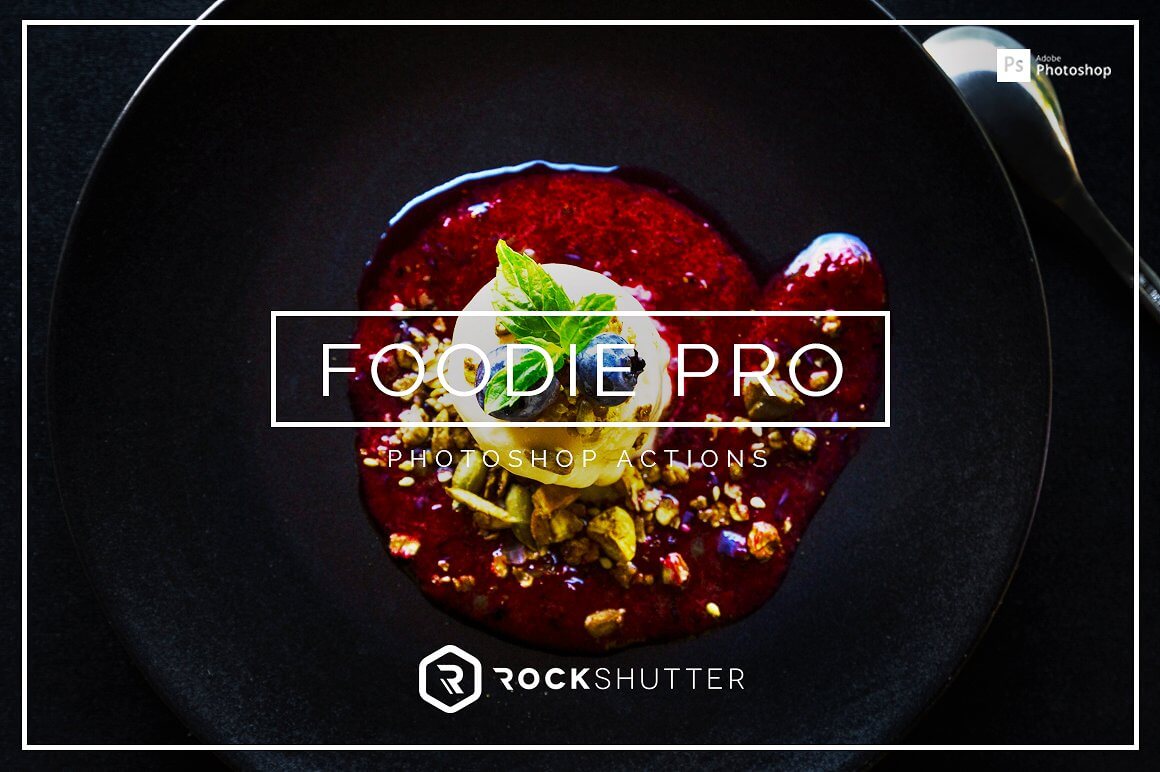
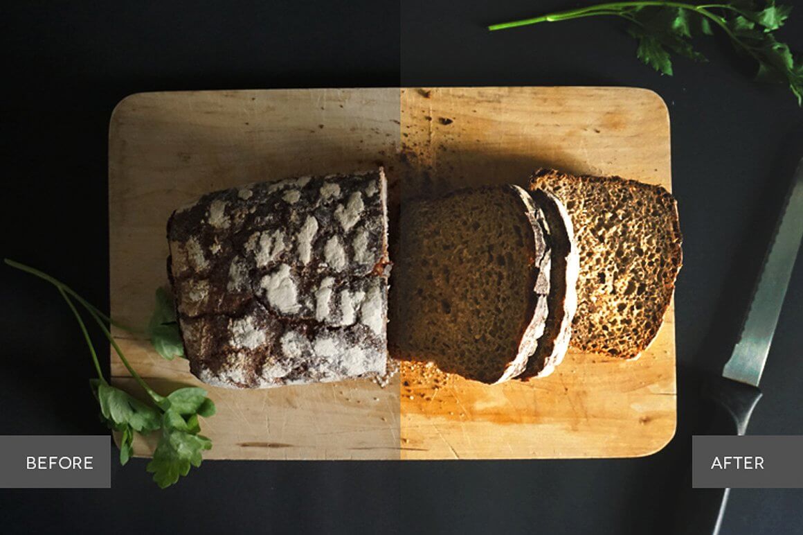
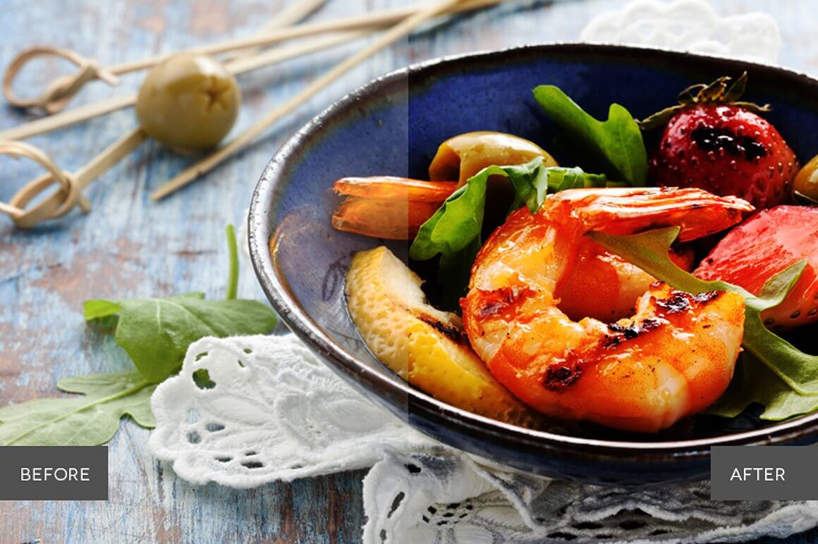
Sharp, tasty and vivid. You might get hungry when you’re editing your food photos with Foodie Pro. By using these actions, any dish can become something irresistible. Foodie Pro is perfect for food bloggers, professional or amateur photographers, creatives, or anyone looking for the best food shots for websites, magazines, etc.
WHAT'S INCLUDED
- 42 Photoshop Actions created and used by professionals
- 7 Basic Adjustment Actions
- 6 Retouch Actions
- 7 Color Tone Actions
- 10 Creative Effects Actions
- 7 Matte Actions
- 5 Black & White Actions
FEATURES
- Stackable effects
- Non-Destructive
- Compatible with Adobe Photoshop CS4, CS5, CS6 and CC.
- Compatible with both Mac and PC
- Works on RAW and JPEG images
- Fully adjustable settings
- Each element in this collection has been carefully created and adjusted to produce professional and amazing results. We test all our products individually with hundreds of different photos.
- Compatible: Adobe® Photoshop CS4, CS5, CS6 & CC. OSX & Win.
- This product is available for download immediately after purchase.
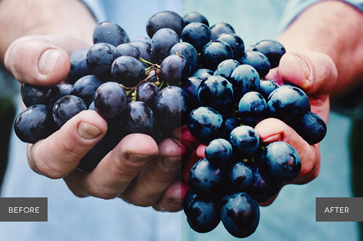
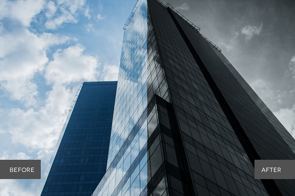
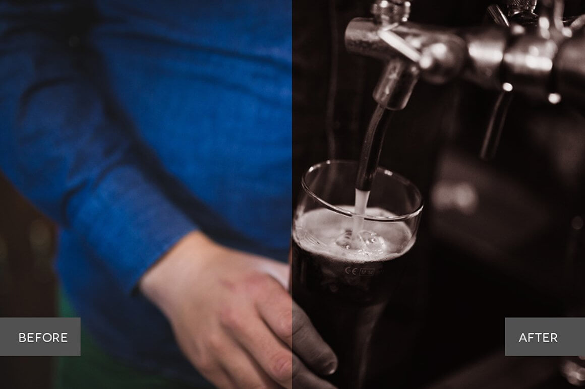
Silvercore B&W Photoshop Actions Collection (Back to Top)
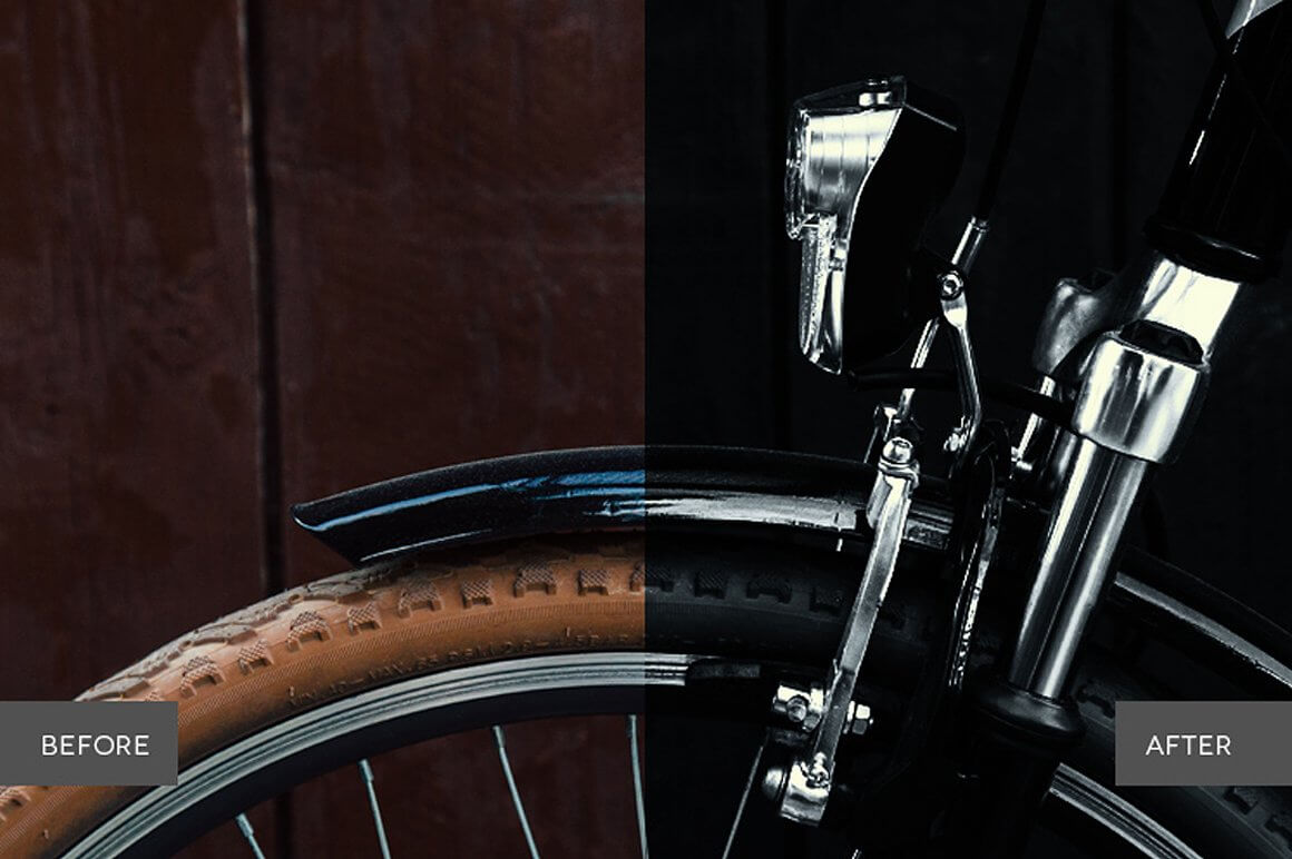
Stylish, misterious and dramatic. Add a touch of vintage mystery and style to your photos with stunning black and white effects. Silvercore is perfect for modeled portraits or city scenery - wherever you need to capture the essence of light and dark to evoke thought and emotion in a pure way.
WHAT'S INCLUDED
- 36 Premium Photoshop Actions created and used by professionals
- 9 Basic Adjustment Actions
- 2 Retouch Actions
- 20 Creative Effects Actions
- 5 Retro Actions
FEATURES
- Stackable actions
- Non-Destructive
- Compatible with Adobe Photoshop CS4, CS5, CS6 and CC.
- Compatible with both Mac and PC
- Works on RAW and JPEG images
- Fully adjustable settings
- Each element in this collection has been carefully created and adjusted to produce professional and amazing results. We test all our products individually with hundreds of different photos.
- Compatible: Adobe® Photoshop CS4, CS5, CS6 & CC. OSX & Win.
- This product is available for download immediately after purchase.


Lightroom Presets: Full Descriptions & Previews (Back to Top)
Below you will find previews and features of each individual collection of Lightroom Presets included in this pack!
Uber Grads Lightroom Collection

Creative, unique and mindblowing! Push the limits of photo editing in Lightroom with this professional collection of effects. Uber Grads features colorful and creative duotones with subtle and breathtaking gradients to create stunning images that will surely catch anyones attention.
WHAT'S INCLUDED
- 50 Premium Lightroom presets created and used by professionals
- 20 All in one effects Presets
- 3 Enhancement presets with 3 strengths
- 10 Duotone base Presets
- 10 Gradient Presets
FEATURES
- Stackable presets
- Non-Destructive, 1-click reset
- Compatible with Adobe Lightroom 4, 5, 6 and CC.
- Compatible with both Mac and PC
- Works on RAW and JPEG images
- Fully adjustable settings
- Each element in this collection has been carefully created and adjusted to produce professional and amazing results. We test all our products individually with hundreds of different photos.
- Compatible: Adobe® Lightroom 4, 5, 6 & CC. OSX & Win.
- This product is available for download immediately after purchase.




Silverlight B&W Lightroom Collection (Back to Top)
Glamorous and stunning. This workflow gives you the tools to edit any picture with stunning black and white effects. It contains different modules of Develop Presets as well as a set of Lightroom Brushes. With darkened moods and incredible, nostalgic lighting, Silverlight will provide a sense of Film Noir to your photos. Add a touch of subtle mystery to portraits and modeling shots, or capture the true grit of a city landscape and its everyday people. You’ll be taking a step back in time, and into a sharp, stunning and dark world with Silverlight.
WHAT'S INCLUDED
- 58 Premium Lightroom Presets created and used by professionals
- 10 Local Adjustment Preset Brushes
- 12 Basic Adjustment Presets
- 15 Creative Effects Presets
- 10 B&W Duotone Presets
- 7 Vintage Effects Presets
- 14 Enhance Presets
FEATURES
- Stackable presets
- Non-Destructive, 1-click reset
- Compatible with Adobe Lightroom 4, 5, 6 and CC.
- Compatible with both Mac and PC
- Works on RAW and JPEG images
- Fully adjustable settings
- Each element in this collection has been carefully created and adjusted to produce professional and amazing results. We test all our products individually with hundreds of different photos.
- Compatible: Adobe® Lightroom 4, 5, 6 & CC. OSX & Win.
- This product is available for download immediately after purchase.
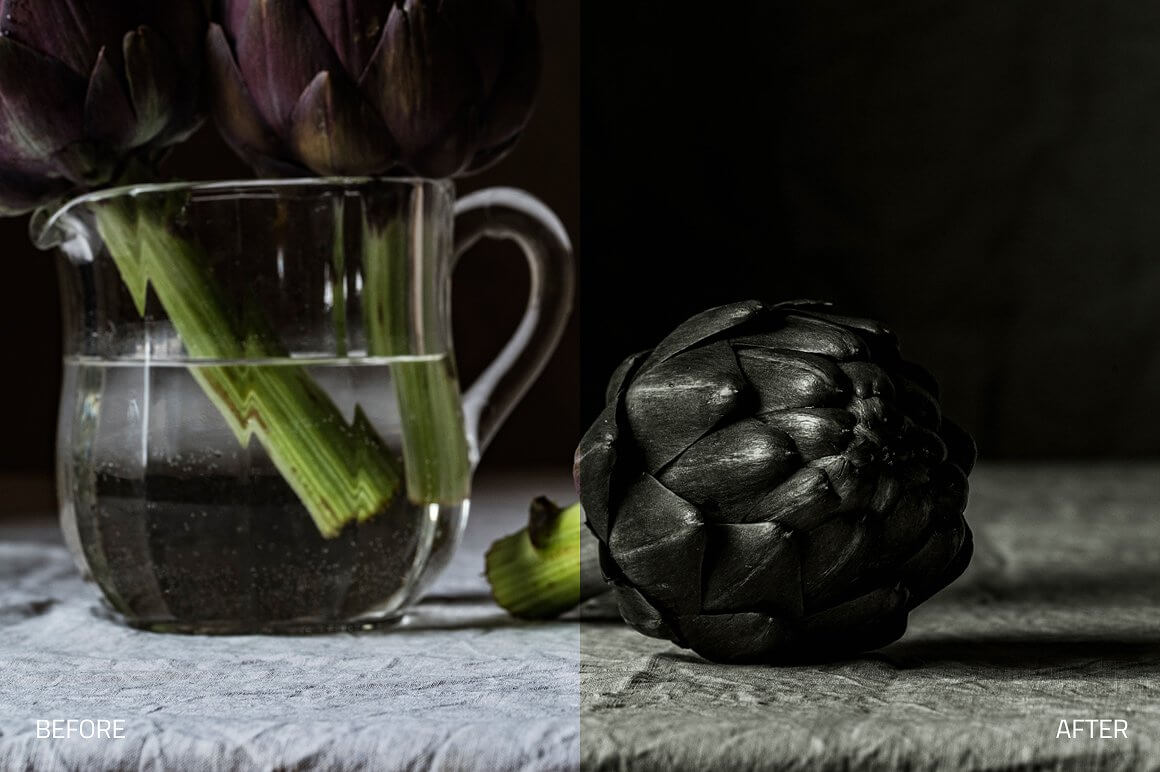
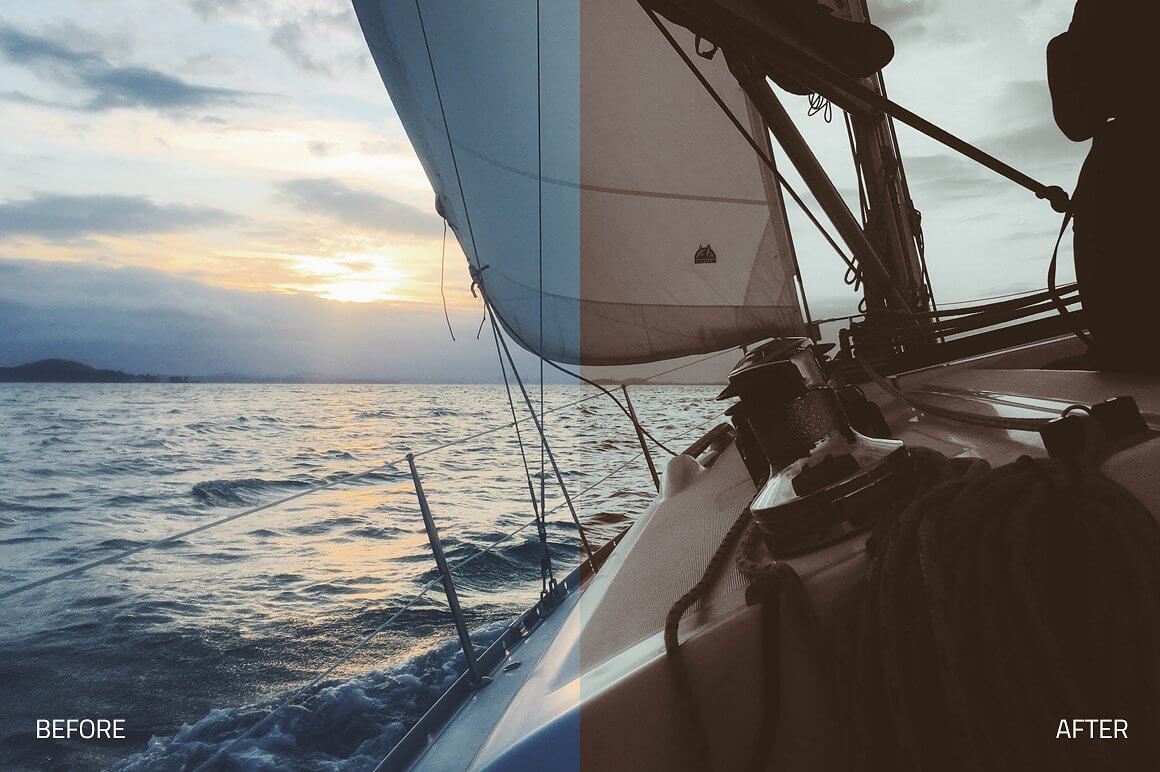
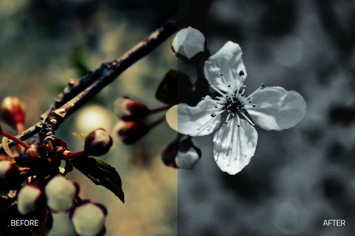
Zinepress Lightroom Collection (Back to Top)
Glamorous and stylish. This workflow gives you the tools to edit any fashion or editorial work. It contains different modules of Develop Presets as well as a set of Lightroom Brushes. With glamorous lighting and stylish effects, you can create professional photos that look like they were made for the top magazines. From portraits and modeling, to products and landscapes, the ability to adjust clarity, tone, and vibrance will give you a complete editorial look for any photo.
WHAT'S INCLUDED
- 65 Premium Lightroom Presets workflow created and used by professionals
- 24 Local Adjustment Preset Brushes
- 13 Basic Adjustment Presets
- 20 Retouch Presets
- 6 Foundation Presets
- 8 Lights Presets
- 14 Creative EffectsPresets
- 4 Stylized Black & White Presets
FEATURES
- Stackable presets
- Non-Destructive, 1-click reset
- Compatible with Adobe Lightroom 4, 5, 6 and CC.
- Compatible with both Mac and PC
- Works on RAW and JPEG images
- Fully adjustable settings
- Each element in this collection has been carefully created and adjusted to produce professional and amazing results. We test all our products individually with hundreds of different photos.
- Compatible: Adobe® Lightroom 4, 5, 6 & CC. OSX & Win.
- This product is available for download immediately after purchase.

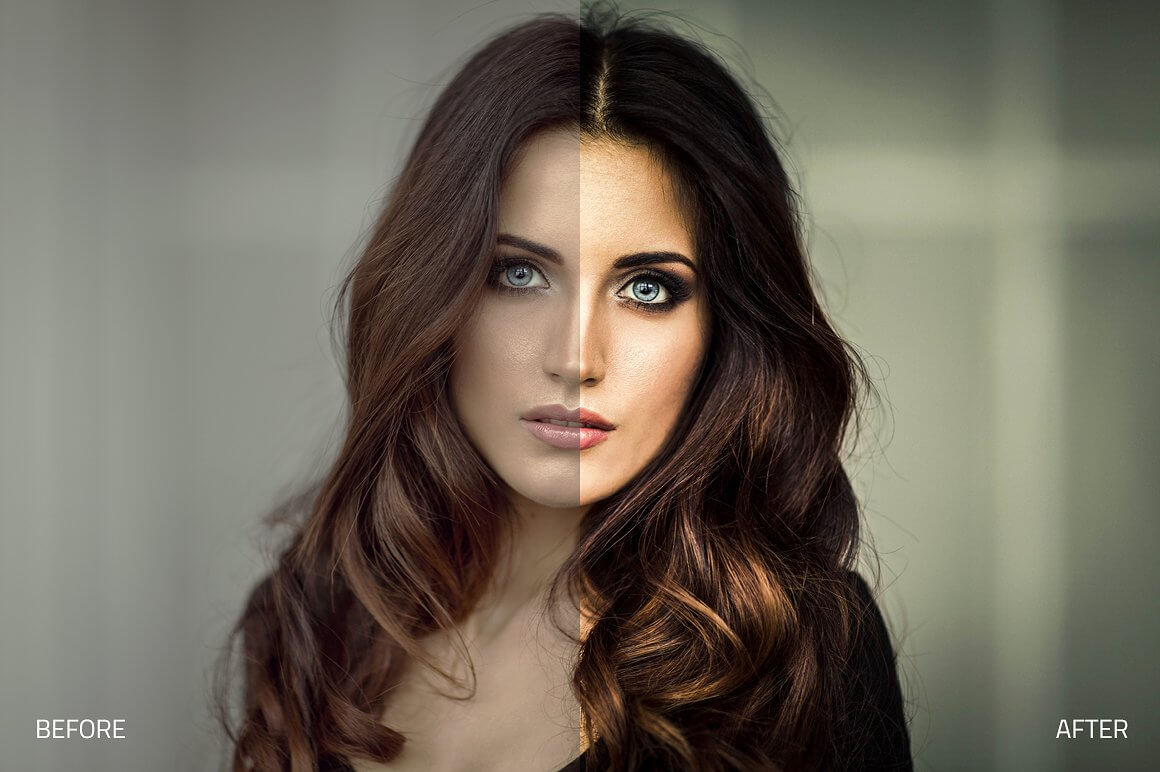
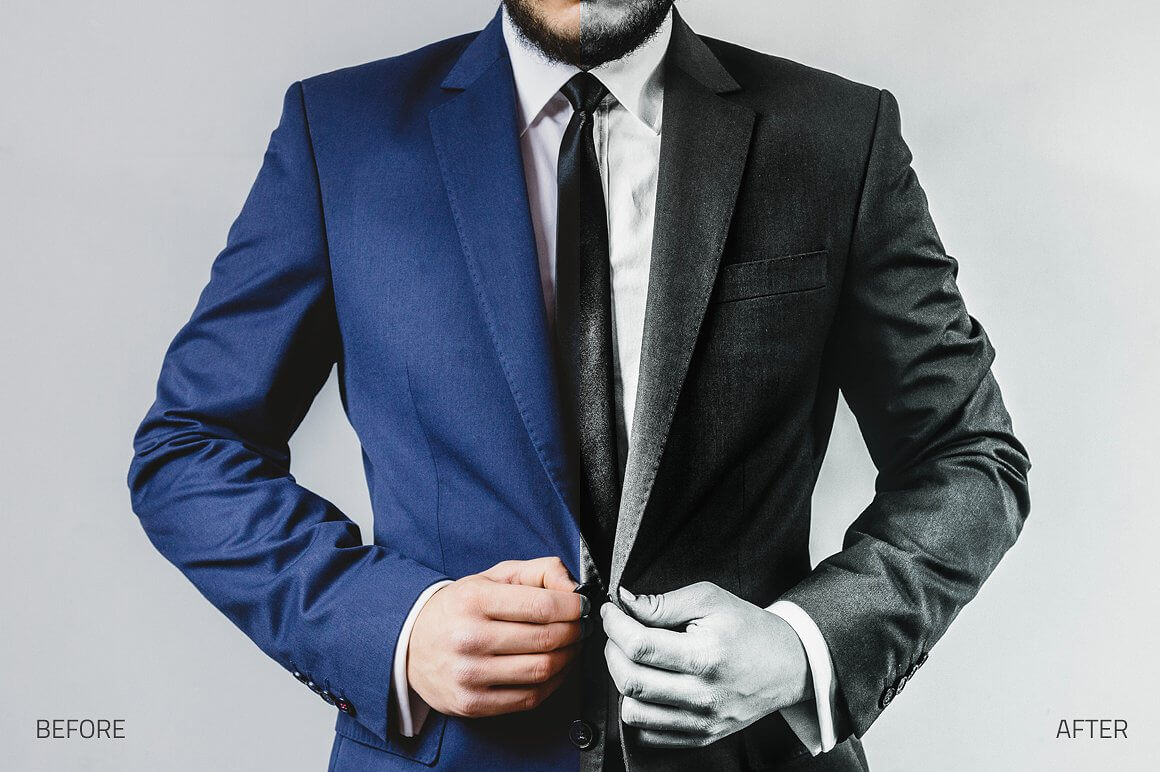

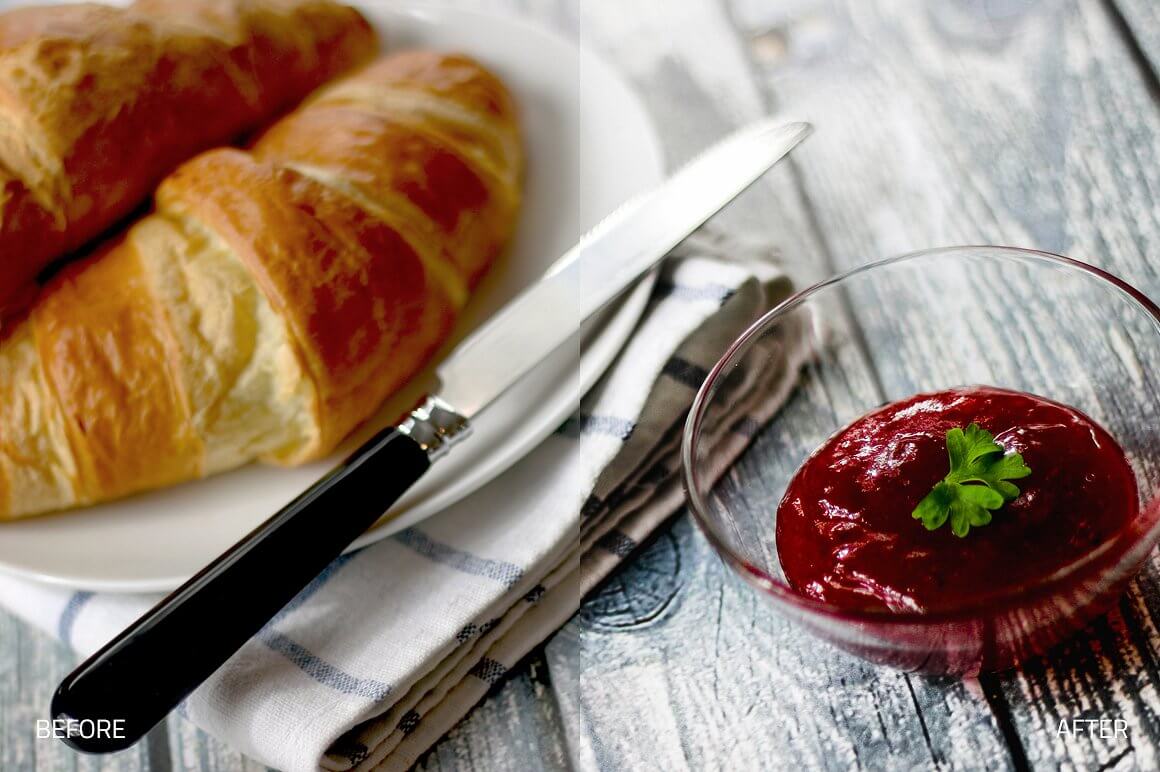
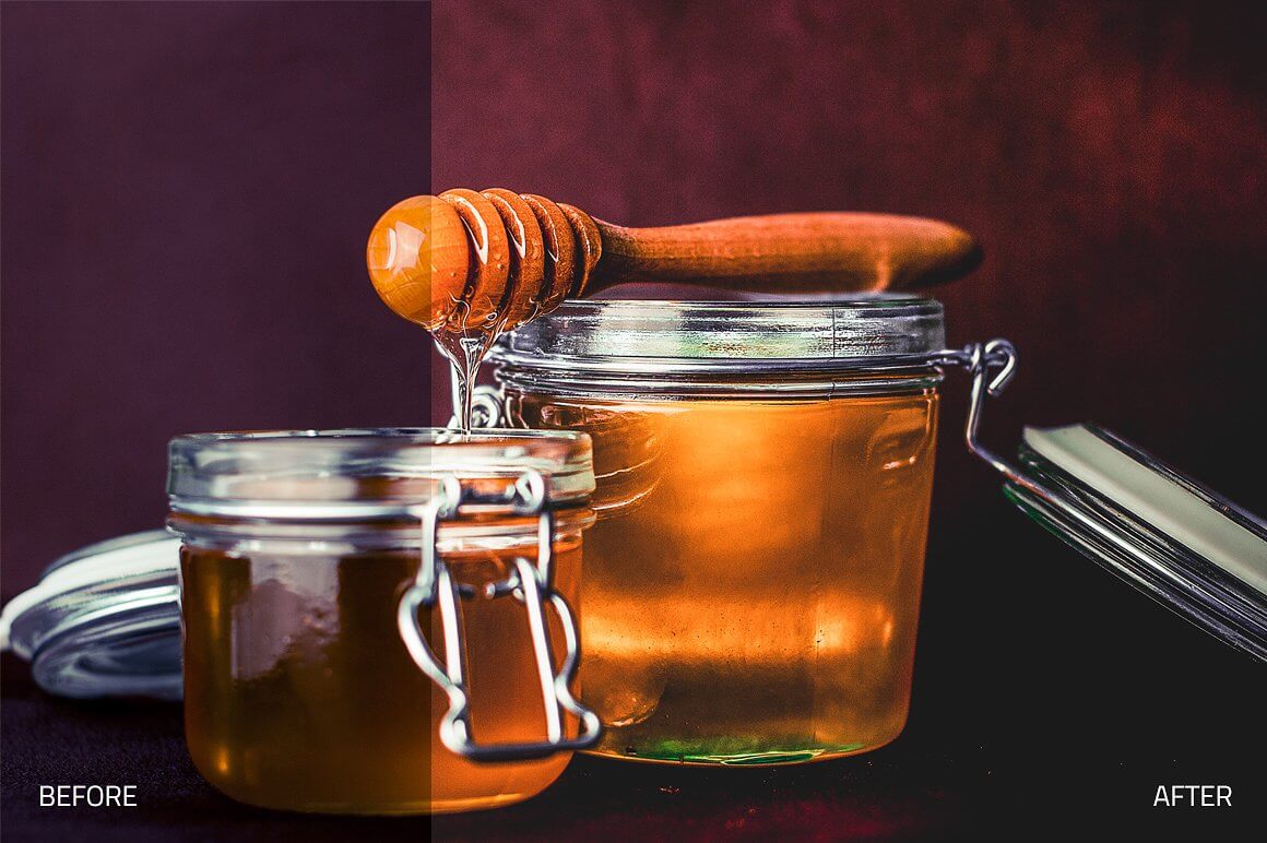
Bistrology Food Lightroom Collection (Back to Top)
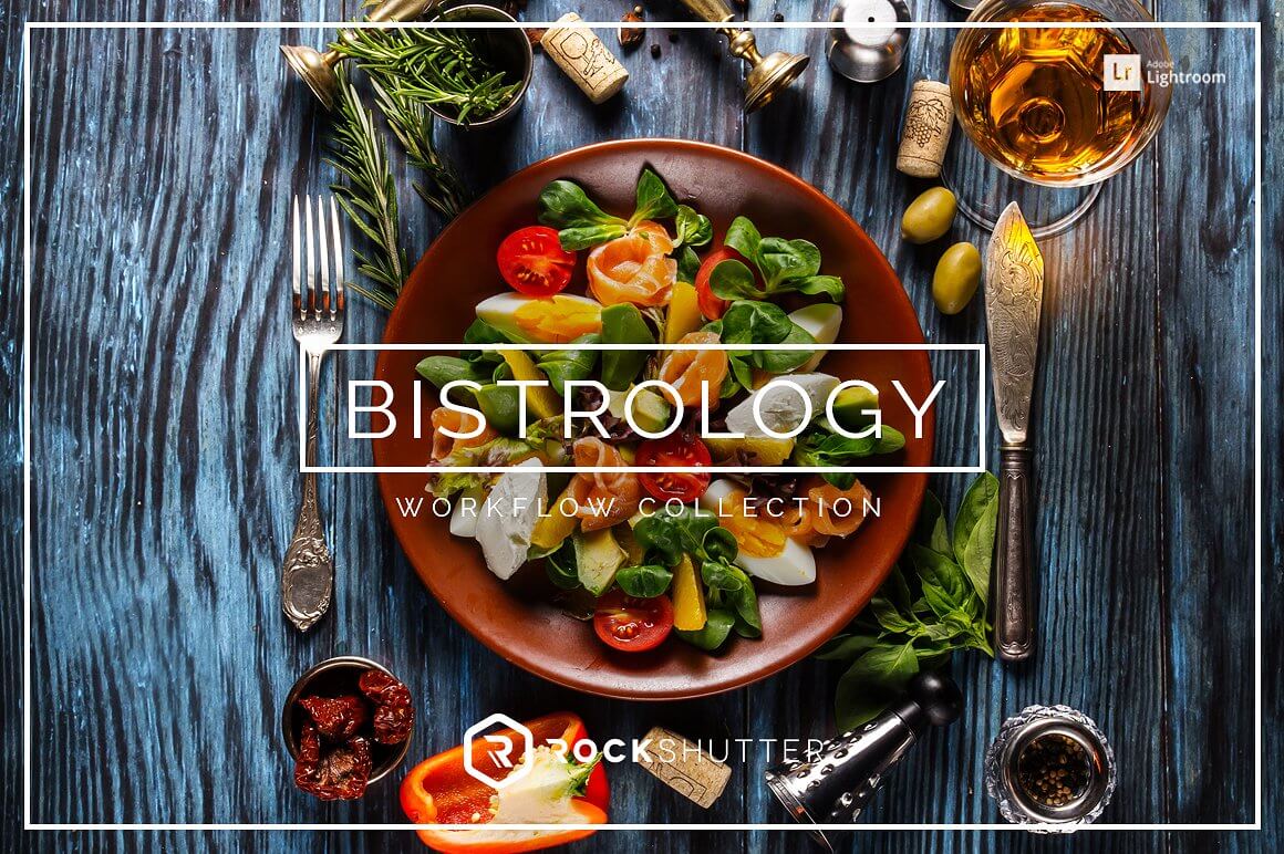
Sharp, tasty and colorful. This workflow gives you the tools to edit any food photography work. It contains different modules of Develop Presets as well as a set of Lightroom Brushes. Want to capture food that is truly mouthwatering? Bistrology is perfect for the food photographer, food blogger or the general photography enthusiast; adding color, brightness, vivid and delicious colors, soft matte, and vintage flair to any photo. Whether you have a food blog or are shooting for print publication, your snacks will definitely never look better.
WHAT'S INCLUDED
- 62 Premium Lightroom Presets created and used by professionals
- 13 Local Adjustment Preset Brushes
- 15 Basic Adjustment Presets
- 15 Retouch Presets
- 16 Creative Effects Presets
- 11 Soft Matte Presets
- 5 Stylized Black & White Presets
FEATURES
- Stackable presets
- Non-Destructive, 1-click reset
- Compatible with Adobe Lightroom 4, 5, 6 and CC.
- Compatible with both Mac and PC
- Works on RAW and JPEG images
- Fully adjustable settings
- Each element in this collection has been carefully created and adjusted to produce professional and amazing results. We test all our products individually with hundreds of different photos.
- Compatible: Adobe® Lightroom 4, 5, 6 & CC. OSX & Win.
- This product is available for download immediately after purchase.
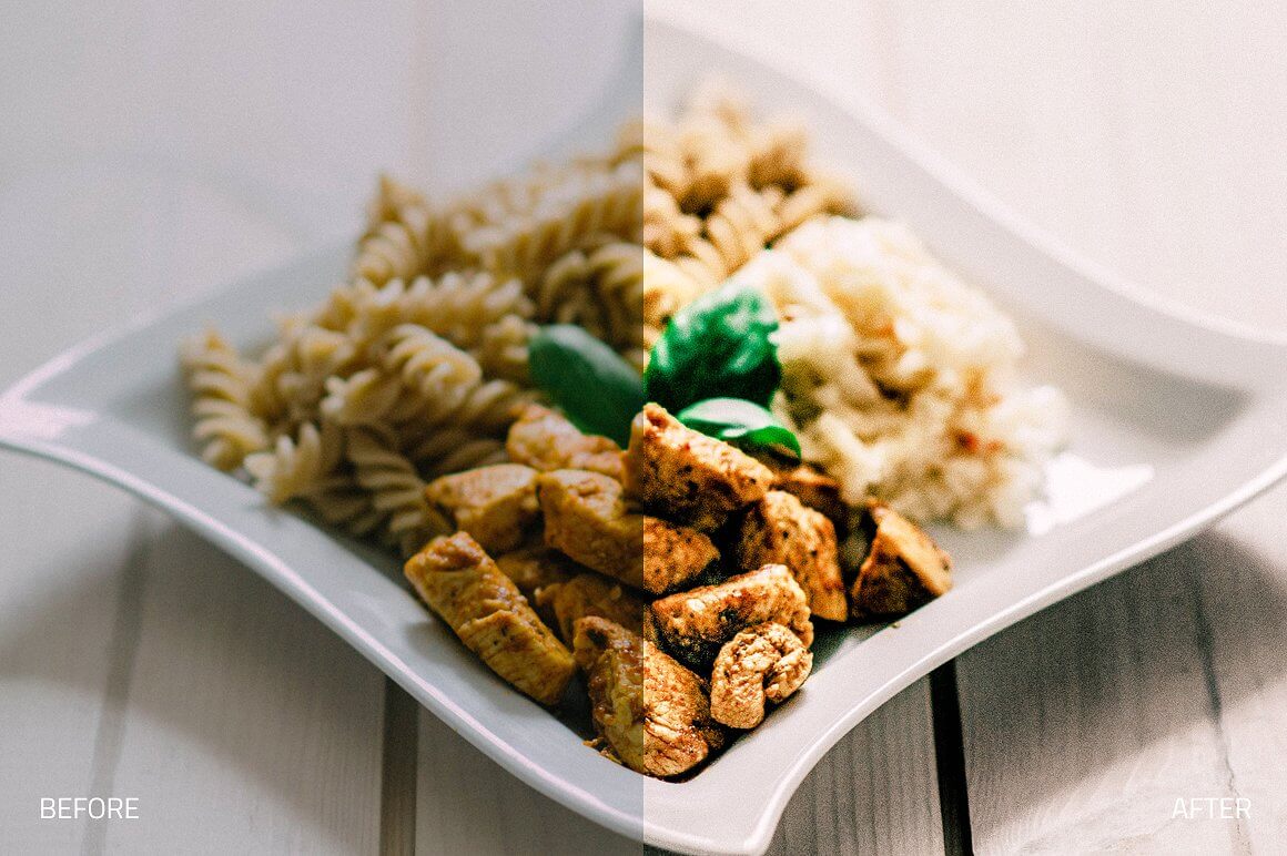

Pastel Dreams Lightroom Collection (Back to Top)
Soft, airy and dreamy. This workflow gives you the tools to edit any picture with pastel and matte effects. It contains different modules of Develop Presets as well as a set of Lightroom Brushes. Add a pop of color and brightness to any photo, or go for a ‘matte’ look that will add a finishing, soft touch to your scene. Pastel Dreams is great for portrait, fashion, editorial, and wedding photographers looking for something soft and colorful.
WHAT'S INCLUDED
- 92 Premium Lightroom Presets created and used by professionals
- 13 Local Adjustment Preset Brushes
- 13 Basic Adjustment Presets
- 15 Retouch Presets
- 15 Enhance Presets
- 12 Lights Presets
- 26 Creative Effects Presets
- 11 Stylized Black & White Presets
FEATURES
- Stackable presets
- Non-Destructive, 1-click reset
- Compatible with Adobe Lightroom 4, 5, 6 and CC.
- Compatible with both Mac and PC
- Works on RAW and JPEG images
- Fully adjustable settings
- Each element in this collection has been carefully created and adjusted to produce professional and amazing results. We test all our products individually with hundreds of different photos.
- Compatible: Adobe® Lightroom 4, 5, 6 & CC. OSX & Win.
- This product is available for download immediately after purchase.


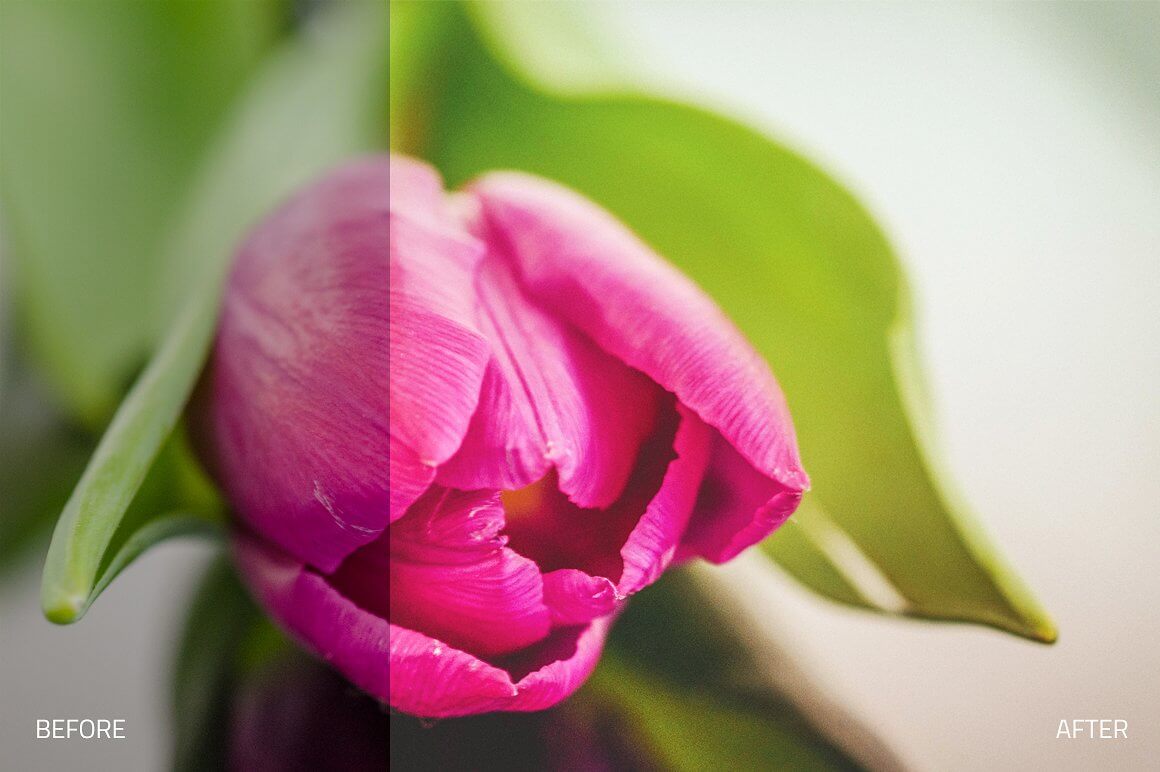
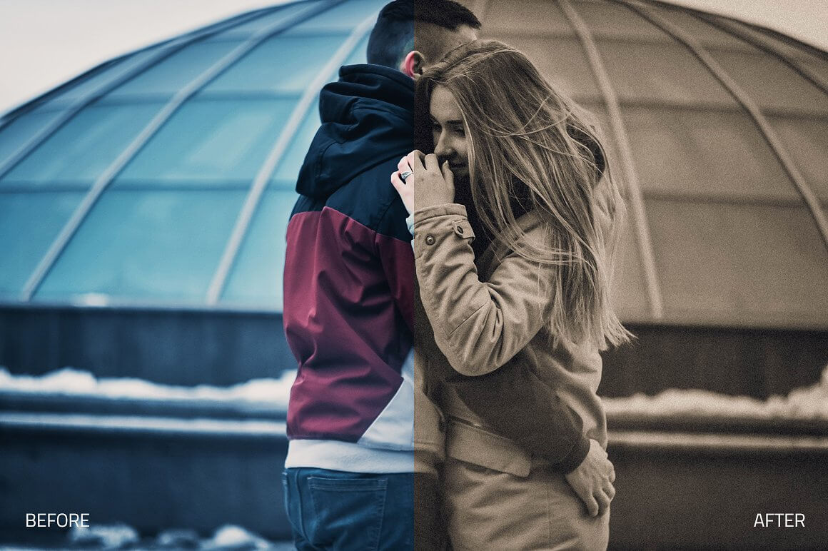
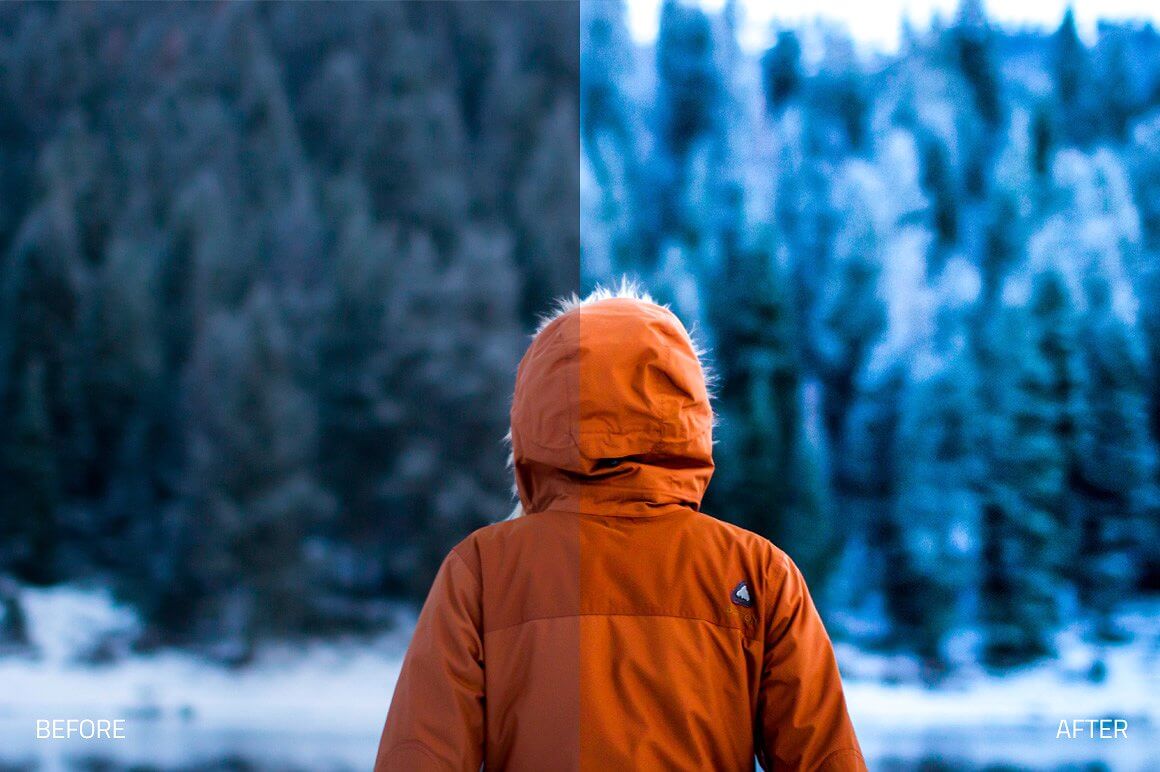
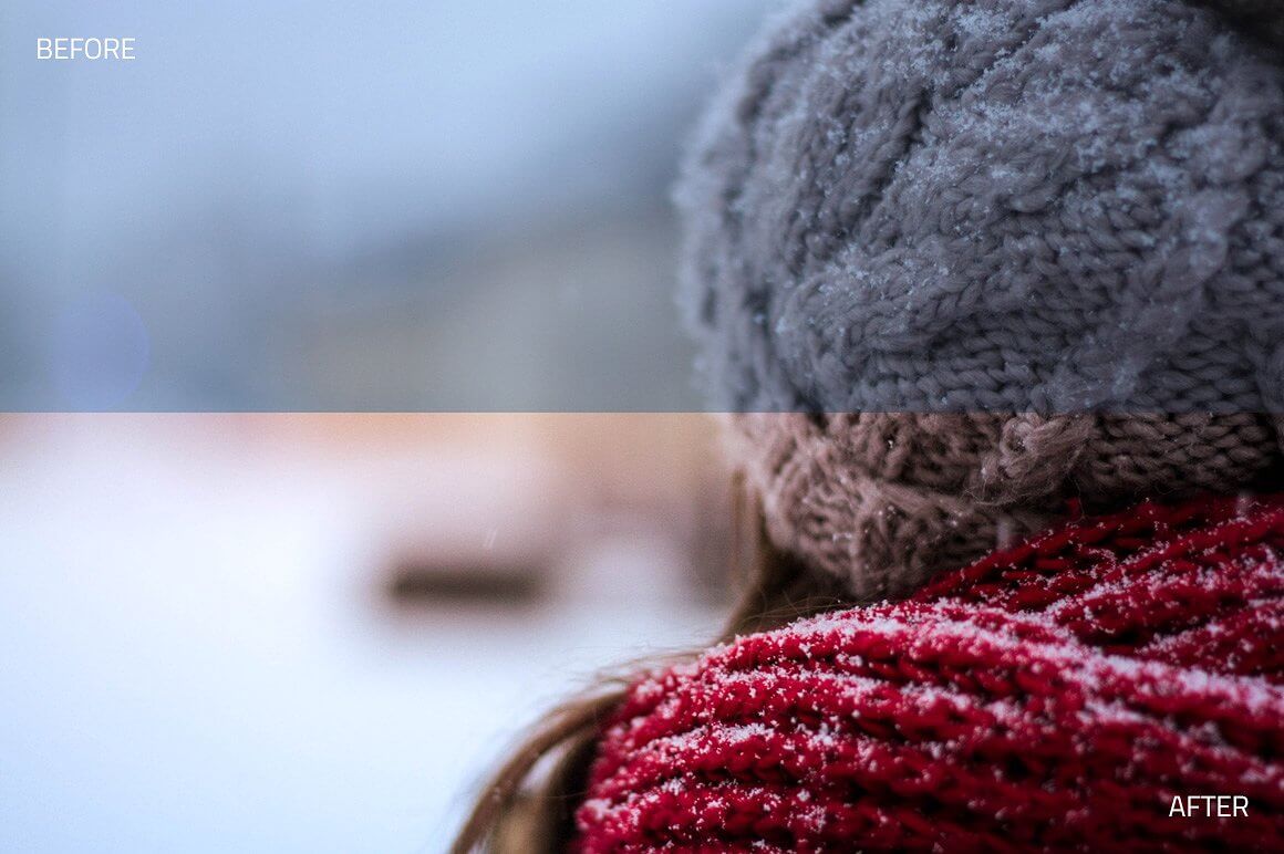
Wintertone Lightroom Collection (Back to Top)

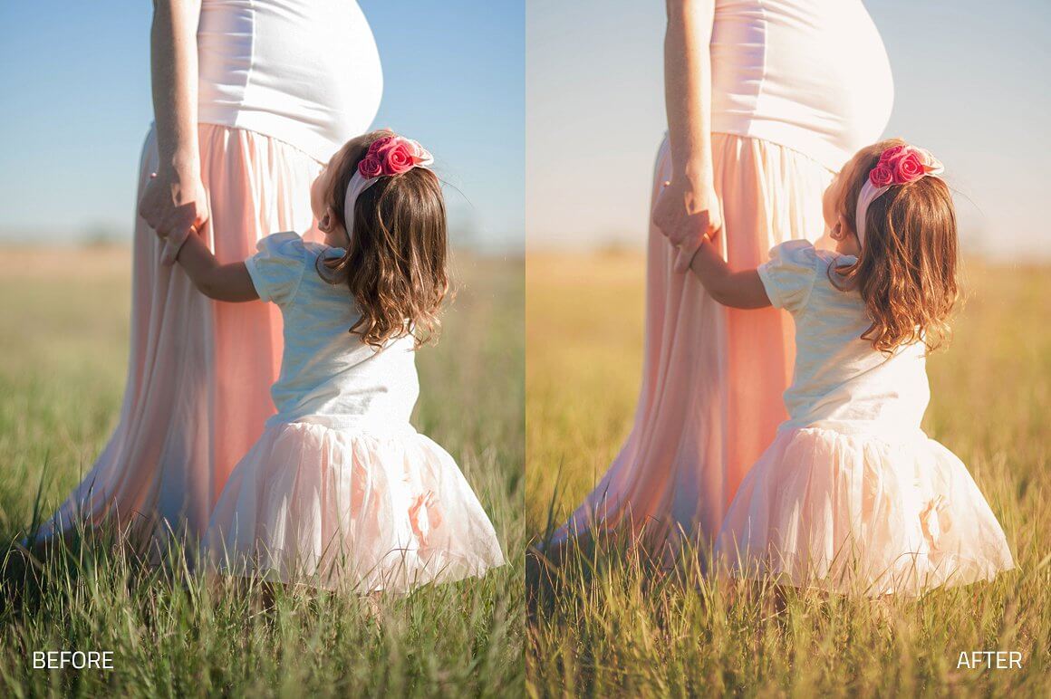
Cold, snowy and beautiful. This workflow gives you the tools to edit any winter and snow photography work. It contains different modules of Develop Presets as well as a set of Lightroom Brushes. Make any winter photo either glisten and sparkle, or show the more mysterious, dark side of the moment with these presets that are set to capture the true essence of the cold, snowy season.
WHAT'S INCLUDED
- 54 Premium Lightroom Presets workflow created and used by professionals
- 11 Local Adjustment Preset Brushes
- 11 Basic Adjustment Presets
- 7 Winter Foundation Presets
- 11 Creative Effects Presets
- 18 Enhance Presets
- 7 Lights & Glows Presets
FEATURES
- Stackable presets
- Non-Destructive, 1-click reset
- Compatible with Adobe Lightroom 4, 5, 6 and CC.
- Compatible with both Mac and PC
- Works on RAW and JPEG images
- Fully adjustable settings
- Each element in this collection has been carefully created and adjusted to produce professional and amazing results. We test all our products individually with hundreds of different photos.
- Compatible: Adobe® Lightroom 4, 5, 6 & CC. OSX & Win.
- This product is available for download immediately after purchase.



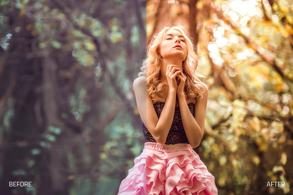
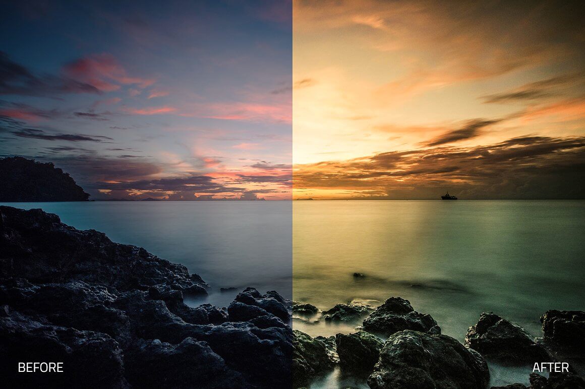
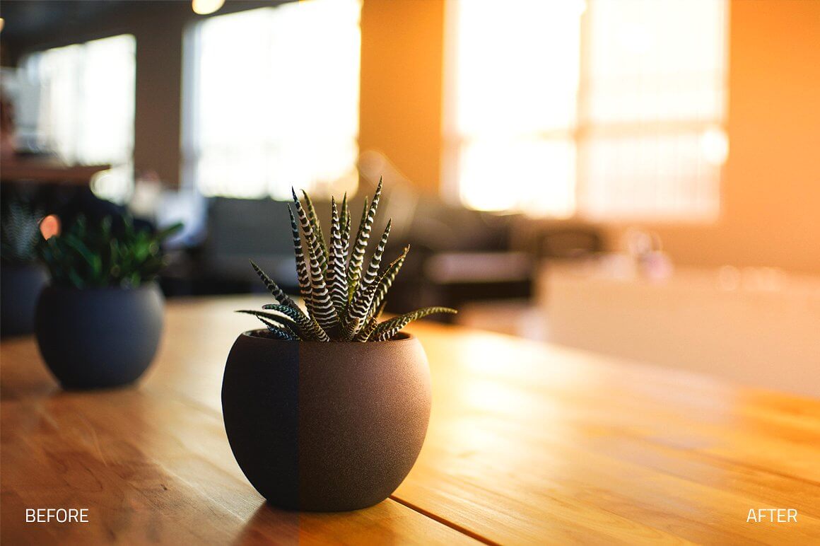
Radiance Lightroom Collection (Back to Top)
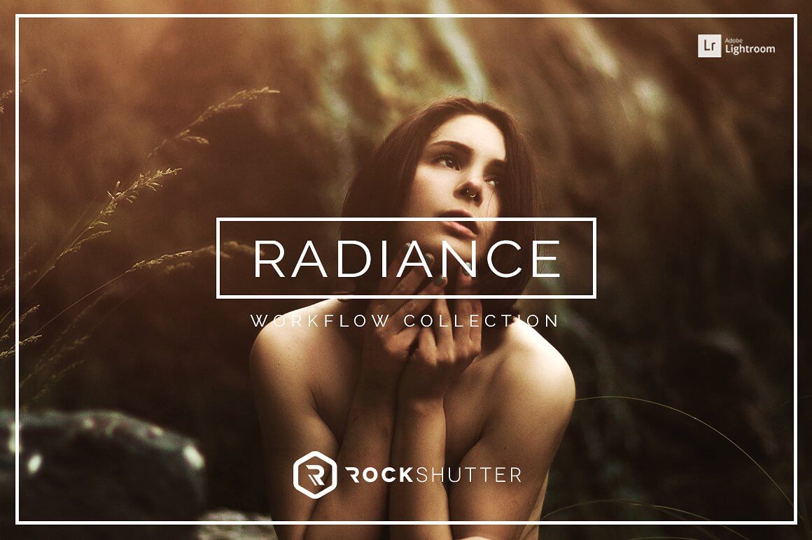
Sunlight, rays of light & warm tones. This workflow gives you the tools to edit any fashion, editorial, portrait or wedding photography work. It contains different modules of Develop Presets as well as a set of Lightroom Brushes. Bring your images to life with the power of lighting! From strong lighting to subtle, ambient, and warm tones, Radiance will truly allow you to change the entire mood of your picture with a few click. Radiance provides you with a vast collection of effects.
WHAT'S INCLUDED
- 73 Premium Lightroom Presets workflow created and used by professionals
- 11 Local Adjustment Preset Brushes
- 8 Basic Adjustment Presets
- 12 Retouch Presets
- 11 Creative Effects Presets
- 28 Sunlight Presets
- 6 Light Foundation Presets
- 8 Enhance Presets
FEATURES
- Stackable presets
- Non-Destructive, 1-click reset
- Compatible with Adobe Lightroom 4, 5, 6 and CC.
- Compatible with both Mac and PC
- Works on RAW and JPEG images
- Fully adjustable settings
- Each element in this collection has been carefully created and adjusted to produce professional and amazing results. We test all our products individually with hundreds of different photos.
- Compatible: Adobe® Lightroom 4, 5, 6 & CC. OSX & Win.
- This product is available for download immediately after purchase.


Ultra Landscapes Lightroom Collection (Back to Top)

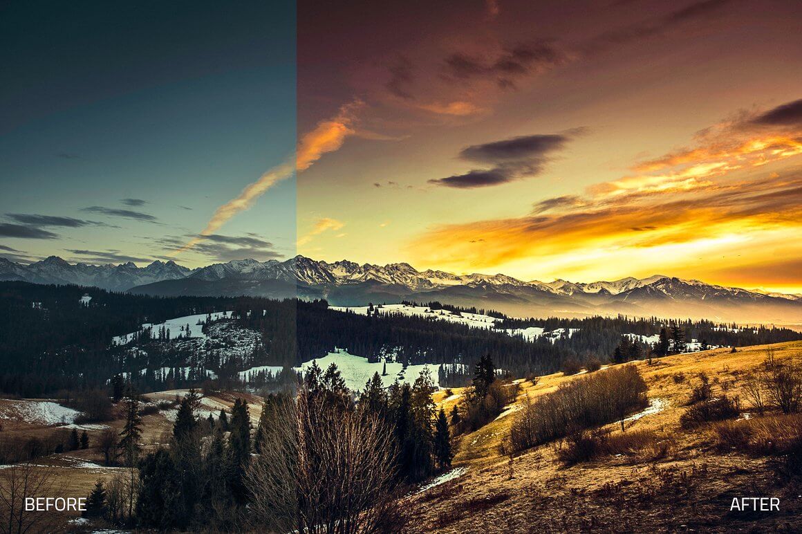
Sunlight & lights. This workflow gives you the tools to edit any landscape or travel photography work. It contains different modules of Develop Presets as well as a set of Lightroom Brushes. Capture the true beauty of the world and nature around you with softened lighting and tints. With a bundle of stylish brushes and creative presets, you can turn any landscape or travel photo into a true wonderland, to accentuate the mysterious, beautiful nature scenes that surround us every single day.
WHAT'S INCLUDED
- 70 Premium Lightroom Presets workflow created and used by professionals
- 28 Local Adjustment Preset Brushes
- 21 Basic Adjustment Presets
- 20 Retouch Presets
- 5 Lights Presets
- 6 Sky Tones Presets
- 15 Creative Effects Presets
- 3 Deep Black & White Presets
- 5 Stylized Black & White Presets
FEATURES
- Stackable presets
- Non-Destructive, 1-click reset
- Compatible with Adobe Lightroom 4, 5, 6 and CC.
- Compatible with both Mac and PC
- Works on RAW and JPEG images
- Fully adjustable settings
- Each element in this collection has been carefully created and adjusted to produce professional and amazing results. We test all our products individually with hundreds of different photos.
- Compatible: Adobe® Lightroom 4, 5, 6 & CC. OSX & Win.
- This product is available for download immediately after purchase.



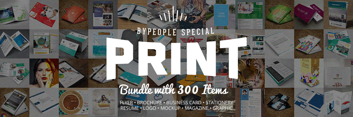
Suitable for All Your Printing Needs!
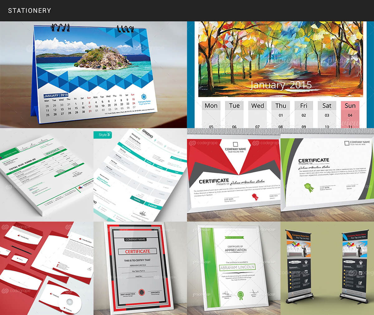
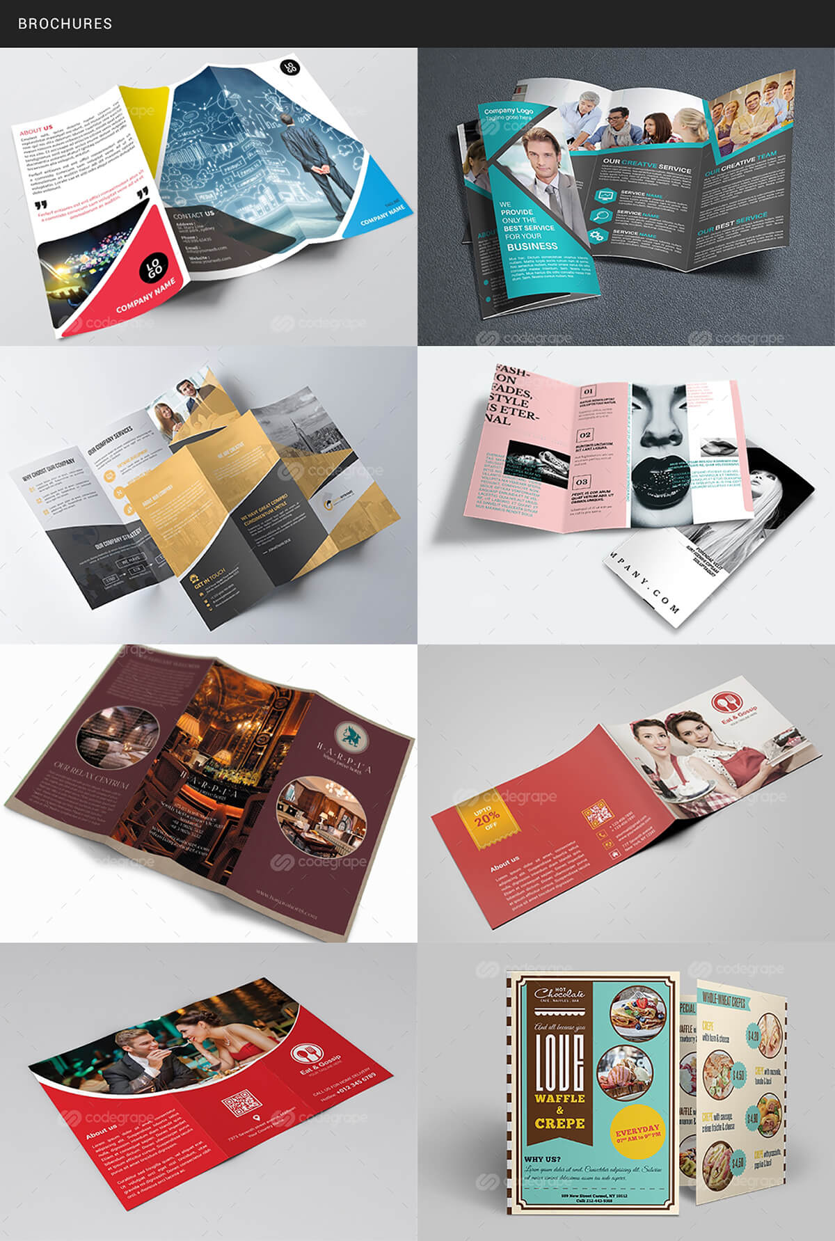
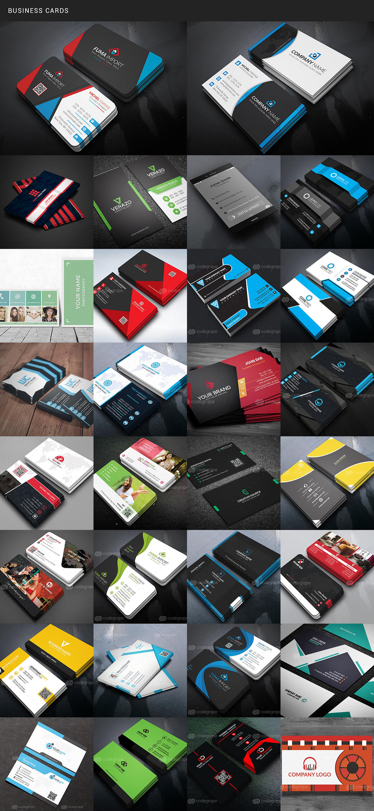
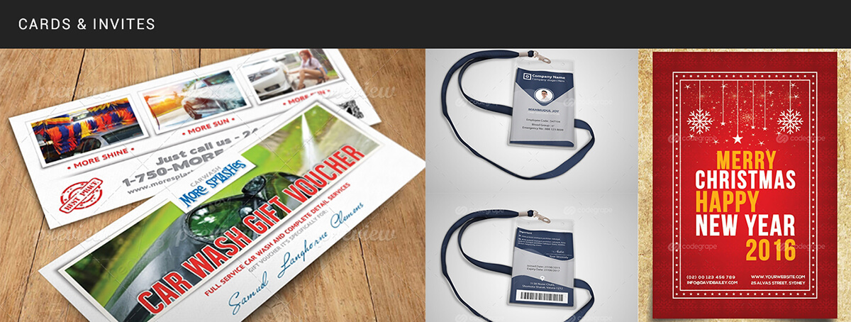
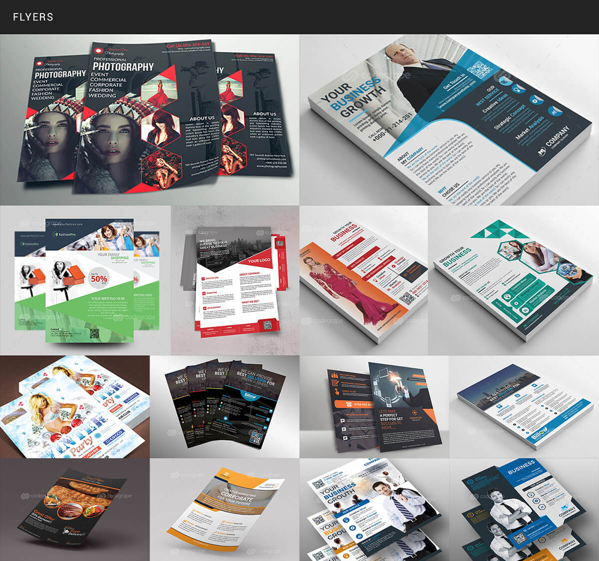
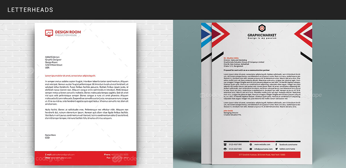
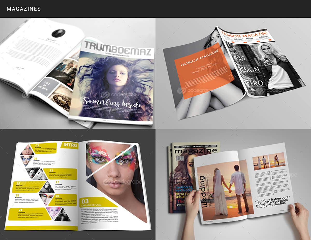
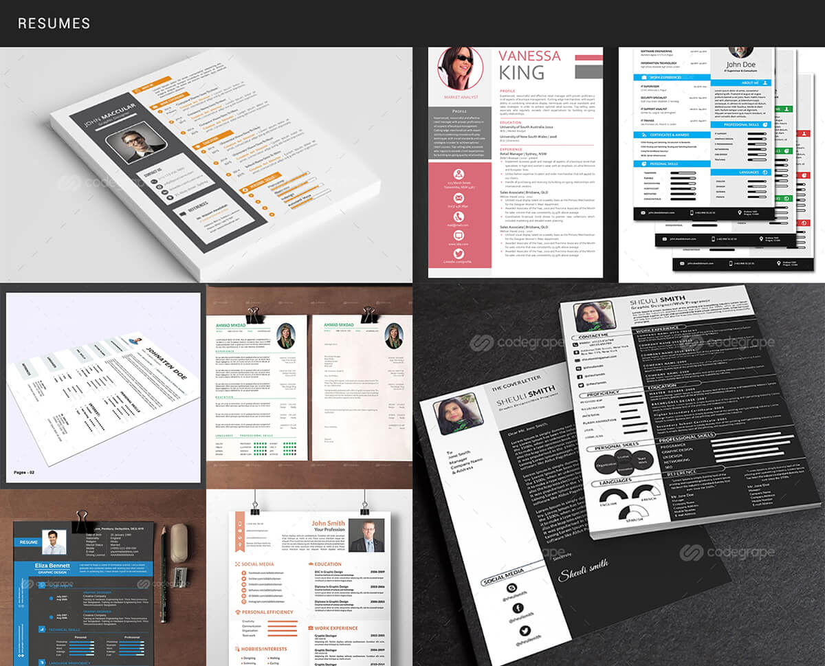
This bundle includes an awesome collection of templates including with 200+ Flyer Templates as well as Brochure, Business Cards, CV/Resumes, Cards & Invitation, Letterheads, Logos, Complete Magazine, and much more! Also includes Mockups for showcasing Websites, Responsive Designs, Photorealistic Street Signs, 3D Display Mockups, Stationery bundles with Branding Templates and Mockups, and 4 Collections of Assorted Design Assets including Ribbons, Icons, and Abstract Shapes. File Formats included in the bundle range from fully layered and editable INDD, PSD, Ai and EPS to PNG, and JPG previews for each item. Best part? You get these assets with extended license for commercial use!
Wanna Keep Reading? Check Out The Features List!
Features:
- 330+ Print Templates Total
- File Formats include INDD, PSD, Ai, and EPS
- Fully Editable Files
- Extended License for Commercial Use. You may not resell the original assets.
Template Categories Include:
- Multi-Purpose Flyer Templates (200+)
- Brochure Templates
- Business Card Templates
- Cards & Invites
- 4 Collections of Assorted Graphics Including Ribbons, Abstract Shapes, Spirals, Icons
- Letterheads Templates
- Logo Templates
- CV/Resume Templates
- Complete Magazine Template in A4 & US Letter Print Measurements
- Mockups for Showcasing Websites & Responsive Designs, Photorealistic Street Signs, and 3D Display Mockups
- Stationery, Including Identity Packs, Invoices, Branding Packs
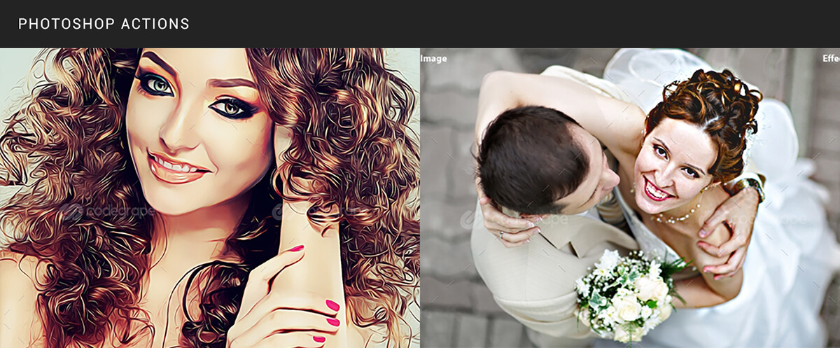
- Bonus Photoshop Actions
Check Out A Couple Of Previews (Back to Top)

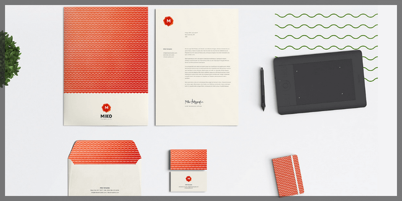
MIKO is a set of highly customizable logos, patterns, and stationery multiformat designs. This package contains 9 patterns, 5 stationery and 4 logo designs spread over different file format extensions. The pack includes Sketch, AI, PS, ID, PDF, PNG, and JPG file formats. Created by Raul Gaitan.
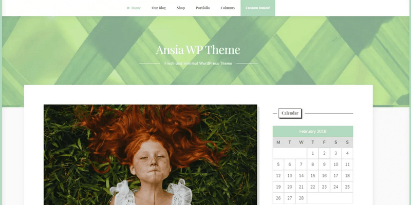
This is a minimal WordPress theme suited for blogging. Its structure allows you to have a classic sidebar and a push sidebar that can be activated through a special button. Compatible with WooCommerce to create your online store. 2 sidebars, footer widget, custom logo among others. Created by CrestaProject.

CSS SANS is the font built exclusively with CSS, the programming language for web designing and typesetting. The font itself is a Sans Serif typeface and only contains 26 uppercase letters.
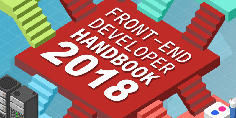
This is a guide for those who want to learn about web development. It outlines the practice of front-end engineering, how to approach it and what tools are used when practising it in 2018. It's also useful to gain insights into the practice of front-end development. This guide is written by Cody Lindley, a front-end/JavaScript developer and recovering Flash developer with over 20 years of experience in the field.
![]()
A Wild Icons Bundle
Wildly awesome promo: This exclusive bundle includes a Full Vector Animal Icons Collection with 7 different design styles like Flat and Material/Material Black. File formats for Adobe Illustrator as well as PSD, Icons Font, SVG, and PNGs in 5 sizes. All of these icons have been meticulously handcrafted with pixel-perfect smaller sizes created individually. More than 1300 icons for a limited time for only $19, a limited time promotion that will be ending soon!
So, what do you get?
- 1380 Animal-Themed Icons
- 7 Styles from Popular Design Trends to Iconshock's Own Styles
- File Formats Include PSD, Ai, SVG, Icon Font
- Vector, pixel perfect, multi sized design
- Extended license for unlimited commercial ussage
Styles included
Material (Back to top)
This flat animal icons set displays a wide arrange of animals: invertebrate molluscs, insects and worms; sealife like fish, sharks and whales; frogs, snakes, turtles and dinosaurs; eagle, parrot, chicken duck and all sorts of birds; mammals from the small mouse to the enormous elephant; and even imaginary ones like dragon and pegasus; a whole zoo of vector icons in ai, svg, and png formats.

Flat (Back to top)
This set displays a wide arrange of creatures: invertebrate molluscs, insects and worms; sealife like fish, sharks and whales; frogs, snakes, turtles and dinosaurs; eagle, parrot, chicken duck and all sorts of birds; mammals from the small mouse to the enormous elephant; and even imaginary ones like dragon and pegasus.

Material-Black (Back to top)
This set displays a wide arrange of creatures: invertebrate molluscs, insects and worms; sealife like fish, sharks and whales; frogs, snakes, turtles and dinosaurs; eagle, parrot, chicken duck and all sorts of birds; mammals from the small mouse to the enormous elephant; and even imaginary ones like dragon and pegasus.

iPhone (Back to top)
This iPhone set displays a wide arrange of animals: invertebrate molluscs, insects and worms; sealife like fish, sharks and whales; frogs, snakes, turtles and dinosaurs; eagle, parrot, chicken duck and all sorts of birds; mammals from the small mouse to the enormous elephant; and even imaginary ones like dragon and pegasus; a whole zoo of vector ai, svg, psd and png icons.

Stroke (Back to top)
This perspective stroke icons set displays a wide arrange of creatures: invertebrate molluscs, insects and worms; sealife like fish, sharks and whales; frogs, snakes, turtles and dinosaurs; eagle, parrot, chicken duck and all sorts of birds; and mammals from the small mouse to the enormous elephant; all as ai vector icons and transparent png's.

Brilliant (Back to top)
This glossy icons set displays a wide arrange of creatures: invertebrate molluscs, insects and worms; sealife like fish, sharks and whales; frogs, snakes, turtles and dinosaurs; eagle, parrot, chicken, duck and all sorts of birds; mammals from the small mouse to the enormous elephant; and even imaginary ones like dragon and pegasus. Every creature as a vector icons in svg and png formats.

Sunny-Day (Back to top)
This cartoon or videogame icons set displays a wide arrange of farm animals, jungle animals and pet icons: from invertebrate molluscs, insects and worms; sealife like fish, sharks and whales; frogs, snakes, turtles and dinosaurs; eagle, parrot, chicken duck and all sorts of birds; mammals from the small mouse to the enormous elephant; and even several dog breeds. All these psd icons have 8 png sizes.

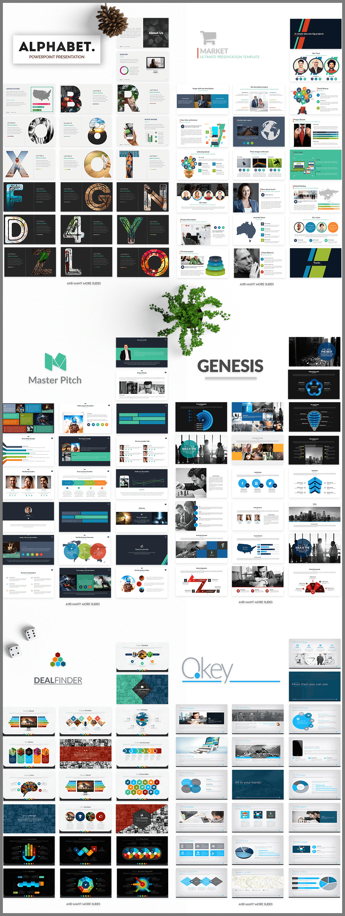
A Comprehensive Presentations Bundle:
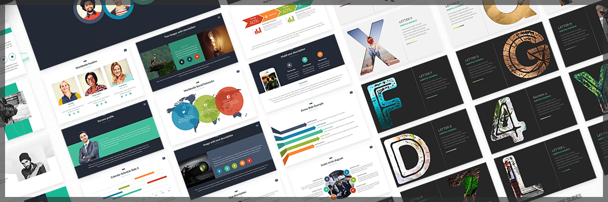
A bundle packed with best selling Powerpoint & Keynote presentations containing 86 templates with well over 15,000 slides in high definition, featuring 160 Color Themes, Print Versions (A4 & Letter), Animated and Non-Animated versions, fully editable verctor shapes, over 500 icon fonts, 16:9 Aspect ratio, smart objects, drag & drop image placeholders, and a stunning amount of slides for Presentation Intros, Maps, Infographics, Tables, Calendars, Charts in dozens of modern styles, team sections, and much more! Get a bundle with $1,290 worth of valuable premium presentation assets with a %99 discount, only $19!
These Templates Feature:
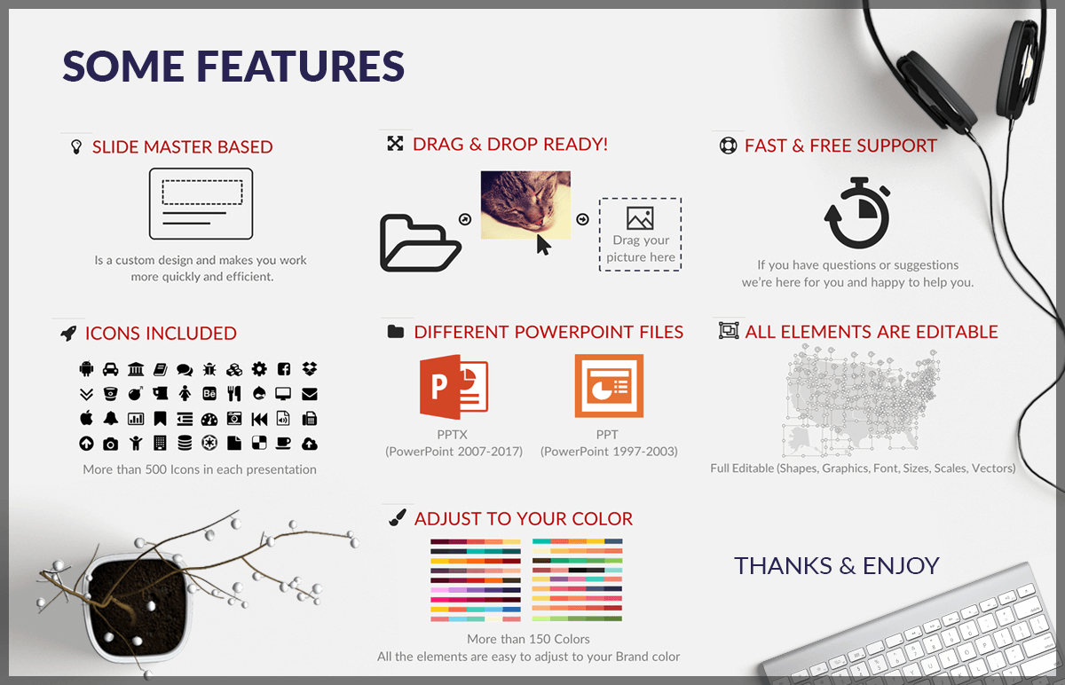
- Windows and Mac formats
- 86 Presentation Templates
- Over 6000 Keynote Slides
- Over 9000 Powerpoint Slides
- Thousands of Unique Slides
- PPT, PPTX, and Keynote.
- Print Versions included (A4 and Letter)
- More than 160 theme colors for all Powerpoint
- Animated and not animates templates
- 1900x1080
- Master Slide Based
- One click Color Changer
- Automatic Fit Images to Shape
- Drag & Drop Image Placeholders
- 500 free font icons (slides included; not need to contact us)
- All graphics are resizable
- Full Editable (Shapes, Graphics, Colors, Font, Sizes, Scales, Vectors, Icons)
- 16:9 HD Widescreen
- Icon Font used (Better Than Vector Images)
- No need for Photoshop
- You save $1,271
Slide Categories Include:
- Introductory Slides
- Text Slides
- Content Slides
- Calendars
- Tables
- Infographics
- Maps
- Modern Charts, dozens of styles.
- Unique Smart Objects
- Device Slides
- Team Sections
Still Not Convinced? Check The Previews Below! (Back to Top)


![]()
A really nice icon set made by Nasir Uddin. It consists of a 100 beautiful designed outline flat icons free for use on any kind of project.
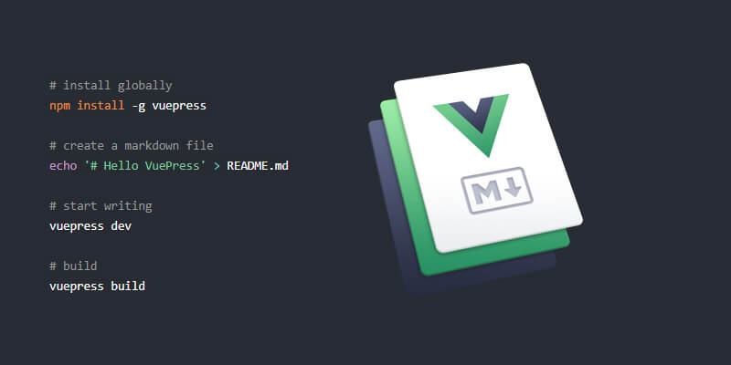
VuePress is a simple, SEO friendly static site generator and default theme optimized for writing technical documentation. Each page made with VuePress has its own pre-rendered static HTML to provide fast loading times and performance. VuePress works as a Single Page Application (SPA), powered by Vue, Vue Router, and Webpack, even allowing to use Vue DevTools to debug your custom theme.
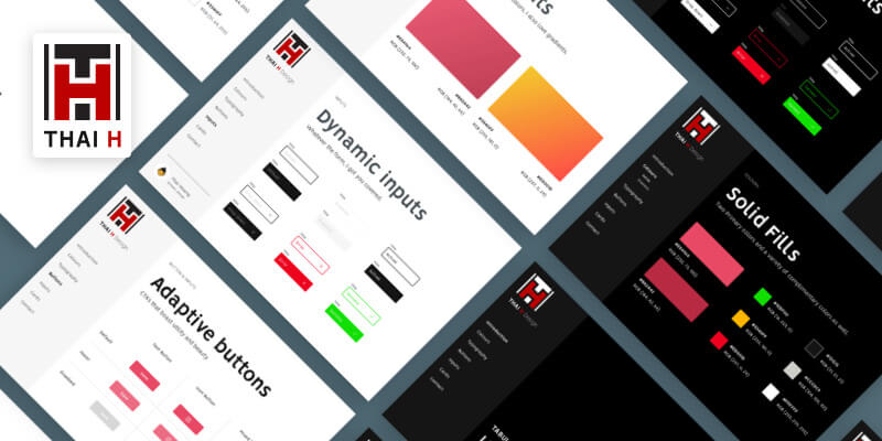
This is a style guide made in Sketch with a clean concept. It has over 50 customizable elements on a simple and organized library. All the elements are completely customizable and thus resizable. Came in light and dark versions and overall this UI Kit is thought to boost your workflow. Designed by Thai Hoang.
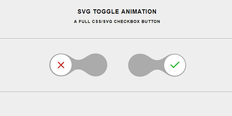
This is a neat and fluid toggle animation on a checkbox. The animation path is controlled by JavaScript styled in CSS with the use of HTML to use several SVG lines. Created by Codepen user Timothee Guignard.
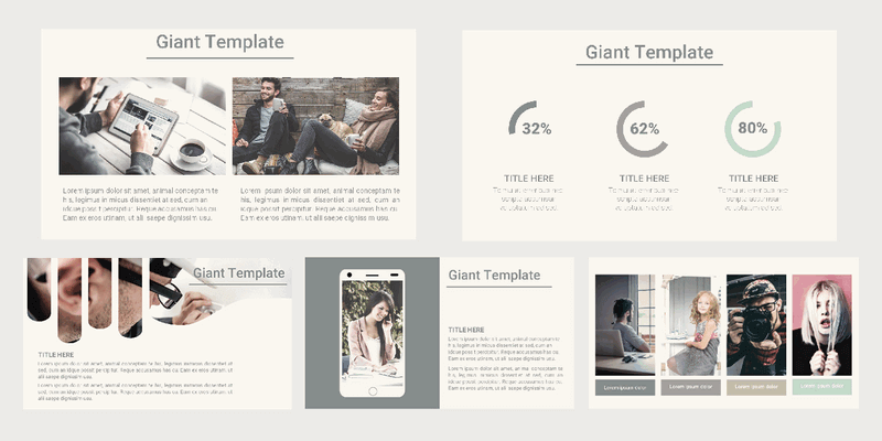
Vita is a free business Powerpoint template, presenting 30 slide layouts and a modern design, perfect for professional presentations. This template is easy to edit and can be used for personal and commercial projects.
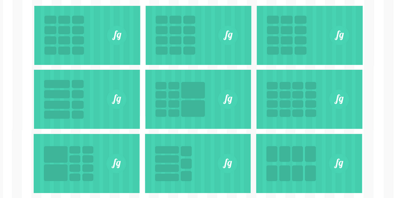
Flexible Grid works very similar to the standard float grid but includes different features only possible with flex, like horizontal and vertical alignment, auto-sizing, and easier source ordering. Created by Kenan Gundogan.
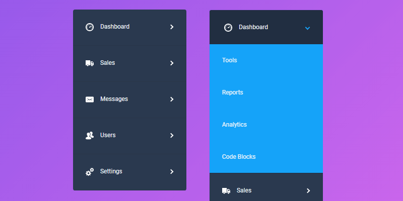
This snippet is a pure CSS drop-down menu designed by landing a classy approach. It's a nice addition to any user interface without the implementation of JavaScript. Uses the menu labels to toggle the menu sections with animations made with linear transitions. Created by Codepen user
Jamie Coulter.
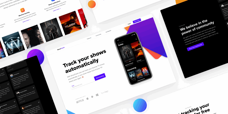
Easy to use, editable landing page template created in Sketch. It contains designs for desktop in HD and iPhone X. The designs are inline with the latest design trends while focusing on hitting the business goal. Made by Daniel Korpai.
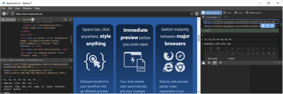
Live, Real-Time CSS Editing with Stylizer 7
Supercharge your workflow with Stylizer, the greatest CSS editor you will ever own that will cut the time you invest styling websites like a knife through butter. Sporting a unique grid-like CSS editing interface that feeds your style sheet to an integrated browser of your choice and allows you to drag page elements around and adjust all your styling needs from the comfort of your editor, all in real-time. Stylizer is packaged with a range of handy tools that just don't exist elsewhere. It automates things like Image Replacement, CSS positioning, clear fixes, CSS hacks (if you need them) and much more.
Instead of loading CSS files directly, Stylizer asks for the URL of the page you want to change. Then when all is said and done, the CSS is saved right back to where it came from via FTP, SFTP, or a network share. You can start writing better, cleaner CSS in half the time with this innovative editor that lets you target elements on the rendered page, see the most minuscule of changes immediately displayed as they would look on all major browsers in real-time with up to 3 side-by-side browser panes, an HTML DOM explorer, with support for cross-platform comparison to pinpoint issues with the interpretation of CSS on different browsers. Say goodbye to constantly having to hit refresh with every change, and say hello to instant gratification. Stylizer features a clutter-free interface and a whole host of unexpectedly powerful tools.
Why Stylizer:
- Lifetime version 7.x updates
- Available for Windows & Mac.
- Multiple side-by-side preview panes — view up to 3 browser panes at the same time.
- Your style sheets, as the browser sees them.
- Real-time DOM explorer for HTML and CSS, painstakingly refined for superior productivity.
- An in-code toolbar so powerful that even keyboard loving CSS experts use it.
- Integrated preview pane with major browser engines — Firefox, Chrome, Safari and Internet Explorer.
- The Bullseye function lets you click on an element on your web page and effortlessly make real-time changes to the CSS that targets it.
- Size Grips allow you to accurately resize any CSS dimension by clicking and dragging the mouse. Page updates in real time!
- Stylizer knows all the latest CSS 3 standards, and provides a real-time Warnings list that updates without delay, as you type.
- Unintrusive auto-complete.
- Remote Control to make repetitive tasks a one-click operation.
- Integrated FTP client to save your changes.
- Online CSS editing — Just open the URL or HTML page you want to edit and the linked style sheets automatically open for editing.
- Full keyboard control — whether you like GUIs or you’re a hardcore hotkey aficionado, Stylizer has you covered.
- Efficient, real-time color adjustments and measurements.
- Many integrated visual tools like a Ruler, Magnification Lens, and more.
Say goodbye to the reload button! In Stylizer, your changes are immediately displayed in all browsers, in real-time—literally as you type or move the mouse. This is a substantial productivity boost for designers of all skill levels.
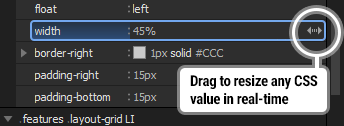
Size faster with Grips: Size Grips allow you to accurately resize any CSS dimension by clicking and dragging the mouse. Click, hold, and drag—watch your page update in real-time and achieve perfection on your first try. Take the guesswork out of sizing. Find the exact spot where that stubborn div wraps. Or use them to perfectly position a background image.
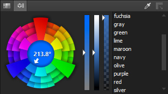
Two-click color changes: Tweak any color in your stylesheet to find the perfect hue, saturation, and luminance level for that exact look, in just two clicks: one click on the CSS declaration, another on the color picker which appears automatically. Stylizer provides two HSL-based color pickers and an opacity channel slider that generates RGB-based colors that work even on legacy browsers. Never guess another hex color code ever again! Stylizer provides two HSL-based color pickers and an opacity channel slider that generates RGB-based colors that work even on legacy browsers. Never guess another hex color code ever again!
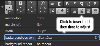
Take control of repetitive tasks: The Remote Control makes many repetitive tasks a one-click operation. Most buttons here double as size grips, allowing you to save time with maneuvers like, for example, mousing down on the "background-position" button to insert a new declaration and starting to adjust it immediately by dragging the mouse. It's intelligent, too: when a declaration is already present, its button appears pressed, and Stylizer will adjust what you have instead of inserting. Or, right-click on a pressed button to delete a declaration without even looking for it.
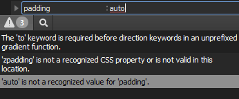
Write error-free CSS: Stylizer knows all the latest CSS 3 standards, and provides a real-time Warnings list that updates without delay, as you type. You'll also see a subtle red underline wherever your CSS does not validate. Stylizer even recognizes many common CSS "hacks" to ensure that the Warning list only contains actionable errors.
Bullseye
Space bar, click anywhere, style anything. Bullseye transforms your workflow into an efficient point, click, and edit process. Using Bullseye is as easy as tapping the space bar, and clicking on the page element that you want to style. All matching CSS rules appear with the most specific rules appearing at the bottom of the list. Bullseye groups styles into two side-by-side lists: computed styles on the left, and the CSS declarations that produced them on the right. This design gives you immediate visibility, positioning you just one or two clicks away from your next adjustment.
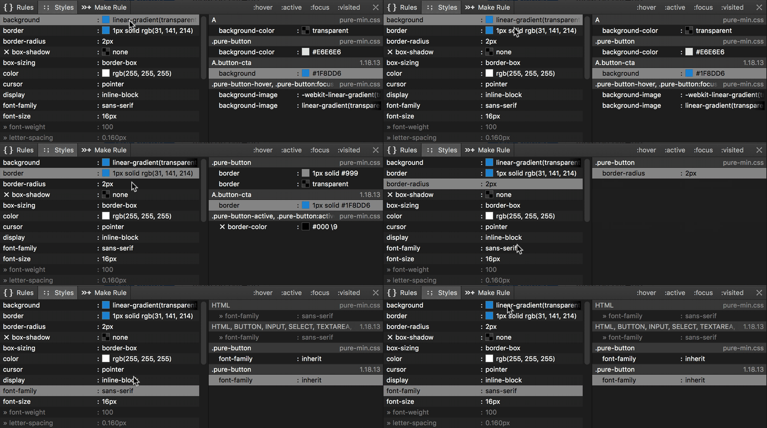
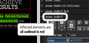
When you use Bullseye, the path of HTML tags leading to the target element is displayed across the bottom of your screen in the Breadcrumb. Use it to select container elements or create new rules with a single click. Make Rule can be used to quickly make a new rule by clicking parts of the target element's ancestor list. Also, whereas Bullseye presents a list of CSS rules that affect a target element, Stakeout outlines all elements that are being targeted the CSS rule you are currently editing. With Stakeout turned on, you'll know which elements are going to be affected by a change before you make it.
The DOM Explorer
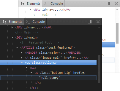
Get a clear view of your HTML with a real-time tree of the HTML DOM. Use it to drill down into elements that are invisible or difficult to click with Bullseye, to quickly highlight and target adjacent elements, and to understand the overall structure of the page. The HTML DOM viewer is a compact panel, opens quickly when you need it, and stays out of your way when you don't.
Your style sheets, as the browser sees them with a real-time window into the browser's view of your style sheets—the CSS DOM. Due to differences between browsers, the CSS you write almost never ends up being interpreted by the browser exactly as you wrote it. The CSS DOM pane not only reveals which rules and declarations were accepted by the browser, it's even smart enough to recognize which declarations in your source code produced which declarations in the DOM.

The CSS DOM viewer is linked in real-time to the Code Grid, highlighting and updating as you work. If you have multiple browser preview panes open at once, the Code Grid will be linked to all of them at once, revealing subtle differences between browsers that can be the difference between fighting for hours and fixing a problem in minutes.
Workflow
Just enter the address of any website in Stylizer to start editing the CSS. Or load an HTML page directly from your Mac or PC. Linked CSS files open automatically in Stylizer so you can start editing right away.
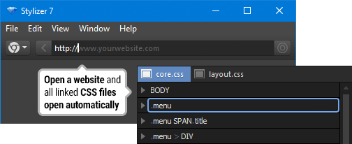
Switch between integrated browsers with one click. Stylizer automatically injects your changes into the new browser so you can switch browsers while your work is in progress and not yet saved. You can even open your page in up to three preview panes at the same time for side-by-side comparisons, making responsive and cross-browser testing a breeze. Stylizer includes embedded preview panes for all major browsers: Firefox, Chrome, Internet Explorer (on Windows), and Safari (on Mac).
Stylizer saves your CSS back to its original location by FTP, SFTP, FTP/SSL or directly to a hard drive or network share. Plus, it remembers where remotely loaded CSS files were last saved, so you only need to choose the location once.
Also compatible with your stack as Stylizer uses no project or temporary files, and works out of the box with almost any website. It works with CMS products like WordPress, Joomla, and Drupal. And it is compatible with practically every web framework: Rails, PHP, ASP.NET, node.js—you name it.
Tools for Pixel Perfection
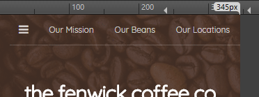
Rulers: Set the preview pane to a specific size, make presets for your breakpoints, and switch between presets with a single click.
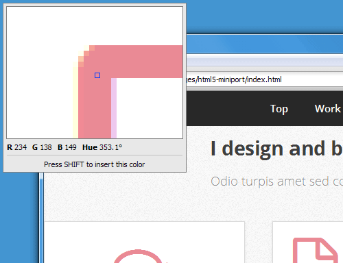
Eye Dropper: Pull colors from Photoshop, a web page, or any other app, preview them in real-time, and immediately inject them into your CSS.
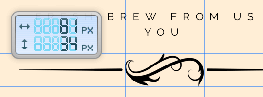
Lasers: Laser-like guidelines follow your mouse to help you ensure the elements on your page are properly aligned, and display measurements in a digital readout.
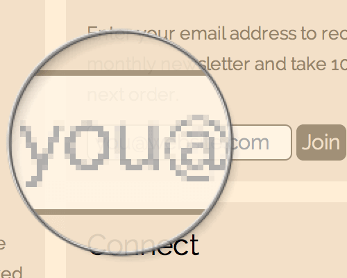
Lens: Ensure per-pixel accuracy by blowing up a portion of the browser by 8 times its original size. The lens can either follow your mouse or be locked in place.
Extras
A wealth of productivity at your fingertips.
Quicker commenting
Commenting out code has never been easier: just press F8 (Command-8 on Mac) to comment or uncomment a style. Stylizer knows the difference between a descriptive comment and commented code and presents them differently, making it obvious which is which.
Customizable formatting
Stylizer guarantees that your stylesheet will be beautifully formatted when saved, using your preferred style (spacing and tabs, indentation, line endings, maximum line length, etc). Working with minified CSS is no different in Stylizer—CSS appears as you would expect in the Code Grid, and minifies again automatically when saved. Formatting presets can be saved, and each individual style sheet can use its own formatting style, making it effortless to work simultaneously on multiple projects with different
requirements.Copy and paste as text
Although Stylizer presents CSS in the Code Grid, you may simply copy and paste between Stylizer and other applications as though it were an ordinary text editor. CSS is always copied in your preferred formatting style, so you'll never need to waste time reformatting CSS again.
Drag and drop
Simply hold Ctrl (Command on Mac), click, and drag to reorder declarations and rules, or move them between style sheets or between applications. The "plus" button on the Remote Control supports drag-and-drop as well, so you can insert a new line without touching the keyboard.
Made for keyboard junkies
We've made every effort to accommodate even the most die-hard emacs fanatic with a personal collection of IBM Model Ms (you know who you are). Efficiently control all of Stylizer and your CSS without going anywhere near a mouse.
Shortcut properties
Stylizer includes a set of unique, built-in shortcut properties that generate CSS declarations for you, making it easier to write correct cross-browser CSS.
Single-click Clearfix
Clearfix is a technique that web designers use to ensure that a container element expands to contain all of its floating children. Stylizer streamlines this process by generating all of the necessary CSS for you with a single click.
Unintrusive auto-complete
Stylizer subtly suggests CSS property names, keywords, and units as you type. It even recognizes hyphenated keywords, allowing you to type shortened CSS like p-t:2 instead of padding-top: 2px.
Offline support
Real-time preview is wonderful, but there are times when you need to open a CSS file to make a quick edit without opening a website. Stylizer's flexible UI works just as well as an offline editor, providing the same great editing experience even without a pane open.
Terms
- You will receive a voucher code, with redemption instructions via email after successfully purchasing.
- One product key can authorize any two computers - Windows and/or Mac.
- Includes free lifetime version 7.x updates.
Live, Real-Time CSS Editing with Stylizer 7
Supercharge your workflow with Stylizer, the greatest CSS editor you will ever own that will cut the time you invest styling websites like a knife through butter. Sporting a unique grid-like CSS editing interface that feeds your style sheet to an integrated browser of your choice and allows you to drag page elements around and adjust all your styling needs from the comfort of your editor, all in real-time. Stylizer is packaged with a range of handy tools that just don't exist elsewhere. It automates things like Image Replacement, CSS positioning, clear fixes, CSS hacks (if you need them) and much more.
Instead of loading CSS files directly, Stylizer asks for the URL of the page you want to change. Then when all is said and done, the CSS is saved right back to where it came from via FTP, SFTP, or a network share. You can start writing better, cleaner CSS in half the time with this innovative editor that lets you target elements on the rendered page, see the most minuscule of changes immediately displayed as they would look on all major browsers in real-time with up to 3 side-by-side browser panes, an HTML DOM explorer, with support for cross-platform comparison to pinpoint issues with the interpretation of CSS on different browsers. Say goodbye to constantly having to hit refresh with every change, and say hello to instant gratification. Stylizer features a clutter-free interface and a whole host of unexpectedly powerful tools.
Why Stylizer:
- Lifetime version 7.x updates
- Available for Windows & Mac.
- Multiple side-by-side preview panes — view up to 3 browser panes at the same time.
- Your style sheets, as the browser sees them.
- Real-time DOM explorer for HTML and CSS, painstakingly refined for superior productivity.
- An in-code toolbar so powerful that even keyboard loving CSS experts use it.
- Integrated preview pane with major browser engines — Firefox, Chrome, Safari and Internet Explorer.
- The Bullseye function lets you click on an element on your web page and effortlessly make real-time changes to the CSS that targets it.
- Size Grips allow you to accurately resize any CSS dimension by clicking and dragging the mouse. Page updates in real time!
- Stylizer knows all the latest CSS 3 standards, and provides a real-time Warnings list that updates without delay, as you type.
- Unintrusive auto-complete.
- Remote Control to make repetitive tasks a one-click operation.
- Integrated FTP client to save your changes.
- Online CSS editing — Just open the URL or HTML page you want to edit and the linked style sheets automatically open for editing.
- Full keyboard control — whether you like GUIs or you’re a hardcore hotkey aficionado, Stylizer has you covered.
- Efficient, real-time color adjustments and measurements.
- Many integrated visual tools like a Ruler, Magnification Lens, and more.
Say goodbye to the reload button! In Stylizer, your changes are immediately displayed in all browsers, in real-time—literally as you type or move the mouse. This is a substantial productivity boost for designers of all skill levels.
Size faster with Grips: Size Grips allow you to accurately resize any CSS dimension by clicking and dragging the mouse. Click, hold, and drag—watch your page update in real-time and achieve perfection on your first try. Take the guesswork out of sizing. Find the exact spot where that stubborn div wraps. Or use them to perfectly position a background image.

Two-click color changes: Tweak any color in your stylesheet to find the perfect hue, saturation, and luminance level for that exact look, in just two clicks: one click on the CSS declaration, another on the color picker which appears automatically. Stylizer provides two HSL-based color pickers and an opacity channel slider that generates RGB-based colors that work even on legacy browsers. Never guess another hex color code ever again! Stylizer provides two HSL-based color pickers and an opacity channel slider that generates RGB-based colors that work even on legacy browsers. Never guess another hex color code ever again!

Take control of repetitive tasks: The Remote Control makes many repetitive tasks a one-click operation. Most buttons here double as size grips, allowing you to save time with maneuvers like, for example, mousing down on the "background-position" button to insert a new declaration and starting to adjust it immediately by dragging the mouse. It's intelligent, too: when a declaration is already present, its button appears pressed, and Stylizer will adjust what you have instead of inserting. Or, right-click on a pressed button to delete a declaration without even looking for it.

Write error-free CSS: Stylizer knows all the latest CSS 3 standards, and provides a real-time Warnings list that updates without delay, as you type. You'll also see a subtle red underline wherever your CSS does not validate. Stylizer even recognizes many common CSS "hacks" to ensure that the Warning list only contains actionable errors.

Bullseye
Space bar, click anywhere, style anything. Bullseye transforms your workflow into an efficient point, click, and edit process. Using Bullseye is as easy as tapping the space bar, and clicking on the page element that you want to style. All matching CSS rules appear with the most specific rules appearing at the bottom of the list. Bullseye groups styles into two side-by-side lists: computed styles on the left, and the CSS declarations that produced them on the right. This design gives you immediate visibility, positioning you just one or two clicks away from your next adjustment.

When you use Bullseye, the path of HTML tags leading to the target element is displayed across the bottom of your screen in the Breadcrumb. Use it to select container elements or create new rules with a single click. Make Rule can be used to quickly make a new rule by clicking parts of the target element's ancestor list. Also, whereas Bullseye presents a list of CSS rules that affect a target element, Stakeout outlines all elements that are being targeted the CSS rule you are currently editing. With Stakeout turned on, you'll know which elements are going to be affected by a change before you make it.

The DOM Explorer
Get a clear view of your HTML with a real-time tree of the HTML DOM. Use it to drill down into elements that are invisible or difficult to click with Bullseye, to quickly highlight and target adjacent elements, and to understand the overall structure of the page. The HTML DOM viewer is a compact panel, opens quickly when you need it, and stays out of your way when you don't.

Your style sheets, as the browser sees them with a real-time window into the browser's view of your style sheets—the CSS DOM. Due to differences between browsers, the CSS you write almost never ends up being interpreted by the browser exactly as you wrote it. The CSS DOM pane not only reveals which rules and declarations were accepted by the browser, it's even smart enough to recognize which declarations in your source code produced which declarations in the DOM.

The CSS DOM viewer is linked in real-time to the Code Grid, highlighting and updating as you work. If you have multiple browser preview panes open at once, the Code Grid will be linked to all of them at once, revealing subtle differences between browsers that can be the difference between fighting for hours and fixing a problem in minutes.
Workflow
Just enter the address of any website in Stylizer to start editing the CSS. Or load an HTML page directly from your Mac or PC. Linked CSS files open automatically in Stylizer so you can start editing right away.

Switch between integrated browsers with one click. Stylizer automatically injects your changes into the new browser so you can switch browsers while your work is in progress and not yet saved. You can even open your page in up to three preview panes at the same time for side-by-side comparisons, making responsive and cross-browser testing a breeze. Stylizer includes embedded preview panes for all major browsers: Firefox, Chrome, Internet Explorer (on Windows), and Safari (on Mac).
Stylizer saves your CSS back to its original location by FTP, SFTP, FTP/SSL or directly to a hard drive or network share. Plus, it remembers where remotely loaded CSS files were last saved, so you only need to choose the location once.
Also compatible with your stack as Stylizer uses no project or temporary files, and works out of the box with almost any website. It works with CMS products like WordPress, Joomla, and Drupal. And it is compatible with practically every web framework: Rails, PHP, ASP.NET, node.js—you name it.
Tools for Pixel Perfection
Rulers: Set the preview pane to a specific size, make presets for your breakpoints, and switch between presets with a single click.

Eye Dropper: Pull colors from Photoshop, a web page, or any other app, preview them in real-time, and immediately inject them into your CSS.

Lasers: Laser-like guidelines follow your mouse to help you ensure the elements on your page are properly aligned, and display measurements in a digital readout.

Lens: Ensure per-pixel accuracy by blowing up a portion of the browser by 8 times its original size. The lens can either follow your mouse or be locked in place.

Extras
A wealth of productivity at your fingertips.
Quicker commenting
Commenting out code has never been easier: just press F8 (Command-8 on Mac) to comment or uncomment a style. Stylizer knows the difference between a descriptive comment and commented code and presents them differently, making it obvious which is which.
Customizable formatting
Stylizer guarantees that your stylesheet will be beautifully formatted when saved, using your preferred style (spacing and tabs, indentation, line endings, maximum line length, etc). Working with minified CSS is no different in Stylizer—CSS appears as you would expect in the Code Grid, and minifies again automatically when saved. Formatting presets can be saved, and each individual style sheet can use its own formatting style, making it effortless to work simultaneously on multiple projects with different
requirements.Copy and paste as text
Although Stylizer presents CSS in the Code Grid, you may simply copy and paste between Stylizer and other applications as though it were an ordinary text editor. CSS is always copied in your preferred formatting style, so you'll never need to waste time reformatting CSS again.
Drag and drop
Simply hold Ctrl (Command on Mac), click, and drag to reorder declarations and rules, or move them between style sheets or between applications. The "plus" button on the Remote Control supports drag-and-drop as well, so you can insert a new line without touching the keyboard.
Made for keyboard junkies
We've made every effort to accommodate even the most die-hard emacs fanatic with a personal collection of IBM Model Ms (you know who you are). Efficiently control all of Stylizer and your CSS without going anywhere near a mouse.
Shortcut properties
Stylizer includes a set of unique, built-in shortcut properties that generate CSS declarations for you, making it easier to write correct cross-browser CSS.
Single-click Clearfix
Clearfix is a technique that web designers use to ensure that a container element expands to contain all of its floating children. Stylizer streamlines this process by generating all of the necessary CSS for you with a single click.
Unintrusive auto-complete
Stylizer subtly suggests CSS property names, keywords, and units as you type. It even recognizes hyphenated keywords, allowing you to type shortened CSS like p-t:2 instead of padding-top: 2px.
Offline support
Real-time preview is wonderful, but there are times when you need to open a CSS file to make a quick edit without opening a website. Stylizer's flexible UI works just as well as an offline editor, providing the same great editing experience even without a pane open.
Terms
- You will receive a voucher code, with redemption instructions via email after successfully purchasing.
- One product key can authorize any two computers - Windows and/or Mac.
- Includes free lifetime version 7.x updates.
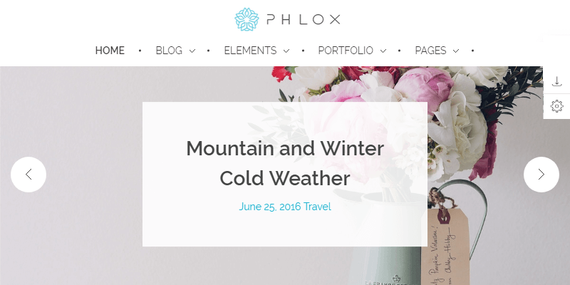
A multipurpose theme for WordPress featuring several different layouts for all kinds of websites, from professional business and services sites to portfolios, restaurants, classic blogs, etc. It is a perfect solution for business owners, bloggers, photographers, travelers or anyone who seeks to own a professional website. It contains several grid sections, sliders, and great adaptability. There are 7 premade layouts with their respective demos.
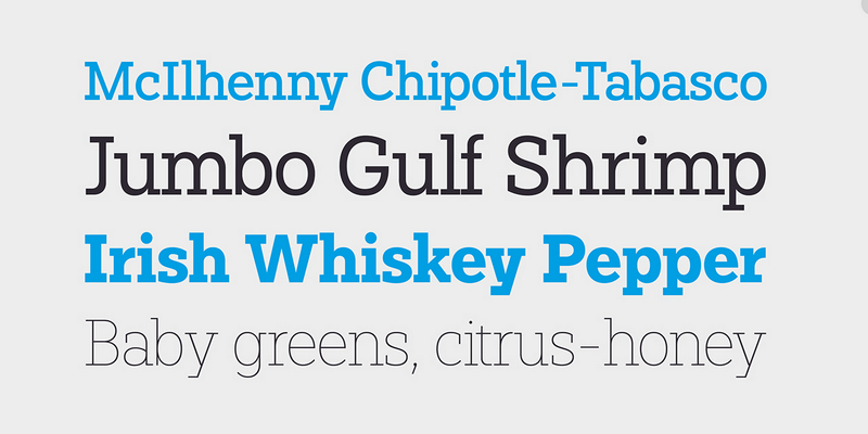
Paul Slab is a modernist Slab Serif typeface. This free version provides three weight styles, thin, regular, and bold. Also, the font has an extended language support, special characters as fractions, arrows, numbers, money signs and more. You can use Paul Slab for any kind of display like editorial, corporate or graphical design. This font was made as a collaborative work between Lukas Biscoff and Fargus Meiser.
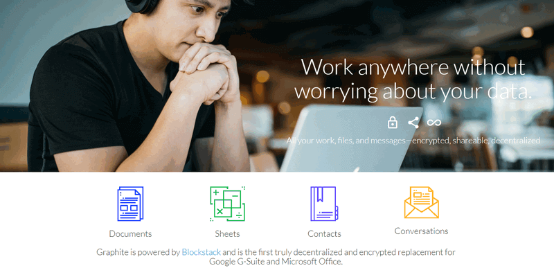
Graphite is a replacement for G-suite & MS Office, it enables secure capabilities to ensure user privacy and workflow. Graphite lets you work with the same advantages of cloud computing that makes easy to share and work with your files while keeping the ownership of your data. Share files, make edits, and collaborate while never losing ownership of your data. Graphite is equipped with end-to-end encryption and features decentralized data management given that it's built with Blockstack, powered by Blockchain technology.
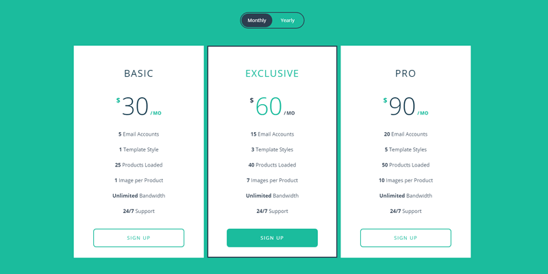
This is a pricing table section totally responsive, it's designed to showcase month and year price for an e-store subscription plan. It has a flat style with a rounded switch on top to flip the tables and change from monthly to yearly price view. The transition is controlled by jQuery actions and in general, the section is made with plain HTML and CSS. It has a display-role reset for older browsers. Created by Codepen user Shane Heyns.
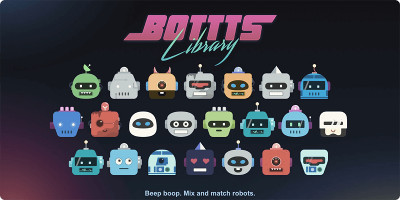
Bottts is a library for Sketch where you can select, compose, modify, and mix robot frames, antennas, sensors, colors, accessories, easily in Sketch App. Bottts is designed by Pablo Stanley and is under free license agreement both for personal and commercial use.
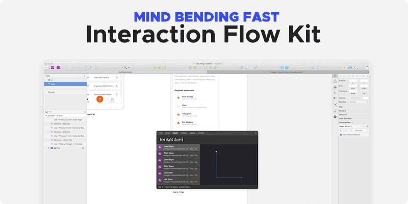
This Interaction Flow Kit helps you creating flows in sketch quickly and effortlessly. It allows you to have screens, wireframes, interaction flows and sitemaps, everything synched into one Sketch file with one shared library. just add interaction flow kit to your Sketch library, create a new page, open interaction flow templates Sketch file and copy desired flow artboard from Flow Templates page, copy the page into your Flow page in your Sketch file and start creating Flow. Designed by Mobgen.

This is a set of retro representations of star explosions. The collection consists of 75 vector line items in AI, EPS, and PNG format, perfect to highlight simple designs with the power of a Big Bang. This collection was made by MiskKS.
This form design is cataloged as material style with smooth icon transitions from left to right when you click on the username and password input. On submit, it expands the button section and after data convalidation, it turns green giving it a simple yet appealingly visual transition. Built with jQuery 2.1.3 and Sass. Made by Codepen user Mohamed Boudra.
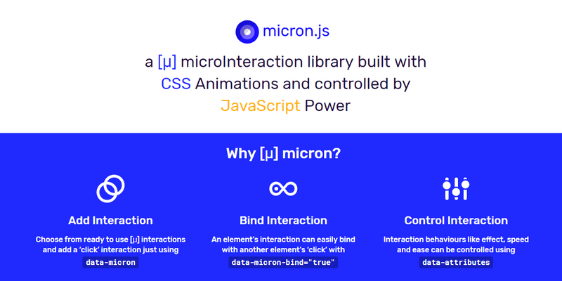
Micron.js is a JavaScript micro-interactions library for creating CSS element animations, the overall interactive behavior is controlled with JavaScript, you just need to include the micron.min.css and micron.min.js to have all ready to use animations or by simply selecting the needed interaction and including it via .min.css file. Also, Micron.js can be included in your project using your favorite package manager. This library was created by Webkul Software.

Glacial Indifference is a Sans-Serif font, inspired by the geometrical design approach from the Bauhaus. This font contains Bold, italic and regular types. It also has Basic Latin and Western European language support. Created by Alfredo Marco Pradil.
Beautiful Decorative Lettering
A majestic bundle with 2882 individual decorative initial drop cap lettering designs with a stunning degree of detail and ornamentation which can be used to create beautiful logos, introductory text & images, branding materials, etc, all with an elegant style reminiscent or illuminated manuscripts from the middle ages. You'll find every letter of the Latin script from A to Z, each with several dozens of unique variations in different styles like Illuminated Medieval Letters, Celtic Caps, Gothics, Gravure, and many more, and the bundle includes mockups, 10 Paper Textures, and Foil Effects & Actions for Adobe Illustrator and Photoshop.
Bundle Features & Contents
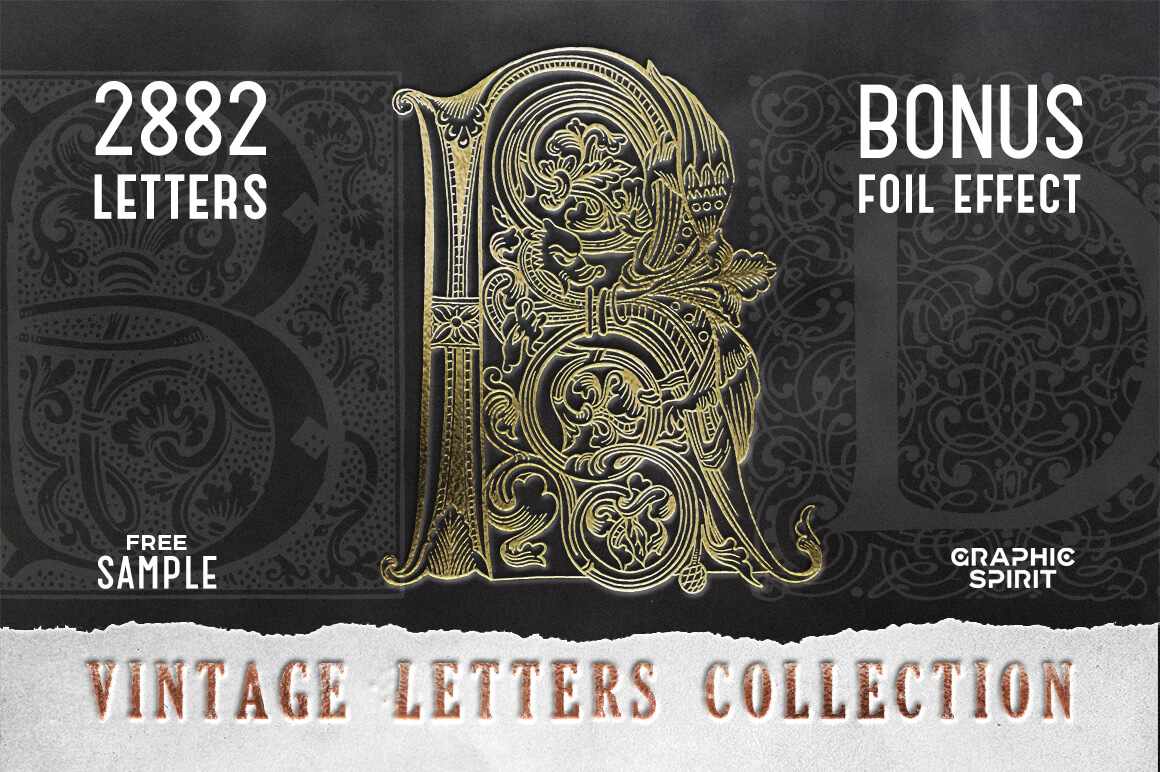
- 2,882 Latin Script Letters
- Foil Effect for Photoshop
- Foil Effect for Illustrator
- Paper Texture (5 Black and 5 White Sheets)
- Suitable for any Vector and Raster Graphic Editors (Photoshop, Core Draw, Illustrator, Gimp)
- Contents divided in 4 Archives (Letters PNG, Letters EPS, Photoshop and Illustrator Foil Effects)
- Free bonus mockups included
- A – 57 variations.
- B – 215 variations.
- C – 173 variations.
- D – 170 variations.
- E – 162 variations.
- F – 150 variations.
- G – 66 variations.
- H – 139 variations.
- I – 169 variations.
- J – 74 variations.
- K – 46 variations.
- L – 146 variations.
- M – 142 variations.
- N – 83 variations.
- O – 133 variations.
- P – 94 variations.
- Q – 53 variations.
- R – 202 variations.
- S – 50 variations.
- T – 189 variations.
- U – 56 variations.
- V – 59 variations.
- W – 165 variations.
- X – 8 variations.
- Y – 49 variations.
- Z – 33 variations.
- Extended License on all assets
(Back to Top)


Massive collection of cool illustrations for your t-shirts
Deal Update: We have added 200 new designs to the bundle, so now you'll get 400 Vector Designs or Illustrations to create unique t-shirt designs, hoodies, hat, pin, posters, invitations, logo or anything. Completely editable features and texts in Adobe Illustrator, pixel perfect vector files capable of re-adapting at any size. If you're looking for something new in vector graphics or some cool illustrations for your new project this unique vector illustrations bundle is for you! $2000 USD worth of graphic resources, only $15! An unbeatable price that reach over the 99% discount!Features
- 400 Vector Designs in AI & SVG formats
- Layered AI file format. Replace or delete layers and customize the designs for your specific projects.
- All the texts are completely editable in Adobe Illustrator
- Adobe Illustrator CS6 compatibility
- Extended License: you can use the designs in all your commercial projects!
See what's new
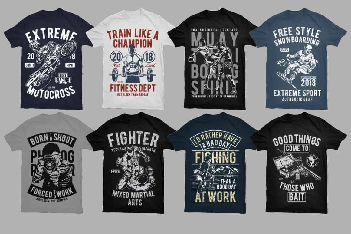
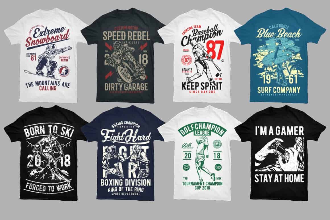
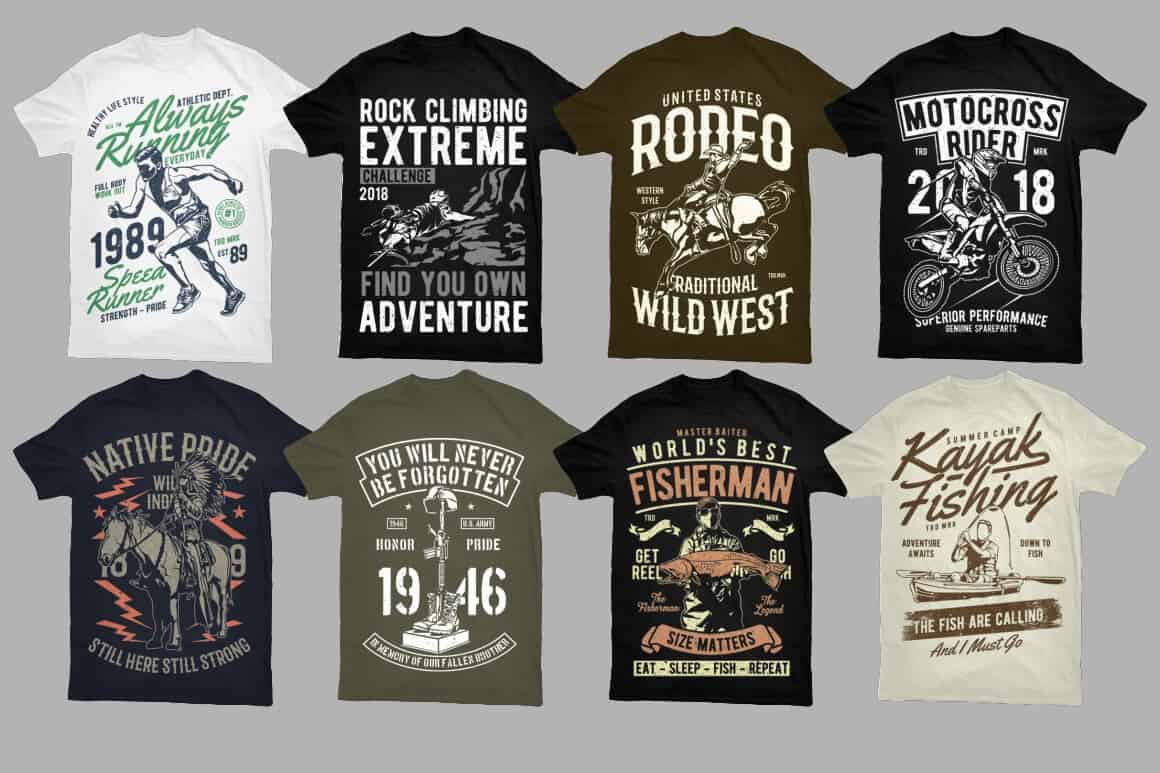
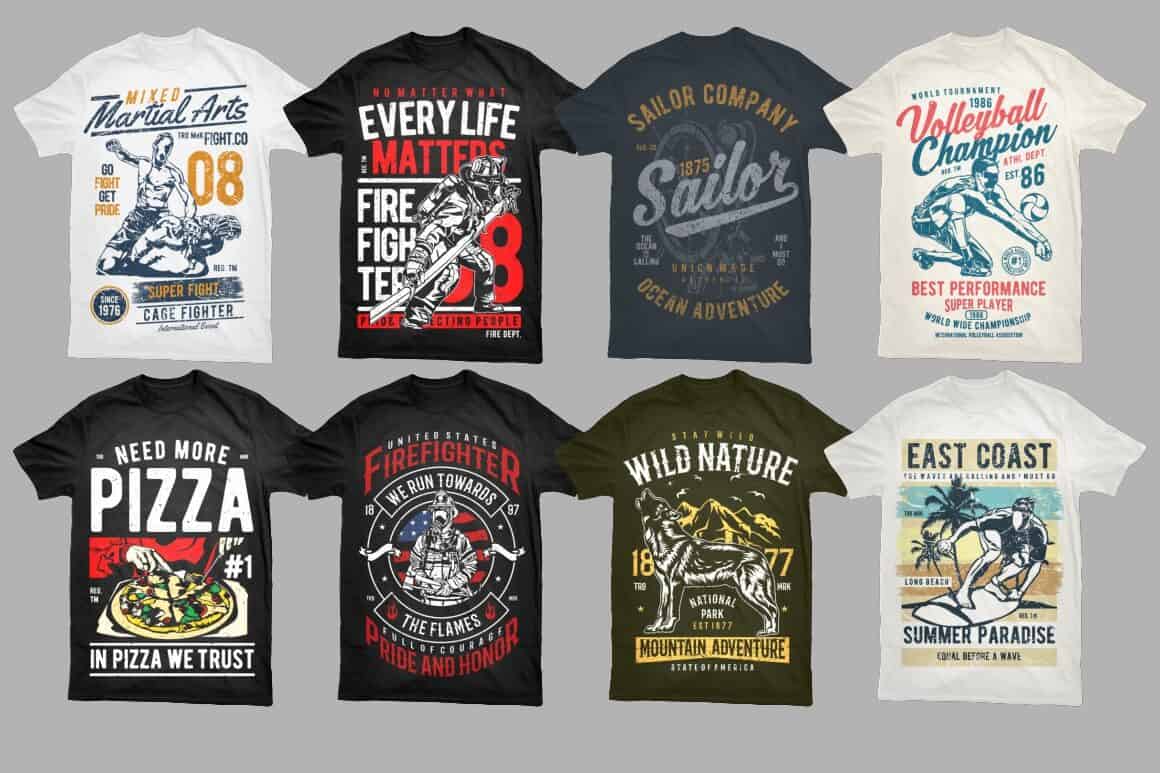
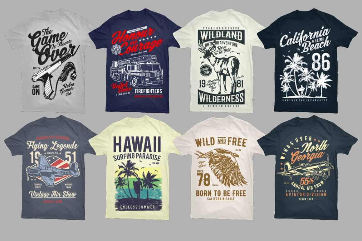
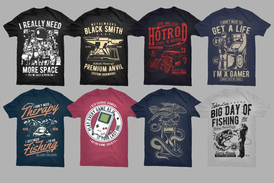
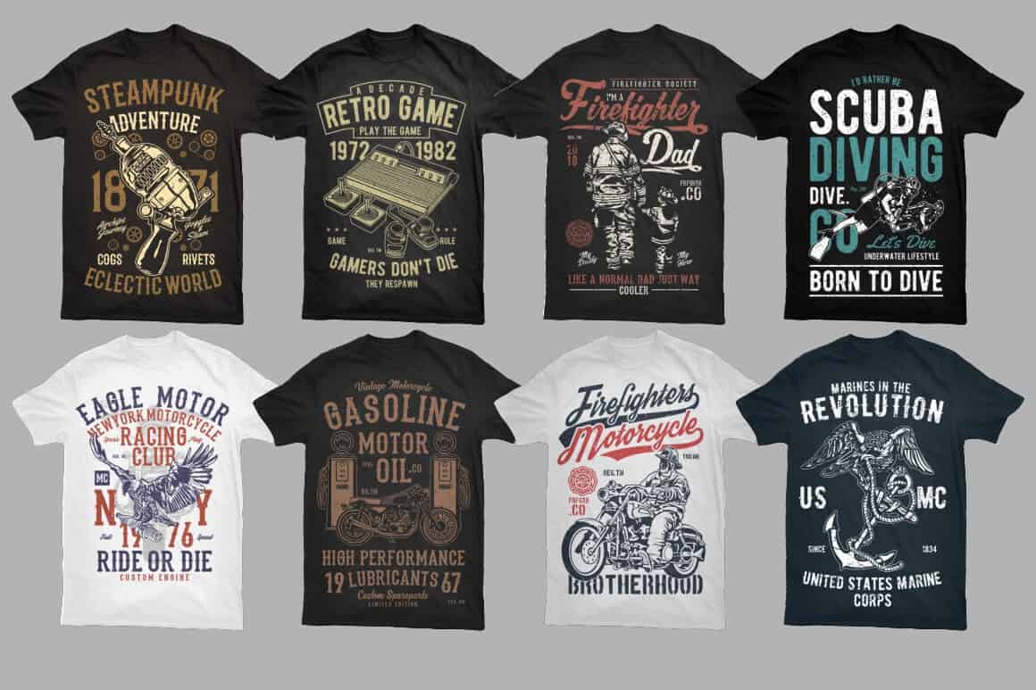
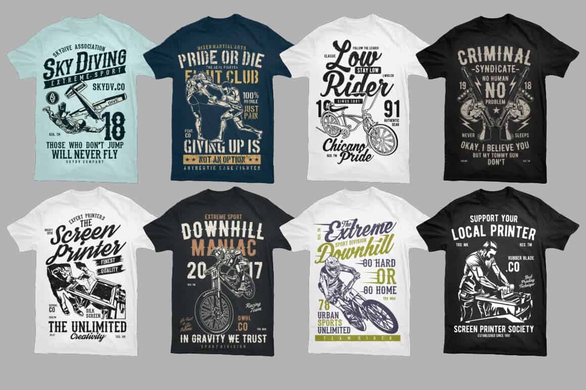
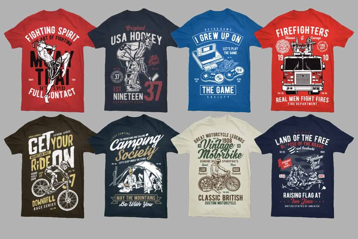
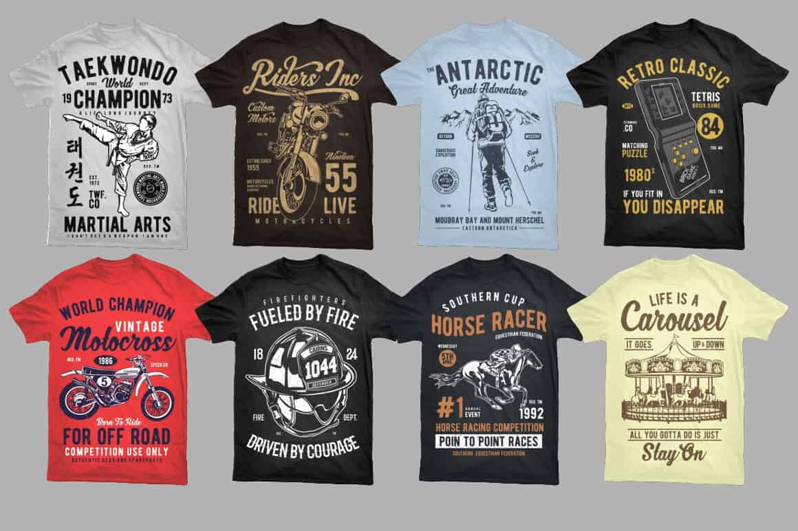
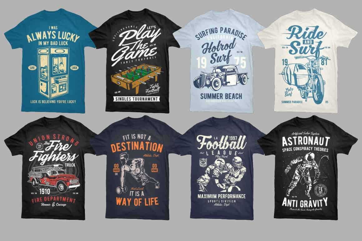
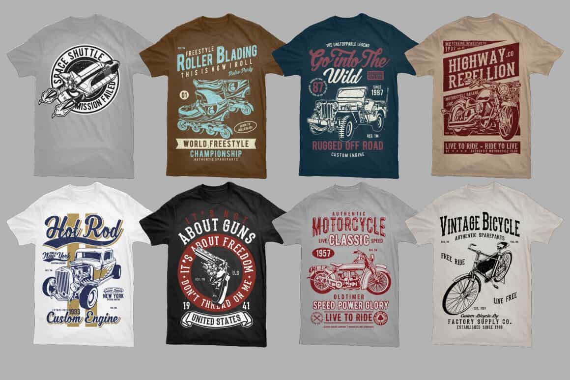
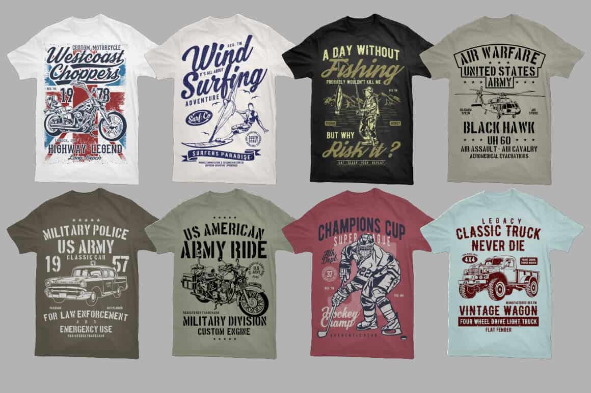
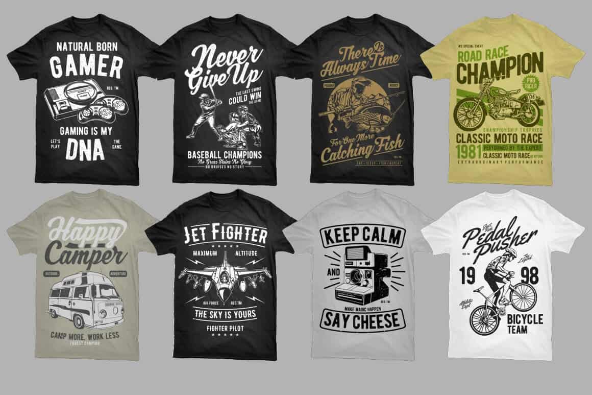
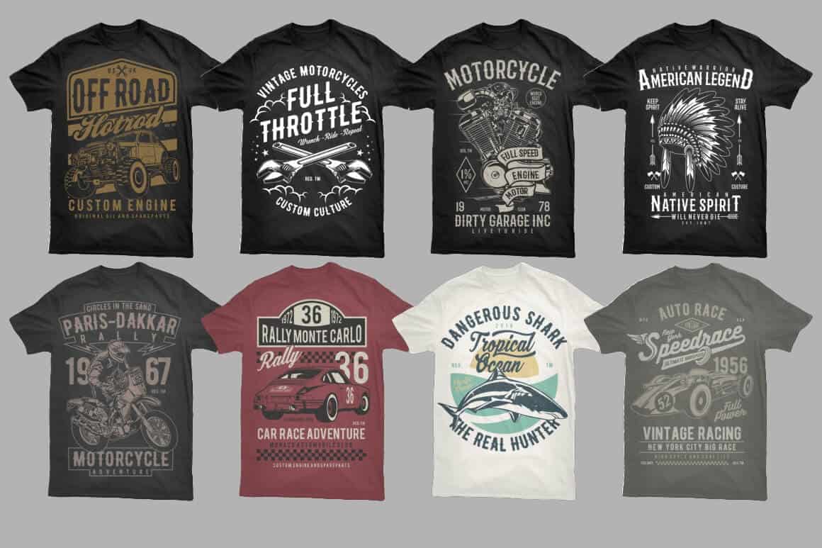
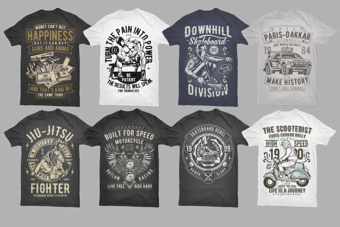
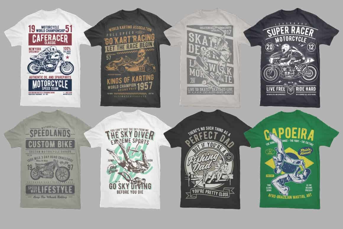
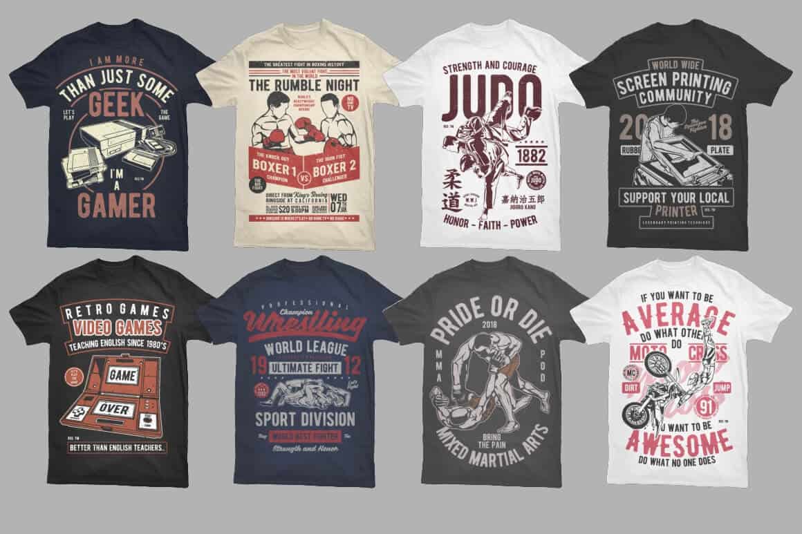
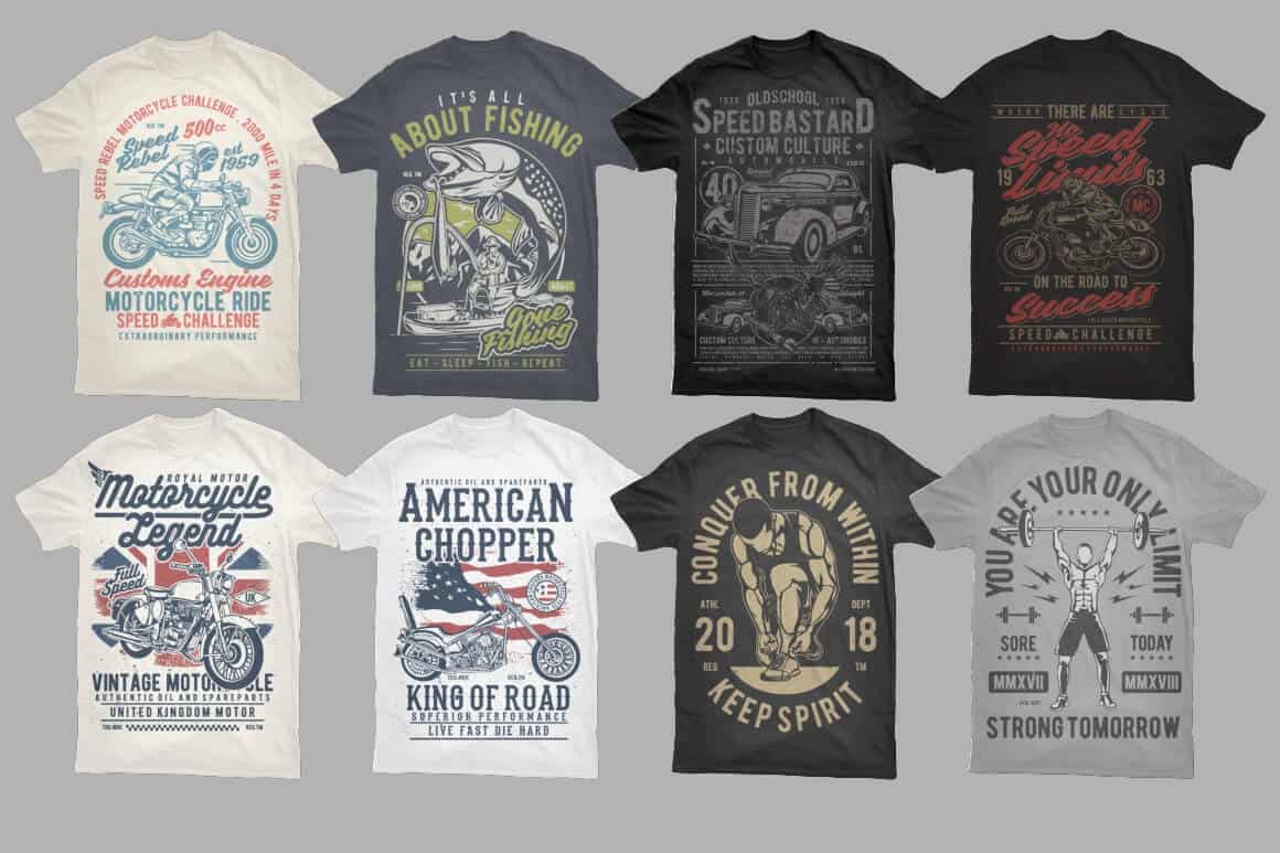
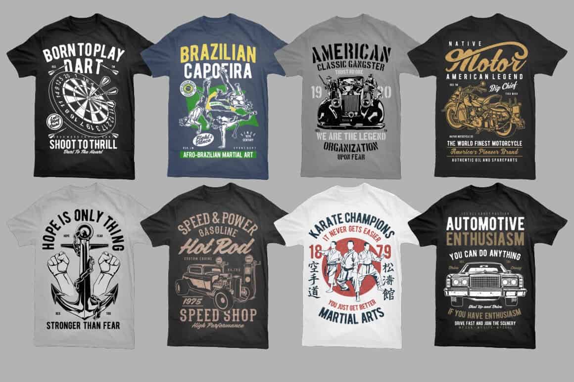
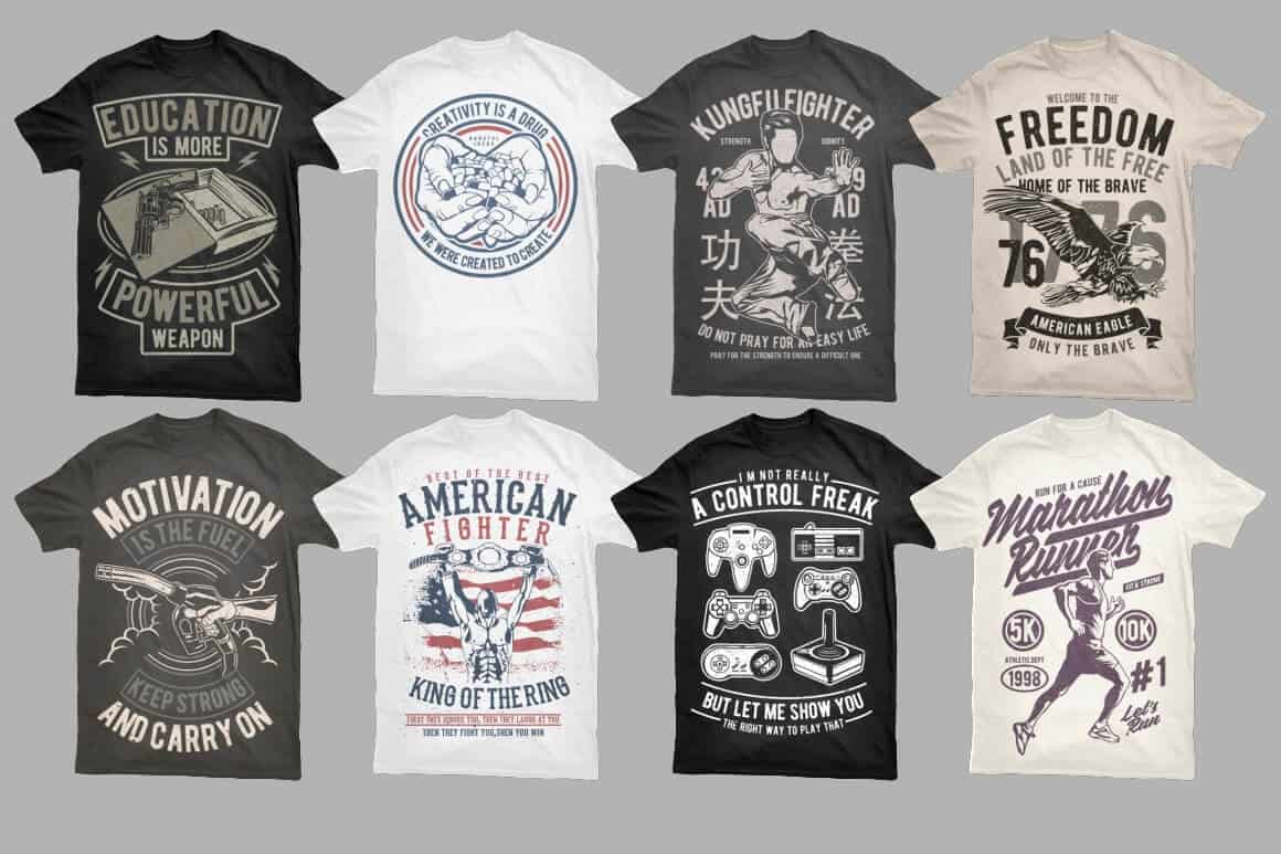
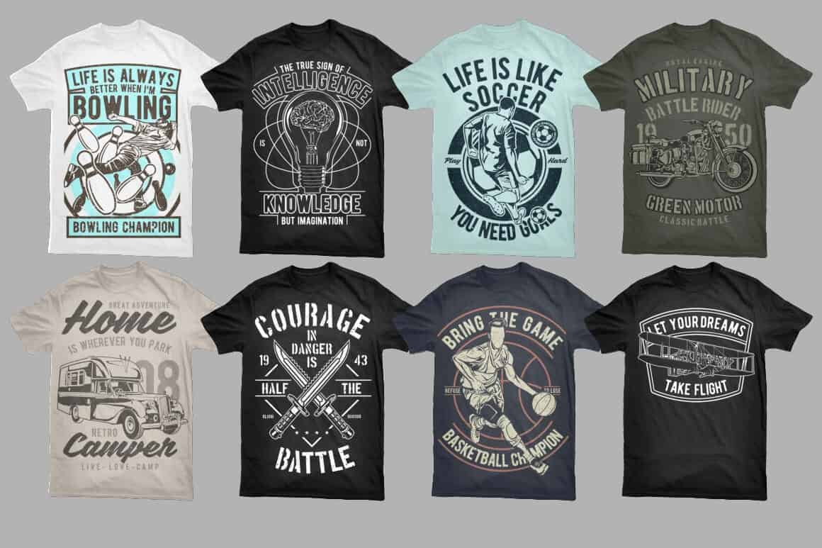
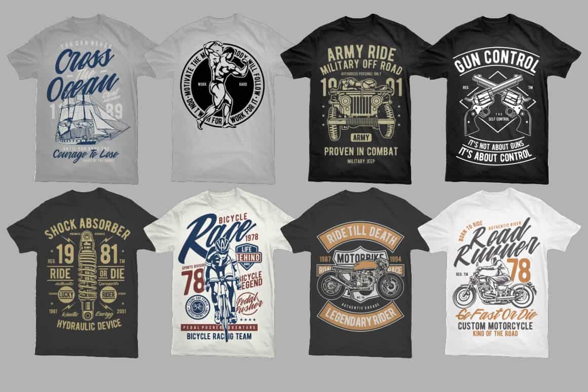
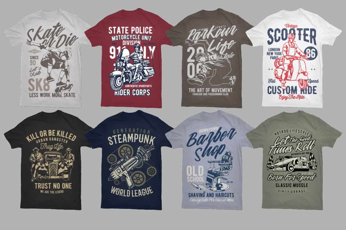
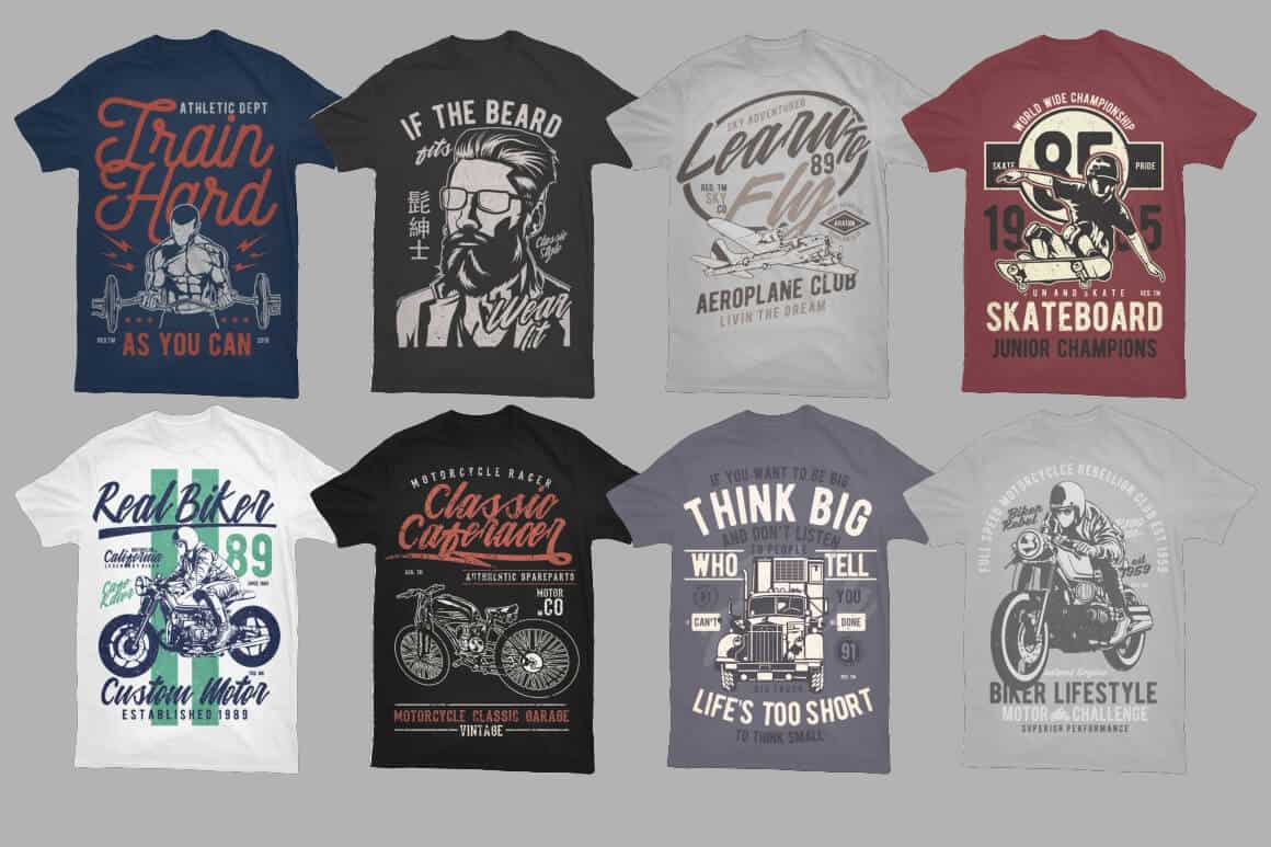
Have a look


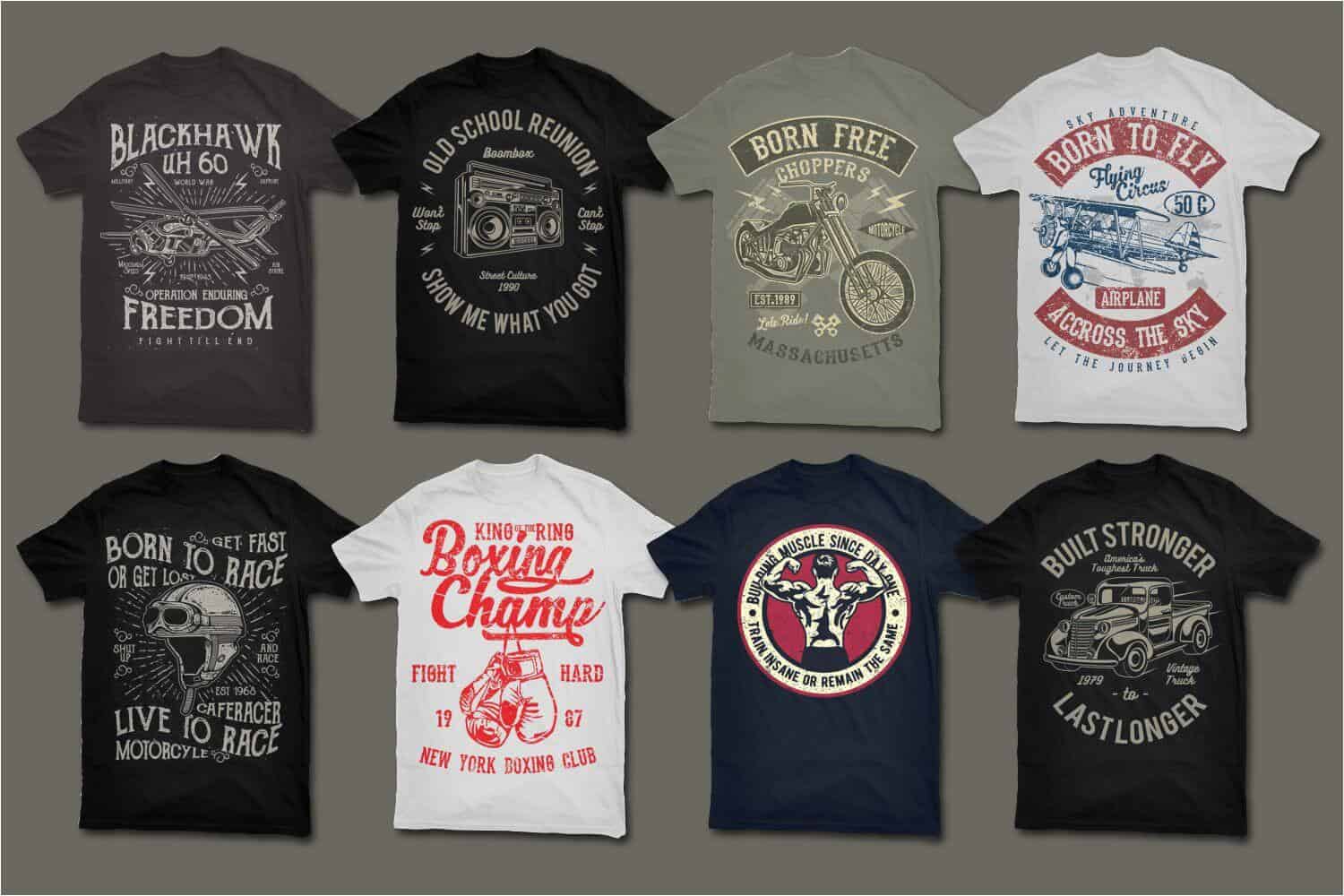
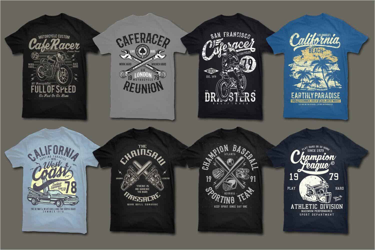
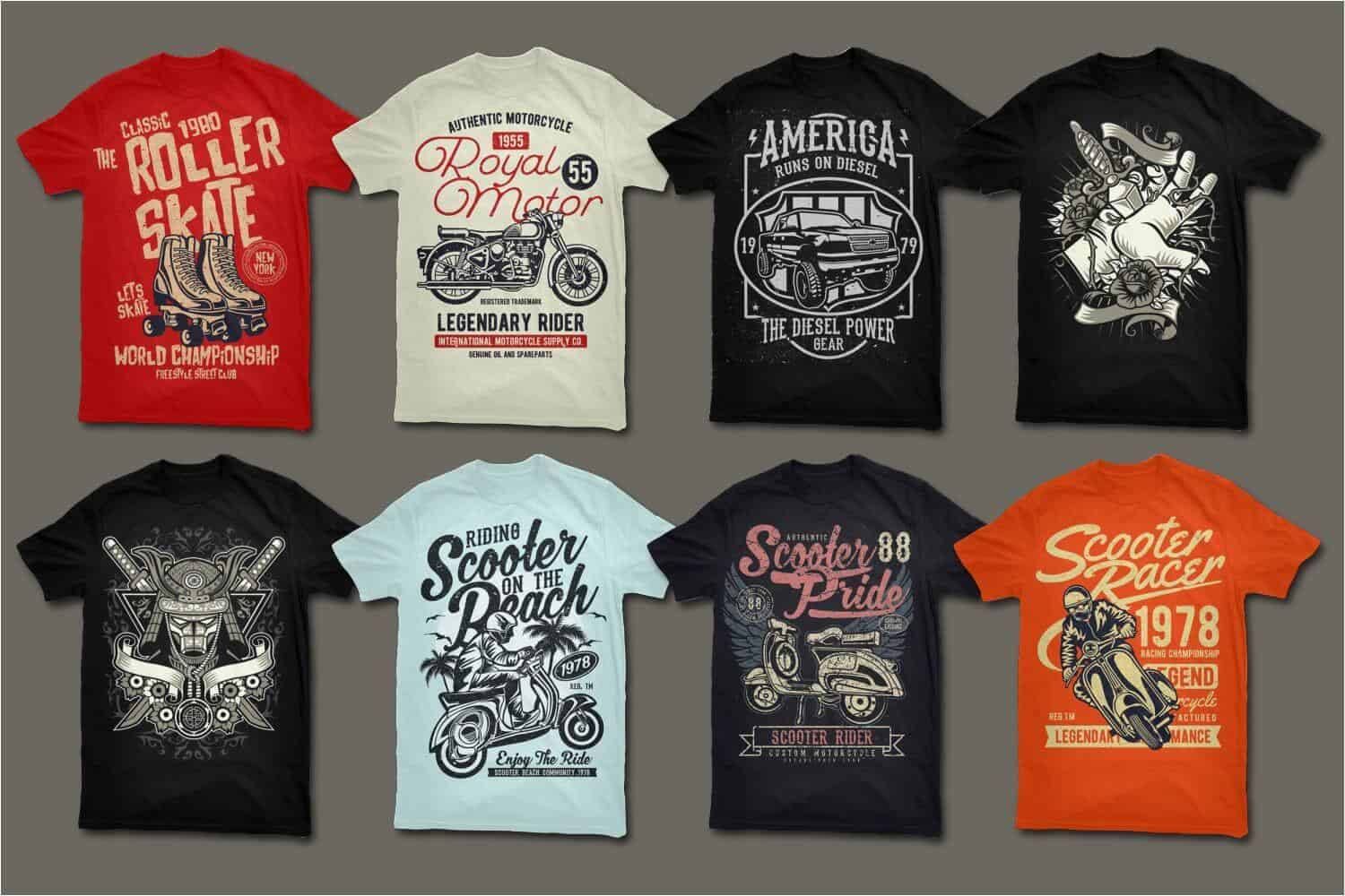
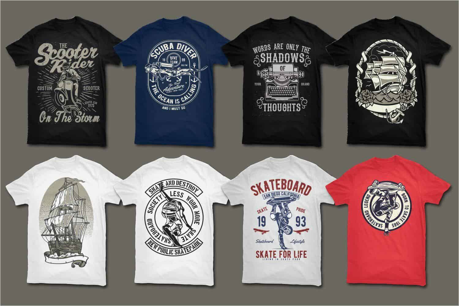
License
You can use this bundle for personal and commercial projects and you can also use them in designs/products that you sell. You can use all these items as a part of your non-digital or digital designs ( posters, t-shirt designs, stickers, web templates ,etc ). You cannot resell these files directly, or within items/goods where they can be extracted in their original form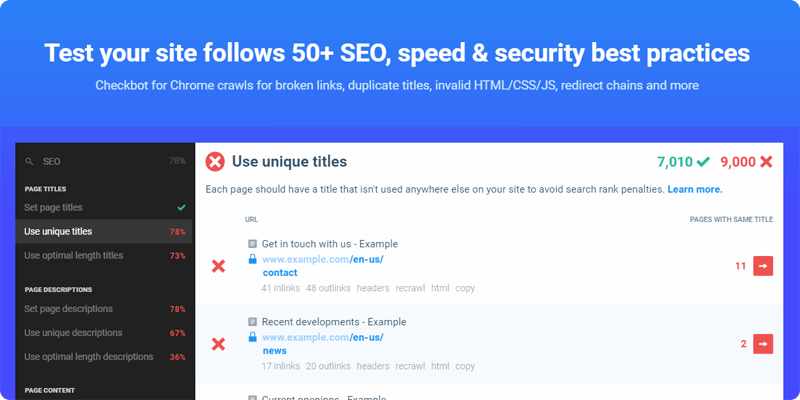
Checkbot is a Chrome extension that will help you understand what is happening with your site in order embrace better approaches while fixing issues on your site. It features a quick an easy installation that runs altogether with Chrome web dev tools, it lets you export lists of URLs to CSV, allowing you to embrace development methodologies and working in a team. Also, Checkbot easily lets you check private or local sites embracing all stages of development. Checkbot without a doubt is the right tool to start optimizing your website today.
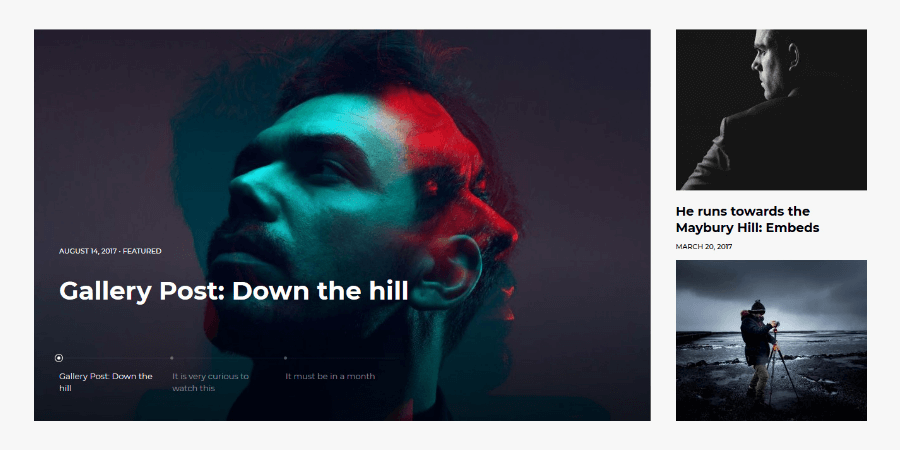
Lookout is specially made for blog sites where the information should look neat and trendy so that ideas can be exposed properly with the right grade of attention. Its concept is keeping it clean, big slide section on the top to extensively showcase your images with nice descriptions on the bottom, broad sized section in compendium with square thumbnails, sidebar info with a reel of symmetrical thumbnails, the following posts section is unintrusive and feature correctly your ideas. Lookout allows you to change in more than 23 styles through customizer, it follows the latest Wordpress standards and lets you natively personalize your site.
A Non-Designer's Guide to Creating Visually Captivating Presentations is a book that will raise your awareness on how to prepare and build fantastic and practical presentations. It walks you through a set of visual examples with case studies and cheat sheets for practical design. In general, this book comprehends the means to visually make the audience care for the content of your presentations.
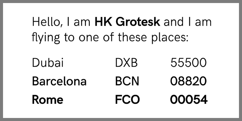
HK Grotesk is a sans serif typeface with a clean design, featuring light, regular, medium, and bold weights, all with their respective italics merging into a total of 20 styles. Every weight has full character sets in Latin script, including special uppercase/lowercase characters, diacritics, symbols, etc, offering support for a large number of languages. This is a friendly and distinguishable typeface that is suitable for small text, you may use it for personal and commercial projects. Typeface by Hanken Design.
A Truly Smashing Book Collection
This week and in tandem with Smashing Magazine, we've brought you a truly awesome promo bundle you will definitely want to add to your collection: Smashing Magazine's Complete eBook Library! With this bundle you can get unlimited, unrestricted access to 56 eBooks about design trends and advanced coding techniques, straight from the most relevant design and development authority on the web. You can get a library filled with the savvy and expertise of best selling authors, regularly priced $396, for a one time payment of only $29!
This is the perfect bundle to learn about Coding, UX Design Trends, Mobile Design, Graphics, WordPress, Freelancing, Content Strategy, etc. Get access to best selling pieces like Alla Kholmatova’s Design Systems, Paul Boag’s The Sketch Handbook, and much more!
Highlights
What You'll Get: (Back to Top)
- An eBook Library With 56 Web Design eBooks Worth $
396. - You get immediate access to all eBooks via .zip archive.
- Every eBook is available in PDF, ePUB, and Kindle file formats.
- Best seller books on Coding, UX Design, Mobile Design, Graphics, WordPress, Freelancing, Content Strategy, Typography,
- All eBooks are DRM-free so that they’ll never expire.
- Save up to 93% on the regular price!
Smashing Library Catalogue & Content Descriptions
If you ever wanted a reliable source of useful and valuable content, look no further. Our Smashing eBook Library has everything you need to start crafting well-designed and well-built websites today.
For almost 10 years now, Smashing Magazine has been where thousands of designers and developers go to learn about design trends and advanced coding techniques. That is why they've have developed the Smashing Library, a comprehensive collection of 56 valuable eBooks.
Smashing Magazine eBook Anthology:
We care about quality content and work hard to support and spread best practices, innovative techniques and forward-thinking ideas. Our Smashing anthology is our editorial flagship, crafted to deliver in-depth knowledge and expertise shared by experts and practitioners from the industry.
Smashing Book #1
The Smashing Book #1 (eBook) is about best practices in modern Web design. It shares technical tips and best practices on coding, usability and optimization and explores how to create successful user interfaces and apply marketing principles to increase conversion rates. It also shows how to get the most out of typography, color and branding so that you end up with intuitive and effective Web designs. And lastly, you will also get a peek behind the curtains of Smashing Magazine.
This book is a treasure of practical and useful knowledge for Web designers and developers. This first Smashing Book looks at Web design rules of thumb, color theory, usability guidelines, user interface design, best coding and optimization practices, as well as typography, marketing, branding and exclusive insights from top designers across the globe. It contains 10 chapters.
Smashing Book #2 + The Lost Files
These eBooks are the long-awaited digital version of our bestselling printed book about best practices in modern Web design. They share valuable practical insight into design, usability and coding, provide professional advice for designing mobile applications and building successful e-commerce websites, and explain common coding mistakes and how to avoid them. You’ll explore the principles of professional design thinking and graphic design and learn how to apply psychology and game theory to create engaging user experiences.
Smashing Book #3 + #3⅓ (2 eBooks)
The Web has changed a lot. Our tools now are advanced, and browsers are highly capable. We are facing new challenges and embracing new technologies. These changes require us to reconsider how we approach Web design. In fact, it’s time to rethink, to recode, to redesign.
The Mobile Book + Addendum
The Mobile Book features the most important things that you need to know as a designer, developer, or mobile strategist for your sites. You'll dive deep into the peculiarities of the mobile industry, explore responsive design strategy, design patterns and optimization techniques, learn about wireframing and prototyping for mobile as well as the guidelines for designing with gestures and touch. As an extra, the addendum to the book provides insights into the popular platforms such as iOS, Windows Phone, etc.
Smashing Book #4 New Perspectives on Web Design
Written by well-respected designers and developers, the 4th Smashing Book contains lots of actionable takeaways that will help you in your daily routine. Think of it as a reliable playbook for issues that keep following you in every project. This book is for you because you’ll discover plenty of valuable, time-saving techniques that will improve your workflow right away.
Smashing Book #5 - Real Life Responsive Web Design
Responsive design is a default these days, but we are all still figuring out just the right process and techniques to better craft responsive websites. That’s why we created a new book — to gather practical techniques and strategies from people who have learned how to get things done right, in actual projects with actual real-world challenges.
Font-end eBook Bundle
Tailored to the needs of front-end developers, this eBook bundle contains 4 selected Smashing eBooks on HTML, CSS, responsive web design, and more. A valuable companion to master your daily front-end challenges.
Behind The Scenes of Real Life Projects
Is there anything more insightful than learning about the workflows from fellow designers and developers, and what techniques they use? What made their projects a stunning success, and how do they overcome missteps? With this eBook, we’ll take a closer look at the techniques and stories of some folks behind real-life Web projects.
Among others, you will discover how renowned projects such as the Financial Times Web app or the Nike Better World website were built, and learn from the success story of a translation app that made it into Apple’s top ten charts. You’ll also get an insight into Google’s User Experience Lab, and (illustrated by the example of Pinterest) explore the importance of paint performance. Furthermore, our Smashing authors share valuable lessons learned in the course of their careers — from both successes and failures. This eBook is full of handy tips, ideas, and personal experiences that are beneficial to any Web professional.
HTML Semantics
You won't get far without the foundational understanding of HTML semantics – but it is even more important to follow up on the recent developments and discussions.
This eBook addresses the importance of semantics in our code. It touches on outlining algorithms, HTML5 semantics, the pursuit of semantic value and the HTML semantic grid system.
Performance Optimization: Techniques And Strategies
Slow loading times break the user experience of any website — no matter how well crafted it might be. In fact, it only takes three seconds until users lose their interest in a site if they don't get a response immediately. If another site happens to be 250ms faster than yours, then users are more inclined to switch to a competitor’s website in no time. Web fonts, heavy JavaScript, third-party widgets — all of them can sum up to become a real performance bottleneck. Nevertheless, tracking that down does not only improve loading times but also results in a much snappier experience and a higher user engagement.
The new Hardboiled Web Design eBook
If you’ve been working on the web for a while, your bookshelves may already be buckling under the weight of books about HTML and CSS. Do you really need another one? Hardboiled Web Design is different. It’s for people who want to understand why, when and how to use the latest HTML5 and CSS3 technologies in their everyday work. Not tomorrow or next week, but today.
UX eBook Bundle
This eBook collection will guide you into the Usability for Web Design field showing you how to use design elements for each purpose. The various possibilities for developing websites foster not only a designer’s creativity, but also the necessity of applying techniques that enhance the User Experience (UX) and website’s usability.
A Field Guide To Usability Testing
Testing usability is vital to creating a successful website — even more so if it’s an e-commerce website, a complex app or any other complicated project. Unlike interviews and focus groups, a well-designed user test measures actual performance.
A Field Guide To User Research

User research is an effective strategy to gain a deeper understanding of your target audience — a crucial step in order to choose efficient design solutions and build smart products. But what has to be considered when conducting user research? What methods have proven themselves in practice? And how do you finally integrate your findings into the design process? With this eBook, you will learn to take the guesswork out of your design decisions and base them on real-life experiences and user needs instead.
Designing Better UX

Even the most thought-out and best-planned user experience can get lost when attention to certain details falls short. To raise awareness for those little things that add up to an ideal user experience, we have put together “Designing Better UX”.
Emotional Design Elements
Whether you're creating a game or a website, a lasting bond with users is more often than not the result of emotional attachment. Knowing the ins and outs of emotional design will enable you to imbue your creation with personality and to shape the user's perception.
How To Create Selling E-Commerce Websites, Vol. 2

With more and more people reaching out for their smartphones and tablets to shop online, mobile e-commerce is set to reach $86 billion by 2016 — a development that brings along entirely new demands on e-commerce websites. After our first e-commerce eBook was published four years ago, we wanted to take a fresh look at the challenges that crafting online shopping experiences bring along today, and equip you with the necessary know-how on how to deal with them effectively.
Navigation & Interaction
How should you set up menus for optimal usability? Does mobile UX design follow different rules? How can you use sound to make your website not just more appealing but also easier to navigate? These and other questions should be factored into any decisions about modern website design, because they will influence the amount and quality of repeat traffic.
Navigation & Interaction, Vol. 2
While users expect content to be unique and exciting, they also prefer clear, predictable patterns when it comes to navigation. After all, navigation is merely a means to an end: consuming content without hassle and not spending too much time looking for it. The foundation of a solid, frustration-free user experience thus lies in a well-structured, simple navigation system. But which design decisions have really proven to work well in practice?
Practical Approaches For Designing Usable Websites
The user-centered design process is based on various steps, each with its respective approaches. Learn about designing flows, optimizing emotional engagement and performing heuristic website reviews.
Psychology Of Web Design
Psychology of Web Design gives you insights on how the human brain deals with different elements, colors, contrast, symmetry and balance. Combining the usability guidelines from Maslow's pyramid will surely help you design closer to your audience’s desires.
Rethinking UX
In “Rethinking UX”, various UX professionals share their lessons learned and provide practical advice from their very own personal experience. The eBook is packed with interesting thoughts and concepts that let us reflect on our own practices. Every designer has their own user research techniques and strategies, but leaving the office and talking to people on the streets can foster innovation even more as any thought-out strategy ever could.
User Experience Design
User Experience (UX) can be strongly influenced by behavioral factors such as emotions, beliefs, preferences and even cultural backgrounds. Being aware of this, Web designers keep developing strategies to improve the overall UX with the help of storytelling, tools for problem solving, relationship engineering and costumer service improvement.
UX Design Process
In this book, you'll learn how lean UX has made the whole discipline more approachable and attractive to startups, and you'll see that UX issues aren't just a quick fix, but should also address big-picture issues. Sometimes, the solution to a problem is to fix a broken UX; other times, you will need to constantly fine-tune in order to keep up with changing demands. You'll also look at wireframing alternatives, research planning and design bias.
Web Design eBook Bundle
Every Web designer, whether freelanced or employed, should have a reference literature that accompanies him or her throughout their professional routine. In this bundle you will find 10 Smashing eBooks that will help you improve your skills in the Web Design field. You will be able to apply techniques to adapt your designs for mobile gadgets, combine different typefaces and intensify your professional abilities.
Creating Meaningful Websites
What is it that makes a website stand out from the crowd? What makes it memorable and meaningful? This eBook wants to approach these questions. It's in no means a step-by-step guide to follow, but rather a collection of thoughts to give you some general impulses and perspectives on creating meaningful websites.
Creativity Lessons For Web Designers
“Creativity” is a term that often partakes of something mysterious and nearly magical — something that we are blessed with, something like an ambivalent, secret power that one moment strikes us unexpectedly, and then puts us on hold when we desperately try to come up with an idea. But the infamous creative spark isn't as random as we might think.
Designing For Email
After taking a look at the current state of HTML email design, you'll get to grips with optimizing email for mobile, and learn to build your own modular email construction kit that you can draw on to cater for best results on desktop, web and mobile clients. We'll also explore handy tips to raise your email above inbox noise — with a friendly tone and engaging content (no dirty tricks here!) — and consider missteps that you should better avoid. Building HTML emails certainly does require some fiddling around, but it's defintely worth it. So, are you ready to take on the challenge?
Inside Creative Minds: Workflows, Habits And Strategies
The authors of this eBook had the occasion to sit down with experienced influencers and successful designers for a row of interviews in which they provide first-hand insights into their very own workflows, habits and strategies. WordPress co-founders Matt Mullenweg and Mike Little are among them, JavaScript evangelist Doug Crockford, IDEO’s Duane Bray, Meetup’s vice president Andres Glusman, as well as many other creative minds from design, UX and startup branches. Their insights and stories are not only truly inspiring, but also contribute to giving this fast-moving, tech-driven Web industry a more familiar face.
Legacy Of Typography
This eBook introduces historical and cultural aspects of type and how they relate to the Web industry. Find out about changing fads in type, about the complexities of Japanese characters and about typographic applications for different situations. You are sure to learn something that you didn't know before from our great authors.
The Sketch Handbook by Christian Krammer
The Sketch Handbook will guide you through every aspect of Sketch: from smart guides and layer manipulation to responsive baseline grid, nested symbols and group resizing. Whether you are a beginner to design or just started to use graphic apps, it will teach you the techniques you need to start designing user interfaces in Sketch.
Typography Best Practices
Whether you're interested in determining the right paragraph layout or typographic details, observing the correct typographic etiquette or making the other small decisions that will dramatically influence how your website is perceived, many answers will present themselves in this collection of articles.
Typography: Practical Considerations And Design Patterns
With the help of this eBook, you can learn how to train and sharpen your eyes to recognize specific typographic details which will be sure to guide you in your own projects and make it easier for you to make design decisions. After an initial stroll through type terminology and classification, this eBook reflects on the quality of fonts (including web font providers, of course) and explores typographic design patterns as well as current practices. These practical considerations and a plethora of real-world examples are bound to be a valuable companion throughout your adventures when designing with type.
Unlocking Innovation: How To Generate And Realize Great Ideas
Certain strategies can help to unlock our creative insight, and make our ideation process — and that of our team members — more effective. Unlocking Innovation wants to equip you with such strategies, but also go beyond the mere process of generating ideas and look at how we can actually bring them to life. Different ways of experimenting with that first vague idea and mocking it up are thus part of the eBook, just like suggestions on finding the idea that is really worthy of our time and energy. The tips that our authors have to share are very practical, and can easily be incorporated into your (or your team’s) workflow. So, take your time and examine them carefully, and, most importantly, try them out to see what works best for you.
Accessibility eBook Bundle
We try to build the best experiences we can, but more often that not, we make them for ourselves and users like us. With this eBook bundle, you’ll learn to enrich the web for everyone by removing existing barriers and creating experiences that are usable to more people.
Inclusive Design Patterns by Heydon Pickering
This book looks at common interface patterns from the perspective of an inclusive designer—someone trained in building experiences that cater to the huge diversity of abilities, preferences and circumstances out there.
Apps For All: Coding Accessible Web Applications
Accessibility is not just about addressing specific disabilities, but making sure as many people as possible have access to the same information. There’s rarely a good reason to lock people out when openness is a foundational principle of the web.
Practical Approaches For Designing Accessible Websites
We design with viewports in mind, keep track of loading times, and hunt down even the smallest browser bugs — all to create the best possible user experience. But despite all these efforts to constantly improve our products, there’s still one aspect that, unfortunately, comes up short quite often: accessibility.
Business eBook Bundle
If you need support when it comes to the business aspects of the web industry, then these eBooks will be a treasure chest for you. Learn to adapt your business to the digital challenges. Get insights into building better products. Read up on how to pitch like a pro and handle your finances properly. Get precious tips on a key issue in your career: communication with clients and partners.
A Career On The Web: Assuming Leadership
Taking the step from being a member of a digital team to becoming a leader can be quite overwhelming. Having proven that you excel in the technical aspects of your job is most probably beyond question, but a leadership position will naturally confront you with entirely new challenges which also call for new skills. After all, a team is as good as its leader, right?
A Career On The Web: On The Road To Success
There comes a time in everyone’s career when changing jobs is the natural next step. Perhaps you’re looking for a new challenge or you feel like you’ve hit a wall in your current company? Either way, you’re standing at a crossroad, with an overwhelming amount of possibilities in front of you. But how can you make the most of this situation? How can you find a job you will truly love?
Clients: Friends You Never Had
A fruitful and balanced cooperation with clients is the dream of every designer. However, to bring this dream to reality, designers constantly need to prepare for the various challenges that different clients tend to bring along. But what can you do to generally improve the collaboration with your clients and — on a long-term basis — foster stable relationships in which both parties are actually pulling in the same direction?
Digital Adaptation by Paul Boag
Nothing is more frustrating than stubborn management entangled in dated workflows and inefficient processes. That's why we created Digital Adaptation, a new practical book on how to help senior management understand the Web and adapt the business, culture, teams and workflows accordingly. No fluff, no theory — just techniques and strategies that worked in practice, and showed results.
Making It Right: Product Management For A Startup World
The main purpose of this book is to help product managers who work specifically with digital projects build better — less complex, more focused, less long-winded and more intelligent — products. By featuring lessons learned from real-life projects, the book provides a structured framework for strategic product management — to help build the right products, at the right time, for the right people with just the right amount of process involved.
Marketing Secrets For Web Designers
Marketing is an essential part of Web design and knowing its 101 helps designers see their design decisions in a broader context. As jumping in at the deep edge and simply starting off marketing can be quite delicate, "Marketing Secrets For Web Designers" is a companion tailored to the specific needs of Web professionals. Weighing the benefits and perils of common marketing practices, it takes designers by the hand as they develop an understanding of what friendly and appealing marketing is all about.
Successful Freelancing For Web Designers
If you are thinking of freelancing or are close to surrendering to your workload, then this eBook will be a treasure chest for you. Realizing that you have made the same mistakes as many before you can be a relief. Read up on how to pitch like a pro and handle your finances properly. Get precious tips on a key issue in freelancing: communication with clients and partners. Compelling marketing strategies will brighten your future, win contracts and make your business profitable.
Work Smart, Live Healthy
Web design is more than a job. It’s a passion. However, keeping up with the immense pace at which the web industry is moving can feel quite intimidating at times and stress or even a burnout can strike all of us someday. With this eBook, we want to raise awareness for those aspects of the web industry which are not frequently talked about. It’s not about frameworks, code or scripts for a change — today it’s about you.
Content Strategy eBook Bundle
With this bundle you will master content and copywriting in no time. Three fresh eBooks contain Smashing Magazine’s best articles on Content, carefully prepared, edited and — of course — without advertising. Perfect for those looking to get into the world of content development for online platforms, this eBook expertly pinpoints the key things one must know before beginning a journey into copywriting. This bundle will help to improve your Copywriting skills.
Content Strategy
If content is king, then the art of messaging is what will drive your product, business or idea forward. This comprehensive eBook delves into the world of content, providing beginners as well as communications professionals with a fundamental understanding of how content strategy works both independently and in conjuncture with other elements.
Content Strategy, Vol. 2: Planning, Producing And Maintaining Quality Content
A brilliant design deserves brilliant content. Content that is intuitive, compelling and flexible. With the help of this eBook, you will learn to face the content challenge. Take it as your guide through the critical phases of content planning, production and maintenance, your partner in crime to develop your content strategy.
Effective Copywriting
Writing for the Web has many facets and uses. As one of the most sought-after and needed skills, it has often become an exercise of bringing together a brand with a voice. This eBook takes a look at many different aspects of copywriting in the online sector.
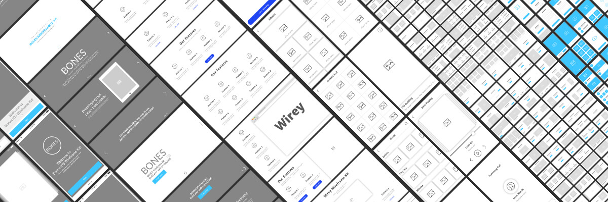
Description
Today's deal brings a complete collection of Vector (AI, PSD & Sketch) Wireframe templates valued $775 USD for only $24. It has more than 856 templates and literally thousands of design elements, totally editable and ready for you to create a cool website from scratch. The bundle includes 15 mood board templates, 236+ flowchart elements, 300+ web wireframes, 300+ mobile wireframes and 5 mockups. Check out its features below and take advantage of the 97% discount, only for a limited time!What's Included?
- Bones Wireframe Kit, valued $120 - 11 PSDs, 11 Ai, 11 Sketch files
- Bones iOS Wireframe Kit, valued $120 - 11 PSDs, 11 Ai, 11 Sketch files
- Wirey Wireframe Kit, valued $150 - 13 PSDs, 13 Sketch files
- Wirey Mobile Wireframe Kit, valued $150 - 11 PSDs, 11 Sketch files
- Flowy Flowchart, valued $120 - 5 PSDs, 5 Sketch files
- Mood Board Templates, valued $90 - 2 PSDs, 2 Sketch files
- 5 Mockups, valued $25 - 5 PSDs
Bones Wireframe Kit
The Bones Wireframe Kit is designed on a grid, and divided into 10 categories, It has 120 ready to use elements in 3 file formats (Photoshop, Illustrator & Sketch.) A smart structure will allow you to drag and drop the elements and create pages in minutes, as well as a 12 column grid that will adapt easily in code. All elements are made with responsive in mind.


Features
- 120 Ready to use elements - Retina ready - Vector shapes - Free fonts used - Properly named layers - Organized structureBones iOS Wireframe Kit
The Bones iOS Wireframe Kit is made with lots of love and hard work to bring the best possible solution for your next app or mobile website project. It includes 120 fully editable screens, in 10 categories and in 3 file formats (Photoshop, Illustrator & Sketch.) Its simple-to-use structure will allow you to position the elements the way you want without loosing time finding the folders and layers you need. Use the screens as they are, or include images and present high fidelity prototypes to your clients in no time!
Features
- 120 Ready to use screens
- Retina ready
- Vector shapes
- Free fonts used
- Properly named layers
- Organized structure
Wirey Wireframe Kit
The Wirey Wireframe Kit is made with fast workflow in mind, so we created 200+ ready to use components, built on the Bootstrap grid in Photoshop & Sketch file formats. You can create wireframes for projects of any complexity and show them to your team or clients in minutes. Super simple to use to boost your creativity and productivity. If you want, you can include images to create high fidelity prototypes.

Features
- 200+ Ready to use components
- 1k Elements
- 13 Categories
- Vector shapes
- Free font used
- Properly named layers
- Organized structure
- Built on the Bootstrap Grid
Wirey Mobile Wireframe Kit
Wirey Mobile Wireframe Kit is made with fast workflow in mind, so we created 200+ ready to use screens, in Photoshop and Sketch file formats. You can create wireframes for mobile projects of any complexity and show them to your team or clients in minutes. Super simple to use to boost your creativity and productivity. If you want, you can include images to create high fidelity prototypes.
Features
- 200+ Ready to use screens
- 1k Elements
- 11 Categories
- Vector shapes
- Free font used
- Properly named layers
- Organized structure
Flowy Flowchart Elements
Flowy is made with fast workflow in mind, so we created 236 ready to use templates, built on the 1170 grid and in Photoshop & Sketch file formats. You can create flowcharts for both mobile and web projects of any complexity and show them to your team or clients in both digital and print form. We also created additional elements that will help you connect the elements and show how they will flow in the finished design.


Features
- 236 Components
- 1000+ Elements
- Grid Based
- PSD & Sketch files
- Organized Structure
- Video Tutorial
- Free Google Font
- Ready to use templates
- Print ready A4 and Letter sizes
Mood Board Templates
Inspire yourself or your team with these handy, printable mood boards and get your project going. Two dimensions A4 & Letter, ready to use files and super organized structure will allow you to create mood boards in minutes.
Features
- Fully editable Photoshop and Sketch files - Ready to use- A4 & Letter dimensions
- Video tutorial included
- Organized files
- Super easy to use
5 Mockups
These are 5 MacBook Pro and IPhone 5S mockups. Mockups are Photoshop files with fully editable smart objects and atmosphere effects. Double click the smart objects, paste your designs and save.
Features
- Fully editable Photoshop files
- JPEG previews included
- Smart objects
- Atmospheric effects included
- Simple to use
License
- You'll get an extended license, meaning that the product can be used in any personal and commercial project with no restrictions. - You cannot resell the bundle in it's current, or any other form (as is), for a single client or within any marketplace. - It can be used in an unlimited number of client projects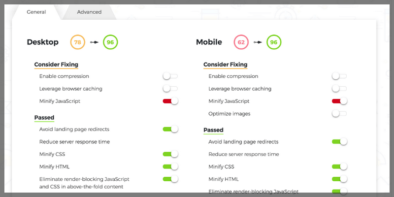
If you have performance issues with your WordPress site or simply want to optimize your page, PageSpeed Ninja is for you. PageSpeed Ninja is a WordPress plugin that was built to optimize the loading of your site on desktop and mobile. It features an easy to use all-in-one package ready to boost your site performance mainly by the use of above-the-fold critical CSS generation method.
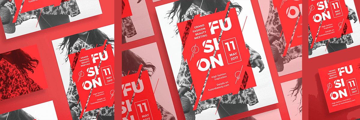
A massive vector-based AI & EPS files bundle with 120 different design ideas for social networks posts. There're 13 creative post sizes and 11 stylish cover templates for each of these concepts. Totally, 2880 Editable Templates! that meet all the requirements and are adapted for the usage on Facebook, Twitter, Youtube, Google+, Instagram, Pinterest, LinkedIn, Tumblr, Etsy, blogs and more. This package is a perfect kit to upgrade your social media in a modern and professional way! Normally the separate files of this bundle could be priced up to $1440 USD but for a limited time, all the templates can be yours only $19 (99% OFF)
Main Features
- 2880 templates total
- Easy to edit and customize
- Intuitive ordered layers
- All shapes are vector based
- Free pictures and fonts used only
Templates specifications:
- 13 social media post formats:
- Social Media Universal Post (1200x 1200 px)
- Twitter In-Stream Photo (1024 x 512 px)
- Facebook Photo Post (940 x 788 px)
- Facebook App (810 x 450 px)
- Facebook App / Tab Image (111 x 74 px)
- Instagram Feed Square (1080 x 1080 px)
- Instagram Feed Landscape (1200 x 628 px)
- YouTube Video Thumbnail (1280 x 720 px)
- Pinterest Pin (736 x 1104 px)
- LinkedIn Update/Blog Post (1200 x 628 px)
- LinkedIn Post Header (700 x 400 px)
- Tumblr Image Post (540 x 810 px)
- Etsy Listing Photo (1000 x 800 px)
- 11 social media header formats:
- Twitter Header (1500 x 500 px)
- Facebook Cover (828 x 465 px)
- Facebook Event Cover (828 x 315 px)
- Google+ Cover (1080 x 608 px)
- YouTube Channel Cover (2560 x 1440 px)
- Pinterest Board Cover (736 x 736 px)
- LinkedIn Profile Banner (4000 x 1700 px)
- LinkedIn Company Cover (1536 x 768 px)
- Tumblr Banner (3000 x 1055 px)
- Etsy Cover (1200 x 300 px)
- Etsy Shop Banner (760 x 100 px)
- EPS / AI files for Adobe Illustrator
- PSD files for Adobe Photoshop
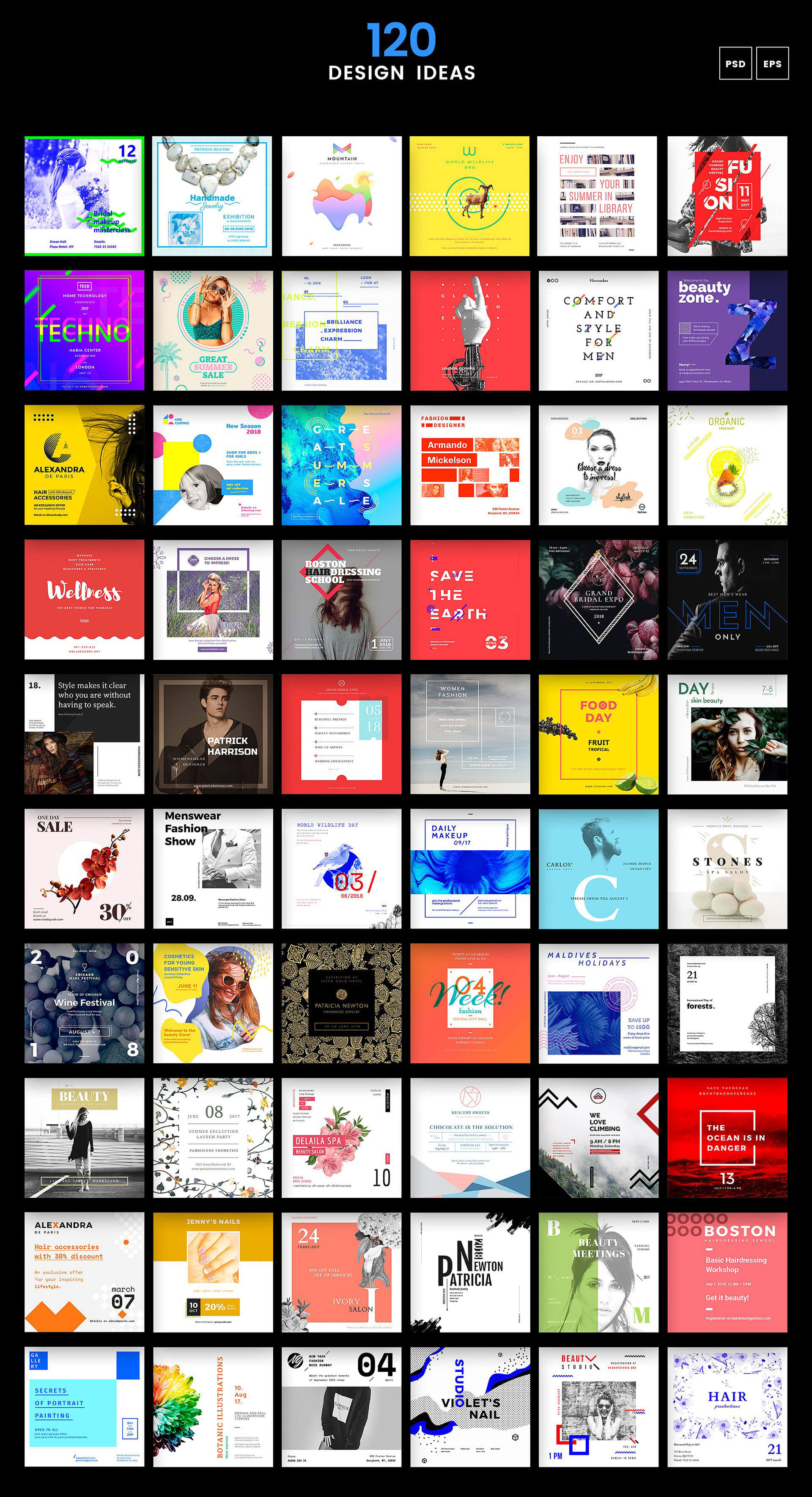
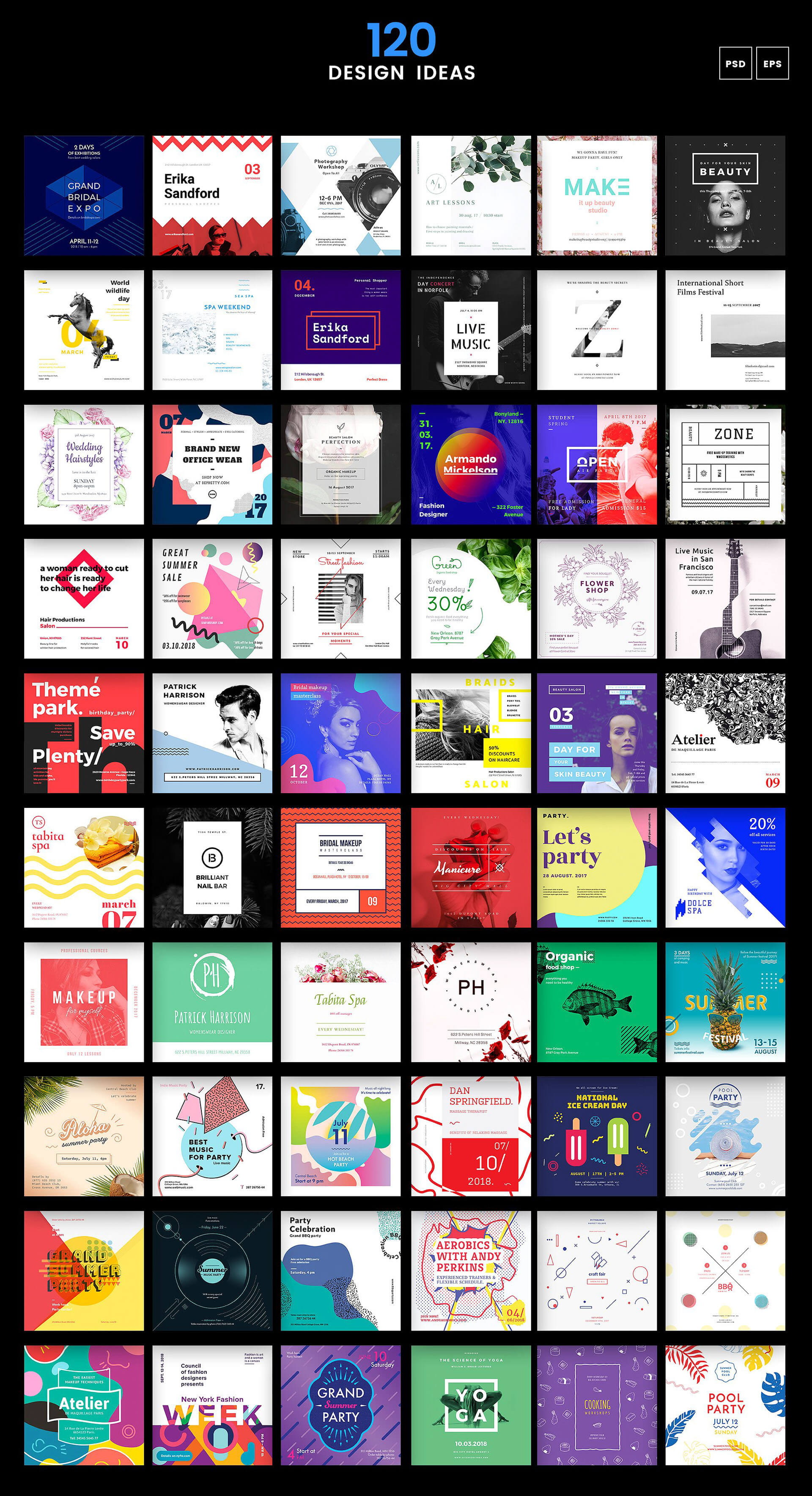


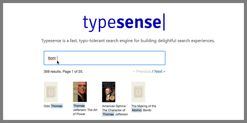
Typesense is a simple and fast opensource search engine that tolerate typographic errors delivering fast and relevant search queries. Typesense is best suited for light projects or small teams with relatively low bandwidth to administer. At that scale, you can have a fine-tune search experience from the beginning.
This is a fantastic set of 240 illustrations in 3 styles: Multicolour, Duotone, Monotone. The free illustrations feature an LGBT theme. it convenes a flat and cartoonish aesthetics that you will love. This pack was made to support the LGBT cause so you can use them for personal and commercial projects with no restriction. This illustration pack was published by Vincent Le Moign.
Here you have Glide.js, a simple and responsive yet customizable slider and carousel. It features a dependency-free build in vanilla JavaScript, everything came on board and ready for action. It has a modular structure where you can easily select, drop, remove, integrate themes and link with external plugins, all this with an excellent overall compression. Glide.js was created by Jędrzej Chałubek under the MIT license.
Need to draw graphics with a sketchy hand-drawn appearance? Rough.js is for you. This JavaScript library allows you to easily create graphics with Canvas and SVG that resembles those made by hand. You can build anything in code and Rough.js translate your code to produce that warmy hand-drawn feeling into your project.
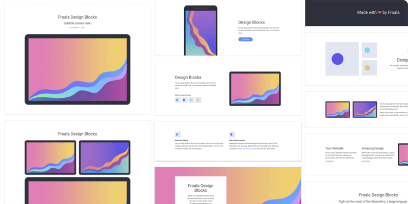
A set of over 150 design blocks totally responsive built with Bootstrap 4. To start simply use the builder and download the subsequent code. In the downloaded archive, you will find directories and files providing both compiled and minified CSS variations. At the moment of this publication, Froala Web Design Blocks supports all major web browsers.

What you got here is a CSS mask effect that on hover, the mask is animated with a gooey flowing effect. It's built with Sass SCSS preprocessor and mainly uses SVG properties. Created by Codepen user Irem Lopsum.
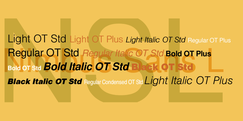
Nimbus Sans L is the free version of the font that comes with Adobe sources Nimbus Sans. The characters were made with metrics almost identical to Helvetica and Arial. The font is also the standard typeface for GNU/Linux distros. Nimbus Sans L comes in four different styles, Regular, Bold, Regular Italic and Bold Italic and on the four style combinations, Nimbus Sans L has 755 characters, languages support Baltic, Basic, Cyrillic, Basic Greek, Basic Latin, Catalan, Central European, Euro, Turkish and Western European.

Nimbus Sans L is the free version of the font that comes with Adobe sources Nimbus Sans. The characters were made with metrics almost identical to Helvetica and Arial. The font is also the standard typeface for GNU/Linux distros. Nimbus Sans L comes in four different styles, Regular, Bold, Regular Italic and Bold Italic and on the four style combinations, Nimbus Sans L has 755 characters, languages support Baltic, Basic, Cyrillic, Basic Greek, Basic Latin, Catalan, Central European, Euro, Turkish and Western European.
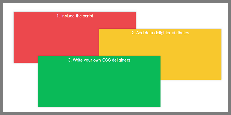
Delighters.js is a lightweight, declarative, flexible, zero-dependency JavaScript scroll-triggered animation library that toggles class names as you scroll. The library lets you apply interactive animations to any element when they become visible in the viewport. Supports both mobile and desktop devices. Simply add the ‘data-delighter’ attribute to your elements, apply your own CSS3 animations to the element, you can also specify the scroll position (start/stop threshold) at which you want to trigger the animation in the ‘data-delighter’ attribute. It Degrades gracefully to your default styling. Developed by Martin Kool.

Vueds is an open source tool for building UI Design Systems that provides a set of organized tools, patterns, and practices working as the foundation of your application development. Vueds has features like Editing Living Documentation where using a custom version of Vue Styleguidist and Component Status where you can get an automated overview of how your design system progresses over time and what is still left to do.The recommended way is to keep Vue Design System separate from your applications and use the system library via NPM as a private dependency. Vueds is developed by Viljami Salminen.
Sails.js is a Model-View-Controller (MVP) web application framework that supports a more modern data-oriented style but designed to resemble frameworks like Ruby on Rails. Sails is compatible with any front-end: Angular, React, iOS, Android, Windows Phone, custom hardware, or something else entirely. Building on top of Sails means your app is written entirely in JavaScript, the language you and your team are already using in the browser.
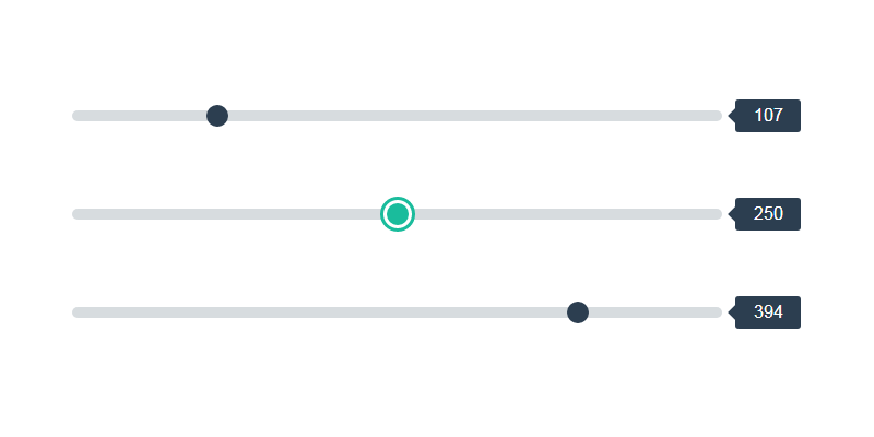
CSS styled linear sliders that range from 0 to 500. Top and bottom sliders have a step of 1 while the middle one has a step of 50 along the horizontal axis. JavaScript is used only to grab the values and the code itself is highly modifiable. Made by Codepen.io user Sean Stopnik.
![]()
Chaplin, Gandhi, Batman and Nikola Tesla are among others in this quality icon pack full of personality. Thick border outline and flat icon design approach. The package contains 30 free vector avatar icons in PNG, SVG, Ai, and Iconjar. Made by diversityavatars.
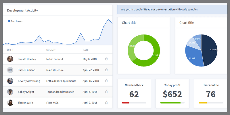
Tabler is a stunningly beautiful admin dashboard template with a fully responsive design, support for mobile, tablet and desktop. Tabler is responsive in all major browsers works perfectly with: latest Chrome, Firefox+, latest Safari, Opera, Internet Explorer 10+ and mobile browsers with continous support and updates. The dashboard only use modern web technologies like HTML5 and CSS3, includes some subtle animations, and a clean code structure following Bootstrap’s guidelines to make integration as easy as possible. All code is handwritten and W3c valid. Tabler also includes over 20 individual pages featuring various components, giving you the freedom of choosing and combining. All components can take variation in color and styling, that can easily be modified using Sass.
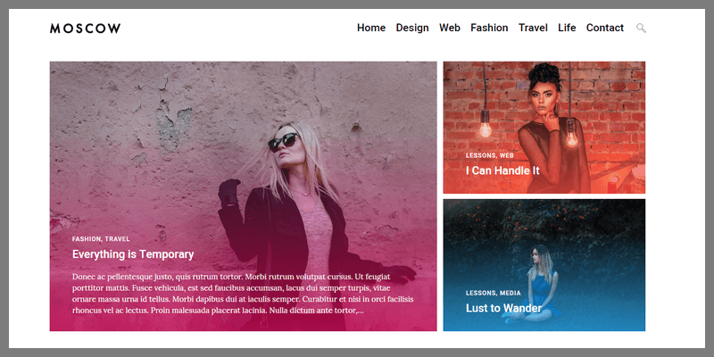
Moscow is a free, SEO optimized theme for WordPress that is lightweight fast and easy to customize. It is perfect for personal fashion travel food and lifestyle blogs. It features a fully responsive design, with a 3-panel image grid under the top menu, which is a sticky scroller top bar, a single column layout for recent posts located on the center-left, and a right column for a variety of options like social, trending articles, subscribe panel, etc. It also includes 40+ configuration options, valid HTML5 markup, 5 Blog styles, unlimited sidebars, 5 widgetized areas, 7 custom widgets, Instagram photos, toggable search panel, and a ton of mojo and cool functionalities more! Compatible with the latest version of WordPress.
A hexagonal grid that spots images on hover and creates and spatial 3d flow on mouse movement. Its made with three.js to work with GPU graphics rendering directly on WebGL. Its design takes full range gestures that translates into a vivid motioned mosaic that brings life to your project. Created by CodePen user Ivan Juarez.
Popmotion gives the power of JavaScript merged with the simplicity of CSS to make declarative animations easily on your HTML, SVG and React projects. Its API implement semantics to make easier work with different JavaScript flavors and propose a library of custom animation to enhance your workflow pace.
Fengardo Neue is a free typeface from Velvetyne type foundry. It comes in 2 styles, Regular & Black, and features an extensive character set with support for several languages as well as diacritics, special characters, grammatical symbols, etc. You may modify the font, as well as redistribute it, and use it for personal and commercial projects, as long as you credit the author and the foundry. Created by LoÏc Sander.
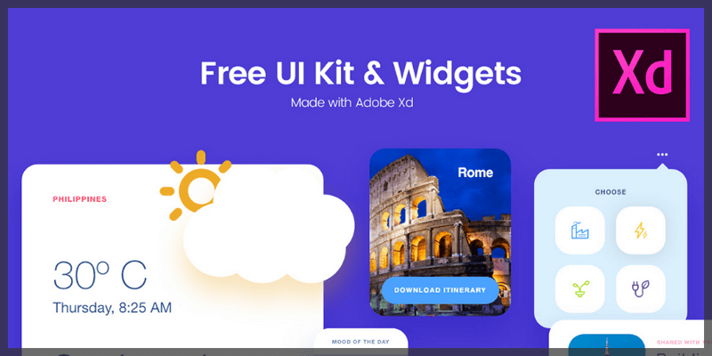
Smooth UI/UX kit made with Adobe XD by Hannan Milan. Its concept is conceived to give a modern material look to widgets and functional frames to keep it looking good.
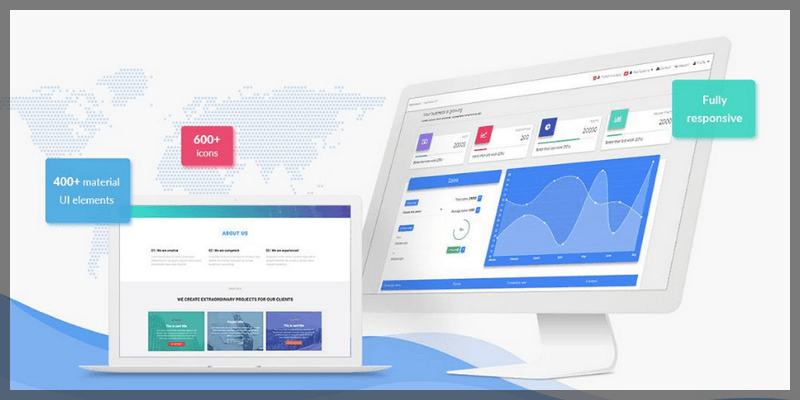
Material Design UI Kit for Bootstrap 4 featuring 400+ material UI elements, 600+ material icons, 74 CSS animations, SASS files, templates, tutorials and many more. Includes a detailed user-friendly documentation at your disposal and a wide array of tutorials to help you implement your ideas easily. Free for personal and commercial use.
Cute Avatars With Endless Possibilities
A huge collection with over 1800 unique vector elements for Illustrator and Photoshop to compose beautiful cartoon avatars and characters! You'll get access to a massive variety of elements including outfits, cosmetics & articles, hairstyles, facial components, body components, endless combinations for avatars in different postures with the ability to give them their own unique facial expressions and personalities! Get this awesome pack plus 65 premade avatars for just $19!
Check Out A Full Listing Of Contents!
- 1800 Total Elements.
- Fully Editable Vector Ai & PSD Files.
- All Elements Arranged and Divided By Gender.
- 60 Hair Styles.
- 60 Facial Hair Items.
- 60 Heads.
- 330 Legs.
- 210 Arms.
- 435 Bodies.
- 300 Facial Expressions.
- 56 Eyebrows.
- 50 Noses.
- 30 Facial Marks.
- 50 Glasses & Other Objects.
- 40 Default, Ready To Use Characters.
- 25 Bonus Characters From Famous Tv Shows, Movies, and General Pop Culture.
- Thousands Of Poses, Expressions, And Combinations. Endless Possibilities!
Full Content Previews! (Back to Top)


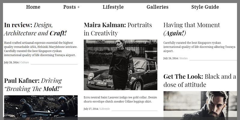
Hive is a top-notch blogging WordPress theme with a special focus on typography and versatile layouts. A great choice for publishers of all kinds featuring a clean layout, modern typography, and flexibility. It's 3 column masonry-style layout is ideal for displaying articles, news, product reviews, etc, in a clean and orderly fashion. The theme is fully responsive, SEO optimized, and features a sidebar inside of the post details to add whatever widget strikes your fancy. Get the Lite version completely free!

Awesome freebie from Hannah Milan containing 12 Email Templates for Adobe XD, great for online shops to use for greeting/newsletters for their subscriber mailing list. The templates feature several choices of layouts like listings, image grids, product detail, etc, as well as buttons for purchasing/learn more, favicons for social media, and fully responsive design.
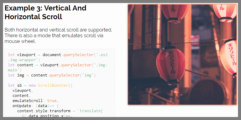
ScrollBooster is a powerful content drag to scroll javascript library developed by Ilya Shubin. Its lightweight (~2KB gzipped), offers a nice array of usage methods and options, like bounce effects with/without inertia, scroll friction, and much more. It supports all major browsers like Chrome, Firefox, and Safari, as well as IE 11 and Edge. Released under MIT License.
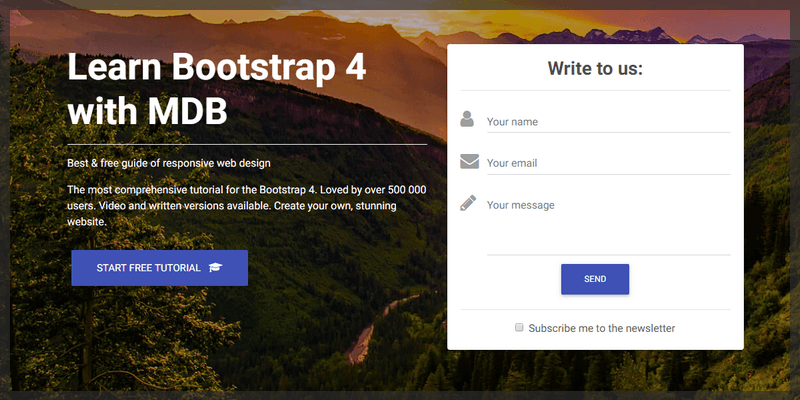
A landing page template created with Material Design for Bootstrap Framework featuring several call to action buttons, a full-width hero image with a contact form, a sticky top bar scrolling menu, and a pleasant layout to display relevant information in columns, grids, and videos with bulleted listings of features next to them.

Huge gallery of CSS gradient colors perfectly suited for backgrounds that you can copy and paste directly into your project. Simply search the library, pick a gradient of your liking, and copy the CSS to add it where necessary on your project. This gallery is made by Eggradients and so the gradients are served in form of egg shapes.
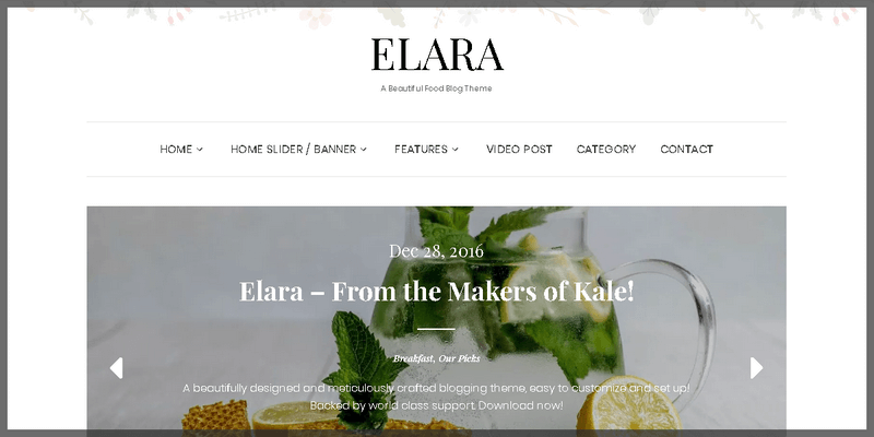
This sleek restaurant theme has several grid sections featuring food categories with a description box by its side. The main section has a broad image slider with fade-in transitions and a middle parallax section perfect to showcase featured items. It can also work as fashion o beauty blog, where showcasing items can be assured by the general scope of the theme.
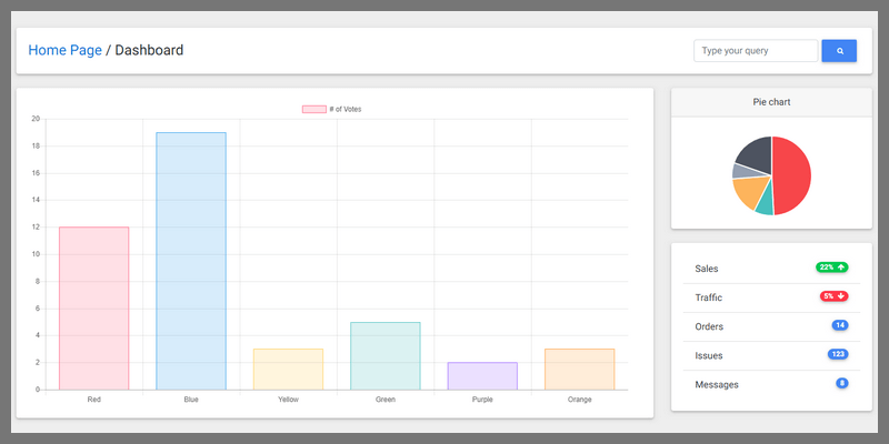
A slick material design admin dashboard template from MDBootstrap containing line graph charts, pie charts, radar charts, data tables & presentations, analytics insights components, modal boxes, google maps integration,
A condensed display font with a slick tall character design, created by João Scarpim. Features a full character set for Latin Script in uppercase only, and its free for personal and commercial use.
Fictoan is a simple SCSS framework with intuitive, descriptive class names, developed by Sujan Sundareswaran. It's fully customizable, allowing to tweak a variables file to have different styling rules for separate projects without rewriting each time, responsive across devices with .one-fourth, .one-third-on-tab-ls, .six-eights-on-mobile and so on. To install, simply drop the dist/fictoan.css file into your project and you’re good to go!
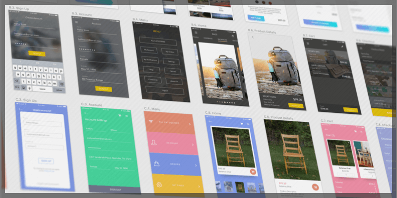
Neat UI Kit for Ecommerce apps, created by The Design Process, perfectly suited for startups and online shops to launch an app with a store function on it. Features 20 fully editable screen templates including sign up/login, main menu, sidebar menu, categories, shopping cart, grids for products, product details, and much more. Available in Sketch format, use this UI kit as a base for your personal and commercial projects.
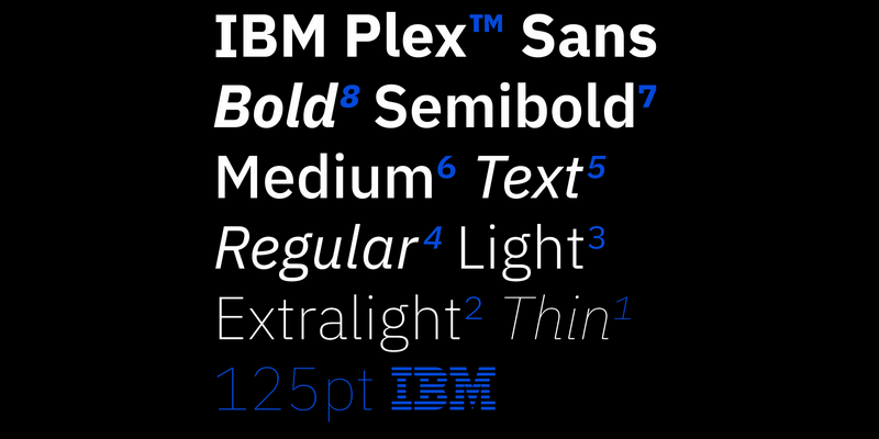
Plex is IBM's new typeface, with a slick design, a wide array of variations and matching italics for each of them as well as their respective weights, IBM Plex is as versatile as it is powerful. It features Serif, Sans-Serif, Mono, and Condensed styles, as well as Thin, Extra Light, Light, Regular, Text, Medium, Semi-Bold, & Bold weights, matching italics, an extensive glyph set with real support for over 100 languages including special characters, diacritics, symbols, etc, and it can be used for just about any purpose, from Display and Signage to Body-Copy, Headlining, and more. Download for free and enjoy!
BundleStorm V1 & V2:
BundleStorm is a humongous collection of design assets like no other, and with this promo you can get both Version 1 & 2 in one fell swoop! Thousands upon thousands of royalty free stock photos, overlays and layer styles for Photoshop and Illustrator, infographics, vector icons, seamless vector patterns & textures, abstract fractal art images, hand drawn ornamental swirls and curls, frames badges, crests, banners, avatar/character creation kits, user interface kits, isolated people, fruit, and plant photos, and much more! Every asset included works for Photoshop and Illustrator, including PSD, Ai, and EPS formats to take your design work flow to the next level!
Normally, access to all of these assets would be priced at $294 for one year, so get this awesome deal and get unlimited access to all of these assets for just $19!, come check out full content previews!
Contents Include: (Back to Top)
- 5k+ Royalty free Isolated Stock Photos, People Stock Photos, and Images.
- 717 High-Res Textures
- 11,000+ Photoshop Gradients
- 421 Vector Files including foliage, diamonds, seals, sunbursts, arrows, pointers,and much more!
- Adobe Photoshop ActionsAdobe Photoshop Actions.
- 1400+ High-Res Textures and Flower stock images
- 3k+ Patterns Seamless Vector Patterns
- 2k+ Ornamental Elements, Flowers, Swirls, Flourishes,
- 2235 Vector Icons in EPS and Ai formats.
- Office Mascot Creation Kit with 22 different poses and 100 accessories in in EPS format, to create thousands of custom variations!
- 1000+ Seamless Textures.
- 2700+ Seamless Photoshop Patterns (.pat).
- 265 High-res Textures including Bricks, Walls, Concrete, Pavement, Rocks, and much more, with 7340×4560px resolution.
- 57 Abstract Fractal Art images.
- 320+ hand-drawn ornamental Swirls and Curls in vector format (EPS).
- Thousands of Badges, Labels, Crests, and Banners in vector Ai and EPS formats.
BundleStorm V1:
BundleStorm V2:
Full Content Previews! (Back to Top)


