Web Design Shock - Archives (mai 2018)
Design resources and high quality articles

A music player app UI with a flat design and an iPhone mockup display. It's highly interactive and functional, perfect to feature your audio creations. Designed and developed by Codepen user Emil.
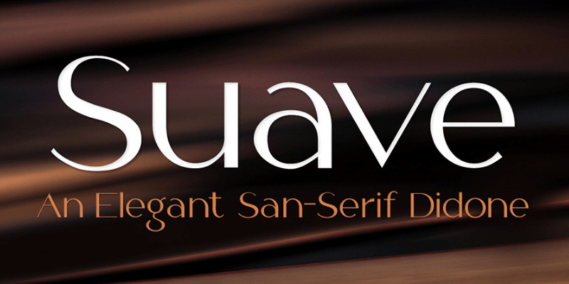
All Caps sans-serif typeface that combines smooth curves and sharp contrasting lines that expresses a beautiful neo-retro feel of the printing media from the 19th century. It works well for headlines, body text as well as typographic layouts. Created by Behance user Manu Ambady.
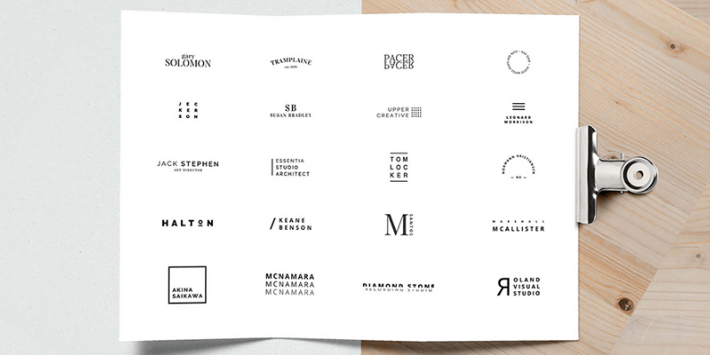
This pack contains 20 different logo templates in Adobe Illustrator and Photoshop file format. All available in clean, and simply stylish design to use for any of your projects. Designed by Nicola Tolin.
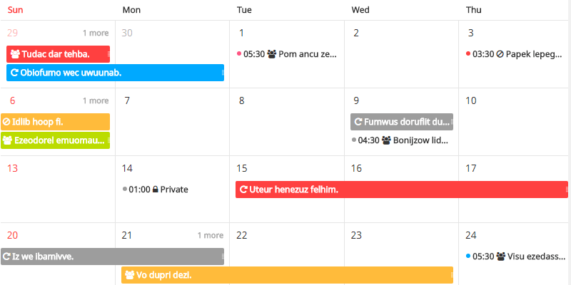
A fully customizable JavaScript schedule calendar. Supports various view types, efficient management of task schedules, dragging and resize adjustment by mouse, and an option to customize the UI by theme.
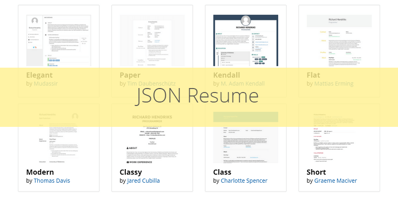
JSON Resume is a community-driven open source project to create a JSON based standard for resumes. The initiative has conversion tools that allow you to move your .json resume file into other file formats like HTML, PDF among other utilities that empower your resume creation.

JSON Resume is a community-driven open source project to create a JSON based standard for resumes. With lots of themes to style your CV and tools to manage, and convert your .json resume file into HTML, and PDF.

6 layered screen designs for an iOS driving/logistics related app. It makes uses of a flat style art making extensively use of color gradients as a differentiator in sections and buttons all with an intuitive design. The screens are free for personal and commercial use.

A website theme design with a large image-grid section and a simple display concept focused on visual content. It only uses text for the side navbar in order to keep it clean and neat. Created by Codepen user Muna in inspired by Leslie Davids' website.

The Last Avatar Creator Bundle You'll Ever Need:
This epic megabundle features an absurdly large collection of over 11,000 vector elements in Ai and PSD formats, premade avatars, icon avatars, mascots, and characters, put together from 10 creator packs, and you can get them all at once bundled together in this awesome character & avatar creation kit! Mix and match eyes, noses, ears, mouths, head shapes, hairstyles, outfits, accessories, and much more to easily edit or create your own personalized avatars. You'll get over 11,000 assets including hundreds of premade robots, monsters, and humans, which you can use to compose your very own and unique character easily in Adobe Illustrator and Photoshop.

This Awesome Characters & Avatars Themed Bundle Features:
- 10 Large Bundles Put Together Into a Massive Avatar Creation Pack
- Over 12,000 Generator Elements.
- Truly Unlimited Possible Combinations
- Premade Robot, Monster, and Human Avatars & Characters Included.
- Fully Editable Vector Shapes (Ai & PSD) For Adobe Illustrator and Photoshop.
- Many design styles including Flat and Material Design.
- All The components necessary to create custom avatars and characters with their own looks and facial expressions
Avatars, Characters, and Creator Packs Included:
- Flat & Material Design Avatars
- Avatar Icon Creator Pack
- Cute Cartoon Avatar Generator
- Cute Icon Avatars Pack
- Huge Vector Characters Set
- Mega Business Characters Bundle Vol. 1
- Mega Business Characters Bundle Vol. 2
- Flat Vector Characters Pack
- Vector Monster Mascots Pack
- Flat Vector Robots Set
Flat Vector Characters Pack Back To Top


Flat Vector Robots Set Back To Top

Avatar Icon Creator Pack Back To Top
Cute Cartoon Avatars Generator Back To Top
Cute Icon Avatars Pack Back To Top
Flat & Material Design Avatars Back To Top
Huge Vector Characters Set Back To Top

Mega Business Characters Bundle Vol. 1 Back To Top

Mega Business Characters Bundle Vol. 2 Back To Top

Vector Monster Mascots Pack Back To Top

![]()
Set of 20 animal icons in a simple shape style art, featuring the core essence of each animal. The icons have small unique details that make them feel unique and custom. The bold style of the icons ensures that it will work at any size. Designed by Behance user Steve Wolf.

Rustic, fresh and casual styled font ideal for composing condensed titles and short texts. with 490 glyphs, diacritics, and support for over 103 Latin languages. Designed by Daniela Raskovsky and Pablo Cosgaya under SIL Open Font License.

Package of illustrations allusive to the commemoration of Ramadan, with 4 files full of illustrations in flat style art and a calligraphy all in Adobe Illustrator(AI) file format. Created in collaboration by Wessam Eissa, Mohammad Mannaa, Hend Jamal, Nermeen Sediq, and Mohammad Wasef.
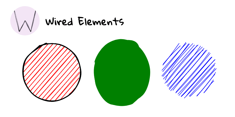
A set of UI elements with a hand-drawn sketch look. Wired Elements are implemented as web components. The elements are drawn randomly so that no two renderings will be the same. Developed by Preet Shihn under MIT License.
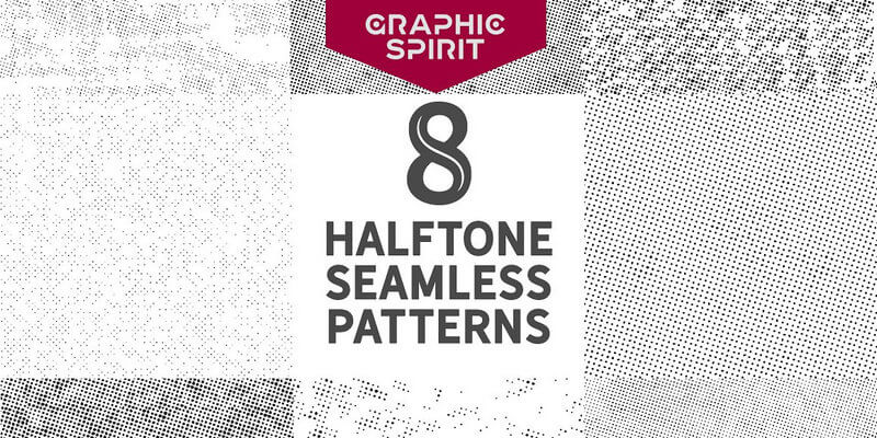
A set of 8 different seamless patterns made entirely by hand. A Halftone design based on dots maps creating a vintage feel. The patterns are delivered as entirely tileable Vector EPS files, including also JPG High-Resolution previews and a convenient User Guide to help you enhance your designs easy & fast! Find this premium collection exclusively free on ByPeople courtesy of our friends of Graphic Spirit.
![]()
Set of social icons that includes outline and filled icon variations with both rounded and square border options. The set works similarly to FontAwesome but you can also download the SVG files in case you want to edit them. Created by Github user Alan Museljich under MIT License.
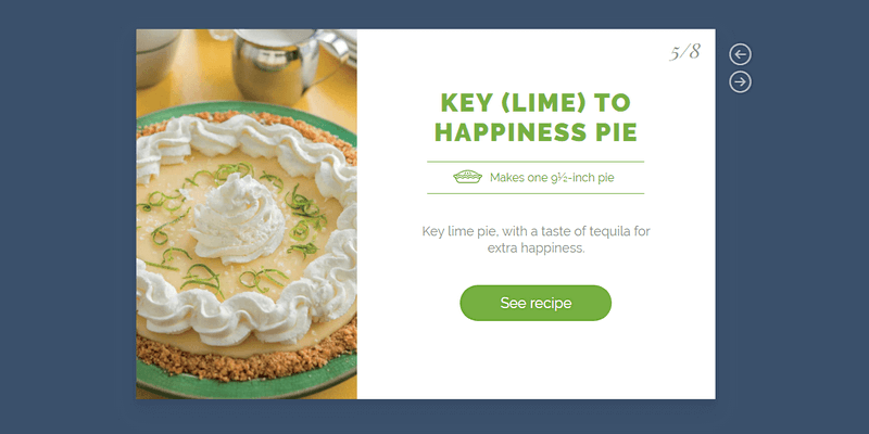
Slider element for web-based presentations. It uses Pug HTML, SCSS and JavaScript to achieve the linear transitions and to control the slides. Created by Codepen user Olivia.
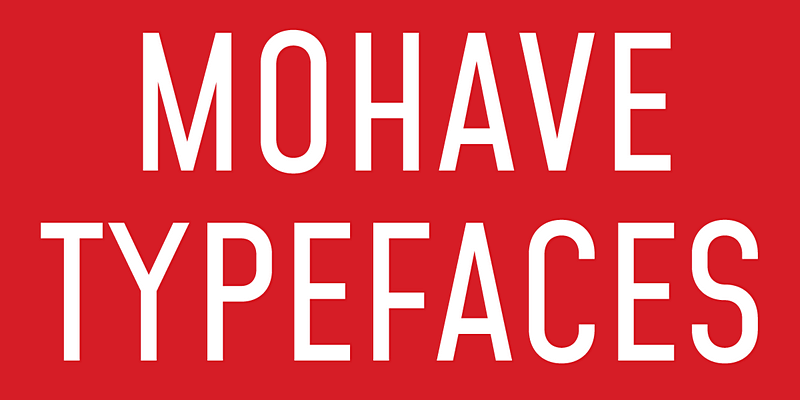
Titling all-caps font designed for large point settings with a smooth height and dynamic glyph. It has four weights in OpenType, TrueType, Webfonts, and .glyphs file formats, with support for over 80 languages. Created by Gumpita Rahayu from Tokotype and under SIL Open Font License.
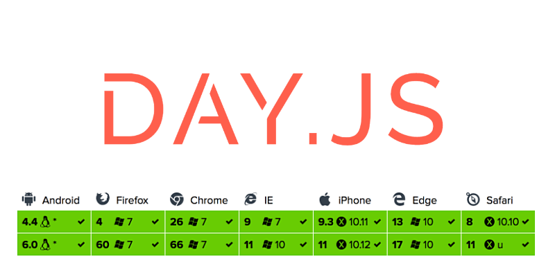
With Day.js you can parse, validate, manipulate, and display dates and times in JavaScript. This is an alternative to moment.js with a size of only 2kb, making it faster yet maintaining the same modern API of moment.js. Developed by Github user iamkun under MIT License.
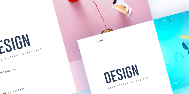
Layered header design featuring 2 columns. On the right side the label and description section and the left side showcasing the featured image. The file is in Sketch format and contains two examples designs of the header. Created by uinugget.

Cunia is a sans serif font with slightly rounded corners designed by Alejo Bergmann. It contains all caps letters numerals and symbols. This font is perfectly suited for a variety of display purposes, including logotypes badges and labels headlines and banners.

This piece of code shows you how images can be stretched with a good looking scrolling effect. Created by Codepen user Nathan Taylor.

Echoes is an HTML template with a minimal style. It features a full height hero image on the left side and the written section on the right one, in the same flow a book cover goes with its content. Also contains grid elements and more traditional post sections, all with the idea to keep it clean and simple. Created by Nicola Tolin.

Take a deep sight into the beauty of our new free Hand-Drawn Floral Collection: 73 vector thematic elements, inspired by nature & flowers, made out with carefully care of details by our friends at Carrot Design.
Including EPS and Adobe Illustrator vector formats, Fully Layered PSD, high-resolution (4000x4000 px) JPEG images and PNG files with transparent background. Usually, this premium pack is priced $9, find it exclusively free on ByPeople.


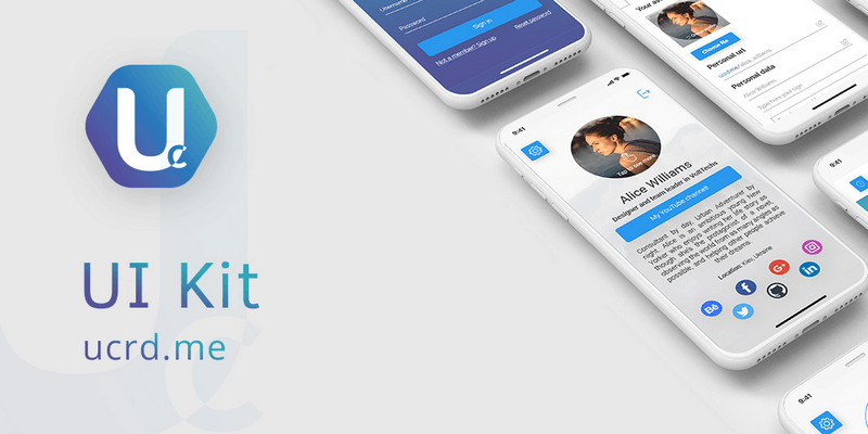
Graphical UI/UX Web Design concept with an iOS modern material style. The kit makes use of the Roboto font family and contains basic elements like buttons, navbars inputs, glyphs, icons and checkboxes skins with stunning styles; also with headers sections and samples that give you an idea of what you can do with this fantastic design.
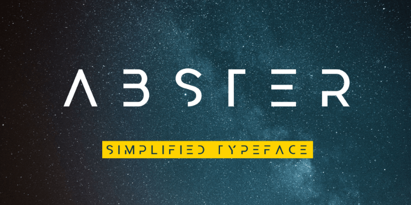
Elegant and modern geometric typeface with a simplified technological aesthetic. It includes basic uppercase Latin script characters. The font is fantastic for headlines, posters, and your branding projects. Designed by Rachel Manch, the font is free for personal and commercial use.

Geometric CSS loader that animates circular shapes in a spiral motion and along the path the shapes are gradually scaled down. Created by Codepen user Louis Hoebregts.
![]()
12 icons inspired by the language and culture where they were conceived. With a flat style, the icons are in Adobe Illustrator file format and are free for commercial use. Designed by Dribbble user Max Panchyk.
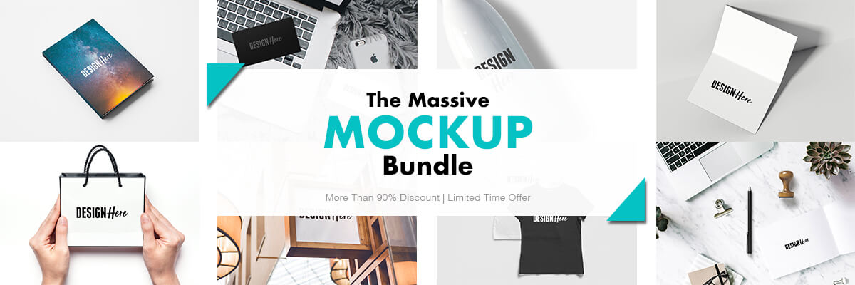
Mockups for virtually everything
131 Unique High-Quality Mockups, with the highest resolutions (up to 4500*3000px), based on real images to get a photorealistic look in all its elements. Easy replace, match & mix with the Smart Objects & Displacement Map features, to reach precise & sharper results in organized & clean full layered PSD files. Multiple topics and applications for different projects: from Branding & Stationery to Smartphone & PC Screens packs. If you were up to buy all this packs separately, the price would be about $380, but with our magnifique promotion, you can have it only $14! (96% OFF) Sounds fair, isn't it?
Detailed Features
- 131 High-Resolution Mockups delivered in PSD Format
- Smart Objects feature to add your artwork quickly
- Displacement map feature to achieve far realistic results
- Edit everything: from the colors to the backgrounds
- Some mockups include photo filters to get a perfect match
- Can be used for Commercial & Personal projects
Packages contained
- 10 Flat-lay Stationery Mockups
- 15 Essential Branding Mockups
- 10 Business card Mockups
- 7 PC Screen Mockups (1 Bonus Included)
- 6 Gift Bag Mockups
- 17 Signboard Mockups
- 5 Paper Bag Mockups
- 15 Object Closeup Mockups
- 10 Indoor Frame Mockups
- 6 Front & Back Shirt Mockups
- 10 Smartphone/Tablet Mockups
- 20 Minimal Frame Mockups
Check out the full previews


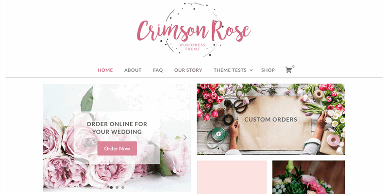
WordPress theme with a pastel color palette and a general feminine feeling, perfect for female entrepreneurs. The homepage uses widgets, and grid layout based content. This theme is designed to easily integrate with Jetpack, WooCommerce, and AffiliateWP so that you can spend less time configuring your theme, and more time writing and sharing your content to your audience. Designed by Chris Baldelomar.

This is a layered landing page design for freelancer and remote workers with a delicate and feminine touch. It contains flat style illustrations and minimalist layout in PSD format file. Designed by Aryo Pamungkas.
![]()
Super Tiny Web Icons under 1KB each. SVG versions of your favorite logos. The logos have a 512x512 viewbox (256 radius). They will scale up and down to suit your needs.
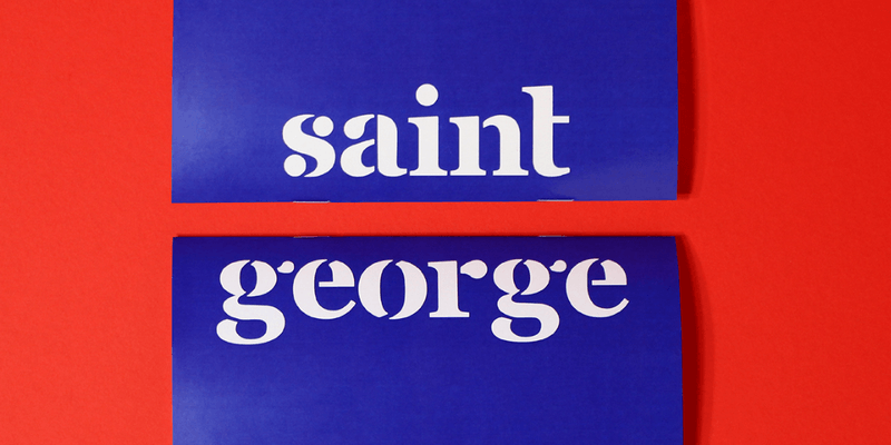
It is a bold stencil typeface available only in lowercase Latin characters, based on the common Georgia font. The theme and the type specimen are inspired by the basic Christian tale of Saint George but with a funny twist. Typeface designed by Vedran Vaskovic, it's free for personal and commercial use.

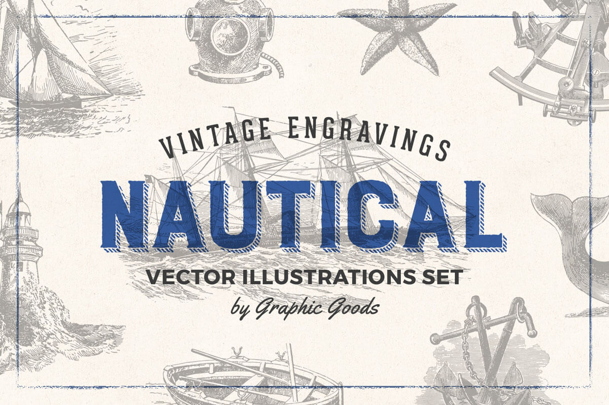
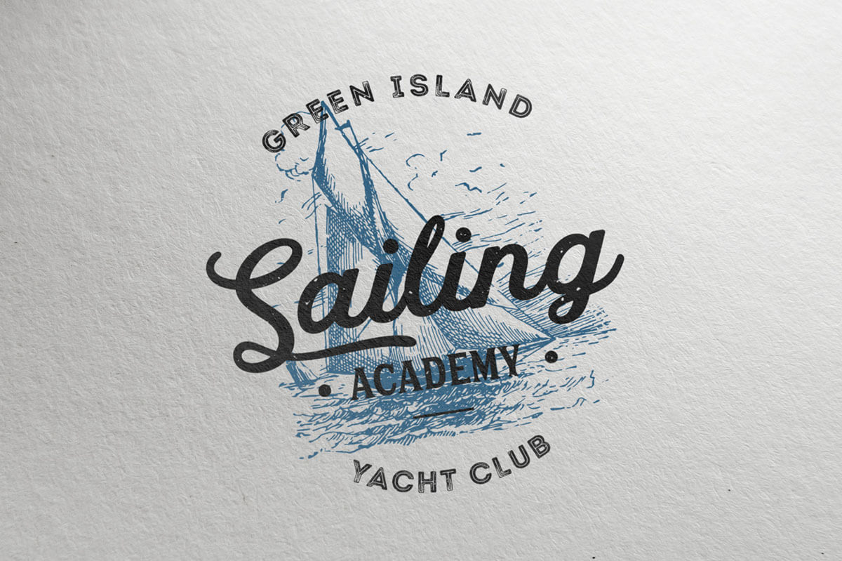
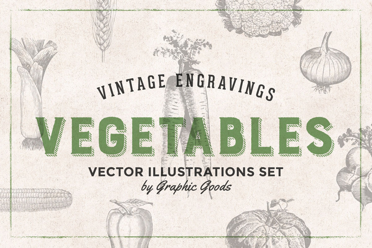
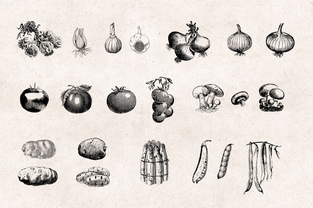
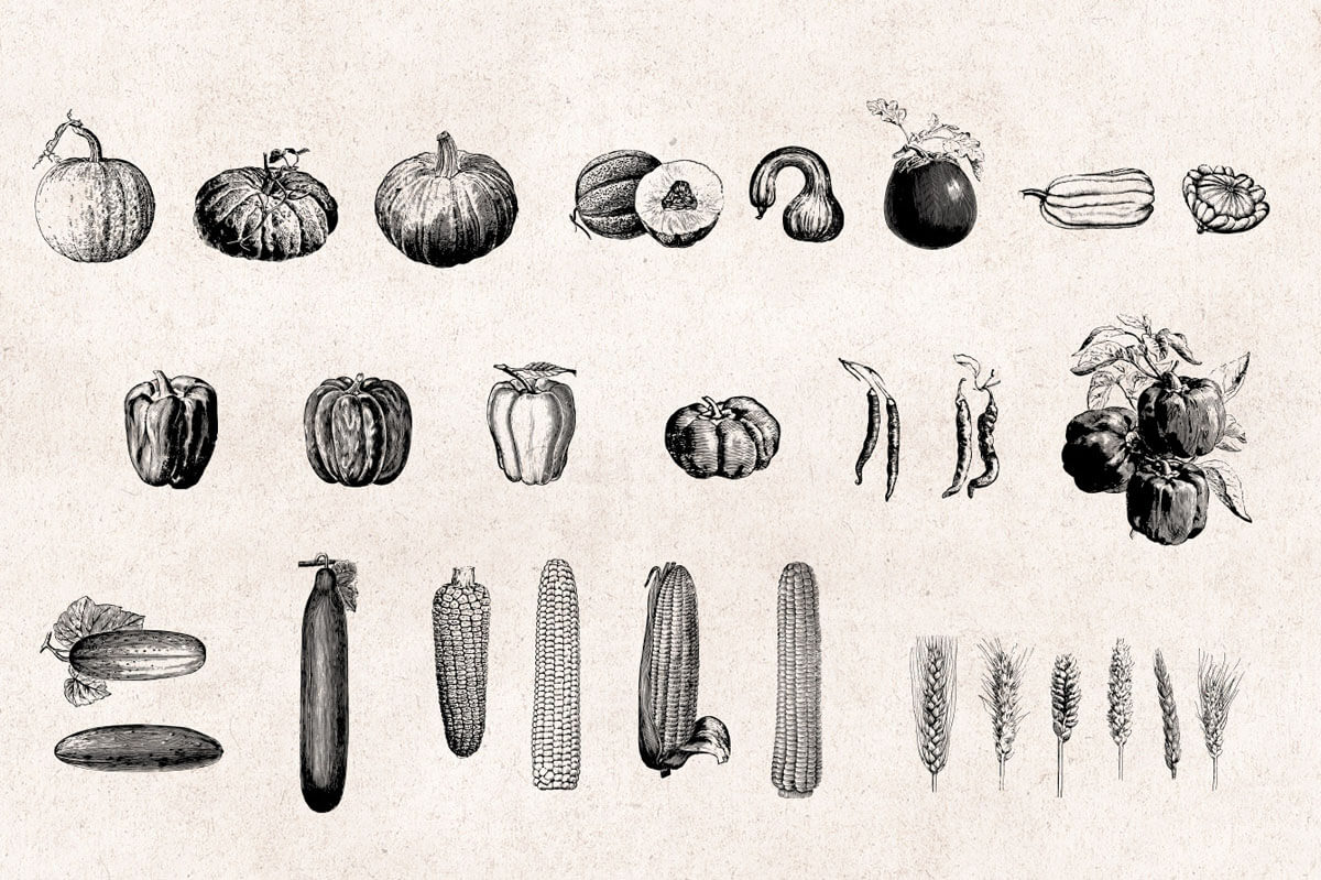
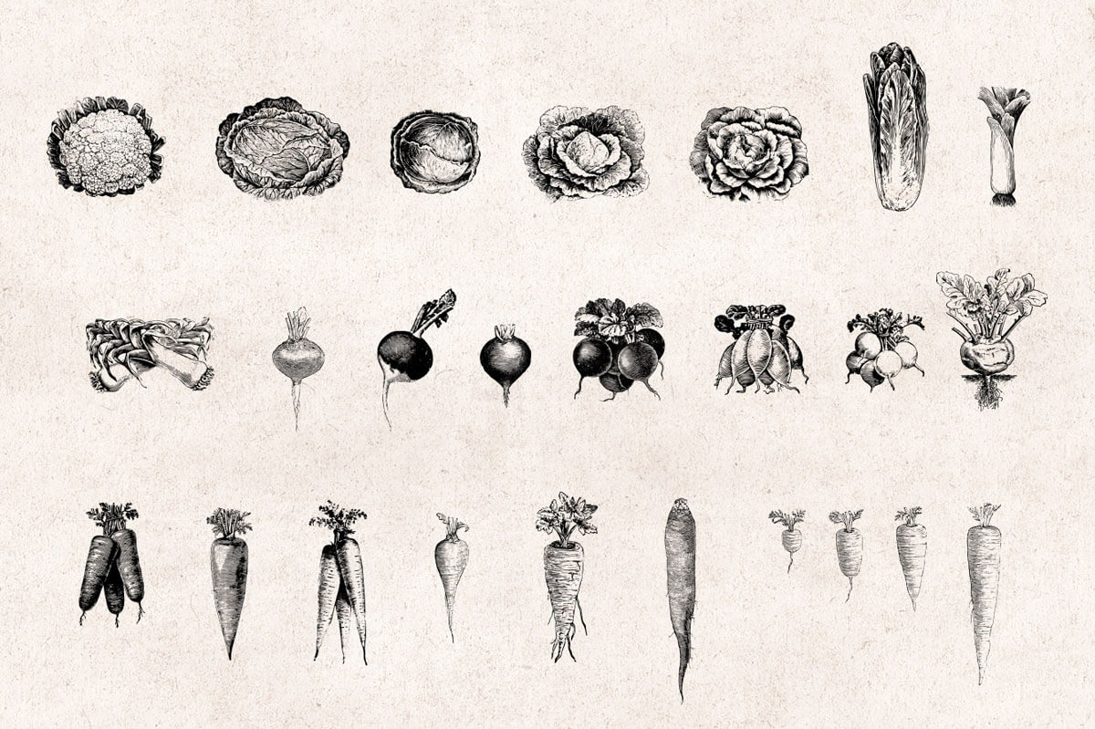
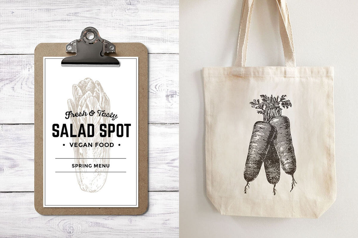
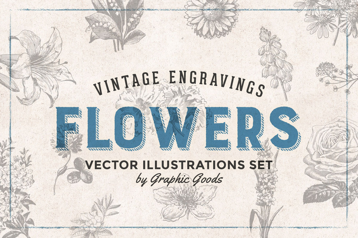
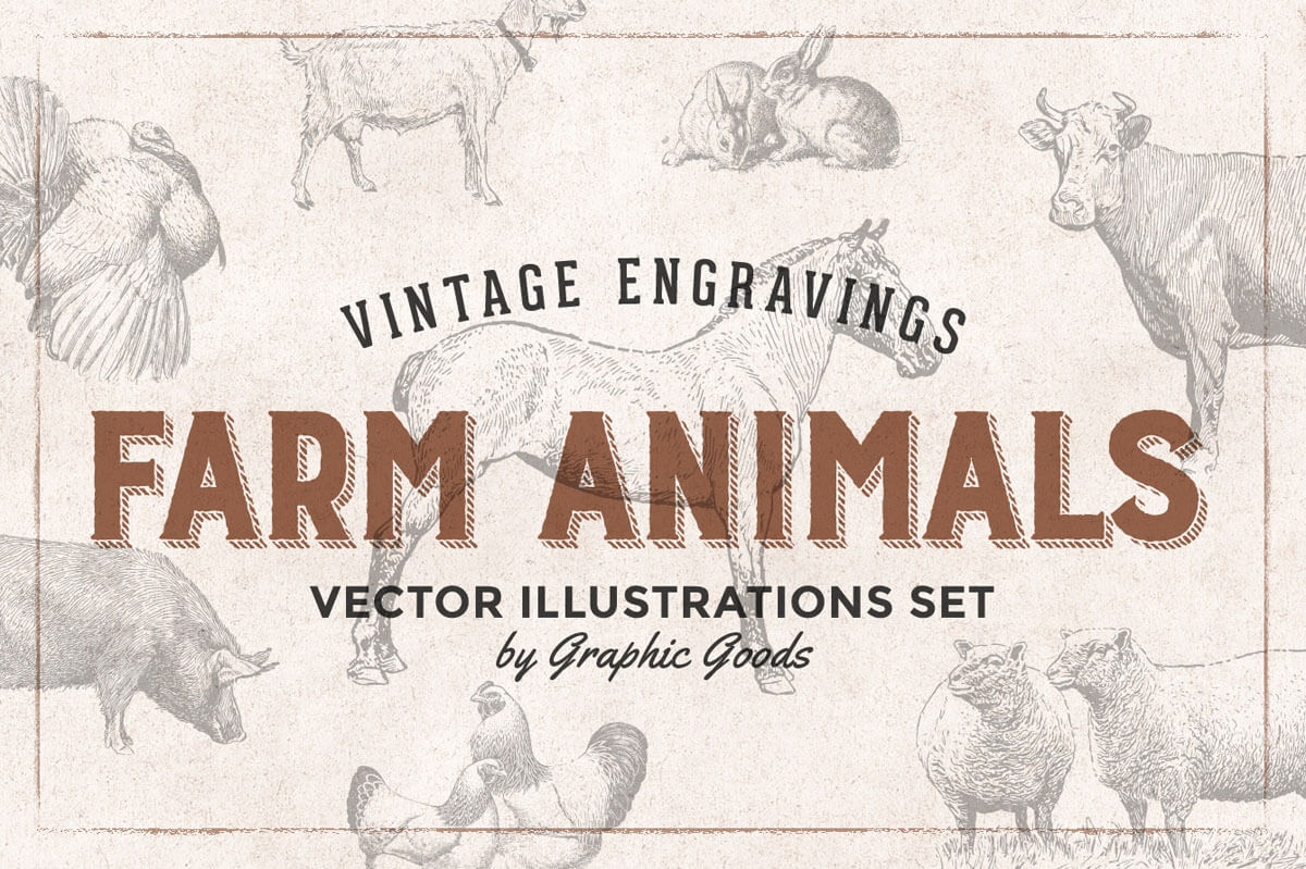
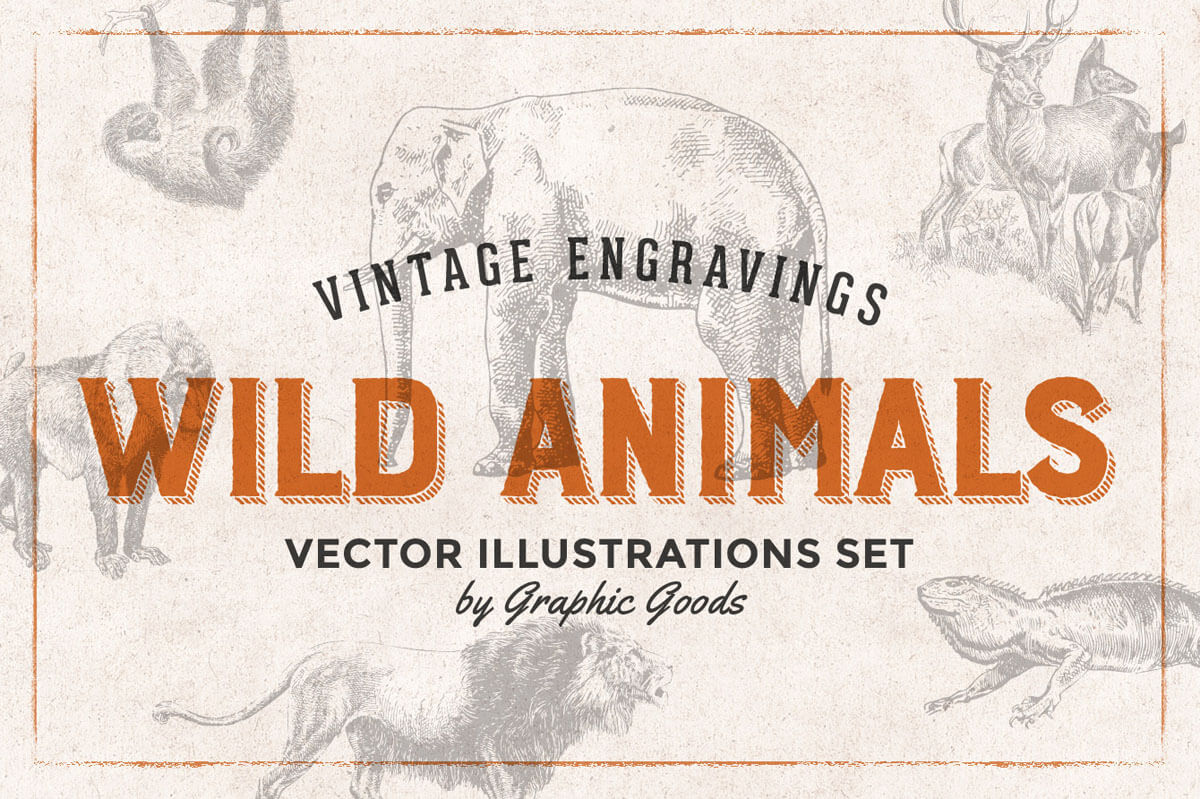
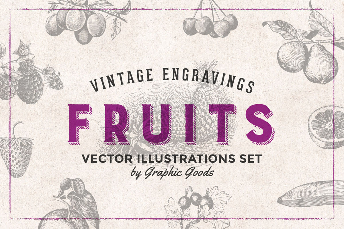
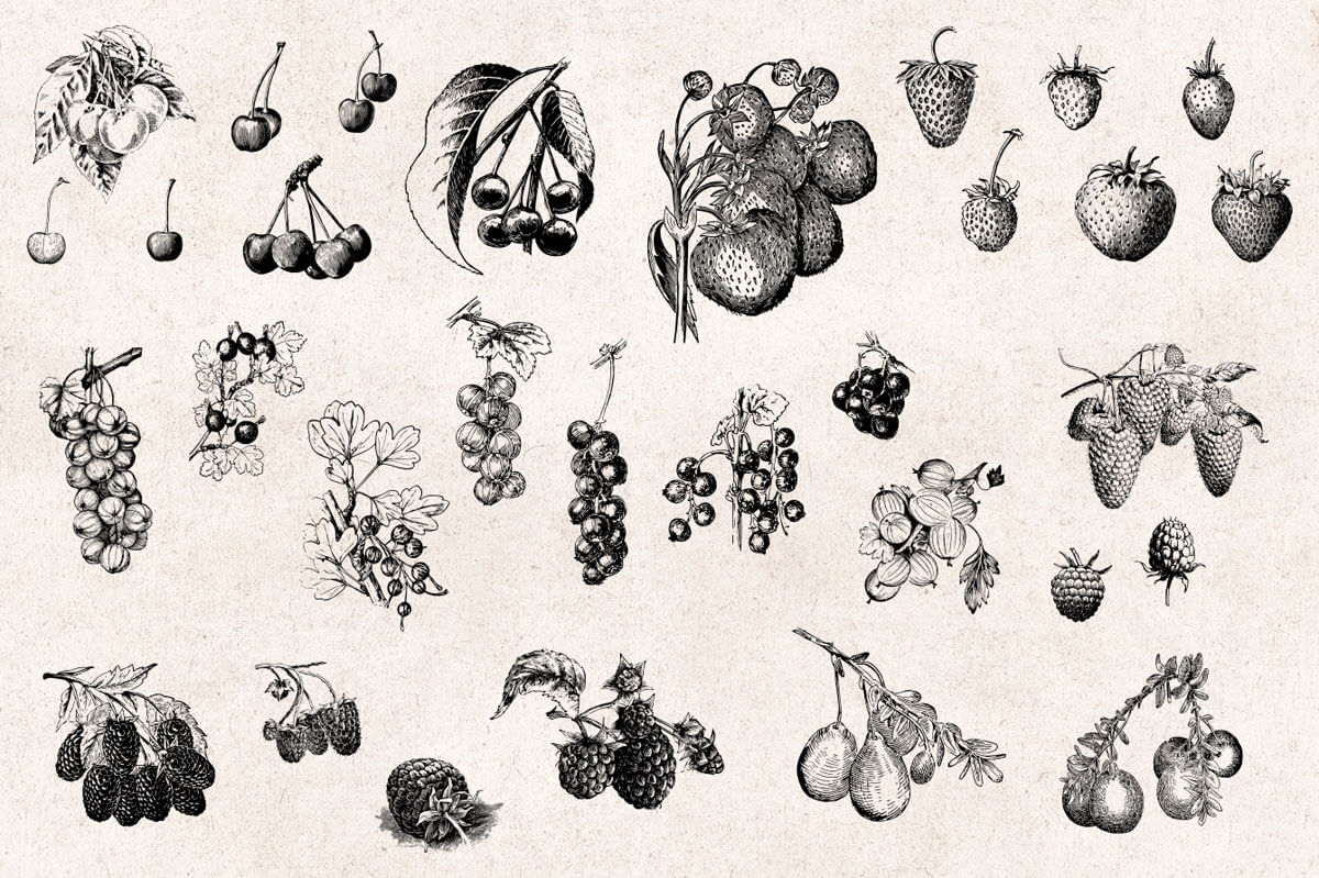
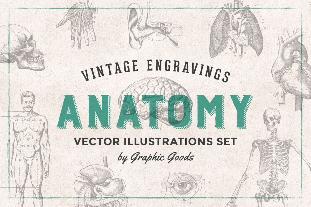
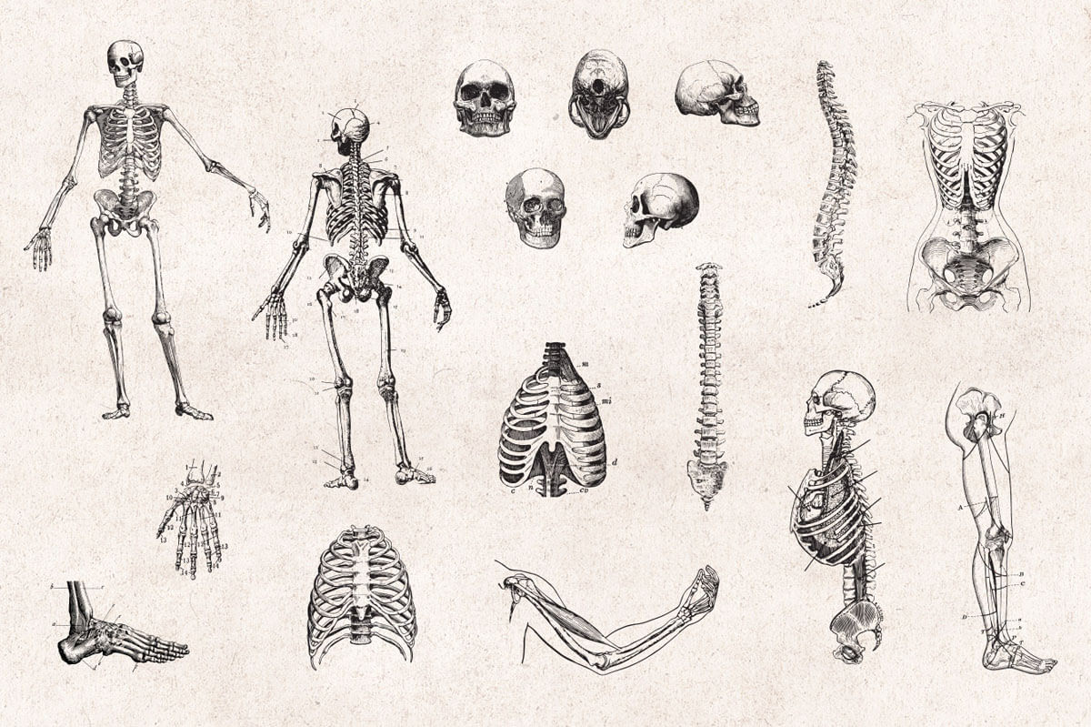
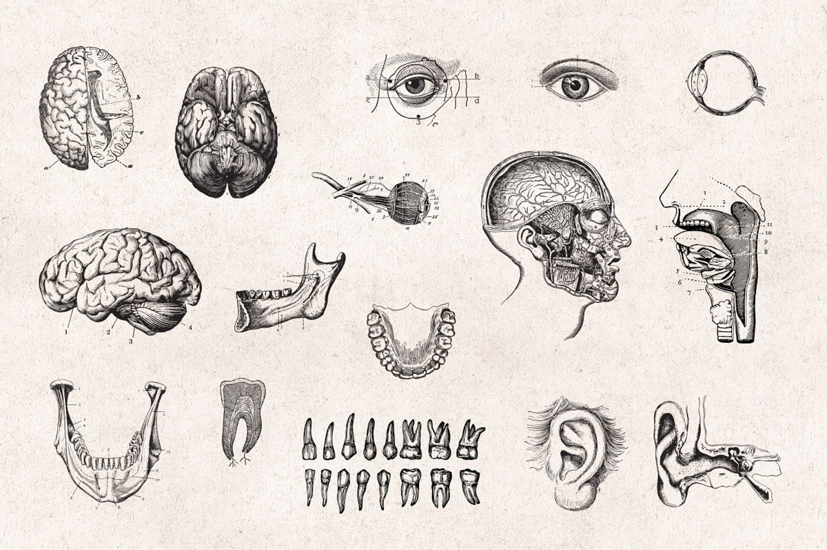
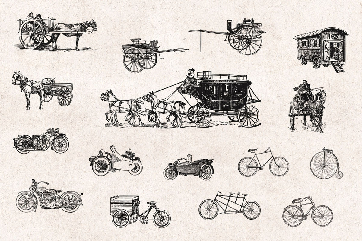
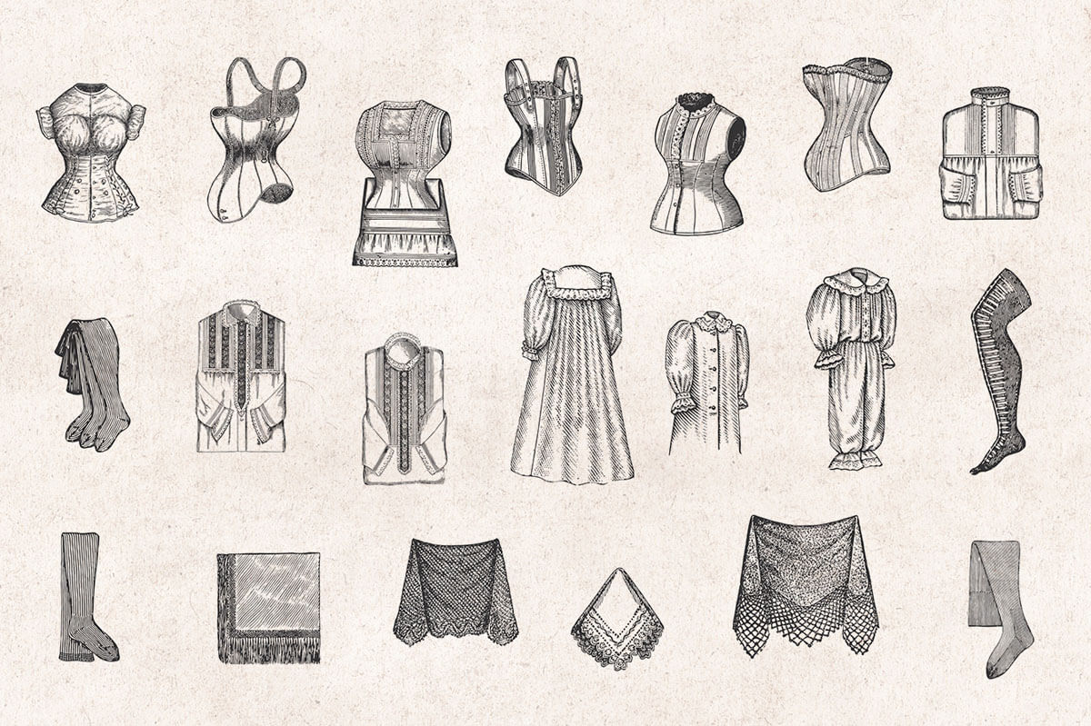
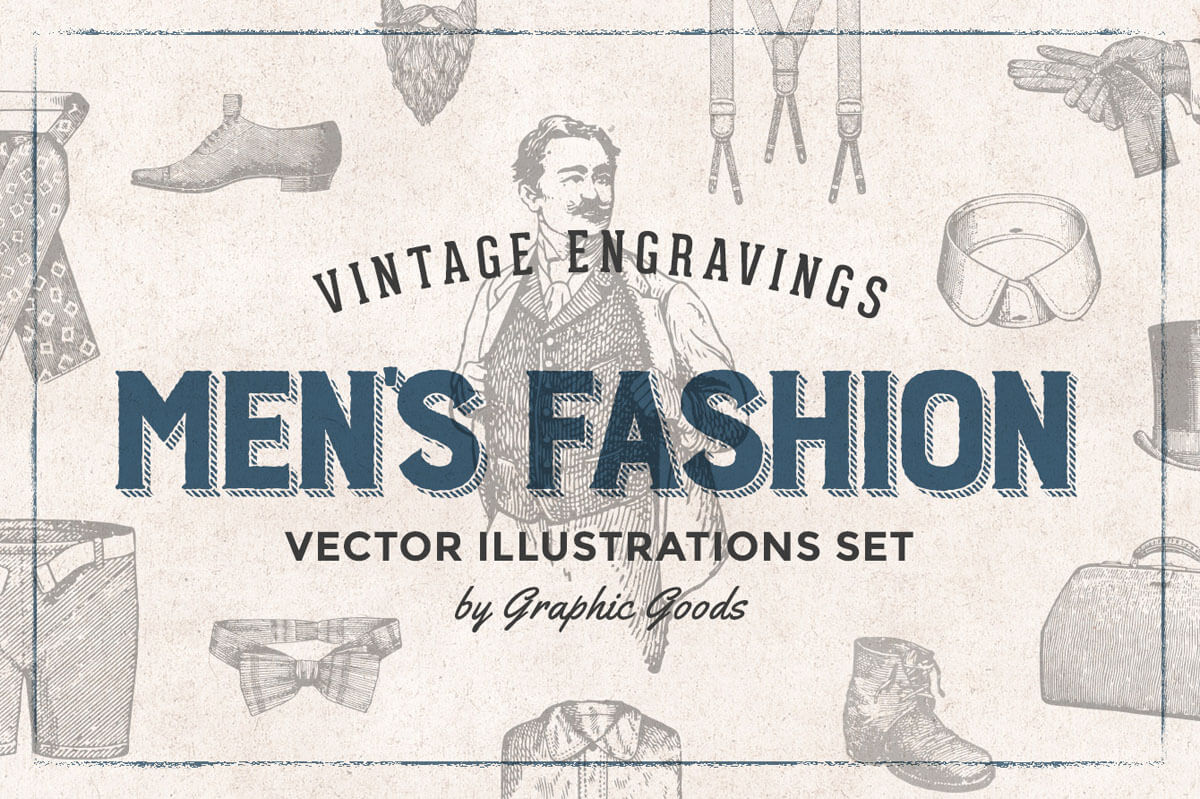
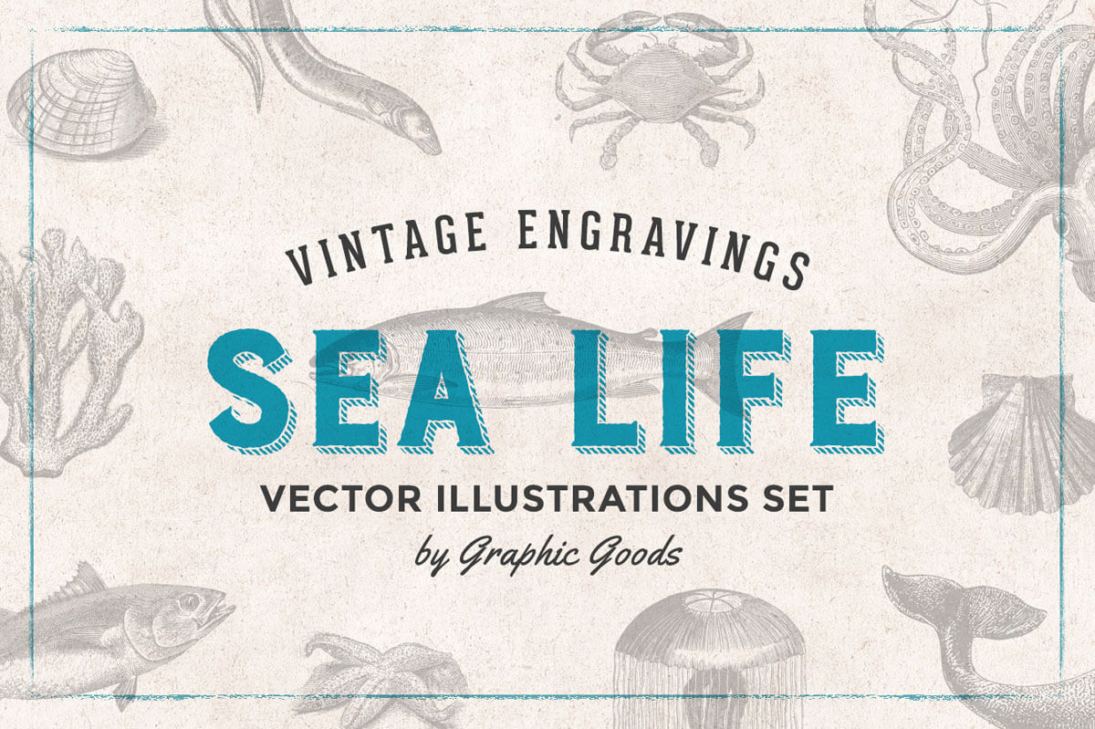
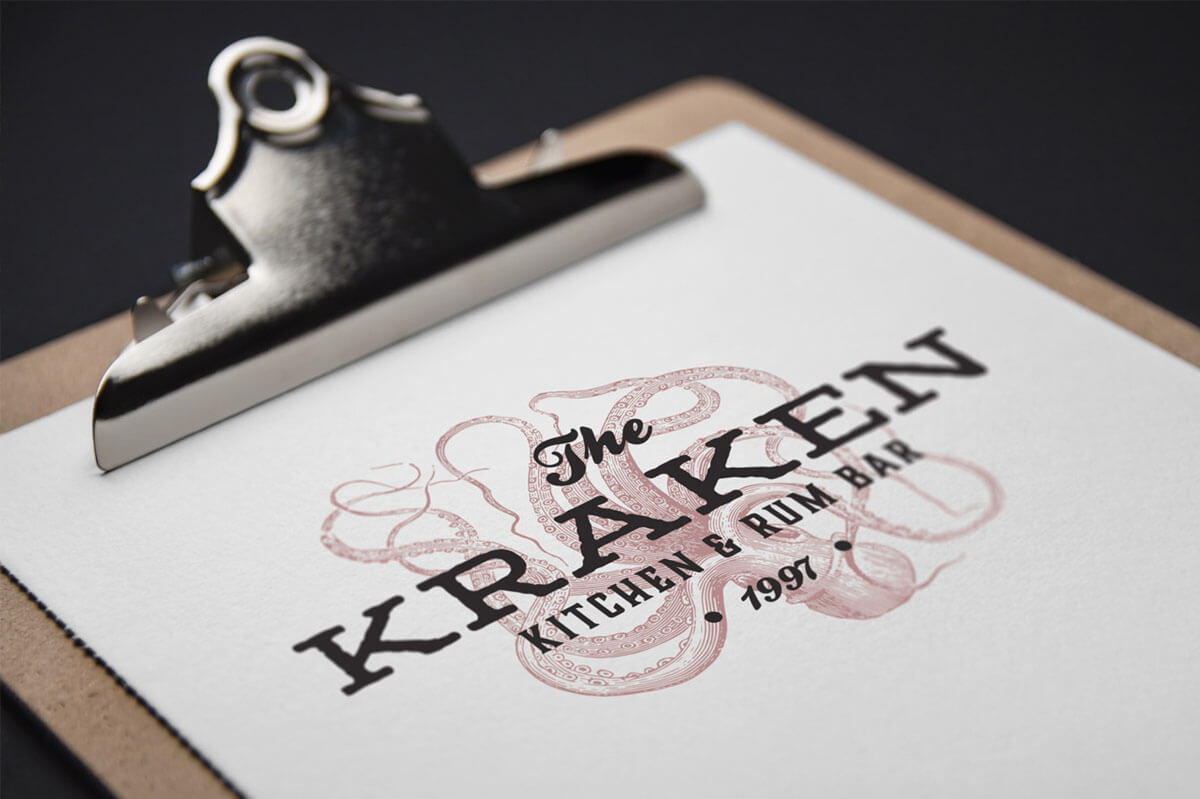
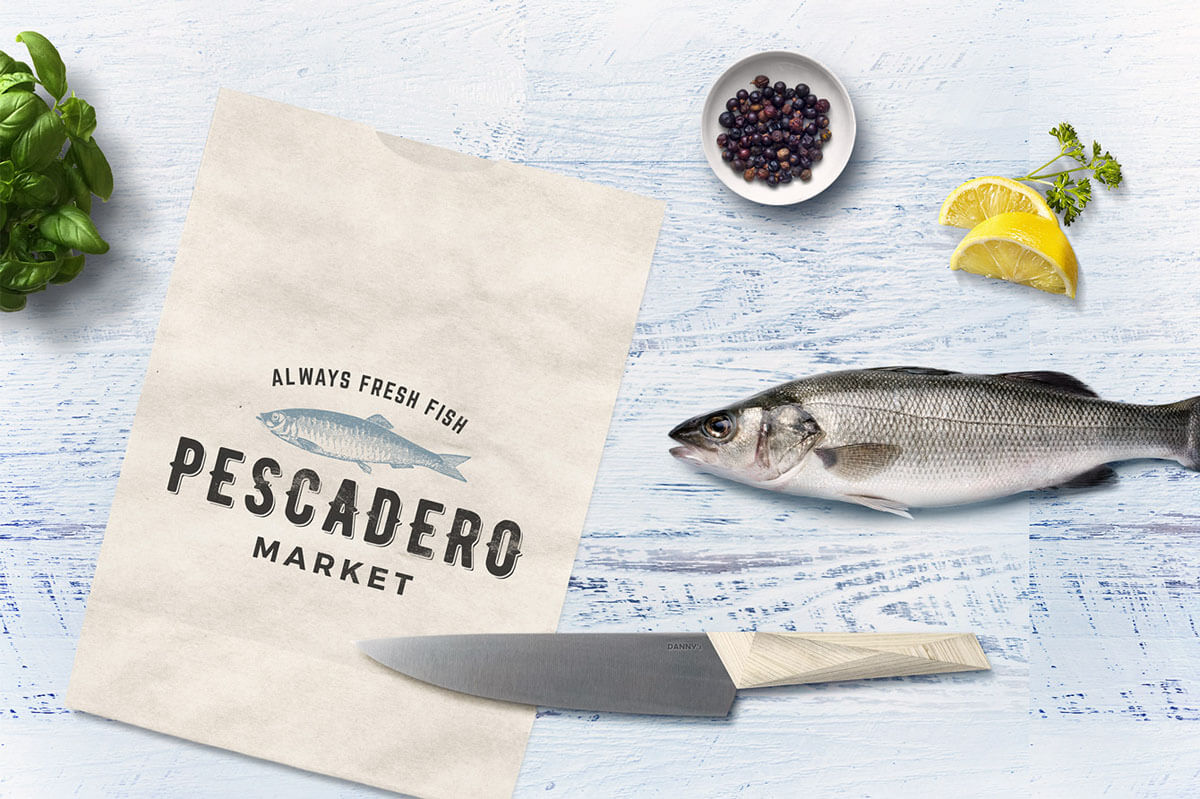
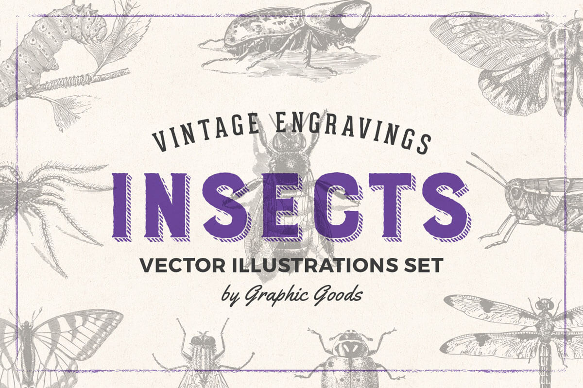
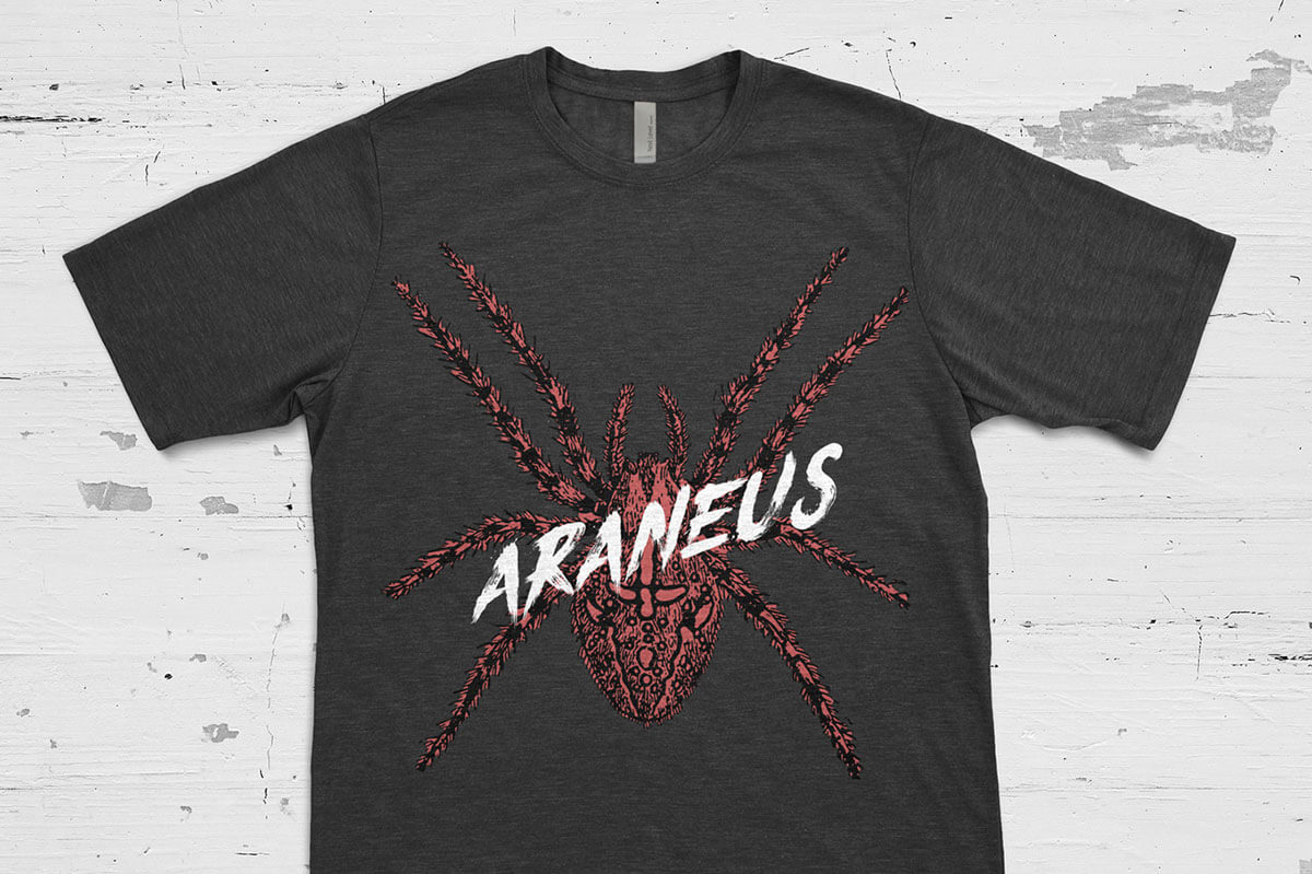
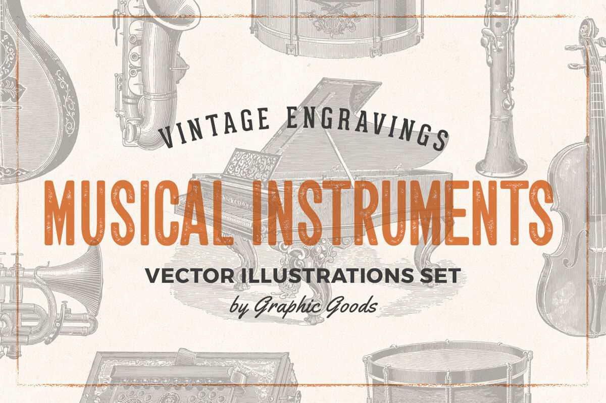
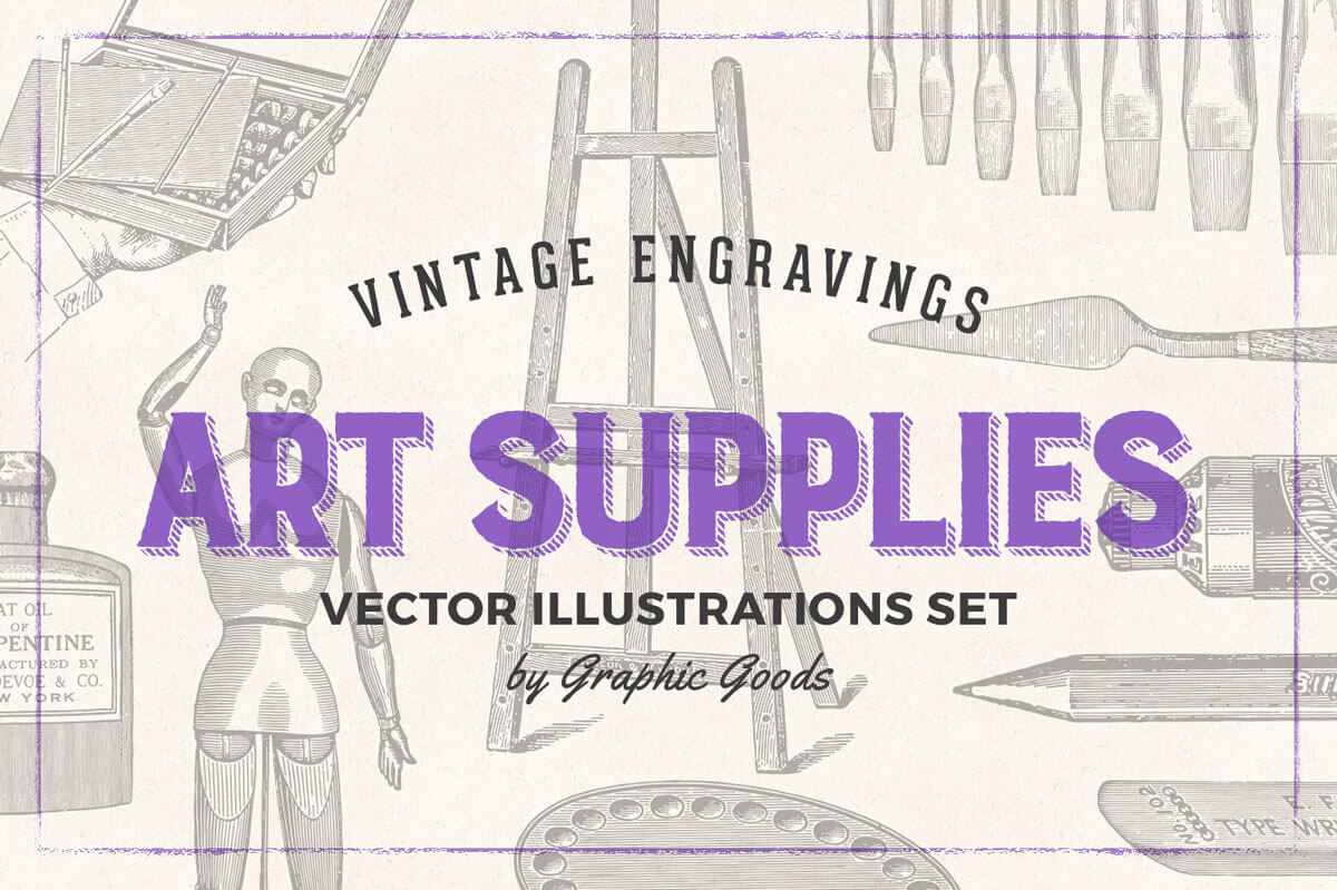
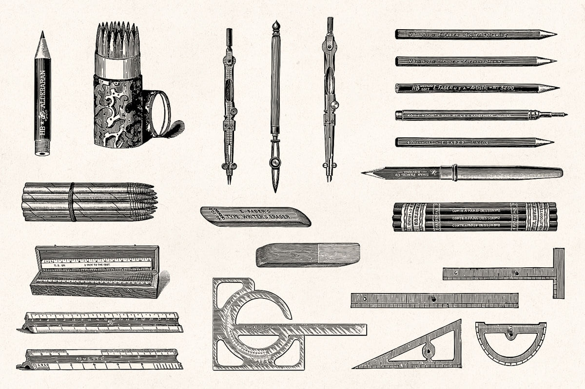
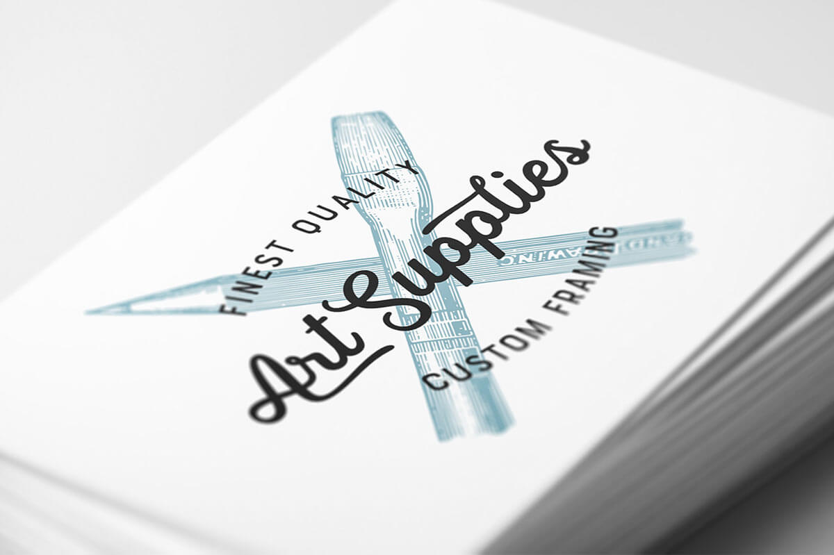
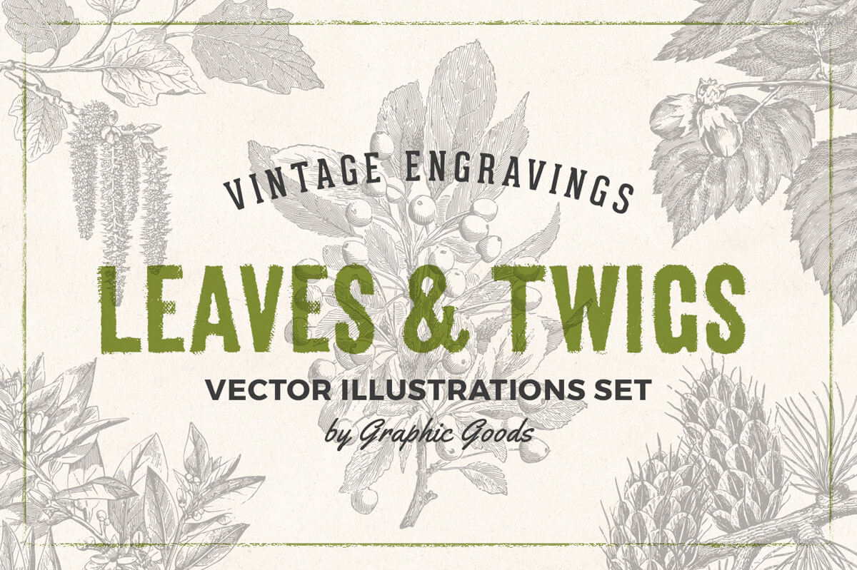
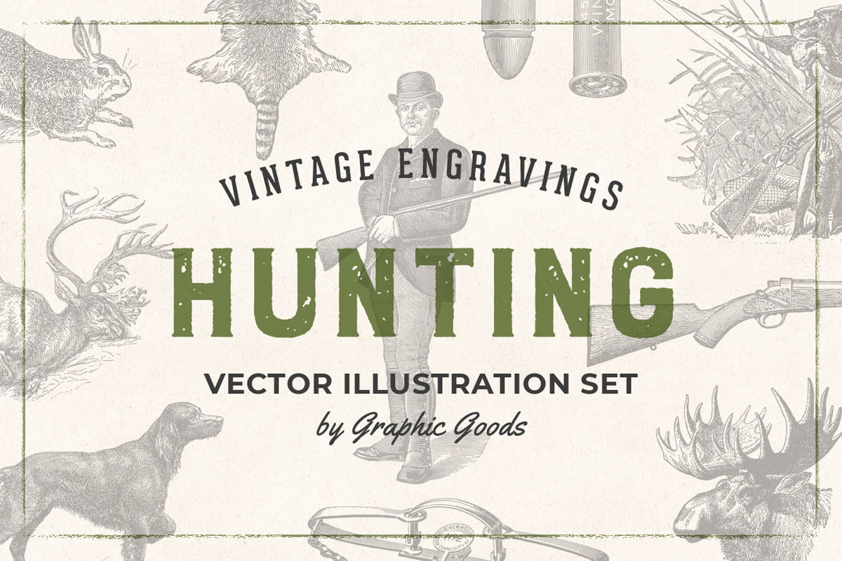
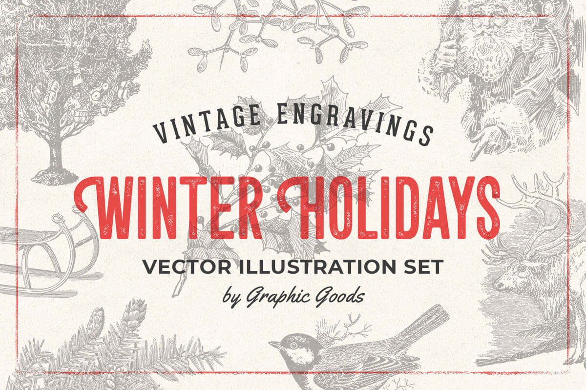
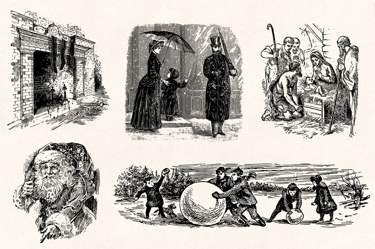
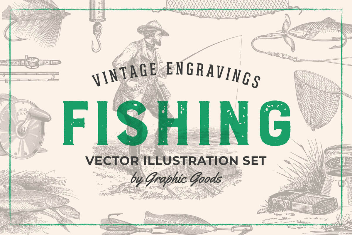
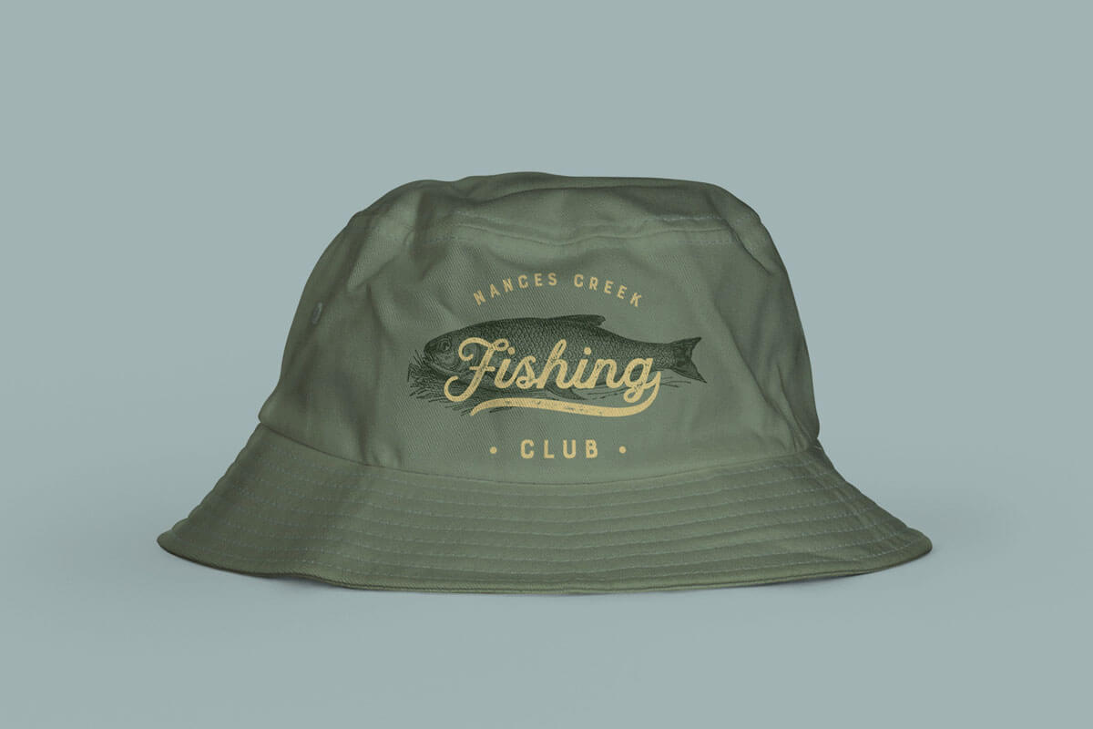
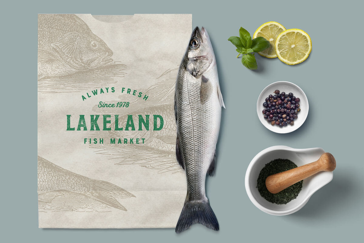
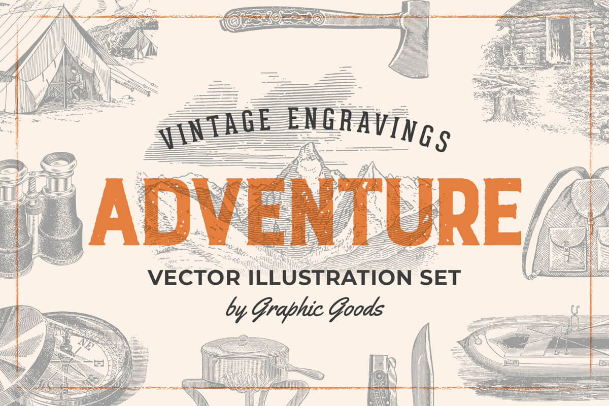
A collection of engraving-style vector drawings restored from old 19th-century books and catalogs, the bundle contains 1840+ vintage drawing illustrations from a wide variety of topics like musical instruments, anatomy, art supplies, clothing, fishing, vegetables, farms, animals, tools, and much more! Each topic includes 90+ highly detailed engraving illustrations in Ai format which you can color, resize, and modify easily, as well as PNGs with transparent backgrounds. These illustrations will be perfect for wide variety of projects, for example, logos and branding, patterns, fabric and apparel design, packaging, stationery etc. It’s also very suitable for decoupage and scrapbooking!

Bundle Features:
- 24 themed bundles.
- 1849 engraving style illustrations.
- Highly detailed engraving drawings, restored from 19th century style books and catalogs
- All files in fully editable Ai and EPS vector formats, and PNGs with transparent backgrounds.
- Perfect for making logos and branding projects, stationery, apparel design, and much more!
Individual Pack Previews:
- Vegetables Set
- Flowers Set
- Farm Animals Set
- Wild Animals
- Fruits Set
- Kitchen Tools
- Anatomy Set
- Transportation Set
- Birds Set
- Skulls & Bones Illustration Set
- Vintage Men's Fashion Set
- Fishes & Sea Life Set
- Vintage Shells Set
- Vintage Ladie's Fashion Set
- Vintage Trees Illustrations Set
- Nautical Illustrations
- Vintage Insect Engravings
- Musical Instruments Set
- Art Supplies Vintage Illustrations
- Leaves & Twigs Set
- Hunting Vintage Illustrations
- Winter Holidays Vintage Engravings
- Fishing Illustrations Set
- Vintage Adventure Gear Set
Nautical Illustrations Set Back To Top



Vegetables Set Back To Top

Flowers Set Back To Top


Farm Animals Back To Top


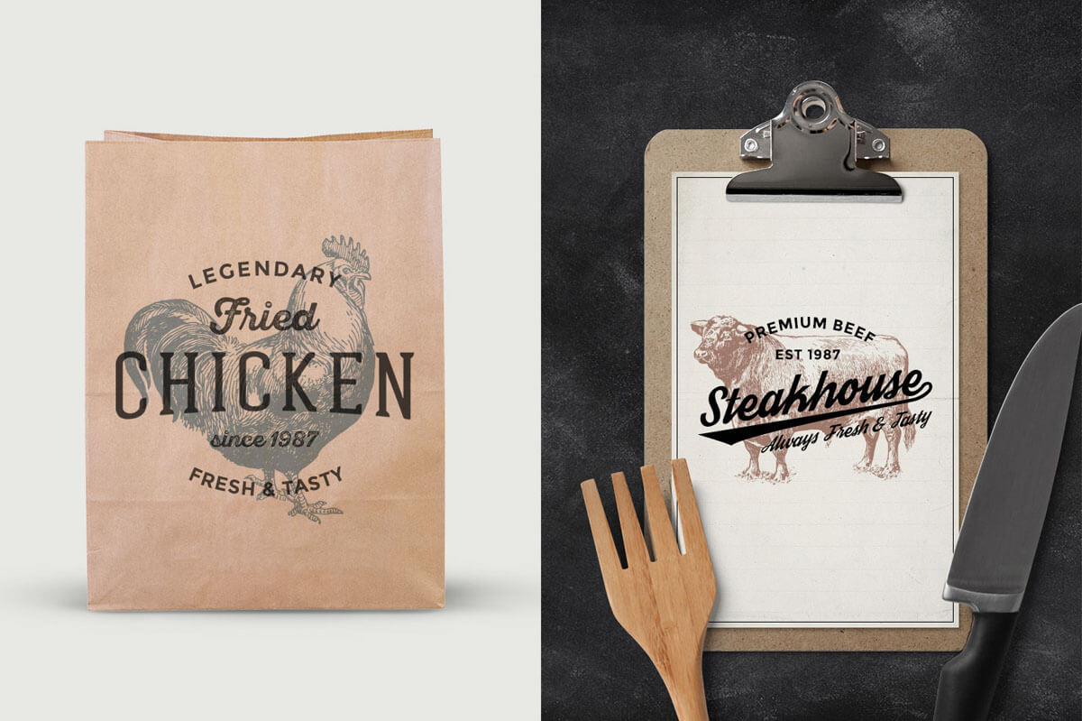
Wild Animals Back To Top



Fruits Set Back To Top



Kitchen Tools Back To Top


Anatomy Set Back To Top



Transportation Set Back To Top



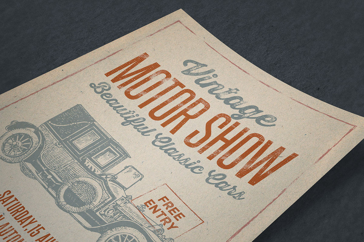
Birds Set Back To Top
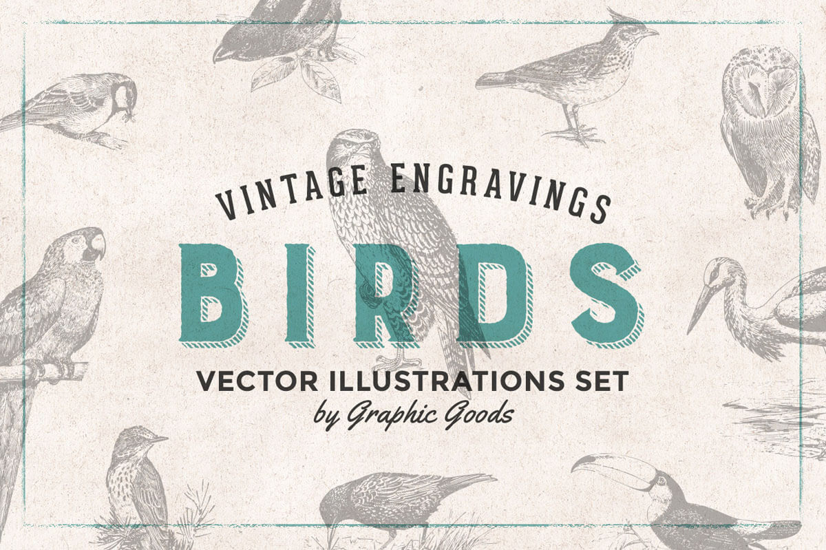


Skulls & Bones Illustration Set Back To Top
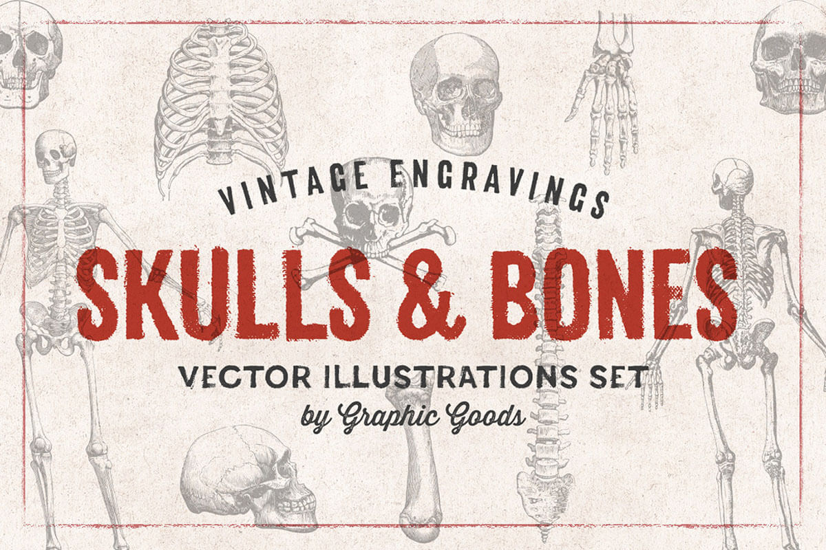

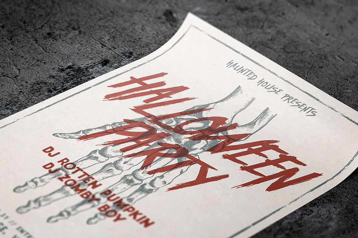

Vintage Ladie's Fashion Set Back To Top
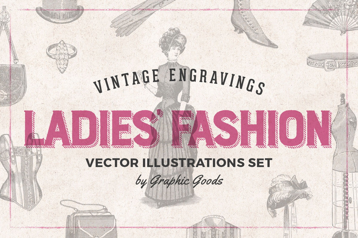
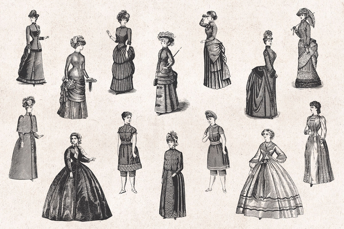
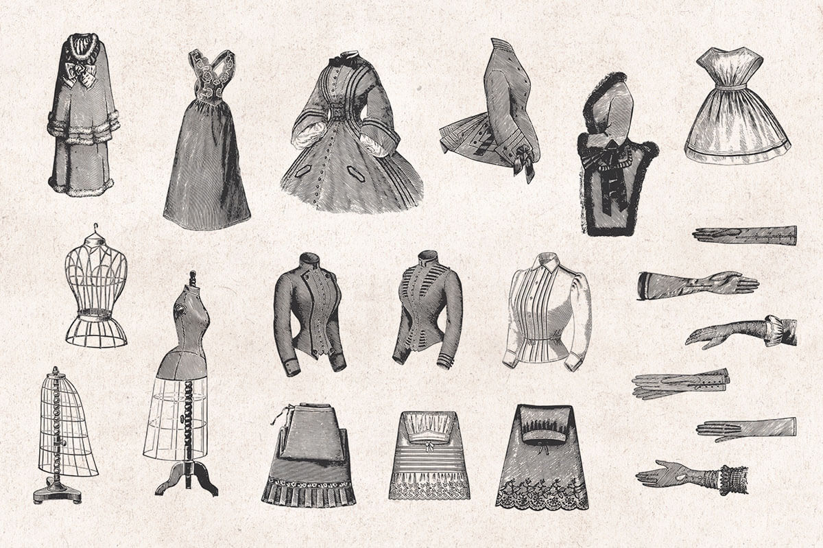


Vintage Men's Fashion Set Back To Top


Fishes & Sea Life Set Back To Top


Vintage Insects Engravings Back To Top


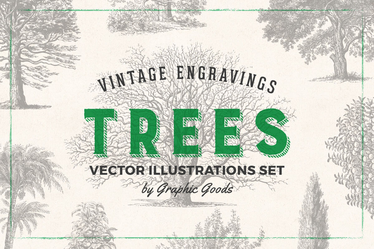
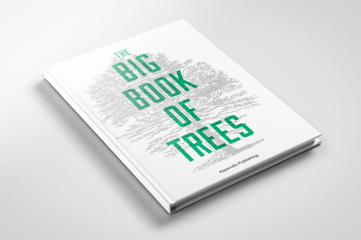
Vintage Trees Illustrations Set Back To Top



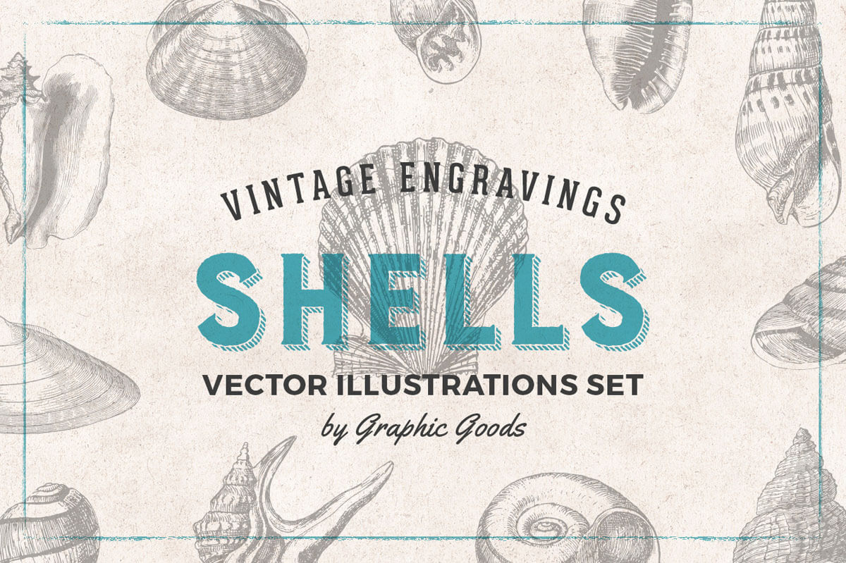
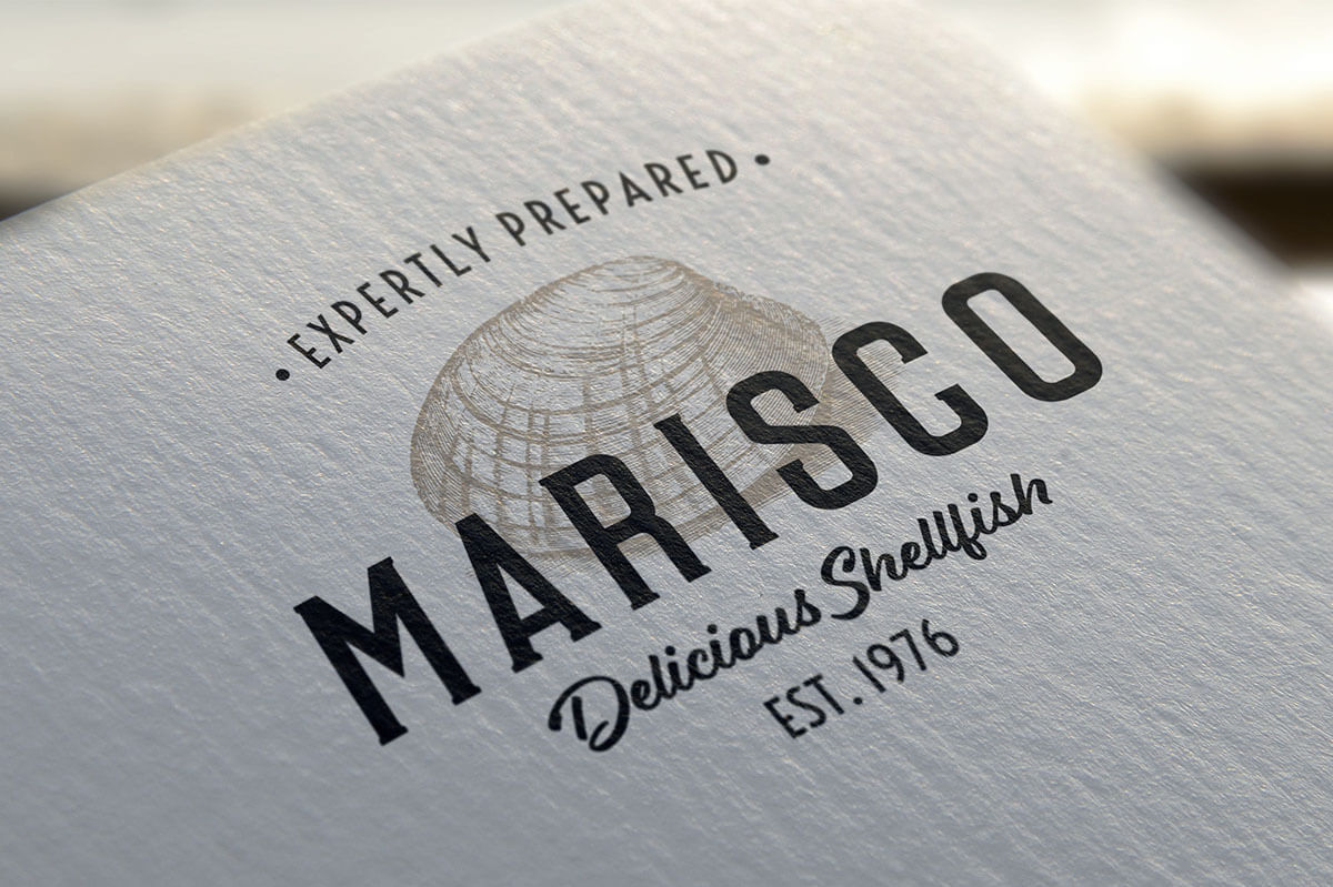
Vintage Shells Set Back To Top



Musical Instruments Set Back To Top


Art Supplies Vintage Illustrations Back To Top






Leaves & Twigs Set Back To Top


Hunting Vintage Illustrations Back To Top



Winter Holidays Vintage Engravings Back To Top



Fishing Illustrations Set Back To Top


Vintage Adventure Gear Set Back To Top


This is a front-end framework featured rich and fully responsible, inspired by Bootstrap. It's built mainly by using flexbox for layout enhancements and better alignment control. To use it, you just have to include the compiled CSS and JavaScript in your document.
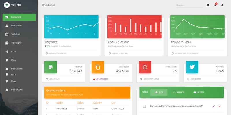
Built over Vue Material and Vuejs, this beautiful template will help you get started developing dashboards in no time. Using the Dashboard is pretty simple but requires basic knowledge of Javascript, Vuejs and Vue Router.
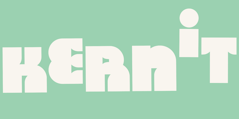
A typeface made in honor of Jim Henson's work, Kernit is a bold font with an unusually cartoony design. Uniquely shaped character elements, especially counters and open counters on each letter make it a great choice for fun projects and related display purposes. It features Uppercase latin script characters, numerals, and limited support for grammatical symbols. Designed by COLLINS & MCKL.
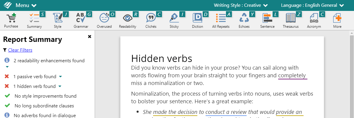
Whether you're a writer, blogger, reviewer, and whatever your level of writing in the English language, ProWritingAid will help you achieve new heights. Exceptional writing depends on much more than just correct grammar. You need an editing tool that highlights style issues and compares your writing to the best writers out there. ProWritingAid analyzes your text and highlights key issues, such as overused words, sentence structure, repeated phrases, consistency, dialogue, pacing and readability. Whether you’re just starting out or a seasoned professional, ProWritingAid will tighten your writing and help you get your ideas across. It includes a fantastic grammar checker, but also goes way beyond to help you improve the style and clarity of your writing by presenting 25 different reports with in depth information, statistics, charts, and tips.
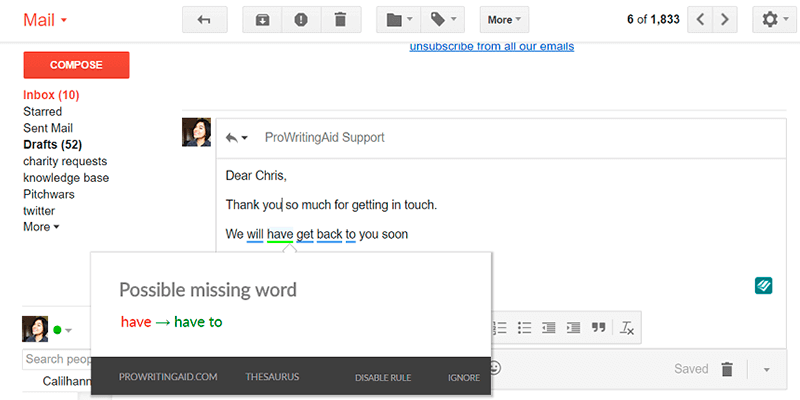
ProWritingAid goes way beyond your normal grammar checker. We look at elements of writing that are grammatically correct, but still sounds awkward or amateur to the reader. It also integrates with MS Word, Open Office, Google Docs, Scrinever, and Google Chrome, so you can keep you writing neat and perfect anywhere you are.
What Makes ProWritingAid Awesome?
- This is a Lifetime Premium Plan, which means you pay once and will have access to their premium features forever!
- Mac and Windows Support on all of PWA word-processor integrations.
- Desktop app designed to work with Scrivener projects, Rich Text, Microsoft Word, Open Office, and Markdown documents.
- No Word Count Limits.
- Plugins to integrate with MS Word, Open Office, Google Docs, Scrivener and Google Chrome so you can edit wherever you write.
- Improve Your Writing With Useful Insights and Statistics About Your Texts.
- Live Grammar Check with their Browser Extension.
- Edit Faster with a software that automatically suggests 1000s of style improvements.
- Fix style issues like repetitiveness, vague wording, sentence length variation, over-dependence on adverbs, passive voice, over-complicated sentence constructions, and much more!
- Write clean, error-free texts.
- Find The Right Words with PWA's Word Explorer and Contextual Thesaurus.
- ProWritingAid analyzes your writing and presents its findings in over 25 different reports to asses your own strengths and weaknesses.
- Learn As You Edit! PWA helps substantially improve your writing as it allows you to see and eliminate your own bad habits and common mistakes.
- Contextual Thesaurus Report that highlights every word that can be changed for a synonym. It only suggest words that fit the context and order them so that the best suggestions come first.
- Context Sensitive Style Suggestions with thousands of hand-coded rules to cover the most vital style improvements you can make.
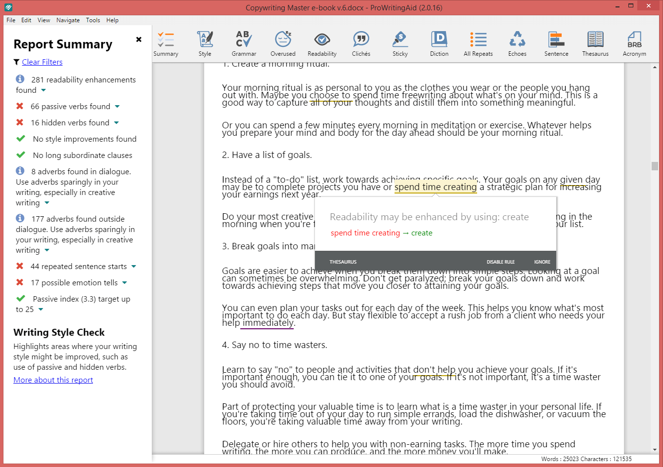
Digging Deeper: The Summary Report
An in-depth look at your text that will offer you insights into your writing with charts and graphs, Flesch–Kincaid readability test and Coleman–Liau index results, grammar and spelling suggestions, and much more, in a report that is as easy to understand as it is helpful when it comes to helping you improve your writing technique. Check it out!

The Summary Report is an all-in-one look at the statistics in your writing. Not just the basics like word count, sentences, and paragraphs, but it also points out the key actions you need to take to strengthen your writing.
It looks at your text's:
- Readability Scores
- Overused Words
- Sentence Structure
- Sentence Length
- Writing Style
- Grammar & Spelling
- (dreaded) Sticky Sentences
- Dialogue
- Pacing
- Transitions
- Repeated Phrases
- Clichés & Redundancies
- Consistency
- Diction
- Vague & Abstract Words
- Corporate Wording
Each report is set apart by a bold, colored line, and shows you the statistics you need to analyze to strengthen your writing. Each summary section shows the statistics particular to that report, whether it’s a percentage that your work was below or above, or even a graph to show you the variety of your sentence lengths. One of the most powerful sections in the Summary Report is the Readability Measures. You want your writing to be easy for readers to understand, and this report uses 4 distinct tools that measure the words per sentence and syllables per word to calculate your score.
There are as many uses for ProWritingAid’s new Summary Report as there are ways to strengthen your writing. Consider if you’re under a tight deadline and don’t have time to run through each report individually. You can run the Summary Report and check to see what needs shored up before sending your work off to an editor or a client. And if you’re interested even a little bit in statistical analysis, you’ll love the Summary Report’s multitude of numbers, percentages, and graphs.
Digging Deeper: ProWritingAid's 25 Reports
ProWritingAid analyzes your writing and presents its findings in 25 different reports. Each writer has their own strengths and weaknesses and so different PWA reports will appeal to different users. Remember, all the software can do is highlight potential pitfalls in your writing. It's up to you, the writer, to decide which suggestions work within your specific context, and which ones should be ignored.
The Writing Style Report
The Writing Style Check is one of the most popular and comprehensive reports that ProWritingAid offers. It highlights several areas of writing that should be revised to improve readability, including passive voice, overuse of adverbs, repeated sentence starts, hidden verbs and much more.
The Grammar Report
The Grammar Check works similarly to the spelling and grammar checkers in a word processor. It highlights any word that’s not in their dictionary in case it’s misspelled. It also looks at the construction of the sentence to make sure that the structure, punctuation and tense are correct.
But, in addition to these standard grammar checks, PWA's team of copyeditors have been inputting thousands of specific checks that they have come across in their years of editing. For example, they noticed that many writers write “adverse” when they actually mean “averse”? When this comes up, the software will offer a short explanation about how the two words are different so that you can make sure you select the correct one.
The Overused Words Report
There are some words and sentence constructions that are fine to use occasionally, but become problematic when they are overused. They fall into five main categories:
- Too Wishy-Washy
- Telling Rather Than Showing
- Weak Words Dependent on Intensifiers
- Nonspecific Words
- Awkward Sentence Constructions
The Clichés and Redundancies Report
Writers often use clichés when they are working on their first draft because thinking up original wording takes time and can interrupt creative flow. That’s fine. But, when you go back to edit, this report will pick out instances of unoriginal phrasing so that you can replace them with fresh ideas.
Redundant wording creeps into the texts of even the most experienced writers. It adds quantity to your writing, but not quality. Every word in your writing should be there for a reason. This report helps you eliminate the clutter.
The Sticky Sentence Report
A sticky sentence is one that is full of glue words. Glue words are the 200 or so most common English words (in, of, on, the, at, if, etc.). They are the empty space that readers need to get through before they can get to your ideas. Generally, your sentences should contain less than 45% glue words. If they contain more, they should probably be re-written to increase clarity. Let’s look at a quick example:
- ORIGINAL: Dave walked over into the back yard of the school in order to see if there was a new bicycle that he could use in his class. Glue index: 60.7% - Sentence length 27 words.
- REDRAFT: Dave checked the school’s back yard for a new bicycle to use in class. Glue index: 42.8% - Sentence length 14 words.
The second sentence is much easier to read. Unnecessary information has been discarded, and the wording is more concise. The point of the sentence comes across clearly.
The Repeats Check
Writers often mistakenly use the same word several times in the span of one paragraph because it’s foremost in their mind. But those repeats can set off an echo in the reader’s mind – that subconscious feeling of “Didn’t he just say that?” It can be irritating to read and, worse, it can detract from what you are trying to say.
But it’s difficult for writers to spot repetition in their own work. When they are editing, they go over the same text several times and become impervious to that echo feeling. And when you replace a word when making amendments, it’s easy to forget that the same word was in the sentence before or after. This report highlights repeated words and phrases in your document so you can use a more diverse vocabulary.
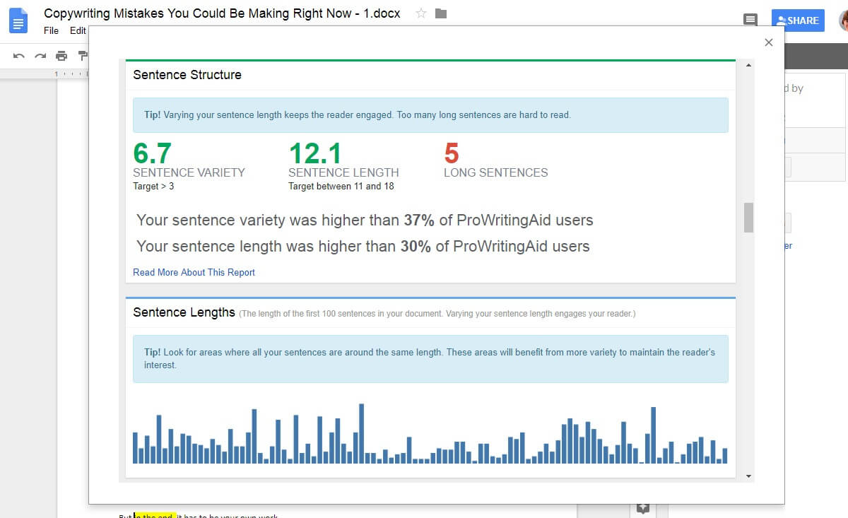
The Sentence Length Report
Writing that uses varying sentence lengths keeps the reader’s brain engaged. Some should be short and punchy, others should be long and flowing. Sentence variety adds an element of music to your writing.
ProWritingAid will create a bar graph of your sentence lengths so that you can pick out areas where you should add more variety. It will also give you an Average Sentence Length Score, which will highlight whether you are using too many long sentences, which may result in a monotonous text, or too many short sentences, which may result in a choppy text.
The Pronoun Report
When writers are in creative mode, they often rely on pronouns to keep the narrative moving: “He did this”, “She did that”, “They ran there”, “I found out.” That’s fine. It’s more important to keep writing momentum up than it is to get every sentence just right.
ProWritingAid will scan your document and calculate a pronoun percentage. Ideally it should fall somewhere between 4% and 15%. Any more than this and writing can feel dull. This is especially so with initial pronouns – those at the start of the sentence. The initial pronoun percentage should be under 30%. Run the report and replace your pronoun-heavy passages with more dynamic wording.
The Transition Report
Statistics show that published writing has a high level of transition use. Transition words are the road signs in writing. And great transitions help your reader follow your train of thought without becoming bogged down trying to discern your meaning. Words and phrases like “similarly”, “nevertheless”, “in order to”, “likewise,” or “as a result” show the relationships between your ideas and can help illustrate agreement, contrast or show cause and effect.
The Transition Report will give you a “transitions score”, which is based on the percentage of sentences that contain a transition. PWA recommends that you aim for a score of 25% or higher, which means that you use at least one transition word or phrase every four sentences.
The Consistency Check
Consistency is so important in writing. It makes it feel professional and polished. ProWritingAid doesn’t care if you choose to write in American or UK English, as long as you choose one and stick to it. Likewise, it’s up to you whether you capitalise a word like “Yoga” but the report will highlight if you have done it in one place and not in another.
The Consistency Check highlights inconsistency of spelling, hyphenation, capitalisation, and punctuation.
The Pacing Check
Pacing refers to the speed at which a story is told and how quickly the reader is moved through events. Good writing contains faster-paced sections, such as dialogue and character action, as well as slower-paced sections, such as introspection and backstory. Differently paced sections should complement each other, allowing the reader to move with you through the narrative.
ProWritingAid’s Pacing Check finds those areas in your writing that are paced more slowly so that you can spread them out.
The Dialogue Tags Check
Dialogue tags are the words that refer dialogue to a specific character. The two most common examples are “said” and “asked”. They are essential in writing, particularly in scenes that include several characters, because they help the reader follow the conversation. Ideally, your dialogue tags should be invisible within your writing, just signposts that point out who is speaking. The character’s actions or the dialogue itself should be carrying the emotion. Where possible, try to omit dialogue tags altogether. Instead, use description and action to point out your speaker and build your scene.
The Dialogue Tags Check will highlight all your dialogue tags so that you can find a better way to demonstrate emotion.
The Sensory Check (NLP Predicates Check)
Every writer has a tendency to favor one or two of their senses over the others, and this affects the way that he or she experiences the world, processes information and makes memories. When you are writing for a broad audience, you should try to write with words (primarily verbs, adverbs and adjectives) associated with all five of the senses. It will help emotionally engage with the widest range of people.
Run your writing through the Sensory Report and make sure that you have all five senses covered.
The Vague and Abstract Words Check
There are two types of words that muddy the waters for clarity and concise writing: vague and abstract words. Vague words lack specific information. If you say you will be “slightly” late it’s less clear than if you say you will be 20 minutes late. Your understanding of “slightly late” may be quite different to mine.
An abstract noun denotes something intangible, such as a quality or state, whereas a concrete noun denotes the person or thing that may possess that quality or be in that state. For example: man is concrete and humanity is abstract, brain is concrete and thought is abstract. Abstract nouns are sometimes perfect, but they should not be used to excess as they lack specificity.
Run the Vague and Abstract Words Check to find those words that should be replaced with something more specific or concrete.
The Thesaurus Check
Often, changing just one word in a sentence allows a writer to present a more nuanced or specific idea. The contextual thesaurus allows you to explore a wider vocabulary. Unlike most thesaurus suggestions, this report takes into account the context of the word in the sentence and offers replacement words that fit within that context.
The Diction Report
The Diction Report helps you avoid unnecessarily complicated writing by analyzing your word selection and sentence construction.
When it comes to writing, less is more. Make every word count. If it's not essential, cut it. Too often when writers are trying to sound authoritative, they choose the wordy ways of saying something simple. Why write “has the ability to” when you can write “can”? You’re just using more words to say the same thing, which actually makes your writing much less clear. Similarly, following some basic writing rules like “Don’t end a sentence with a preposition” can help make your writing stronger.
The Alliteration Report
Alliteration is the repetition of a beginning consonant sound. One of the most famous examples is "Peter Piper picked a peck of pickled peppers". Alliteration creates an enjoyable rhythm when reading and so is often used in advertising, or to attract attention and comment. Alliteration is also widely used in poetry.
The Alliteration Report will highlight all instances of alliteration in your document.
The Homonym Check
There are many words in the English language that sound alike but have different spellings. Choosing the wrong spelling can change your sentence completely. The sentence “He lost his patients” means something quite different from “He lost his patience”.
The Homonyms Check will highlight all the words with homonyms. Hover your curser over the word and the alternatives will be displayed as a tooltip.
The Corporate Wording Report
The corporate wording report identifies places where wording can be simplified. It concentrates on words that are often found in corporate reports that make the reports harder to read and understand. It highlights the words that it finds and suggests alternatives.
The Acronym Check
An acronym is a word or name formed as an abbreviation from the initial components in a phrase or a word, e.g. NATO (North Atlantic Treaty Organization), ESPN (Entertainment and Sports Programming Network), or LOL (Laugh Out Loud). The Acronym Report highlights all of the acronyms in your text, and creates a list of all the acronyms you have used. Misspelled or inconsistent acronyms are not usually picked up by normal spell-checkers so the list allows you to easily scan for errors. It can also help you create a glossary of acronyms for your text.
The Complex Words Check
ProWritingAid defines complex words as those with three or more syllables. It is not wrong to use complex words, but paragraphs that contain too many will be less clear. If you can replace a complex word with a simpler one – e.g. enquired with asked or proximate with near – then do it.
Run the Complex Words Check and then scan your document for paragraphs that contain a higher than usual occurrence of multi-syllable words. See if you can replace some of them with clearer vocabulary.
The Eloquence Check
This report was designed to help you develop your use of stylistic writing techniques such as alliteration, epistrophe, and hendiadys. The items in this report are not suggestions, just aids to help you along the way.
The Combo Check
The Combo Report is a customizable feature that allows users to choose their favorite reports and run them simultaneously. This is a great feature for content writers, bloggers or students who edit a lot of shorter documents rather than one long book. You know your own bad writing habits better than anyone, so choose the reports that will have the biggest impact for YOU.
The House Style Check
If you are a premium user, you can create your own House Style Check to look for specific issues relating to your organization. For example, if you want to make sure that the word “Director” is always capitalized in your reports, you can create your own rule in the software that will flag it anytime it is in lower case. To take another example, imagine a fashion design company who always wanted their September collection to be referred to as the “autumn” collection rather than the “fall” collection. They could create a rule where ProWritingAid highlighted any instance of the word “fall” and offered a suggestion that it be changed to “autumn”.
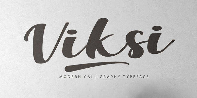
Fabulous script typeface with multilingual support in .ttf file format. You can use it in poster designs, corporate identity, greeting and invitation cards, logotype and fashion magazine & catalogues and more. Designed by Khurasan.
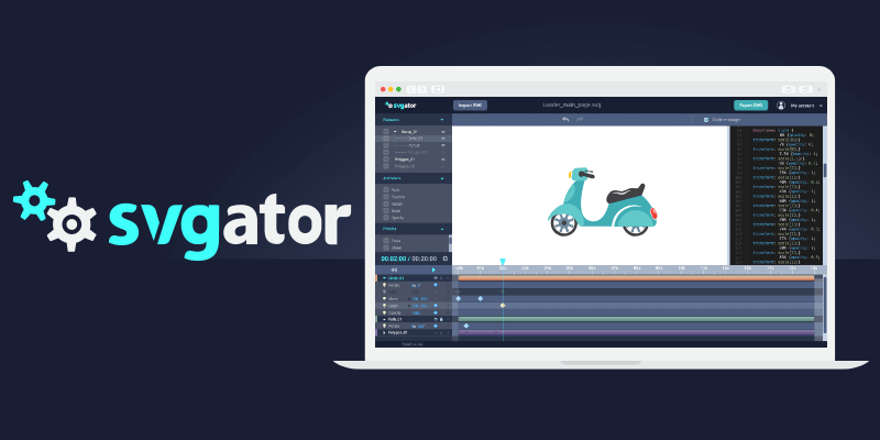
SVGator is a quick and easy way to animate SVG (No coding skills required). It offers a user-friendly interface and automatically generated code.

This CSS effect emulates in your display the shape and movement of a lifted paper that it's pushed when on hover. Created by Codepen user Bastian Andre making use of Sass.

A nicely made app design for iOS mobile platform with a wonderful combination of colors. It contains 7 layered app sections highly customizable in Sketch file format. Published by uinugget, created by Surja Sen Das Raj.
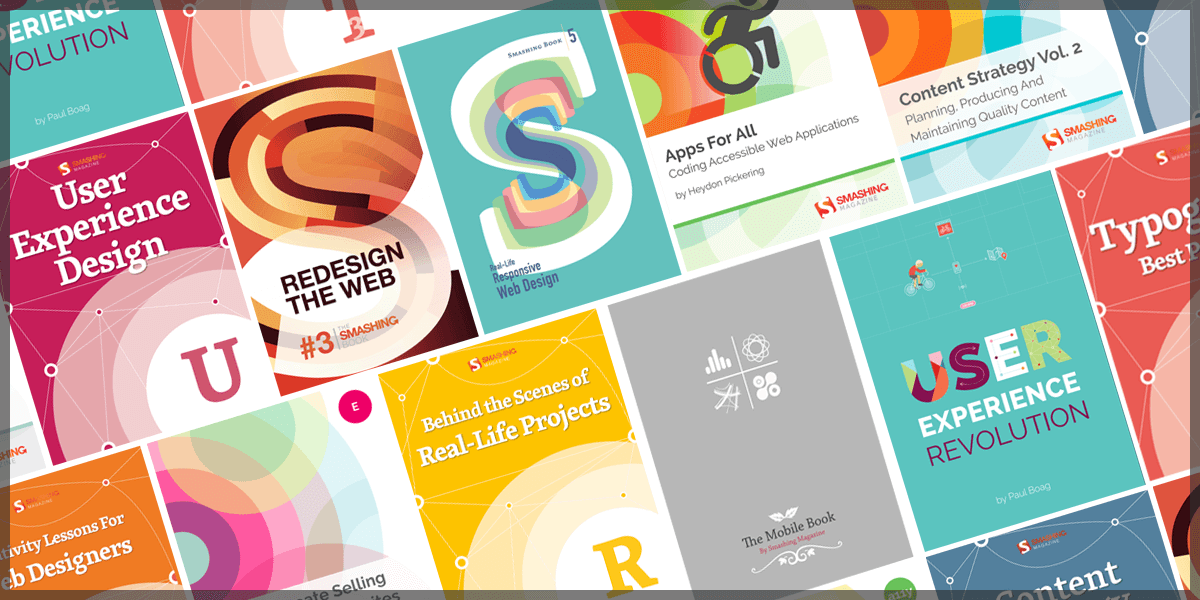
A Truly Smashing Book Collection
This week and in tandem with Smashing Magazine, we've brought you a truly awesome promo bundle you will definitely want to add to your collection: Smashing Magazine's Complete eBook Library! With this bundle you can get unlimited, unrestricted access to 56 eBooks about design trends and advanced coding techniques, straight from the most relevant design and development authority on the web. You can get a library filled with the savvy and expertise of best selling authors, regularly priced $396, for a one time payment of only $29!
This is the perfect bundle to learn about Coding, UX Design Trends, Mobile Design, Graphics, WordPress, Freelancing, Content Strategy, etc. Get access to best selling pieces like Alla Kholmatova’s Design Systems, Paul Boag’s The Sketch Handbook, and much more!
Highlights
What You'll Get: (Back to Top)
- An eBook Library With 56 Web Design eBooks Worth $
396. - You get immediate access to all eBooks via .zip archive.
- Every eBook is available in PDF, ePUB, and Kindle file formats.
- Best seller books on Coding, UX Design, Mobile Design, Graphics, WordPress, Freelancing, Content Strategy, Typography,
- All eBooks are DRM-free so that they’ll never expire.
- Save up to 93% on the regular price!
Smashing Library Catalogue & Content Descriptions
If you ever wanted a reliable source of useful and valuable content, look no further. Our Smashing eBook Library has everything you need to start crafting well-designed and well-built websites today.
For almost 10 years now, Smashing Magazine has been where thousands of designers and developers go to learn about design trends and advanced coding techniques. That is why they've have developed the Smashing Library, a comprehensive collection of 56 valuable eBooks.
Smashing Magazine eBook Anthology:
We care about quality content and work hard to support and spread best practices, innovative techniques and forward-thinking ideas. Our Smashing anthology is our editorial flagship, crafted to deliver in-depth knowledge and expertise shared by experts and practitioners from the industry.
Smashing Book #1
The Smashing Book #1 (eBook) is about best practices in modern Web design. It shares technical tips and best practices on coding, usability and optimization and explores how to create successful user interfaces and apply marketing principles to increase conversion rates. It also shows how to get the most out of typography, color and branding so that you end up with intuitive and effective Web designs. And lastly, you will also get a peek behind the curtains of Smashing Magazine.
This book is a treasure of practical and useful knowledge for Web designers and developers. This first Smashing Book looks at Web design rules of thumb, color theory, usability guidelines, user interface design, best coding and optimization practices, as well as typography, marketing, branding and exclusive insights from top designers across the globe. It contains 10 chapters.
Smashing Book #2 + The Lost Files

These eBooks are the long-awaited digital version of our bestselling printed book about best practices in modern Web design. They share valuable practical insight into design, usability and coding, provide professional advice for designing mobile applications and building successful e-commerce websites, and explain common coding mistakes and how to avoid them. You’ll explore the principles of professional design thinking and graphic design and learn how to apply psychology and game theory to create engaging user experiences.
Smashing Book #3 + #3⅓ (2 eBooks)

The Web has changed a lot. Our tools now are advanced, and browsers are highly capable. We are facing new challenges and embracing new technologies. These changes require us to reconsider how we approach Web design. In fact, it’s time to rethink, to recode, to redesign.
The Mobile Book + Addendum
The Mobile Book features the most important things that you need to know as a designer, developer, or mobile strategist for your sites. You'll dive deep into the peculiarities of the mobile industry, explore responsive design strategy, design patterns and optimization techniques, learn about wireframing and prototyping for mobile as well as the guidelines for designing with gestures and touch. As an extra, the addendum to the book provides insights into the popular platforms such as iOS, Windows Phone, etc.
Smashing Book #4 New Perspectives on Web Design
Written by well-respected designers and developers, the 4th Smashing Book contains lots of actionable takeaways that will help you in your daily routine. Think of it as a reliable playbook for issues that keep following you in every project. This book is for you because you’ll discover plenty of valuable, time-saving techniques that will improve your workflow right away.
Smashing Book #5 - Real Life Responsive Web Design
Responsive design is a default these days, but we are all still figuring out just the right process and techniques to better craft responsive websites. That’s why we created a new book — to gather practical techniques and strategies from people who have learned how to get things done right, in actual projects with actual real-world challenges.
Font-end eBook Bundle
Tailored to the needs of front-end developers, this eBook bundle contains 4 selected Smashing eBooks on HTML, CSS, responsive web design, and more. A valuable companion to master your daily front-end challenges.
Behind The Scenes of Real Life Projects

Is there anything more insightful than learning about the workflows from fellow designers and developers, and what techniques they use? What made their projects a stunning success, and how do they overcome missteps? With this eBook, we’ll take a closer look at the techniques and stories of some folks behind real-life Web projects.
Among others, you will discover how renowned projects such as the Financial Times Web app or the Nike Better World website were built, and learn from the success story of a translation app that made it into Apple’s top ten charts. You’ll also get an insight into Google’s User Experience Lab, and (illustrated by the example of Pinterest) explore the importance of paint performance. Furthermore, our Smashing authors share valuable lessons learned in the course of their careers — from both successes and failures. This eBook is full of handy tips, ideas, and personal experiences that are beneficial to any Web professional.
HTML Semantics
You won't get far without the foundational understanding of HTML semantics – but it is even more important to follow up on the recent developments and discussions.
This eBook addresses the importance of semantics in our code. It touches on outlining algorithms, HTML5 semantics, the pursuit of semantic value and the HTML semantic grid system.
Performance Optimization: Techniques And Strategies
Slow loading times break the user experience of any website — no matter how well crafted it might be. In fact, it only takes three seconds until users lose their interest in a site if they don't get a response immediately. If another site happens to be 250ms faster than yours, then users are more inclined to switch to a competitor’s website in no time. Web fonts, heavy JavaScript, third-party widgets — all of them can sum up to become a real performance bottleneck. Nevertheless, tracking that down does not only improve loading times but also results in a much snappier experience and a higher user engagement.
The new Hardboiled Web Design eBook

If you’ve been working on the web for a while, your bookshelves may already be buckling under the weight of books about HTML and CSS. Do you really need another one? Hardboiled Web Design is different. It’s for people who want to understand why, when and how to use the latest HTML5 and CSS3 technologies in their everyday work. Not tomorrow or next week, but today.
UX eBook Bundle
This eBook collection will guide you into the Usability for Web Design field showing you how to use design elements for each purpose. The various possibilities for developing websites foster not only a designer’s creativity, but also the necessity of applying techniques that enhance the User Experience (UX) and website’s usability.
A Field Guide To Usability Testing
Testing usability is vital to creating a successful website — even more so if it’s an e-commerce website, a complex app or any other complicated project. Unlike interviews and focus groups, a well-designed user test measures actual performance.
A Field Guide To User Research

User research is an effective strategy to gain a deeper understanding of your target audience — a crucial step in order to choose efficient design solutions and build smart products. But what has to be considered when conducting user research? What methods have proven themselves in practice? And how do you finally integrate your findings into the design process? With this eBook, you will learn to take the guesswork out of your design decisions and base them on real-life experiences and user needs instead.
Designing Better UX

Even the most thought-out and best-planned user experience can get lost when attention to certain details falls short. To raise awareness for those little things that add up to an ideal user experience, we have put together “Designing Better UX”.
Emotional Design Elements
Whether you're creating a game or a website, a lasting bond with users is more often than not the result of emotional attachment. Knowing the ins and outs of emotional design will enable you to imbue your creation with personality and to shape the user's perception.
How To Create Selling E-Commerce Websites, Vol. 2

With more and more people reaching out for their smartphones and tablets to shop online, mobile e-commerce is set to reach $86 billion by 2016 — a development that brings along entirely new demands on e-commerce websites. After our first e-commerce eBook was published four years ago, we wanted to take a fresh look at the challenges that crafting online shopping experiences bring along today, and equip you with the necessary know-how on how to deal with them effectively.
Navigation & Interaction

How should you set up menus for optimal usability? Does mobile UX design follow different rules? How can you use sound to make your website not just more appealing but also easier to navigate? These and other questions should be factored into any decisions about modern website design, because they will influence the amount and quality of repeat traffic.
Navigation & Interaction, Vol. 2
While users expect content to be unique and exciting, they also prefer clear, predictable patterns when it comes to navigation. After all, navigation is merely a means to an end: consuming content without hassle and not spending too much time looking for it. The foundation of a solid, frustration-free user experience thus lies in a well-structured, simple navigation system. But which design decisions have really proven to work well in practice?
Practical Approaches For Designing Usable Websites
The user-centered design process is based on various steps, each with its respective approaches. Learn about designing flows, optimizing emotional engagement and performing heuristic website reviews.
Psychology Of Web Design
Psychology of Web Design gives you insights on how the human brain deals with different elements, colors, contrast, symmetry and balance. Combining the usability guidelines from Maslow's pyramid will surely help you design closer to your audience’s desires.
Rethinking UX

In “Rethinking UX”, various UX professionals share their lessons learned and provide practical advice from their very own personal experience. The eBook is packed with interesting thoughts and concepts that let us reflect on our own practices. Every designer has their own user research techniques and strategies, but leaving the office and talking to people on the streets can foster innovation even more as any thought-out strategy ever could.
User Experience Design

User Experience (UX) can be strongly influenced by behavioral factors such as emotions, beliefs, preferences and even cultural backgrounds. Being aware of this, Web designers keep developing strategies to improve the overall UX with the help of storytelling, tools for problem solving, relationship engineering and costumer service improvement.
UX Design Process
In this book, you'll learn how lean UX has made the whole discipline more approachable and attractive to startups, and you'll see that UX issues aren't just a quick fix, but should also address big-picture issues. Sometimes, the solution to a problem is to fix a broken UX; other times, you will need to constantly fine-tune in order to keep up with changing demands. You'll also look at wireframing alternatives, research planning and design bias.
Web Design eBook Bundle
Every Web designer, whether freelanced or employed, should have a reference literature that accompanies him or her throughout their professional routine. In this bundle you will find 10 Smashing eBooks that will help you improve your skills in the Web Design field. You will be able to apply techniques to adapt your designs for mobile gadgets, combine different typefaces and intensify your professional abilities.
Creating Meaningful Websites
What is it that makes a website stand out from the crowd? What makes it memorable and meaningful? This eBook wants to approach these questions. It's in no means a step-by-step guide to follow, but rather a collection of thoughts to give you some general impulses and perspectives on creating meaningful websites.
Creativity Lessons For Web Designers
“Creativity” is a term that often partakes of something mysterious and nearly magical — something that we are blessed with, something like an ambivalent, secret power that one moment strikes us unexpectedly, and then puts us on hold when we desperately try to come up with an idea. But the infamous creative spark isn't as random as we might think.
Designing For Email
After taking a look at the current state of HTML email design, you'll get to grips with optimizing email for mobile, and learn to build your own modular email construction kit that you can draw on to cater for best results on desktop, web and mobile clients. We'll also explore handy tips to raise your email above inbox noise — with a friendly tone and engaging content (no dirty tricks here!) — and consider missteps that you should better avoid. Building HTML emails certainly does require some fiddling around, but it's defintely worth it. So, are you ready to take on the challenge?
Inside Creative Minds: Workflows, Habits And Strategies
The authors of this eBook had the occasion to sit down with experienced influencers and successful designers for a row of interviews in which they provide first-hand insights into their very own workflows, habits and strategies. WordPress co-founders Matt Mullenweg and Mike Little are among them, JavaScript evangelist Doug Crockford, IDEO’s Duane Bray, Meetup’s vice president Andres Glusman, as well as many other creative minds from design, UX and startup branches. Their insights and stories are not only truly inspiring, but also contribute to giving this fast-moving, tech-driven Web industry a more familiar face.
Legacy Of Typography
This eBook introduces historical and cultural aspects of type and how they relate to the Web industry. Find out about changing fads in type, about the complexities of Japanese characters and about typographic applications for different situations. You are sure to learn something that you didn't know before from our great authors.
The Sketch Handbook by Christian Krammer
The Sketch Handbook will guide you through every aspect of Sketch: from smart guides and layer manipulation to responsive baseline grid, nested symbols and group resizing. Whether you are a beginner to design or just started to use graphic apps, it will teach you the techniques you need to start designing user interfaces in Sketch.
Typography Best Practices
Whether you're interested in determining the right paragraph layout or typographic details, observing the correct typographic etiquette or making the other small decisions that will dramatically influence how your website is perceived, many answers will present themselves in this collection of articles.
Typography: Practical Considerations And Design Patterns
With the help of this eBook, you can learn how to train and sharpen your eyes to recognize specific typographic details which will be sure to guide you in your own projects and make it easier for you to make design decisions. After an initial stroll through type terminology and classification, this eBook reflects on the quality of fonts (including web font providers, of course) and explores typographic design patterns as well as current practices. These practical considerations and a plethora of real-world examples are bound to be a valuable companion throughout your adventures when designing with type.
Unlocking Innovation: How To Generate And Realize Great Ideas

Certain strategies can help to unlock our creative insight, and make our ideation process — and that of our team members — more effective. Unlocking Innovation wants to equip you with such strategies, but also go beyond the mere process of generating ideas and look at how we can actually bring them to life. Different ways of experimenting with that first vague idea and mocking it up are thus part of the eBook, just like suggestions on finding the idea that is really worthy of our time and energy. The tips that our authors have to share are very practical, and can easily be incorporated into your (or your team’s) workflow. So, take your time and examine them carefully, and, most importantly, try them out to see what works best for you.
Accessibility eBook Bundle
We try to build the best experiences we can, but more often that not, we make them for ourselves and users like us. With this eBook bundle, you’ll learn to enrich the web for everyone by removing existing barriers and creating experiences that are usable to more people.
Inclusive Design Patterns by Heydon Pickering
This book looks at common interface patterns from the perspective of an inclusive designer—someone trained in building experiences that cater to the huge diversity of abilities, preferences and circumstances out there.
Apps For All: Coding Accessible Web Applications
Accessibility is not just about addressing specific disabilities, but making sure as many people as possible have access to the same information. There’s rarely a good reason to lock people out when openness is a foundational principle of the web.
Practical Approaches For Designing Accessible Websites
We design with viewports in mind, keep track of loading times, and hunt down even the smallest browser bugs — all to create the best possible user experience. But despite all these efforts to constantly improve our products, there’s still one aspect that, unfortunately, comes up short quite often: accessibility.
Business eBook Bundle
If you need support when it comes to the business aspects of the web industry, then these eBooks will be a treasure chest for you. Learn to adapt your business to the digital challenges. Get insights into building better products. Read up on how to pitch like a pro and handle your finances properly. Get precious tips on a key issue in your career: communication with clients and partners.
A Career On The Web: Assuming Leadership

Taking the step from being a member of a digital team to becoming a leader can be quite overwhelming. Having proven that you excel in the technical aspects of your job is most probably beyond question, but a leadership position will naturally confront you with entirely new challenges which also call for new skills. After all, a team is as good as its leader, right?
A Career On The Web: On The Road To Success

There comes a time in everyone’s career when changing jobs is the natural next step. Perhaps you’re looking for a new challenge or you feel like you’ve hit a wall in your current company? Either way, you’re standing at a crossroad, with an overwhelming amount of possibilities in front of you. But how can you make the most of this situation? How can you find a job you will truly love?
Clients: Friends You Never Had

A fruitful and balanced cooperation with clients is the dream of every designer. However, to bring this dream to reality, designers constantly need to prepare for the various challenges that different clients tend to bring along. But what can you do to generally improve the collaboration with your clients and — on a long-term basis — foster stable relationships in which both parties are actually pulling in the same direction?
Digital Adaptation by Paul Boag

Nothing is more frustrating than stubborn management entangled in dated workflows and inefficient processes. That's why we created Digital Adaptation, a new practical book on how to help senior management understand the Web and adapt the business, culture, teams and workflows accordingly. No fluff, no theory — just techniques and strategies that worked in practice, and showed results.
Making It Right: Product Management For A Startup World

The main purpose of this book is to help product managers who work specifically with digital projects build better — less complex, more focused, less long-winded and more intelligent — products. By featuring lessons learned from real-life projects, the book provides a structured framework for strategic product management — to help build the right products, at the right time, for the right people with just the right amount of process involved.
Marketing Secrets For Web Designers
Marketing is an essential part of Web design and knowing its 101 helps designers see their design decisions in a broader context. As jumping in at the deep edge and simply starting off marketing can be quite delicate, "Marketing Secrets For Web Designers" is a companion tailored to the specific needs of Web professionals. Weighing the benefits and perils of common marketing practices, it takes designers by the hand as they develop an understanding of what friendly and appealing marketing is all about.
Successful Freelancing For Web Designers
If you are thinking of freelancing or are close to surrendering to your workload, then this eBook will be a treasure chest for you. Realizing that you have made the same mistakes as many before you can be a relief. Read up on how to pitch like a pro and handle your finances properly. Get precious tips on a key issue in freelancing: communication with clients and partners. Compelling marketing strategies will brighten your future, win contracts and make your business profitable.
Work Smart, Live Healthy

Web design is more than a job. It’s a passion. However, keeping up with the immense pace at which the web industry is moving can feel quite intimidating at times and stress or even a burnout can strike all of us someday. With this eBook, we want to raise awareness for those aspects of the web industry which are not frequently talked about. It’s not about frameworks, code or scripts for a change — today it’s about you.
Content Strategy eBook Bundle
With this bundle you will master content and copywriting in no time. Three fresh eBooks contain Smashing Magazine’s best articles on Content, carefully prepared, edited and — of course — without advertising. Perfect for those looking to get into the world of content development for online platforms, this eBook expertly pinpoints the key things one must know before beginning a journey into copywriting. This bundle will help to improve your Copywriting skills.
Content Strategy
If content is king, then the art of messaging is what will drive your product, business or idea forward. This comprehensive eBook delves into the world of content, providing beginners as well as communications professionals with a fundamental understanding of how content strategy works both independently and in conjuncture with other elements.
Content Strategy, Vol. 2: Planning, Producing And Maintaining Quality Content
A brilliant design deserves brilliant content. Content that is intuitive, compelling and flexible. With the help of this eBook, you will learn to face the content challenge. Take it as your guide through the critical phases of content planning, production and maintenance, your partner in crime to develop your content strategy.
Effective Copywriting
Writing for the Web has many facets and uses. As one of the most sought-after and needed skills, it has often become an exercise of bringing together a brand with a voice. This eBook takes a look at many different aspects of copywriting in the online sector.

2 Different Web Hosting Lifetime Plans:
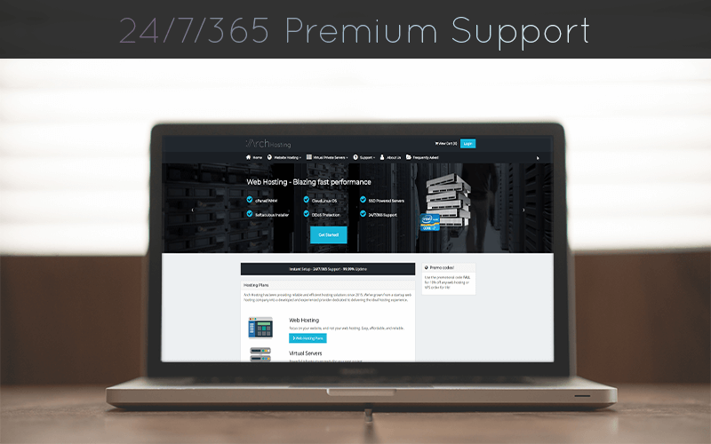
This promo offers 2 different Lifetime Web Hosting Plans for Business & Startups, with features on all plans that you'll definitely want to check out, like an Intuitive cPanel Web Hosting Manager, Drag & Drop SitePad Website Builder, One-Click Deploy for WordPress and hundreds of other popular softwares, and so much more! Take full advantage of multi-core processors, lightning fast network, and powerful hardware. Don't let your innovation be throttled by ancient hardware and slow network; harness their insanely fast servers and network for your own use! So what are you waiting for? Get in here and see what the fuss is all about!
Startup Web Hosting includes 2 GB storage, 500 GB Bandwidth per month, up to hosted 1 domain, CloudFare Optimized Partner with Railgun, https:// on all websites, 5 MySQL Databases, Subdomains, E-mail Accounts, and FTP Accounts (so yeah, 5 each!), Website Builder and Instant Wordpress Install, and free domain for the first year. Whats the cost? Only a one-time payment of $24.99! Save yourself $540 with this plan!
Business Web Hosting includes 10 GB Storage, 1 TB Bandwidth per month, host up to 3 domains, 10 MySQL Databases, E-mail Accounts, FTP Accounts, and Subdomains (so yeah, 10 each!), Cloudflare Optimized Partner with Railgun, https:// on all websites, Website Builder and Instant Wordpress Install, and free domain for the first year. All of this for a one-time payment of $44.99! Guess what? You save over $1080 with this plan!
So, Lifetime Access? I hear you ask. In short: yes, we are thrilled to bring you this amazing promo from Arch Hosting to get your hands on the One Lifetime Web Hosting Plan to Rule Them All, with features that spell awesome all around them.
Quick Jump to Features

Web Hosting Features on all Plans: Breakdown for Nerds (Back to Top)
The following features are included on both Lifetime Web Hosting plans!
- Both plans include a free domain for the first year (Usually $11.99)
- Intuitive cPanel® Web Hosting Manager.
- Drag & Drop SitePad Website Builder - NO coding required!
- One-click deploy Wordpress and hundreds of other popular softwares!
- https:// on ALL domains.
- Cloudflare Railgun - Supercharge dynamic content with backend caching.
- Daily Website Backups.
- Full Email Management - Webmail, Forwarding, etc! Compatible with your iPhone or Android device!.
- Website Traffic & Visitor Logs.
- Private Domain WHOIS.
- 24/7 In-House Expert Support - Real humans who will actually address your questions.
- Enterprise SSD drives - up to 50% faster than hard drive storage!
- Brand New DDR4 RAM.
- Lightning fast Intel Xeon processors.
- 1 Gbps Premium Tiered Network (DDoS Protected).
- MariaDB/MySQL for superior database performance!
- PHP 5.6, 7.0, 7.1, SSH, Perl, Ruby, Python, Cronjob, FTP & Git Support.
- Full IPv6 Ready - Future-proof your business.
- CloudLinux OS & CageFS for isolated resources - you'll get what you paid for, guaranteed.
Plan-Specic Features: (Back to Top)
Startup Web Hosting Plan ($24.99 One-Time Payment):
- 2 GB Storage
- 500 GB Bandwidth per month
- Host up to 1 domain
- 5 MySQL Databases
- 5 E-mail Accounts
- 5 FTP Accounts
- 5 Subdomains
- FREE Cloudflare Optimized Partner with Railgun for 200% additional performance (Usually $200/mo from Cloudflare!)
- FREE https:// on all websites
- FREE Website Builder and Instant Wordpress Install!
- FREE domain for the first year
- One-time payment of $24.99! (Usually $540)
Business Web Hosting ($44.99 One-Time Payment)
- 10 GB Storage
- 1 TB Bandwidth per month
- Host up to 4 domains
- 10 MySQL Databases
- 10 E-mail Accounts
- 10 FTP Accounts
- 10 Subdomains
- FREE Cloudflare Optimized Partner with Railgun for 200% additional performance (Usually $200/mo from Cloudflare!)
- FREE https:// on all websites
- FREE Website Builder and Instant Wordpress Install!
- FREE domain for the first year
- One-time payment of $44.99 (Usually $1080)
About Security With Arch-Hosting
Your file safety and online security is a top priority. Arch Hosting makes use of signed AES 256 SSL encryption on all web services. Their infrastructure has been tested for vulnerabilities by multiple penetration testers and secured against attacks (Apache symlink attacks, hypervisor exploits). Their configuration includes routine backups to offsite locations to ensure that client data is not lost in the event of a hard drive failure.
Sensitive client data is secured with military-grade AES encryption. All passwords are salted numerous times to ensure maximum security. Their set of in-house developers helps prevent them from being vulnerable to the same "zero-day" attacks that other providers may face. No credit card or sensitive billing information is kept on file, preventing any possibility of leaked credit card or financial data in the event of a security breach.
They utilize CloudLinux OS which provides numerous improved security benefits over CentOS. Most significantly is the utilization of CageFS, which provides your website dedicated resources and a jailed environment that’s completely separate from any other user on the server. Just because you’re on a shared server doesn’t mean you need to compromise security!
Support
Do you need a WordPress blog installed? Or a different type of CMS? Let their support do it for you. This team consists of experienced webmasters, developers, and cPanel experts. No outsourcing of tickets to third party companies; all client tickets are handled by an authorized and reliable Arch Hosting employee. Anybody may create tickets via their website, which will be diligently answered accurately and quickly. Theres also the public knowledgebase which contains solutions, answers, and tutorials to address many questions you may have.


![]()
This is a set of 260 mixed icons based on 50px grid for web design. Icons are made in Adobe XD, Illustrator and Iconjar file formats, featuring an outstanding outline art icon style. Published by Dribbble user Becris.
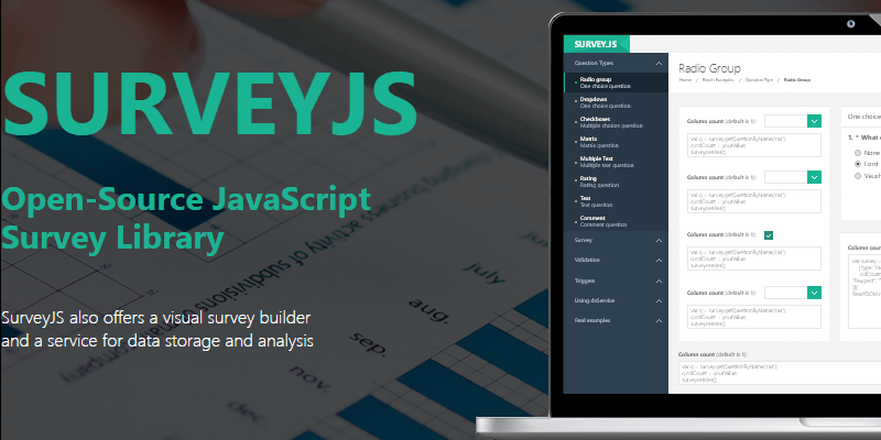
SurveyJS is a JavaScript Survey Library. It is a modern way to add a survey to your website. It uses JSON for survey metadata and results. SurveyJS Library integrates with several popular JavaScript Frameworks like AngularJS, jQuery, React, Vue.js, among others.
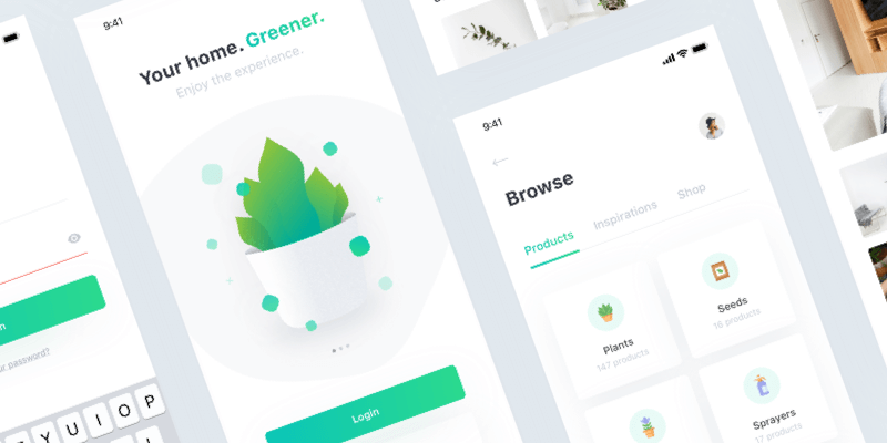
A layered UI design of a plant-care app in Sketch. It contains a home page, login, browse, explore, posts and settings section designs all with a minimal style that brings more attention to your greens. Created by Dribbble user Paolo Spazzini.
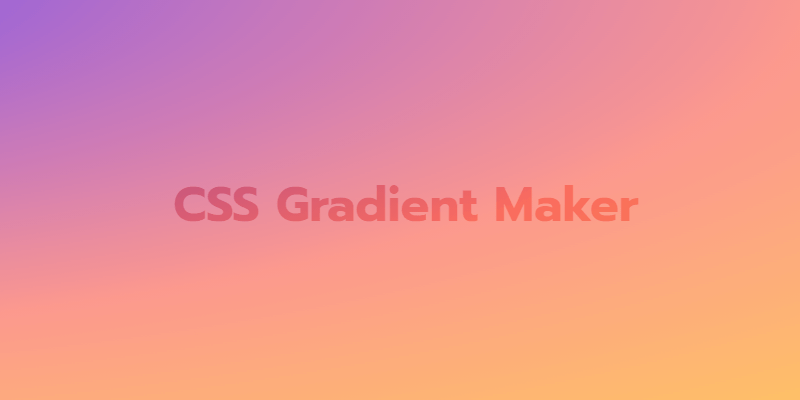
Great snippet to generate Gradient colors in CSS by Codepen user X, uses Smartsettings.js for setting things up and Chroma.js for handling the colors. You can generate a Gradient with up to 4 colors and copy the generated code for it that you can use on your projects.

Because a great product, deserves a better yet package
Deal Update: more than 1000 Packaging Mockups in 113 unique files. All the items are classified in different material presentations (Paper, Metal, Clear & Glass). This bundle offers you the possibility of easily making thousands of combinations and finishes for your packages. The files are intended to use on Adobe Photoshop. Normally this bundle has a joint value of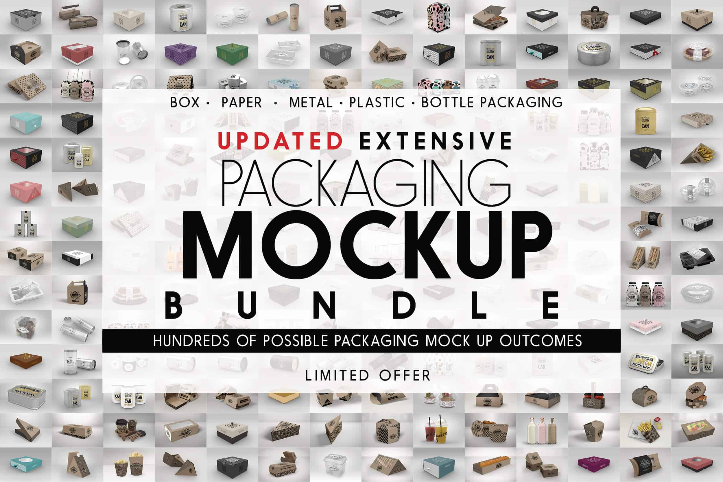
Features
More than 1000 possible packages mockups:
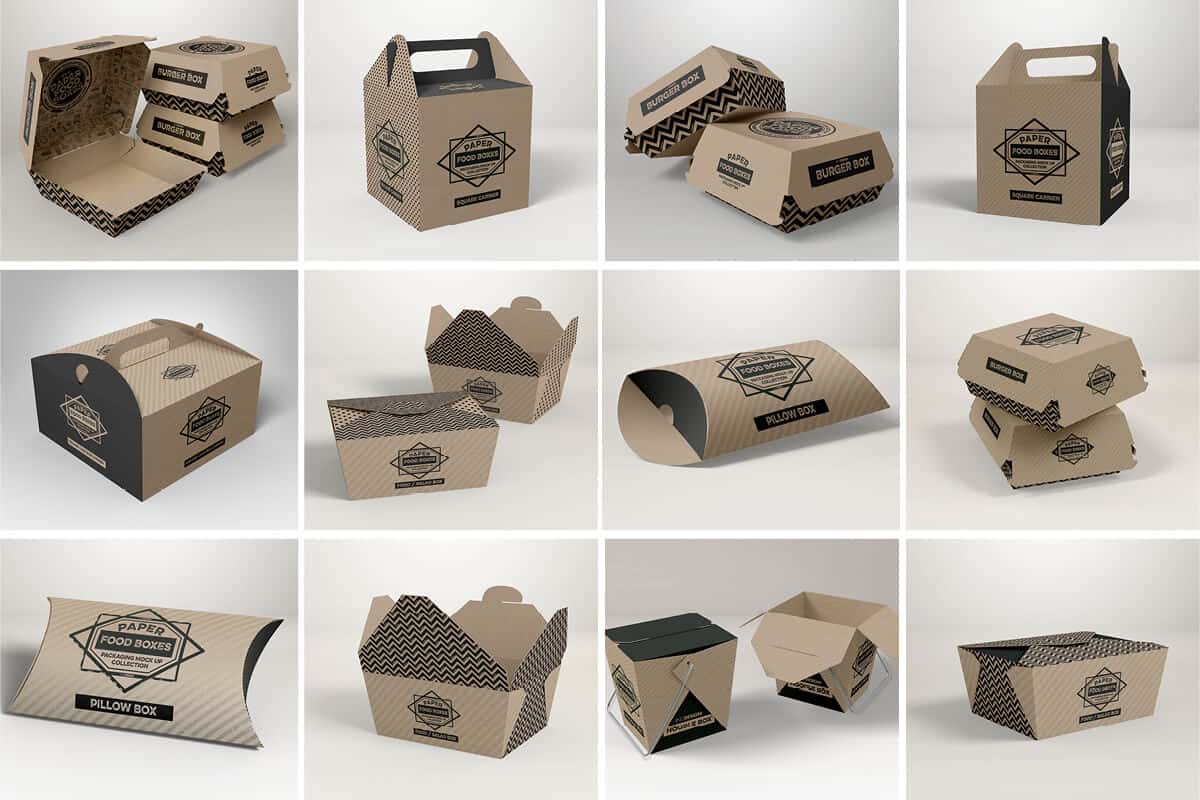
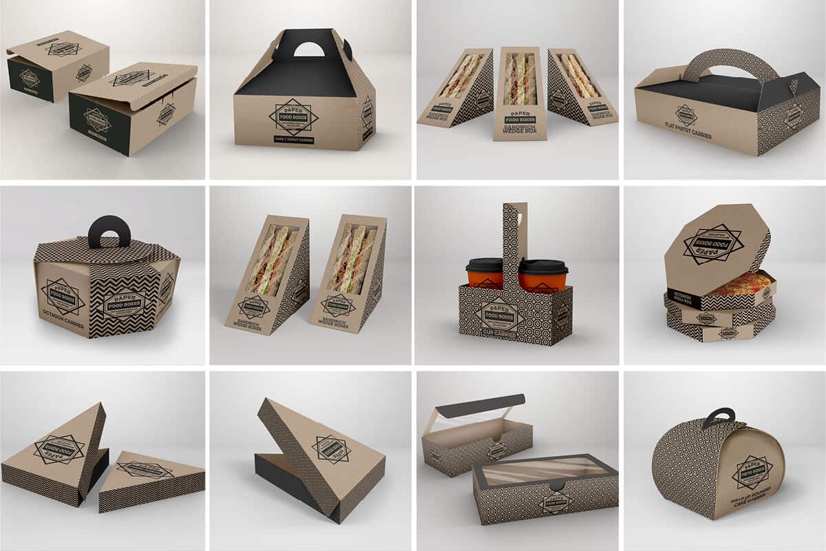
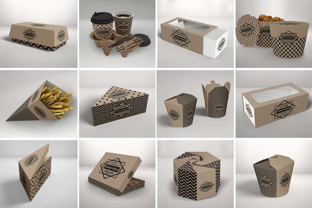
- Paper Food Boxes Bundle (63 psd files):
Volumes 1- 6 + Burger Box set - now includes all box diecuts
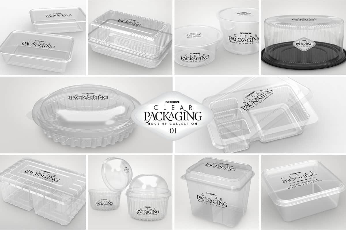
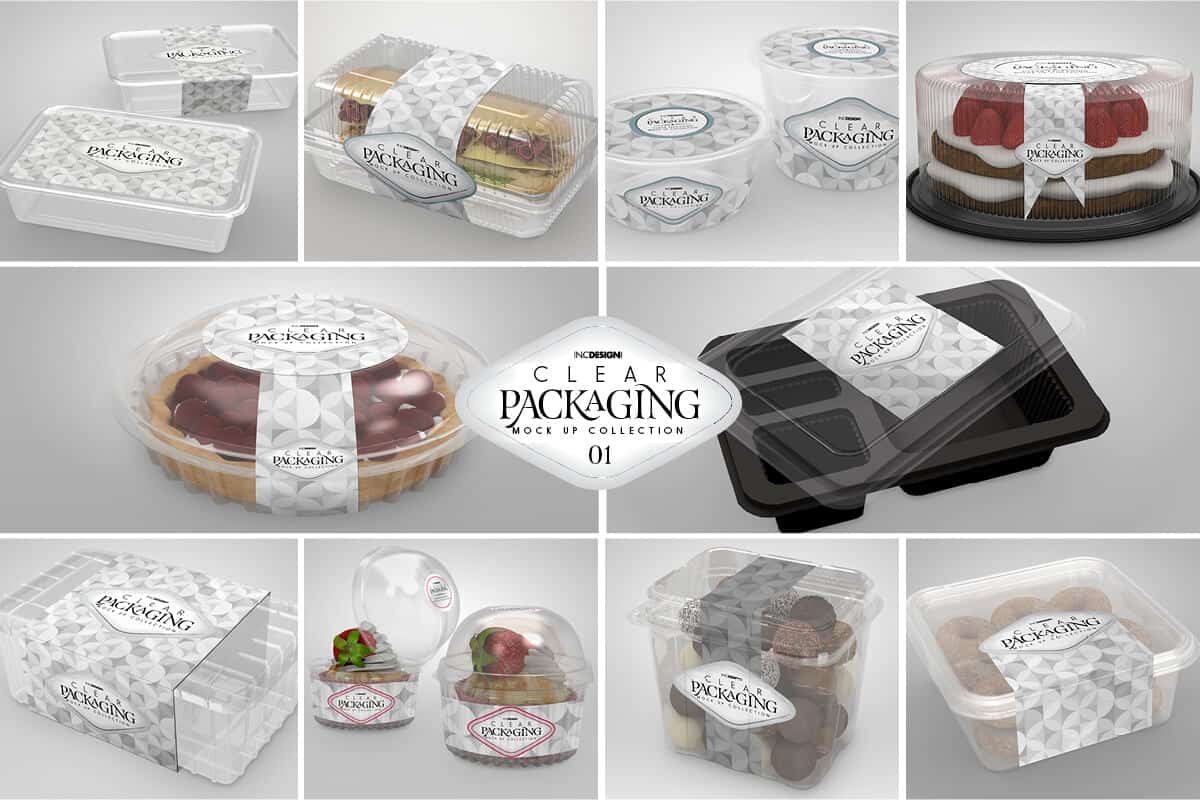
- Clear Packaging Mock Up Bundle (26 mock up files):
Volumes 1 - 2 Clear Packaging Collection + 6 Additional Packaging Mock Up Scenes
- Box Creator Set (4 psd files):
Square Box Creator to create hundreds of cover combinations with two box sizes + bonus Stacked Retail Box 3 scene Mockup Set.
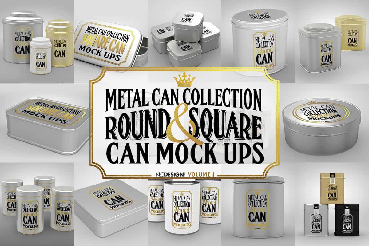
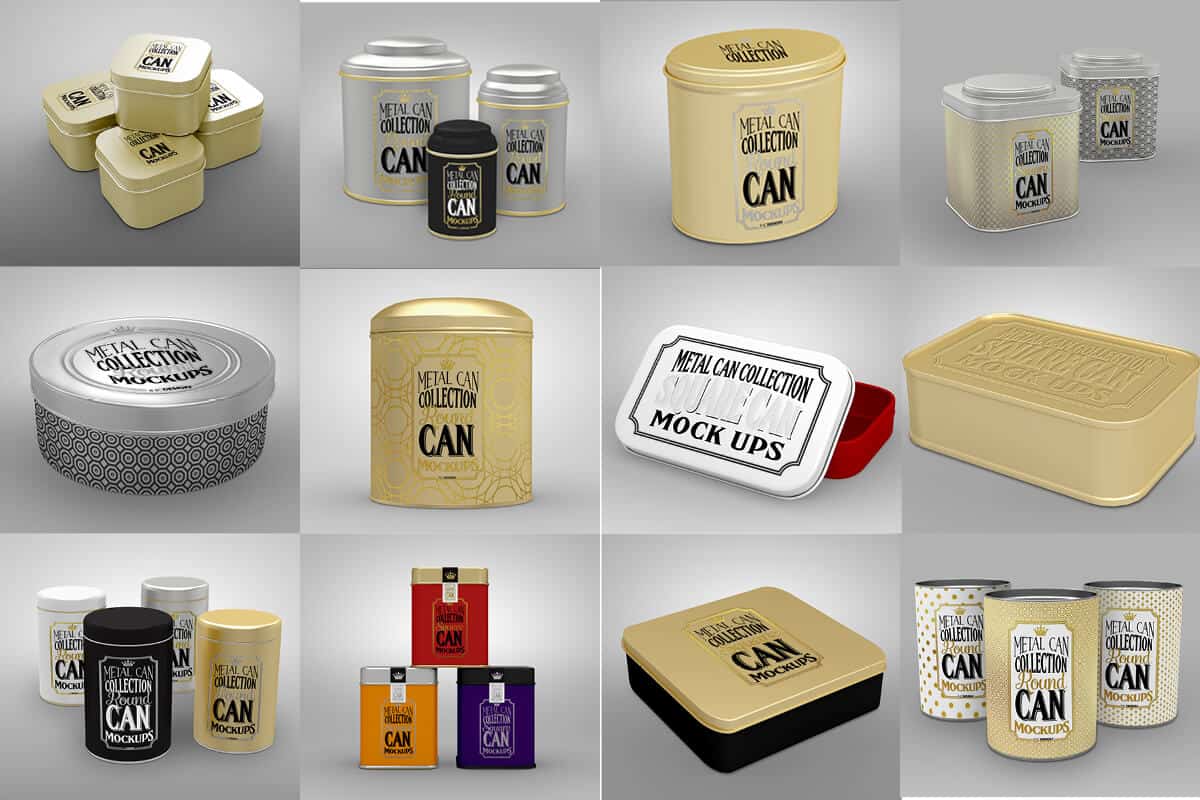
- Metal Can Collection (12 psd files):
Twelve (12) psd files with a TON of options to easily create over a hundred different looks from mix and matching the can finish, to adding silver or gold foil print or embossed designs on the cans.
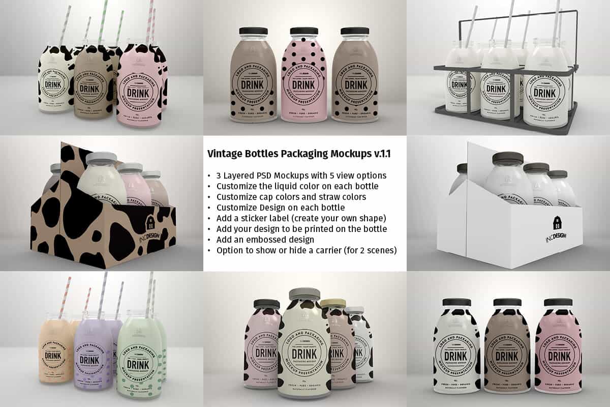
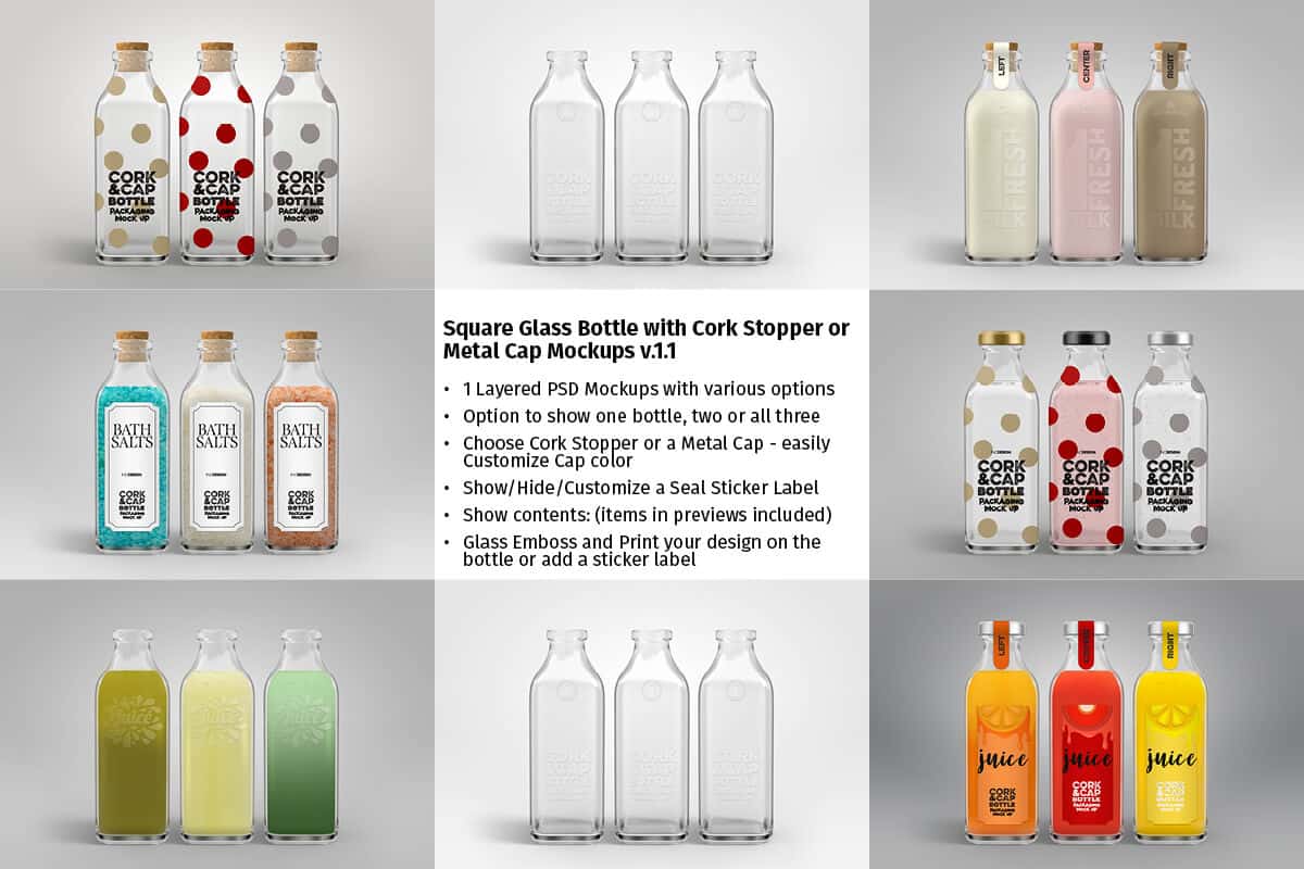
- Drink Packaging Collection (8 psd files):
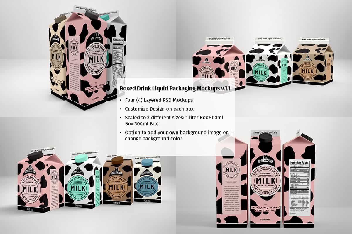
Eight (8) psd files for drink packaging - Vintage Bottles, Cork/Cap bottles and Boxed Drinks Mockups
Box Creator Set
(Back to top)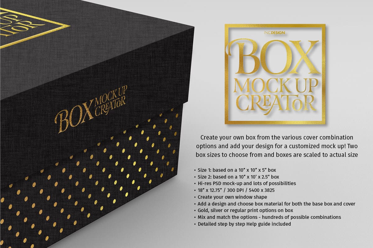
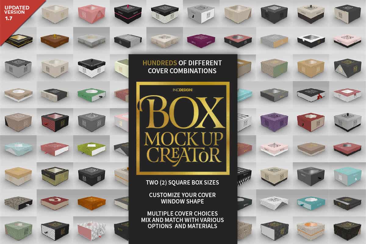
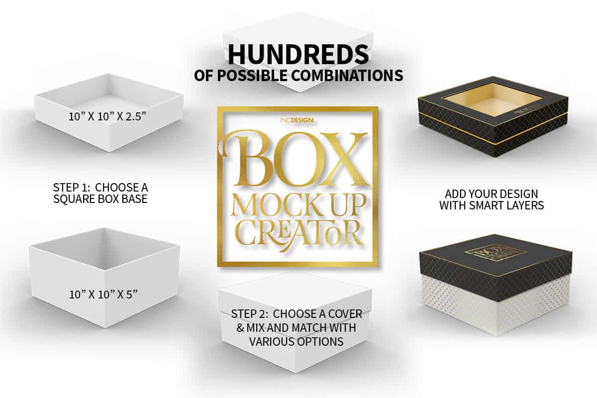
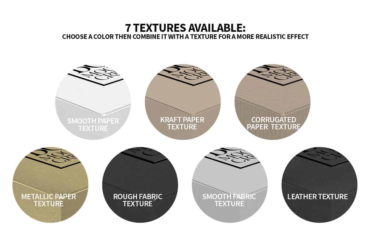

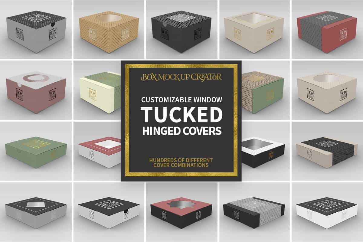
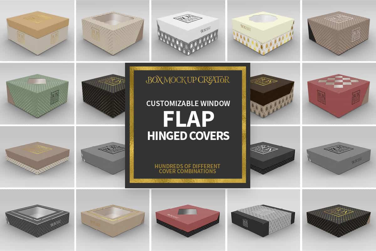

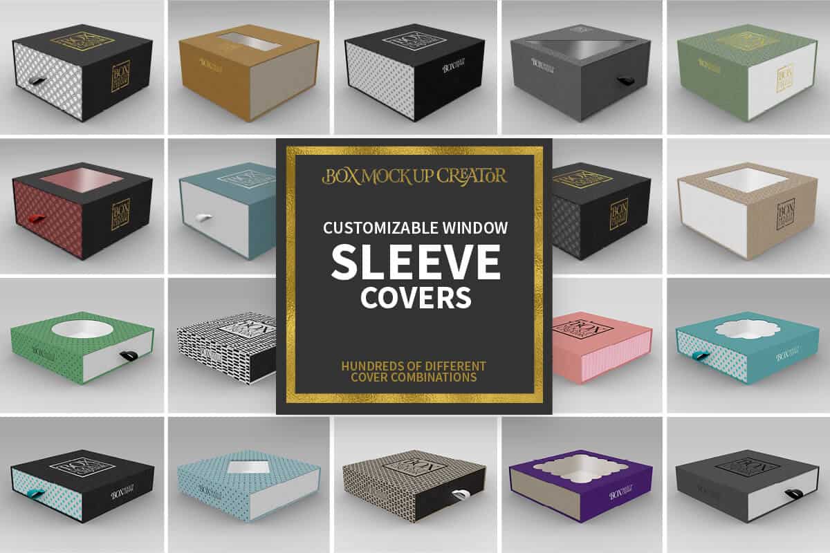
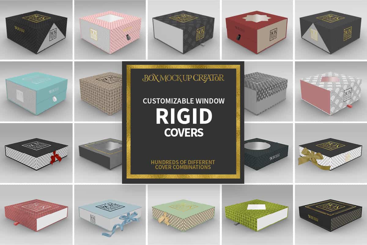
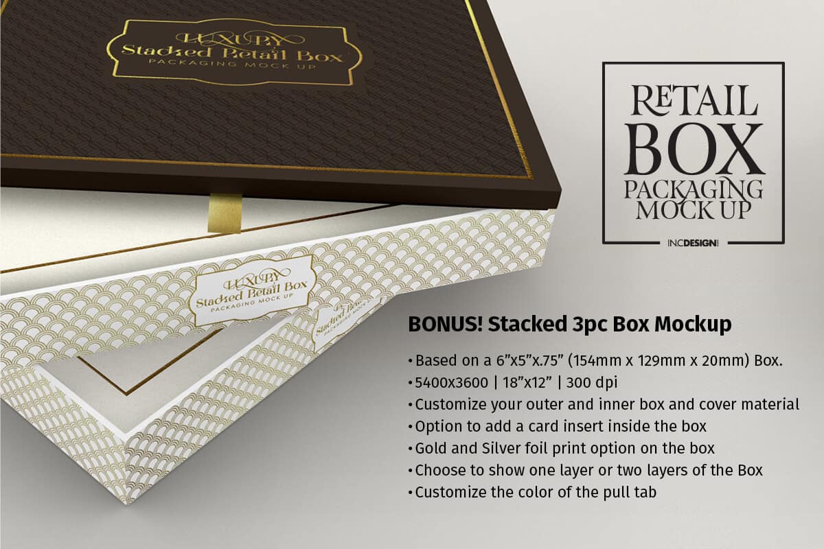
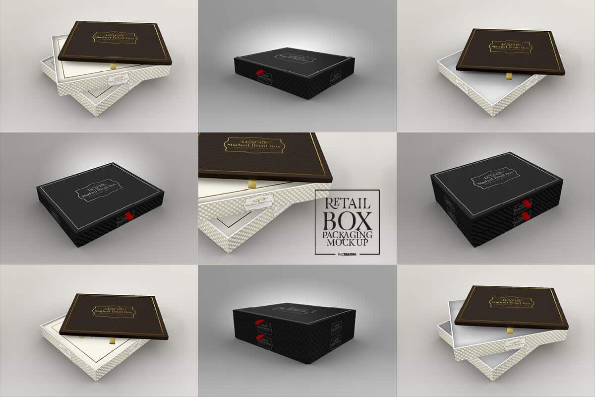
Paper Food Boxes
(Back to top)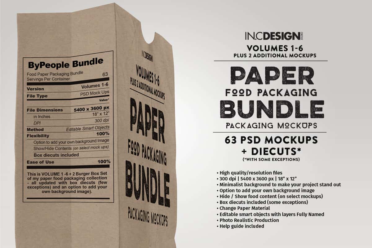
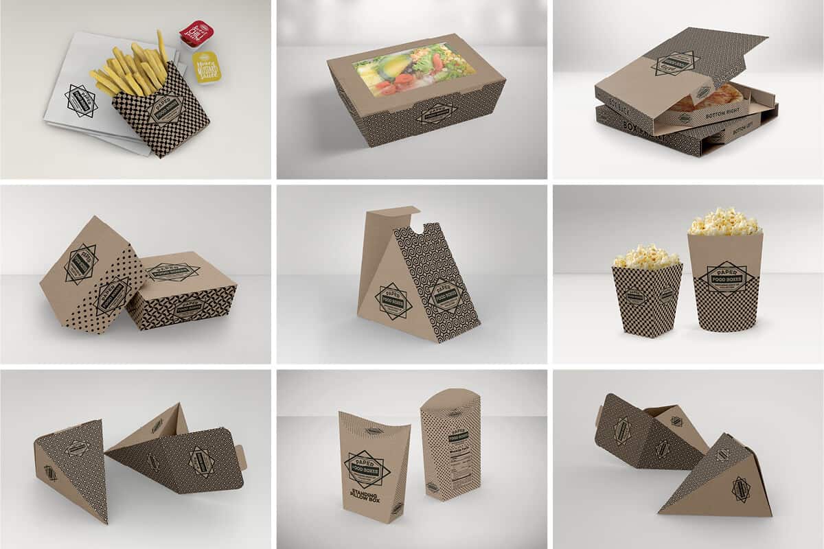
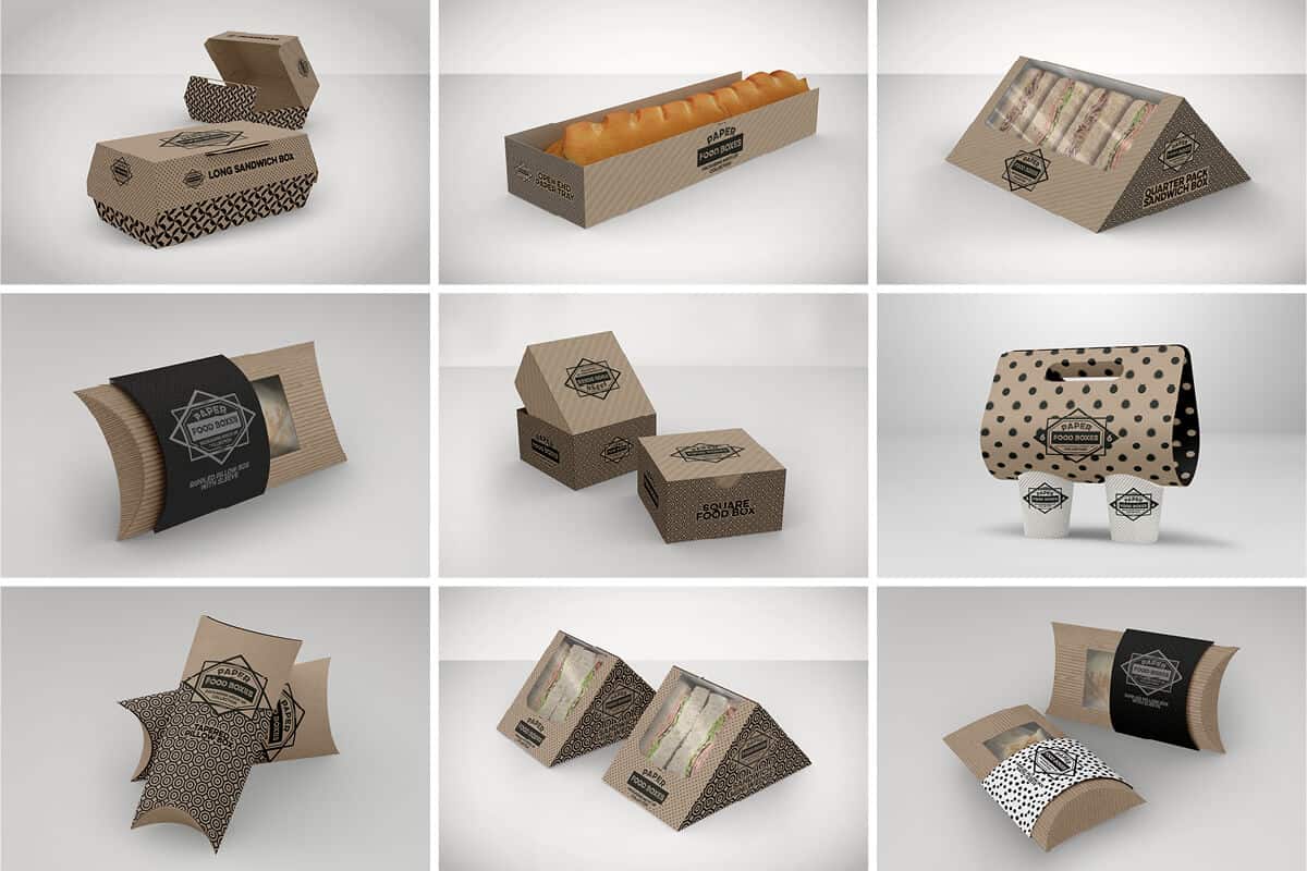
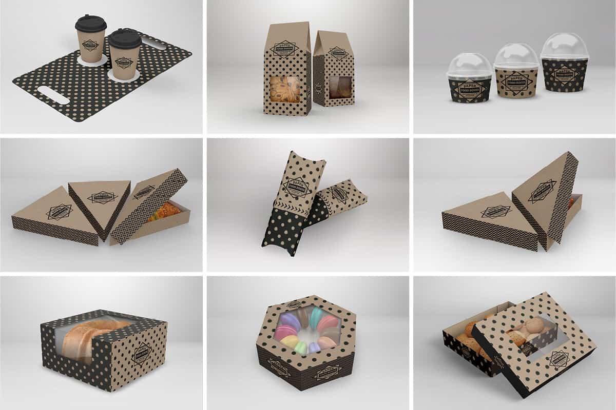
Metal Can Collection
(Back to top)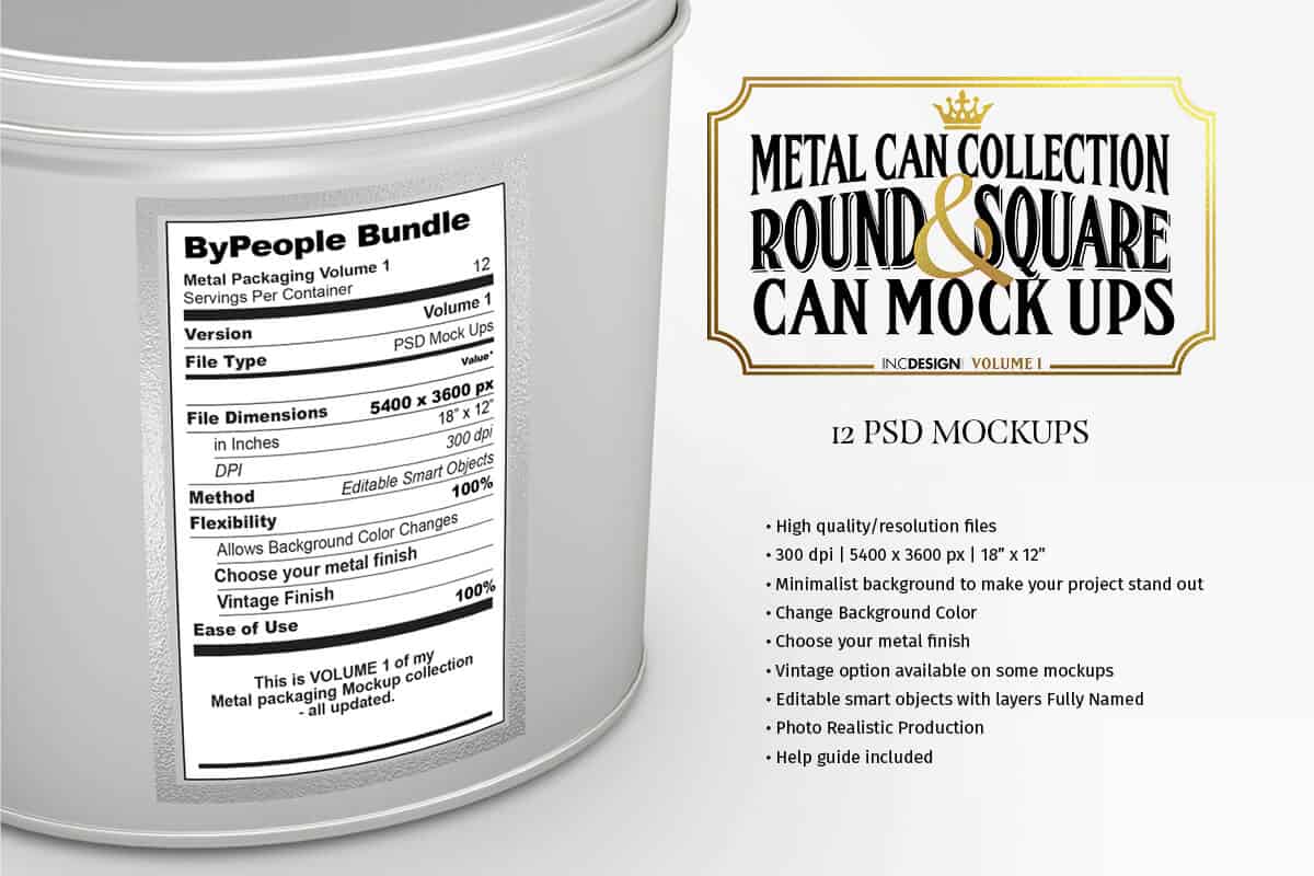
Clear Package
(Back to top)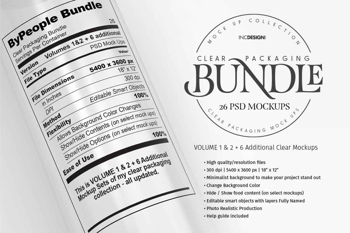




Drink Packaging Collection
(Back to top)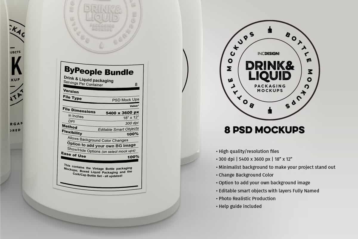
Terms and Conditions
1. Files included in the Bundle are royalty free for use in both personal and commercial projects.
2. You can modify the resources for your use but we are not legally liable for any misuse of our resources.
3. You cannot redistribute, resell, lease, license, sub-license or offer any of these files to any third party.
4. You cannot include or upload our resources to other websites or media-sharing tool and offering them as a separate attachment from any of your work.
5. These files can be used, as elements of the design, in items or website templates sold through a marketplace or directly on a website -- You cannot, however, resell or redistribute those files as is.
6. Questions, please send an email to themockupartist@inc-design.com
Nest is a framework for building efficient, scalable Node.js server-side applications. It uses progressive JavaScript, is built with TypeScript (preserves compatibility with pure JavaScript) and combines elements of OOP (Object Oriented Programming), FP (Functional Programming), and FRP (Functional Reactive Programming).
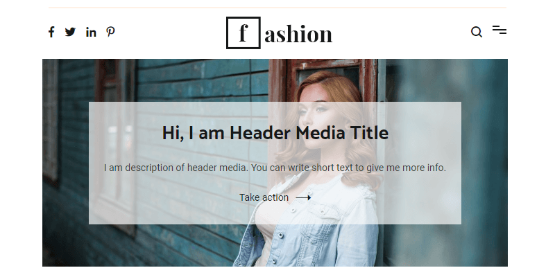
Beautiful clean modern free personal blog WordPress theme. It features standard and Pinterest-like posts view with a big header display for both Cenote default and fashion blog versions. It is licensed under GNU GPL license.

An exclusive freebie courtesy of Polar Vectors: 4 Premade Compositions in a clever toolkit that includes gradient backgrounds, geometric shapes, and patterns to create your own abstract scenes & designs easy and fast.
This trendy toolkit, mostly influenced by the gaming industry and robotics is really useful in poster, brochure, flyer, or book cover creations. The pack is delivered in both AI & EPS vector formats , as wel as PNG rasters.
See the included compositions below:

Fonts for every occasion
A diverse & professional bundle featuring 33 different fonts, featuring multiple weights, styles & design formats: From brush-stylized & handwritten calligraphic fonts to geometrical & slab-serif typefaces. The fonts are delivered in OTF & WOFF files, and all of them include a wide variety of ligatures, signs, punctuation glyphs and a lot of additional features, thanks to the multilanguage support. If purchased individually these fonts could be price up to $490 USD, for a limited-time get the full bundle, only $19 (96% OFF)!Preview all the fonts
- Aksinya Brush Font
- Arlin Brush Font
- Basnow Grunge Font
- Bekabuga Display Font
- Black Shepherd
- Blue April
- Cracky Display Font
- Demetriss Font
- Disquise Brush Typeface
- Dissentio Typeface
- Elvissa Script
- Embrace Autumn
- Forgotten November
- Fun Bang
- Immensely
- Inversus
- Jelani Display Font
- Keril Devil
- Malanya Typeface
- Miss Lavanda
- Mr. Lonely
- Neoscopic Brush Typeface
- The Nordlike
- Old Maple
- Raisia Script Font
- Retano Script
- Sacral Town
- Springfeel
- Summerrine
- Sungai Brush Typeface
- Thirty One Typeface
- Tino Script
- Yoshiko Font Duo
Aksinya Brush Font (Back to top)
Aksinya Brush Font comes with all caps uppercase and lowercase characters, alternate characters, large set of punctuation glyphs, numerals and supports international languages.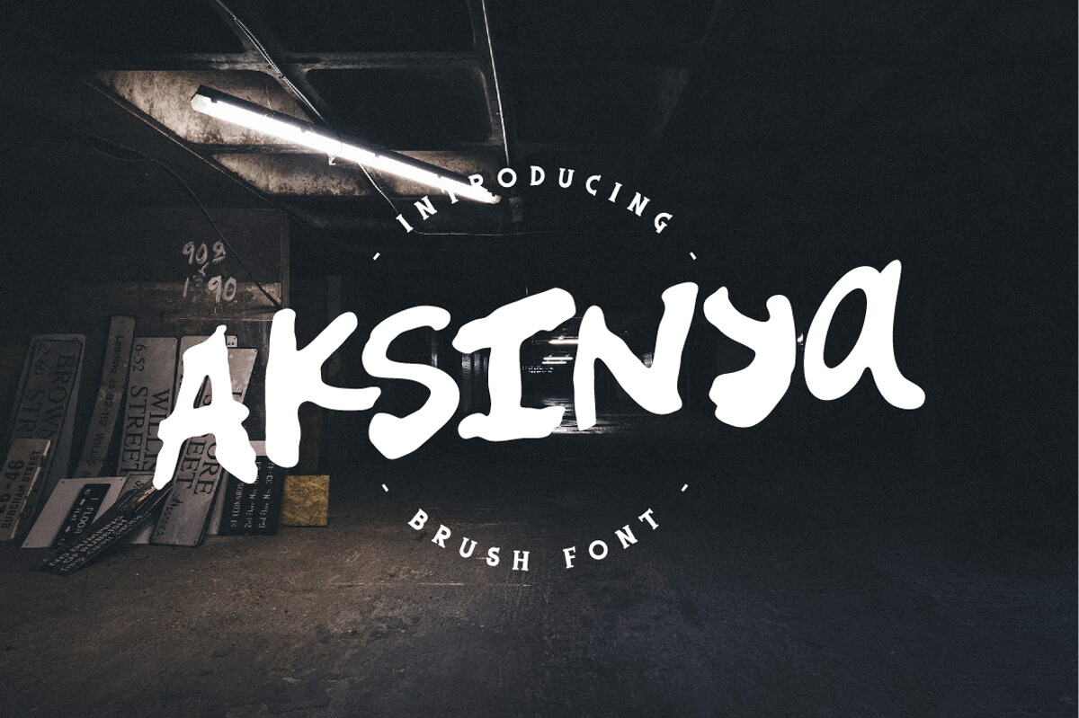


Arlin Brush Font (Back to top)
Arlin Brush Font is a hand brushed font. Ideal for greeting cards, logos, handwritten quotes, product packaging, poster and etc. International language support.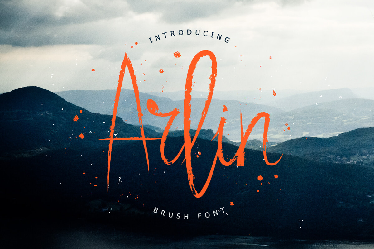


Basnow Grunge Font (Back to top)
Basnow Grunge Font comes with all caps uppercase and lowercase characters, large set of punctuation glyphs and numerals.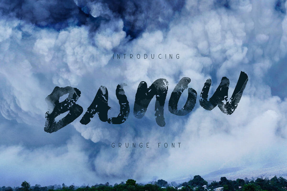
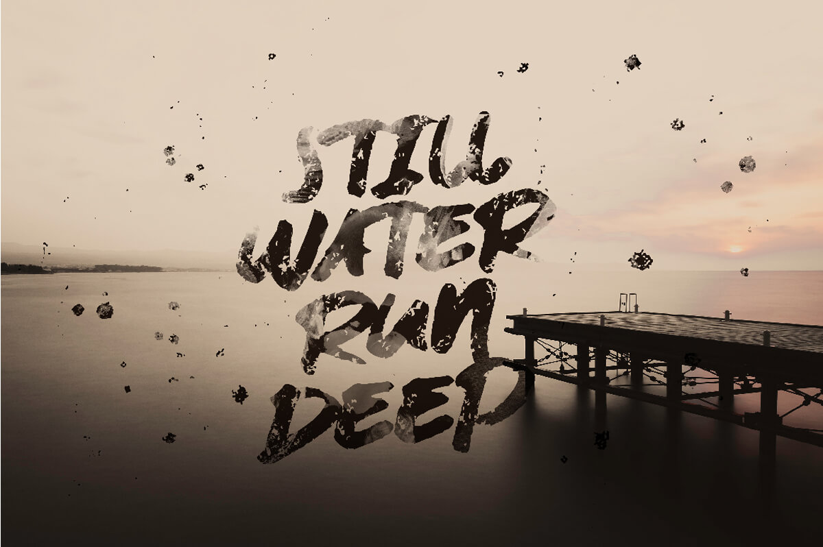


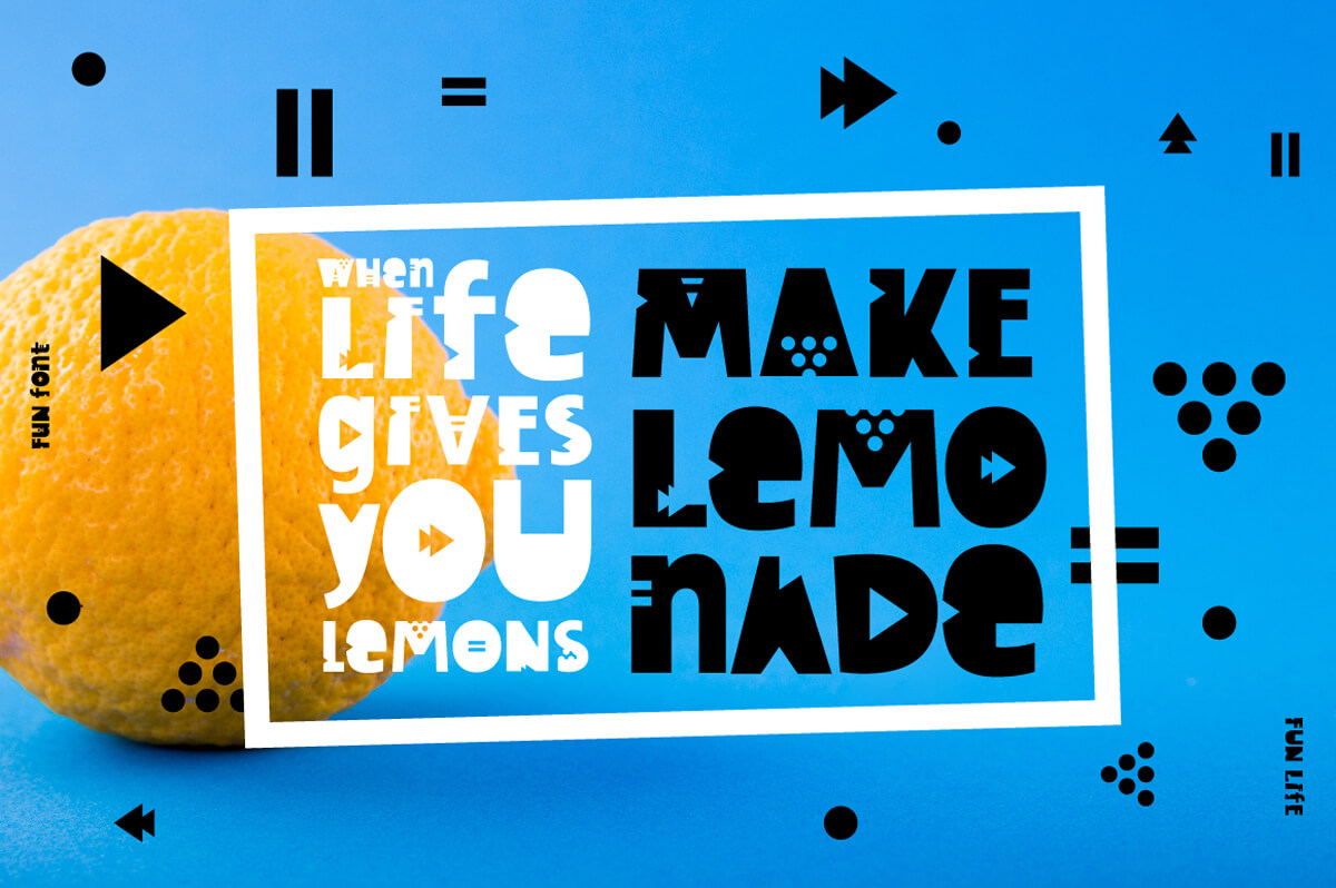
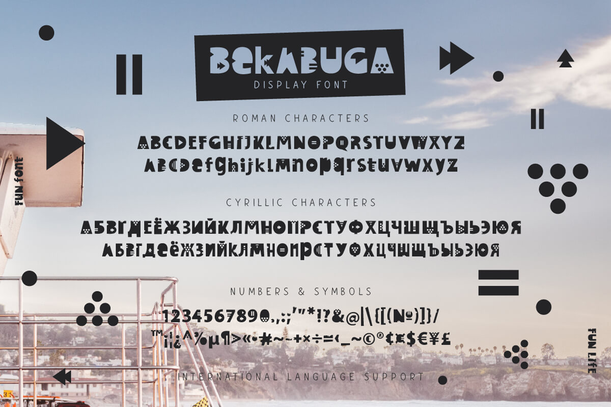
Bekabuga Display Font (Back to top)
Bekabuga is a fun kids font, consisting of geometric cuts. Contains Cyrillic characters and international support.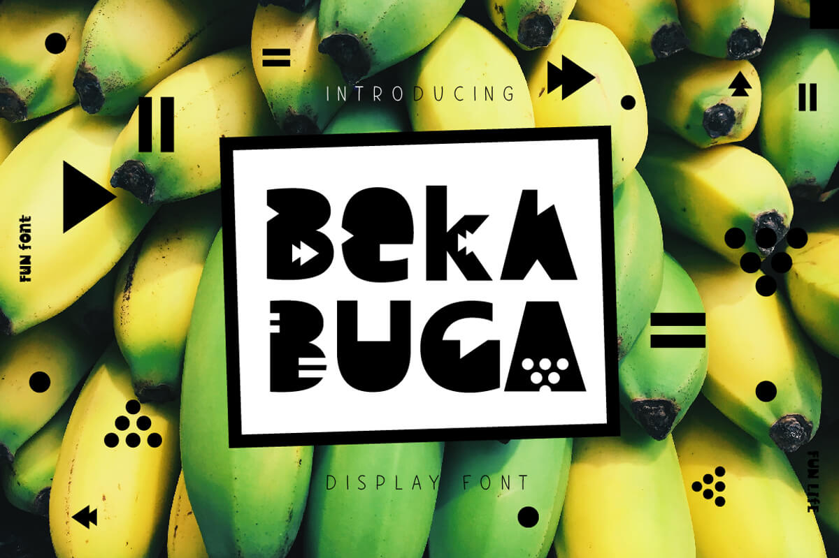


Black Shepherd (Back to top)
Black Shepherd is a bones-based font, perfect for Halloween. Cyrillic characters and international support.


Blue April (Back to top)
Blue April comes with all caps uppercase and lowercase letters, Cyrillic characters and multilingual support. Ideal for quotes, posters, t-shirt, logos, product packaging and etc.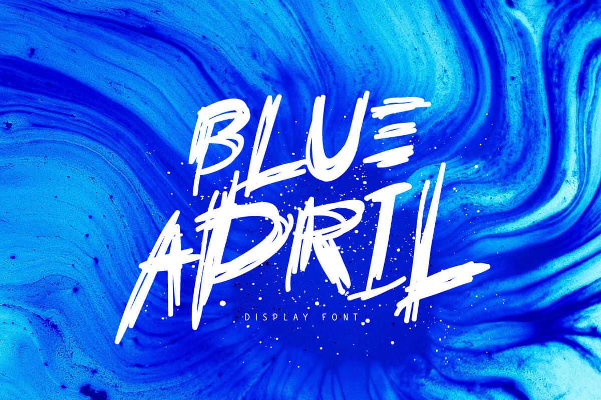


Cracky Display Font (Back to top)
Cracky is a torn font with sharp edges. Contains Cyrillic characters and multilingual support.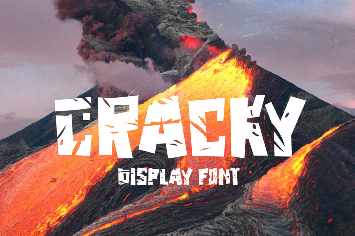


Demetriss Font (Back to top)
Demetriss is a unique handwritten font. Ligatures, Cyrillic characters, and multilingual support.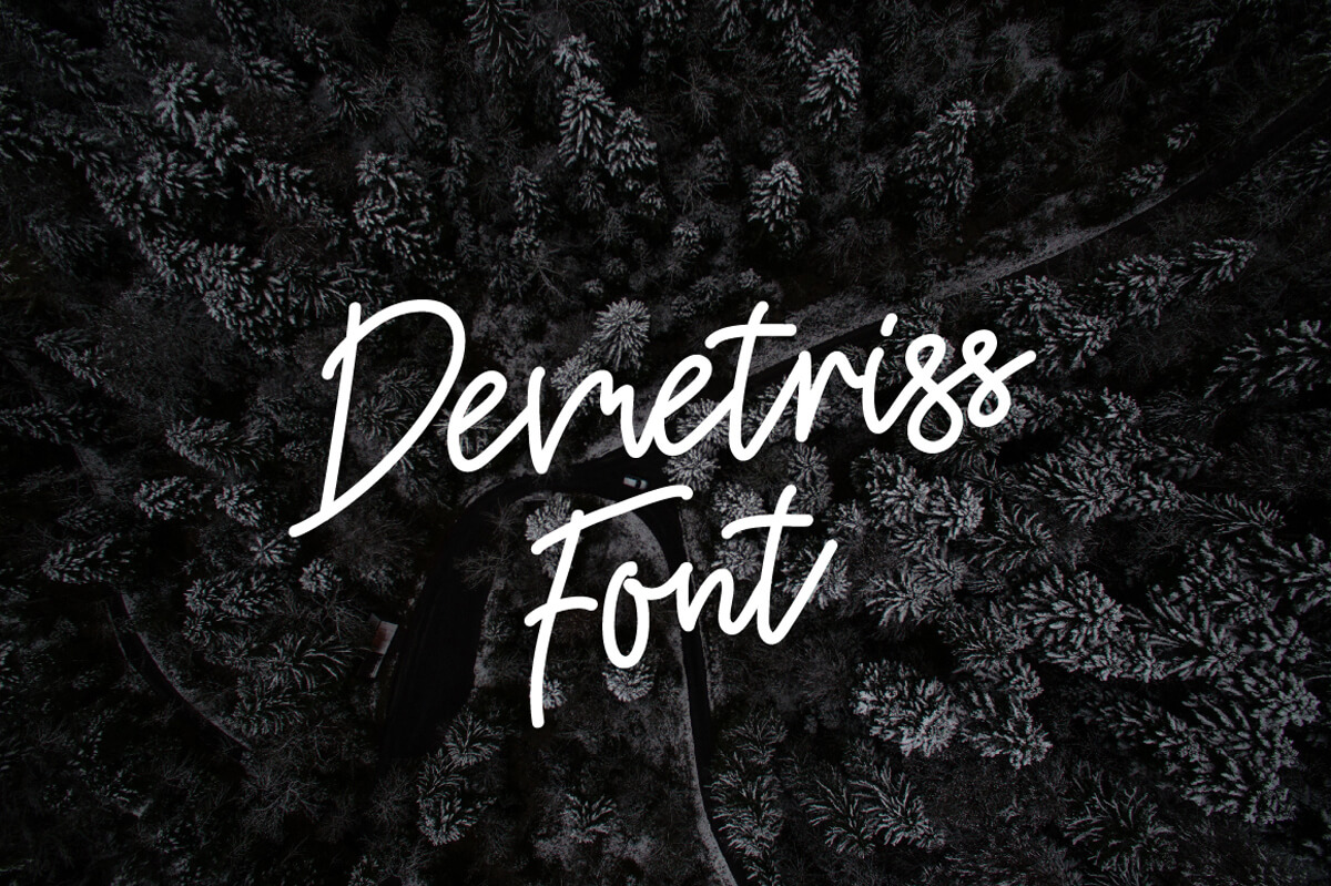


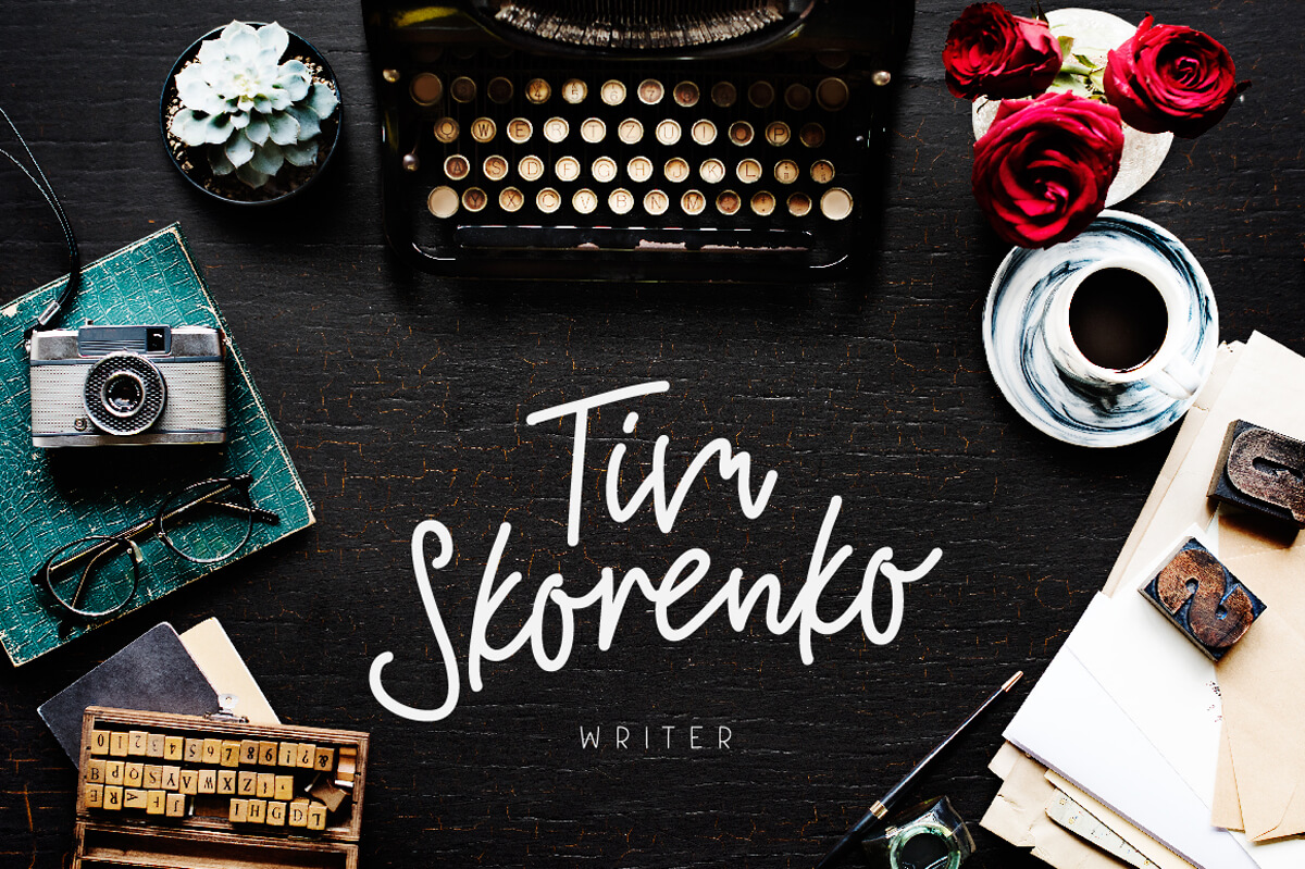

Disquise Brush Typeface (Back to top)
Ideal for handwritten quotes, product packaging, poster and applicable for any graphic design. Supports international languages.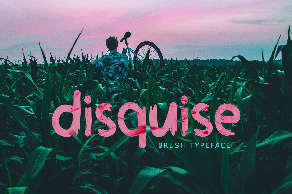


Dissentio Typeface (Back to top)
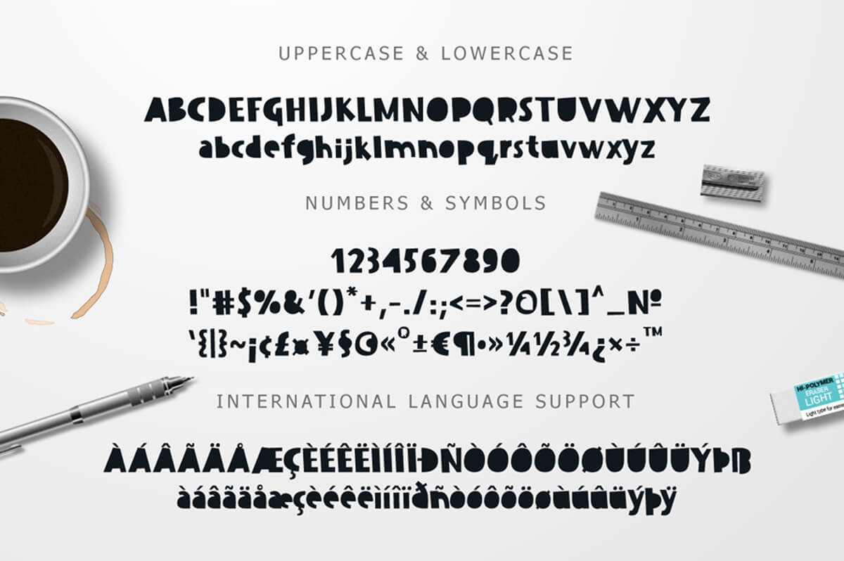
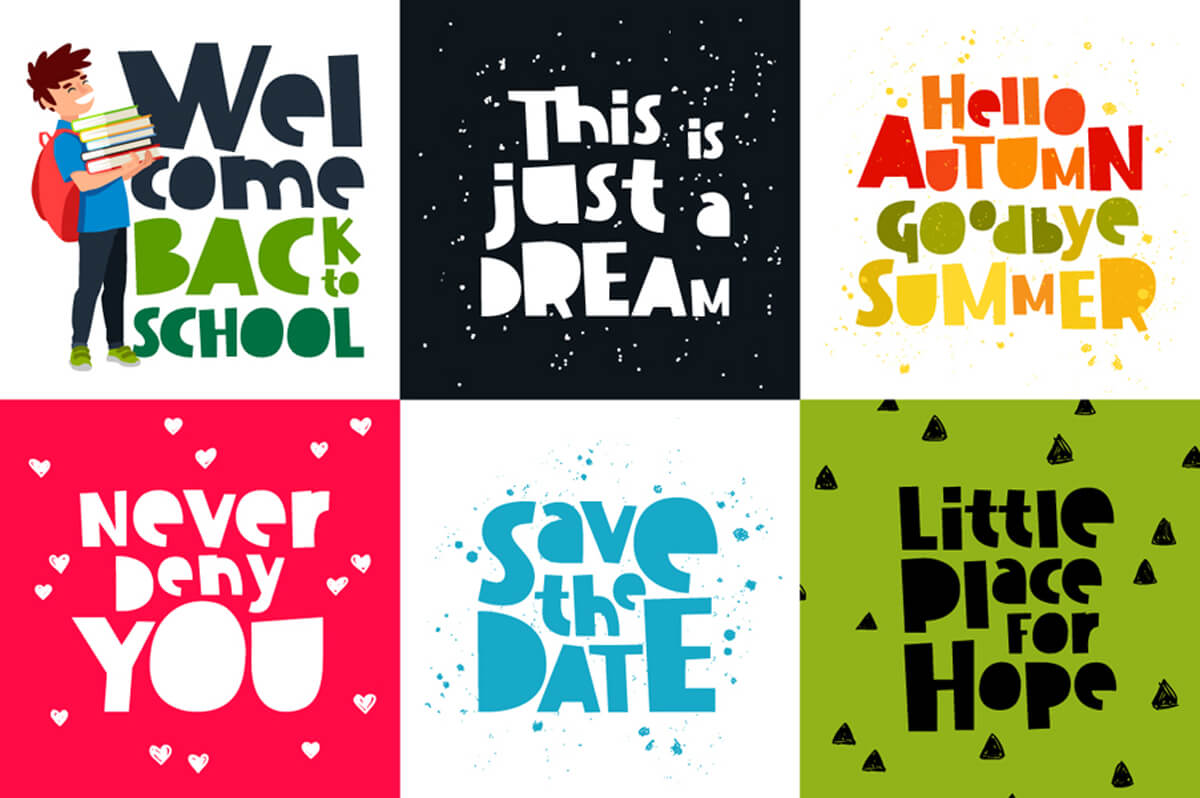
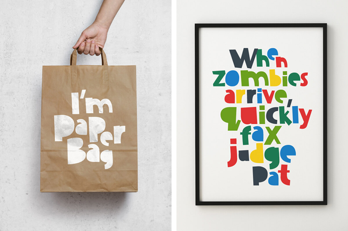
Dissentio is a funny bold font.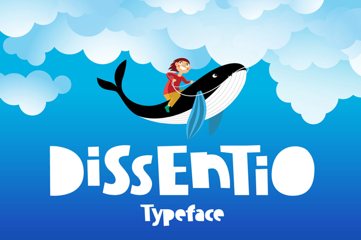

Elvissa Script (Back to top)
Perfect for handwritten quotes, logos, t-shirt, prints and whatever your imagination holds.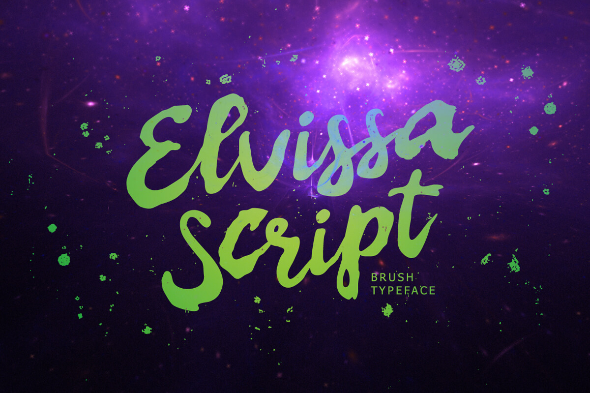


Embrace Autumn (Back to top)
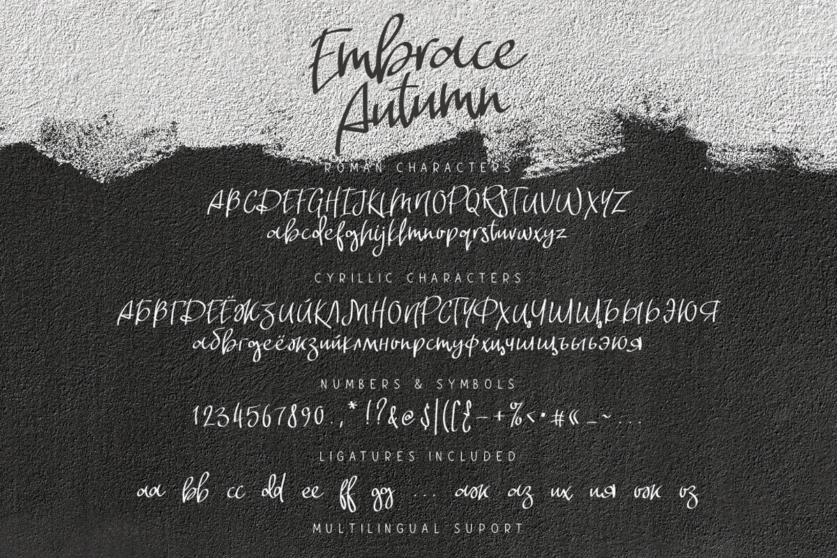
Embrace Autumn is a handwritten font. It comes with ligatures, Cyrillic characters and multilingual support.


Forgotten November (Back to top)
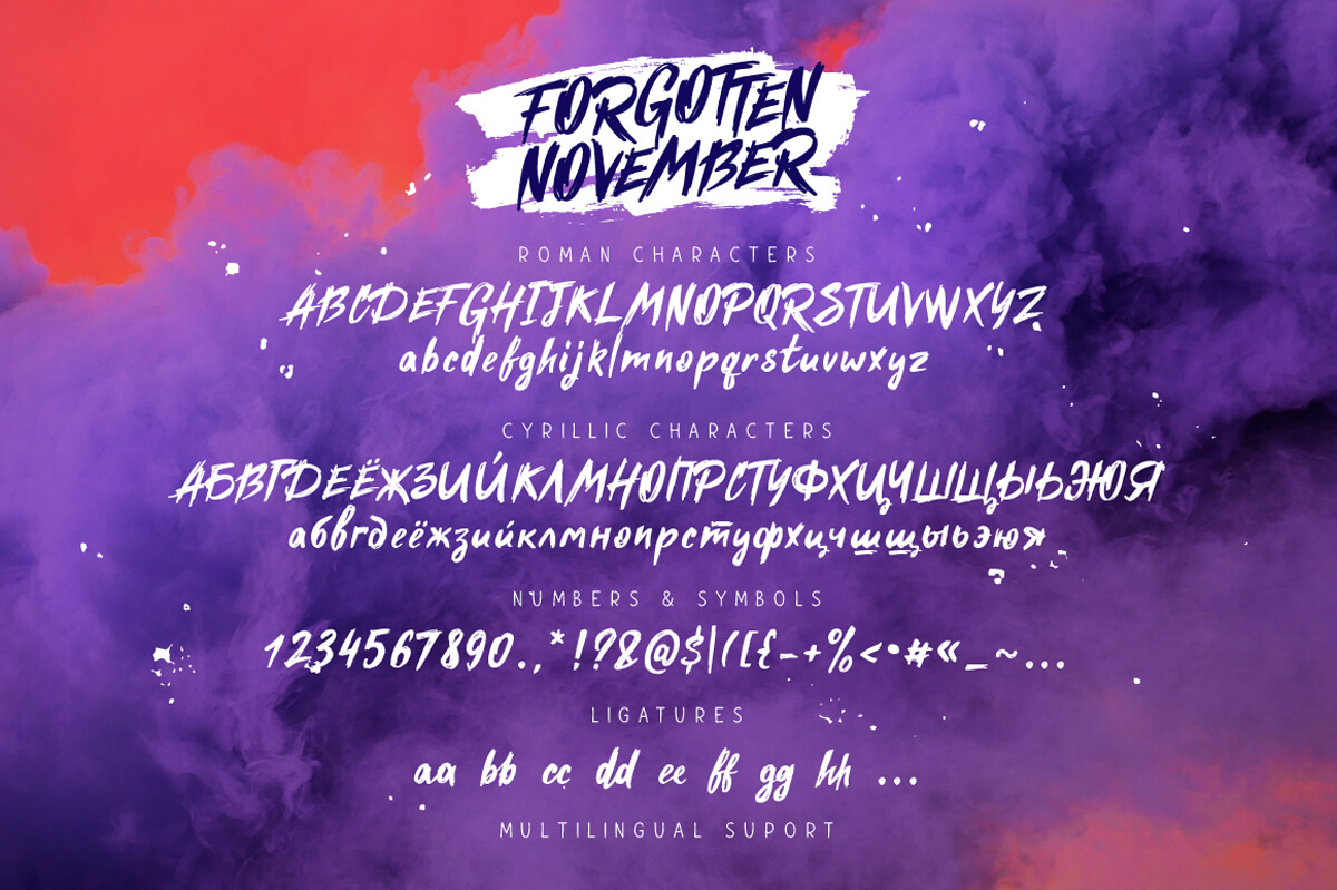
Forgotten November is a handwritten font. Ligatures, Cyrillic characters, and multilingual support.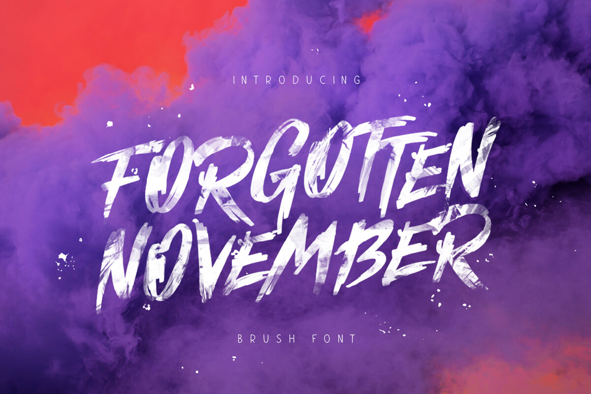


Fun Bang (Back to top)
Fun Bang is a funny geometric font. It comes with ligatures, Cyrillic characters and multilingual support.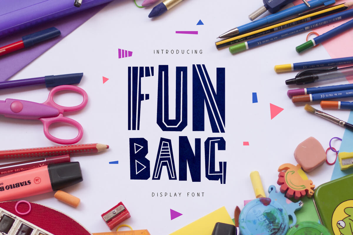


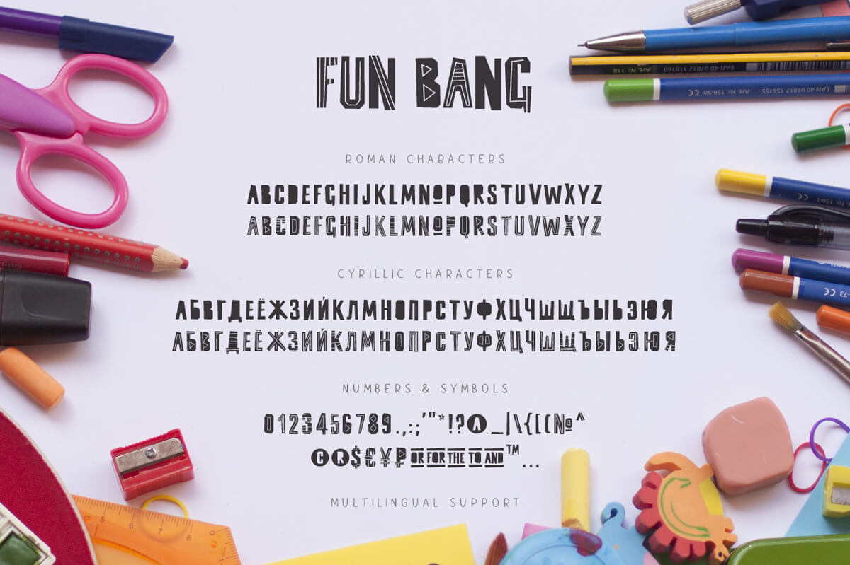
Immensely (Back to top)
Immensely is a handwritten font, comes with ligatures, Cyrillic characters and multilingual support.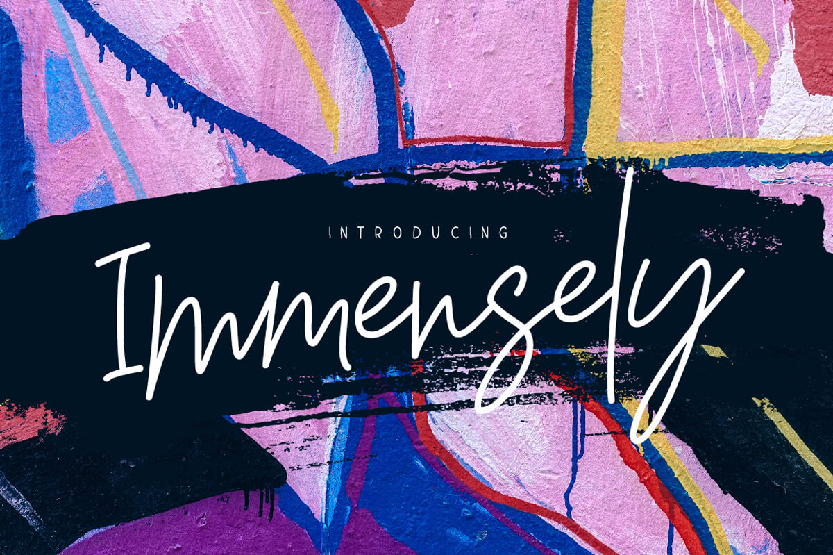


Inversus (Back to top)
Inversus – a slab-serif display font, contains a full set of lower & uppercase letters, alternate letters, a large range of punctuation, numerals, ligatures, Cyrillic characters and multilingual support.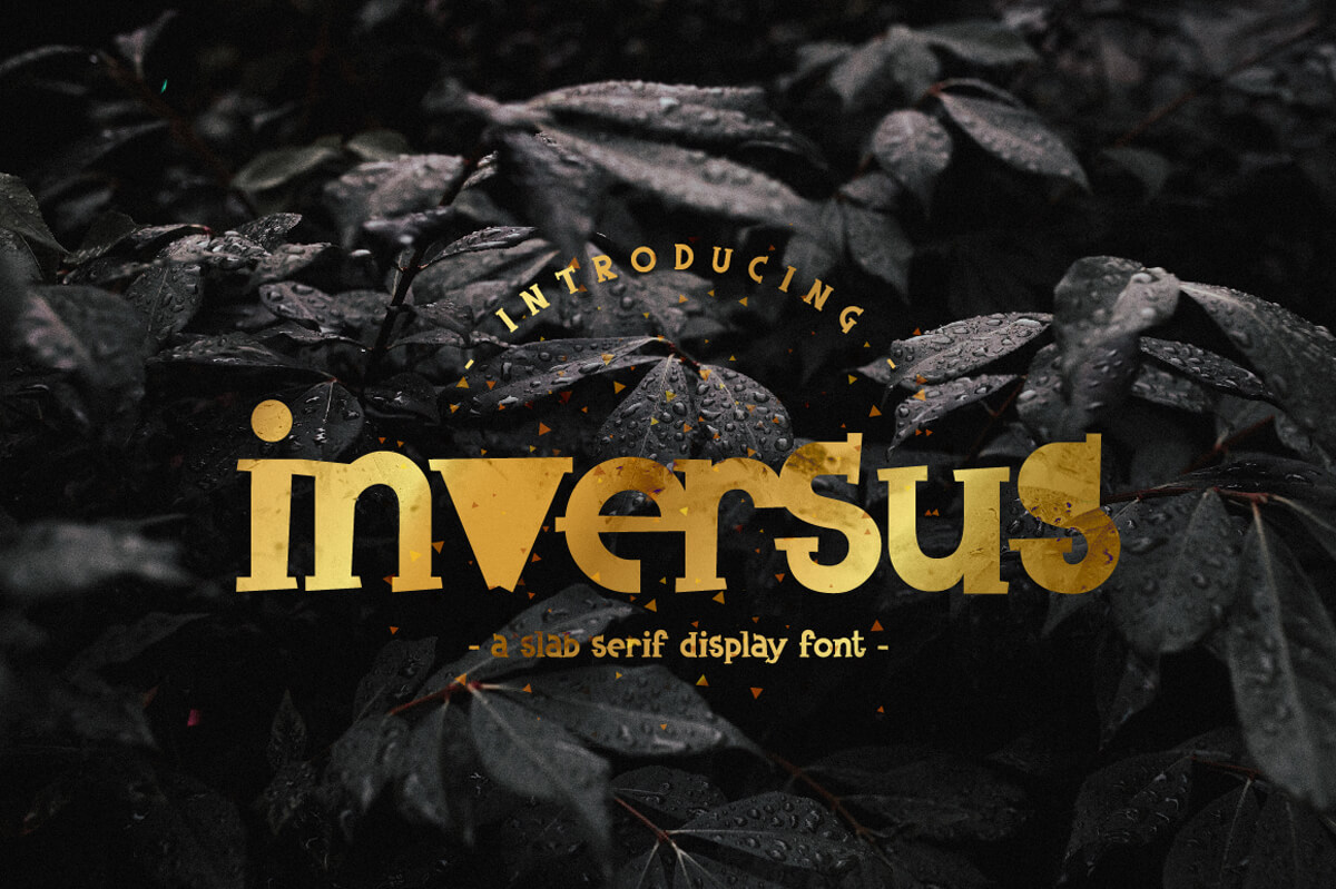


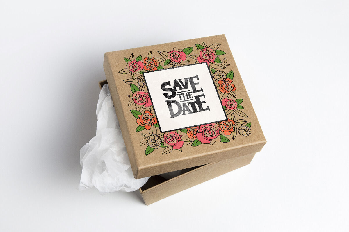
Jelani Display Font (Back to top)
Jelani is a unique authentic font, based on African motifs. Cyrillic characters and multilingual support.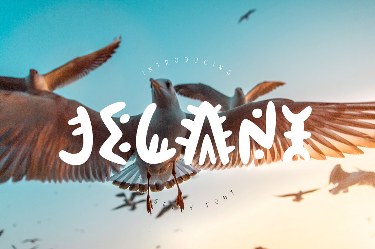


Keril Devil (Back to top)
Keril Devil is a fun kids display font. It contains Cyrillic characters and multilingual support.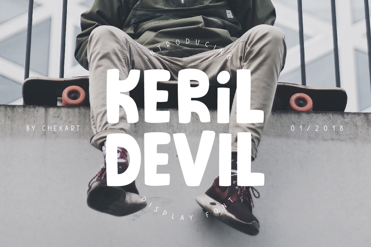


Malanya Typeface (Back to top)
Malanya is a stylish handwritten font. Multilingual support.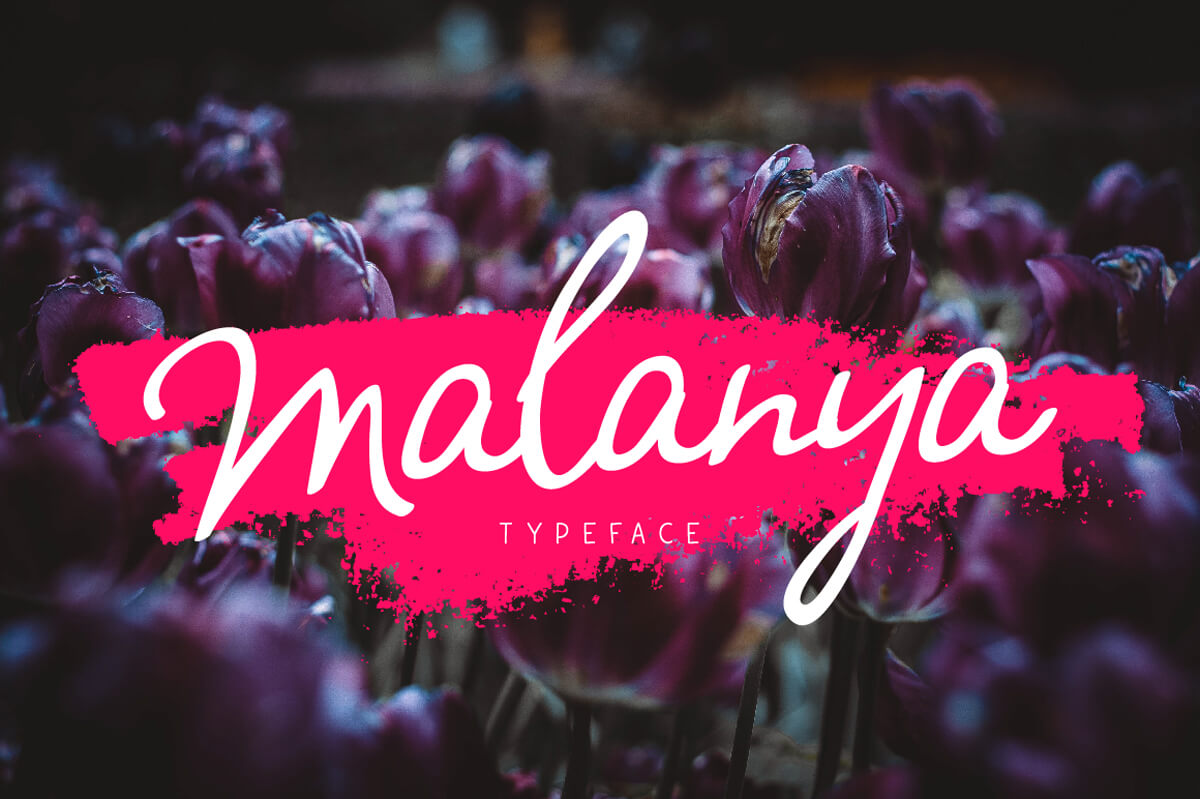
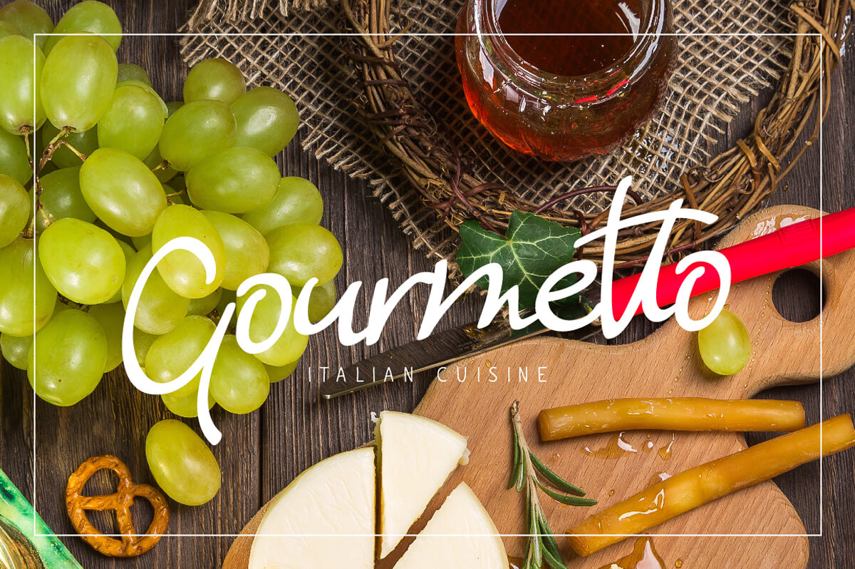

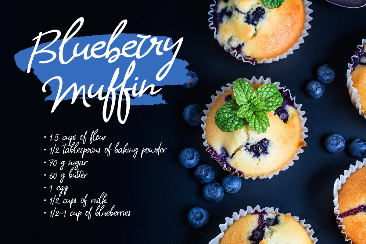
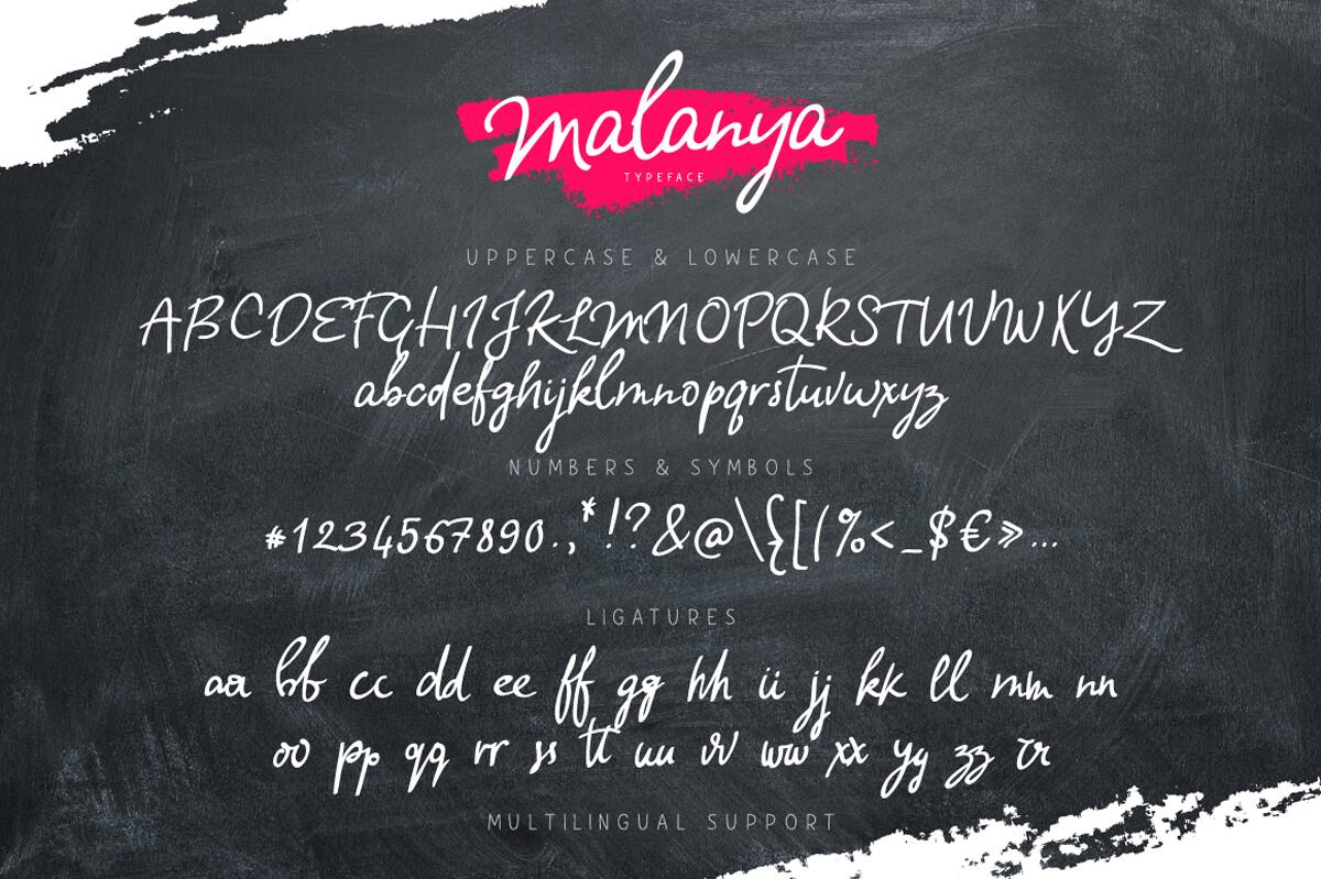
Miss Lavanda (Back to top)
Miss Lavanda is a brush font. Ligatures, Cyrillic characters, and multilingual support.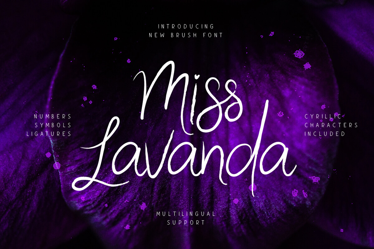
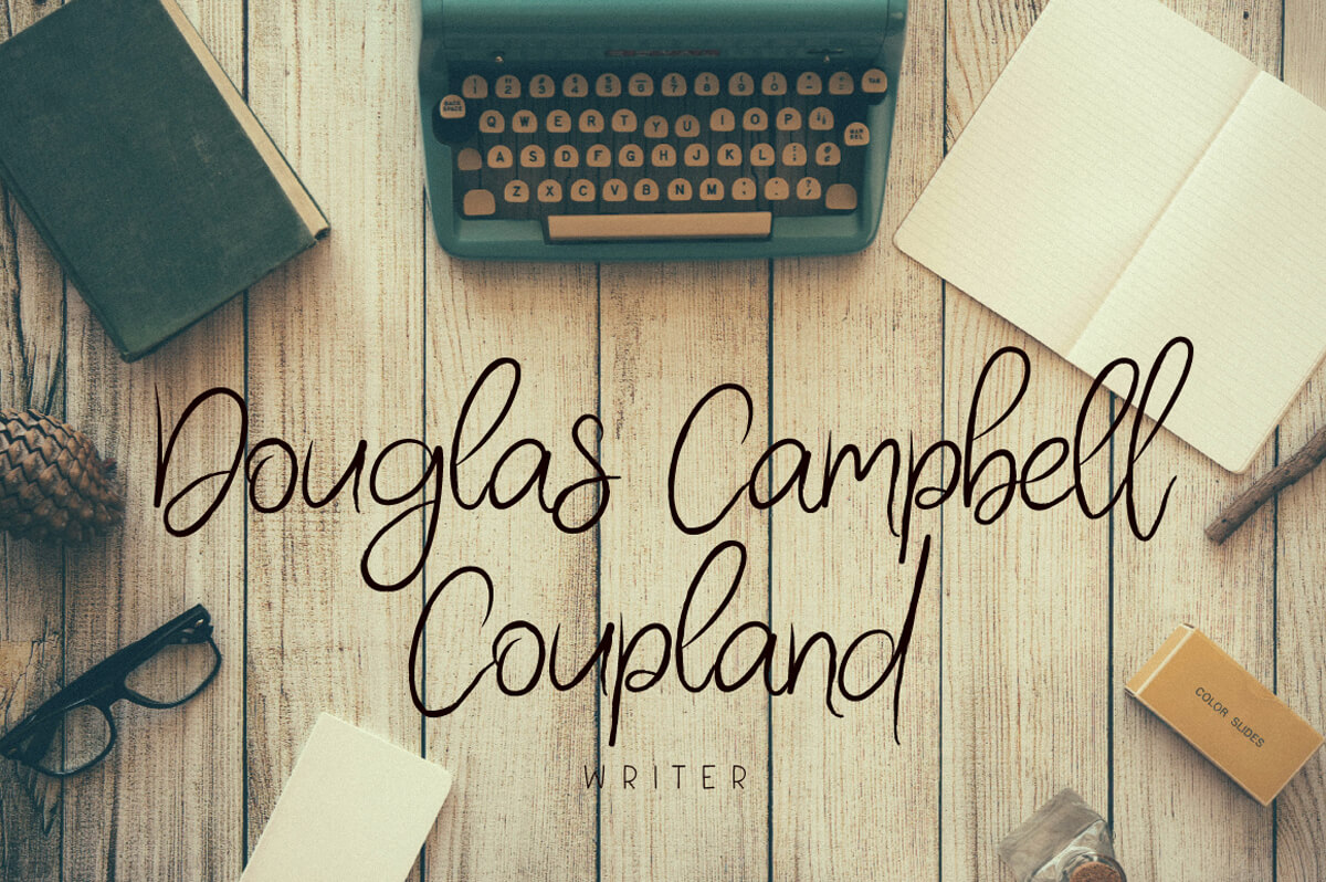

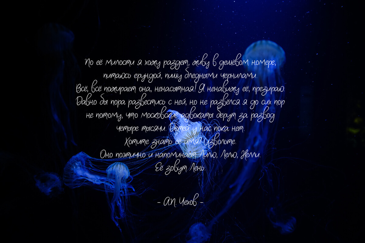
Mr. Lonely (Back to top)
Mr. Lonely is a cute brush font. It contains ligatures, Cyrillic characters and multilingual support.


Neoscopic Brush Typeface (Back to top)
Neoscopic Brush Typeface comes with uppercase and lowercase characters, a large set of punctuation glyphs, numerals, and ligatures.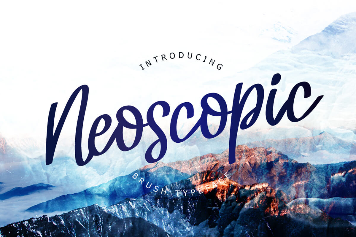


The Nordlike (Back to top)
The Nordlike is a handwritten font, which contains Cyrillic characters and multilanguage support.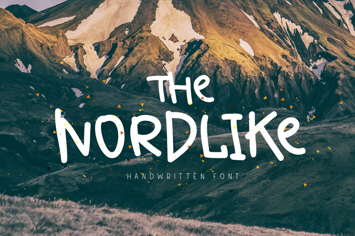

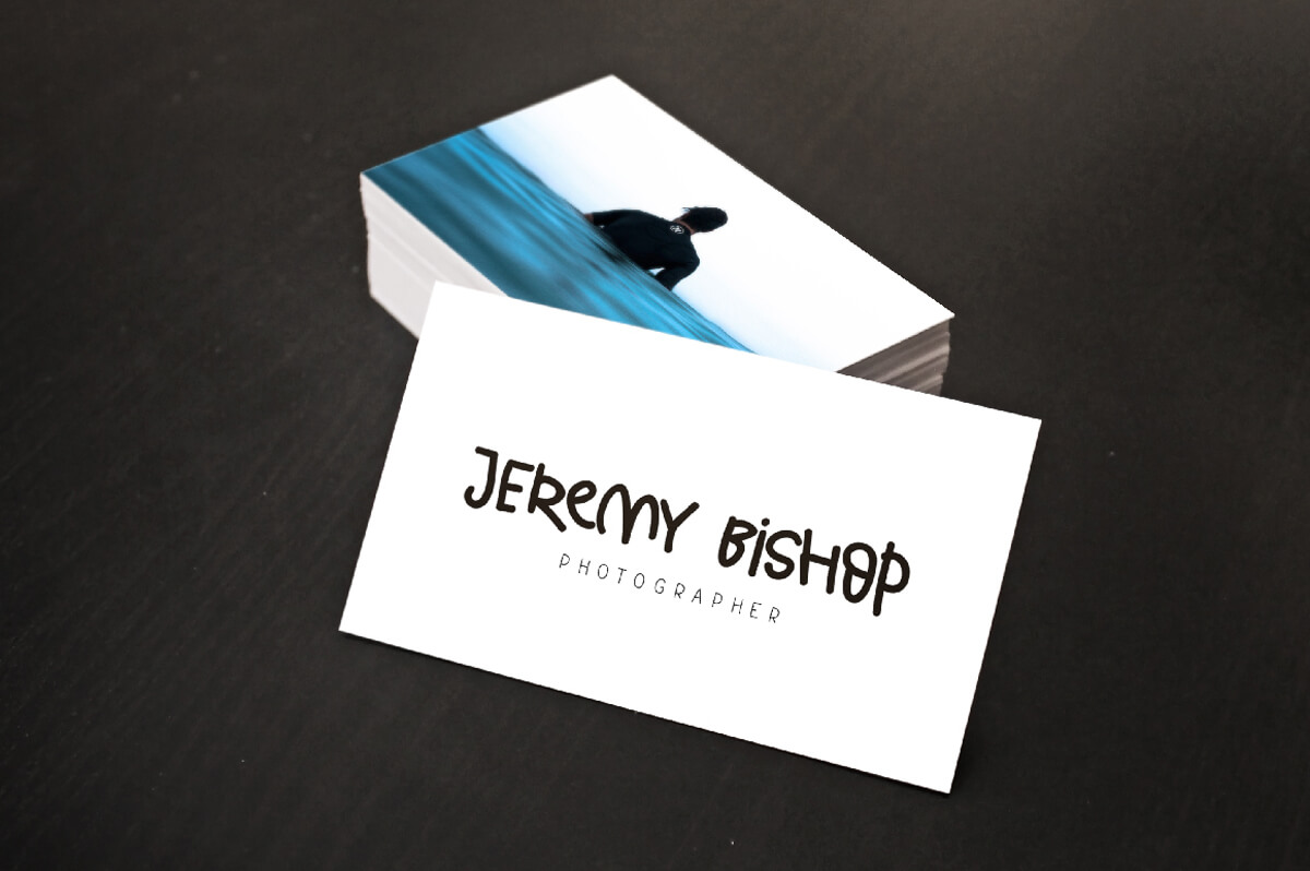


Old Maple (Back to top)
All the letters of Old Maple were carefully taken from my father's notebook. And the missing letters were created on the basis of available ones. Font comes with Cyrillic characters and multilingual support.


Raisia Script Font (Back to top)
Raisia Script Font is a unique handwritten font. Support international language.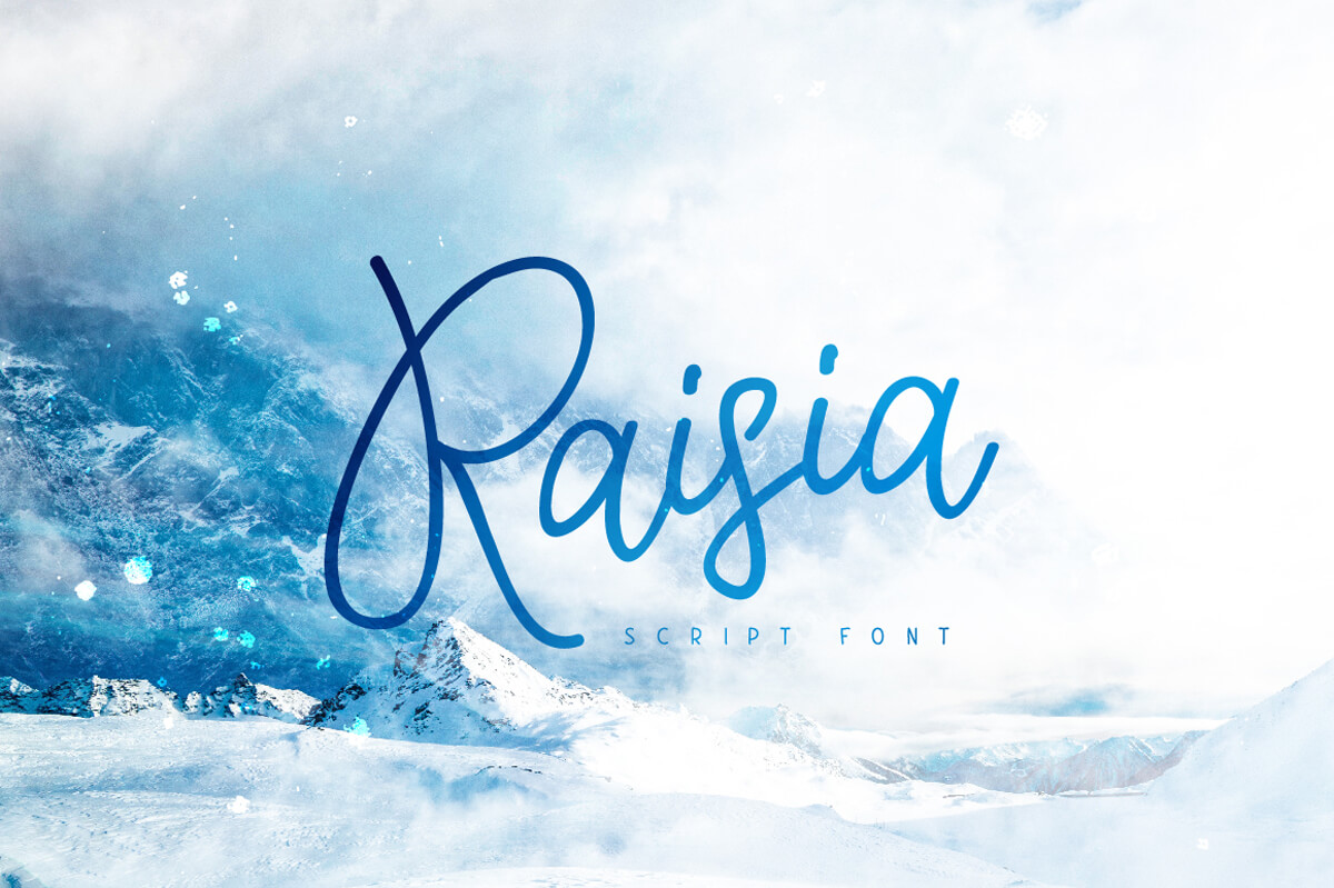


Retano Script (Back to top)
Retano is a new handwritten font. Comes with international characters.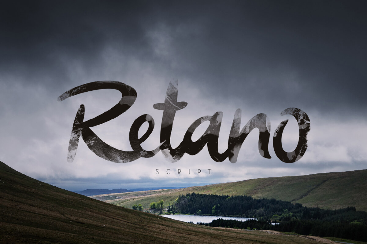
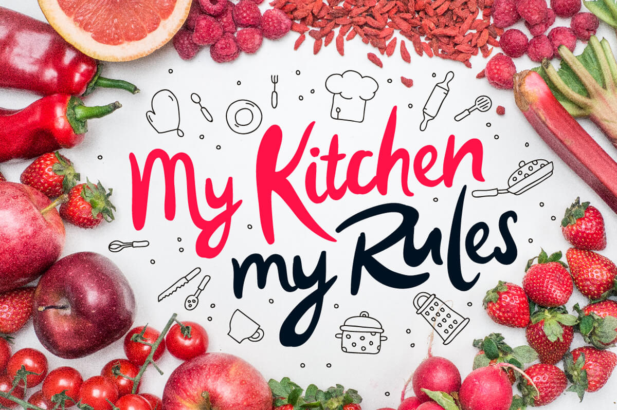


Sacral Town (Back to top)
Sacral Town is a linear geometric font. It comes with all caps uppercase and lowercase characters, a large set of punctuation glyphs and numerals.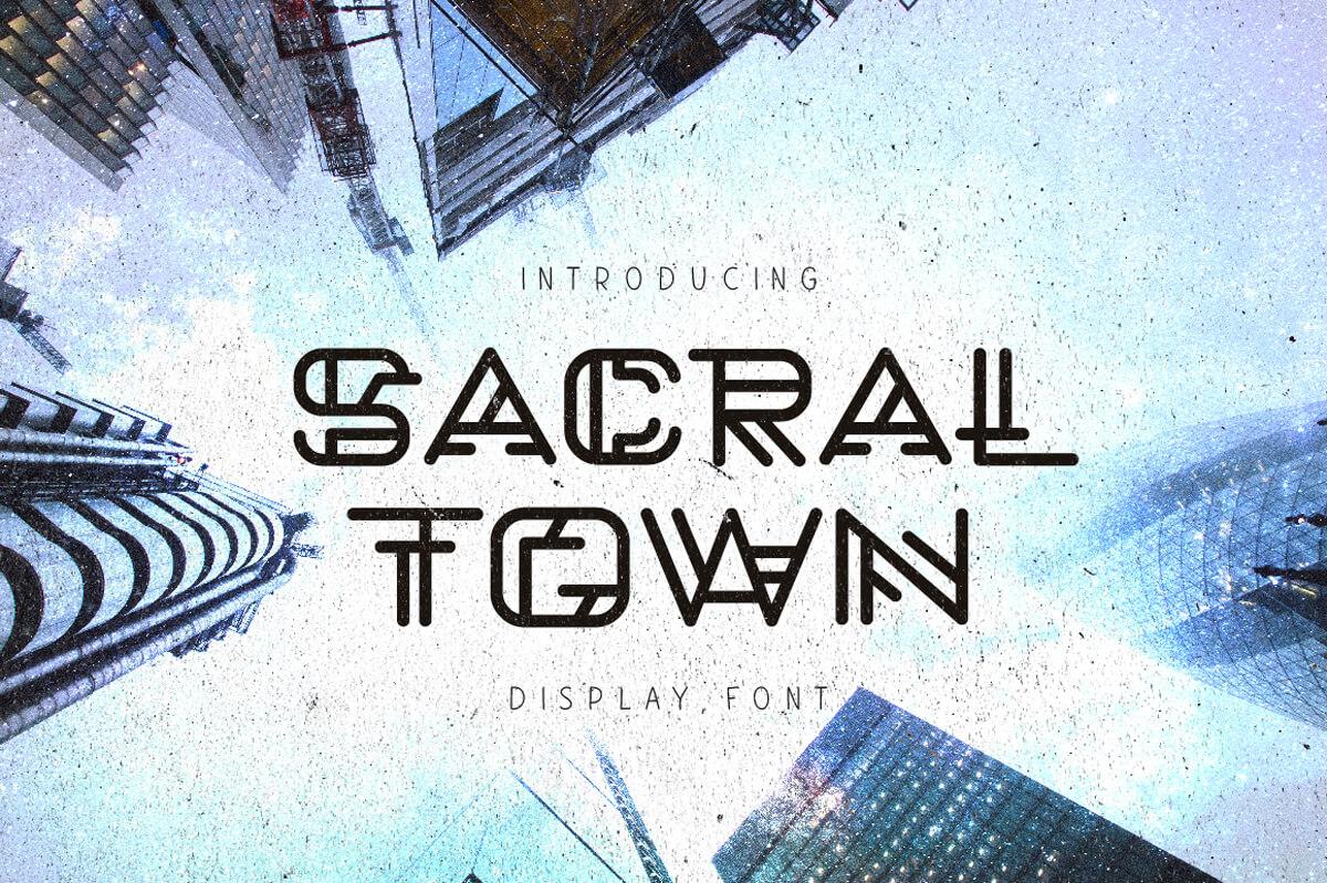


Springfeel (Back to top)
Ideal for quotes, posters, t-shirt, logos, product packaging, book cover and etc.



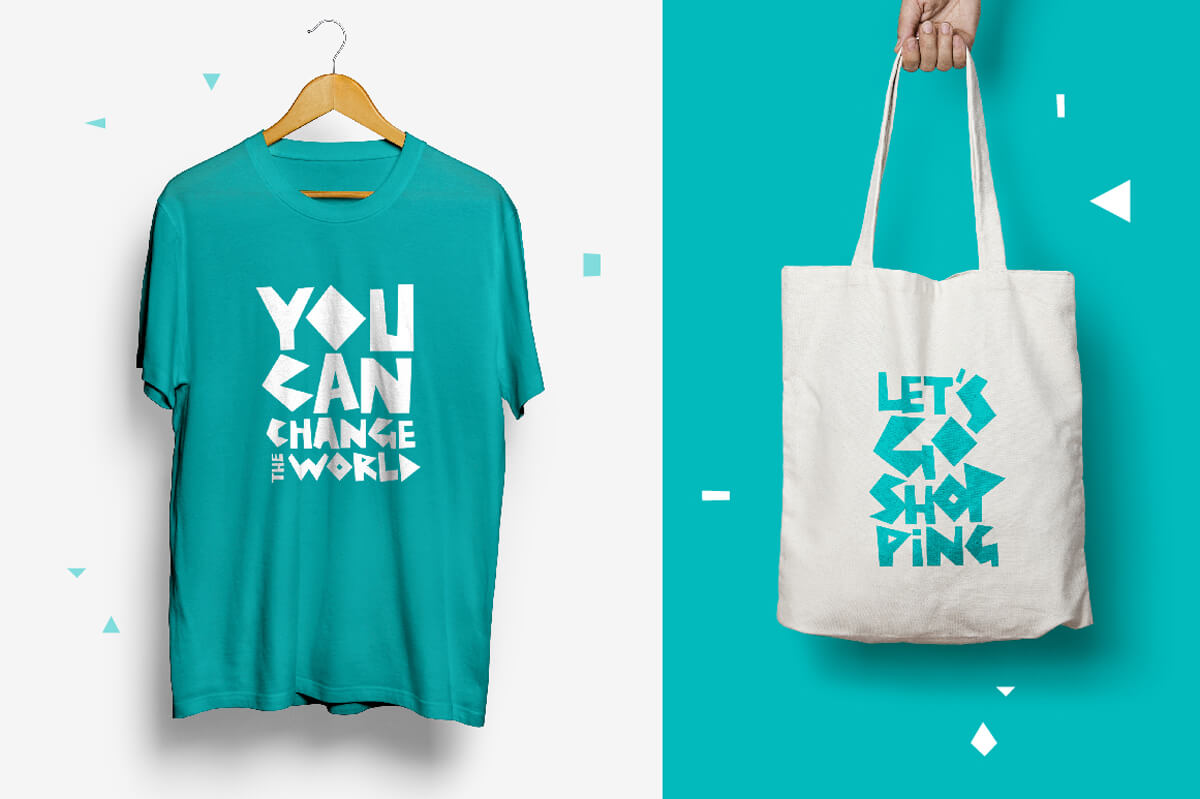
Summerrine (Back to top)
Summerrine is a geometric font without rounded elements. It contains Cyrillic characters and international support.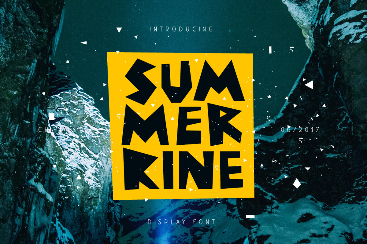



Sungai Brush Typeface (Back to top)
Sungai Brush Typeface is a dry hand-brushed font with ragged edges. Supports international languages.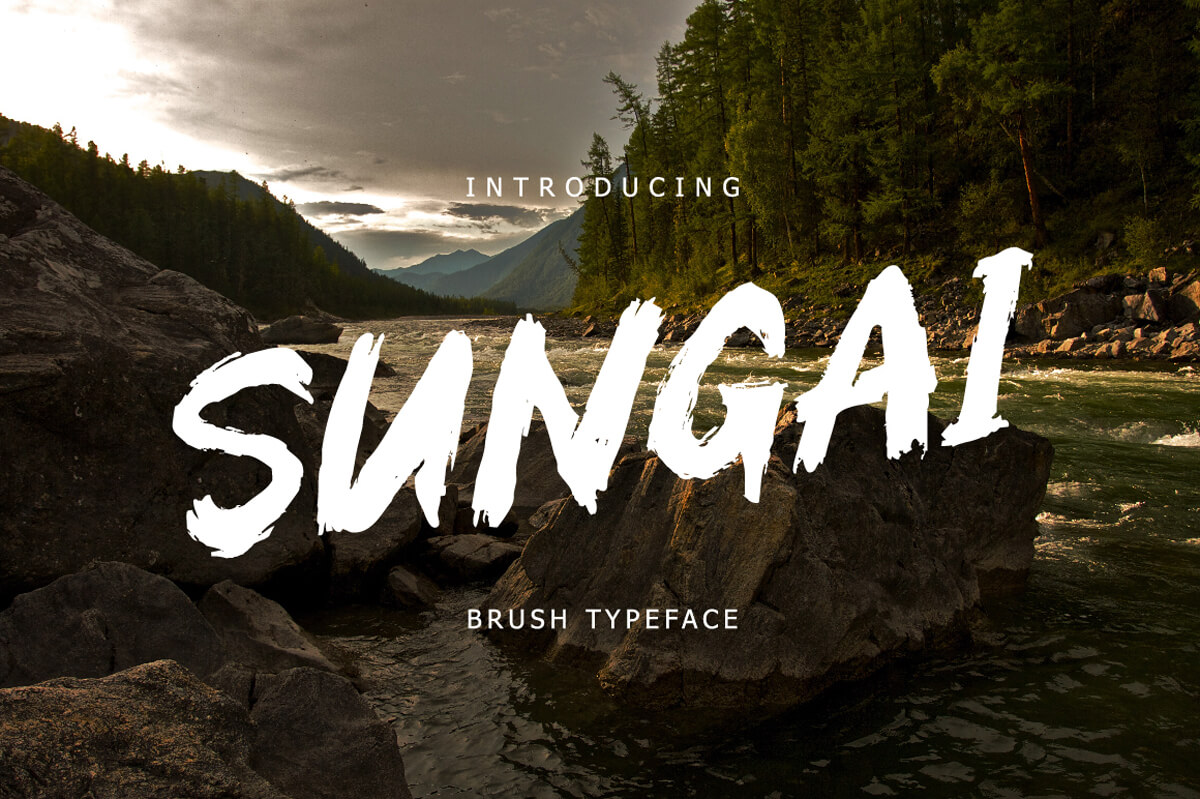


Thirty-One Typeface (Back to top)
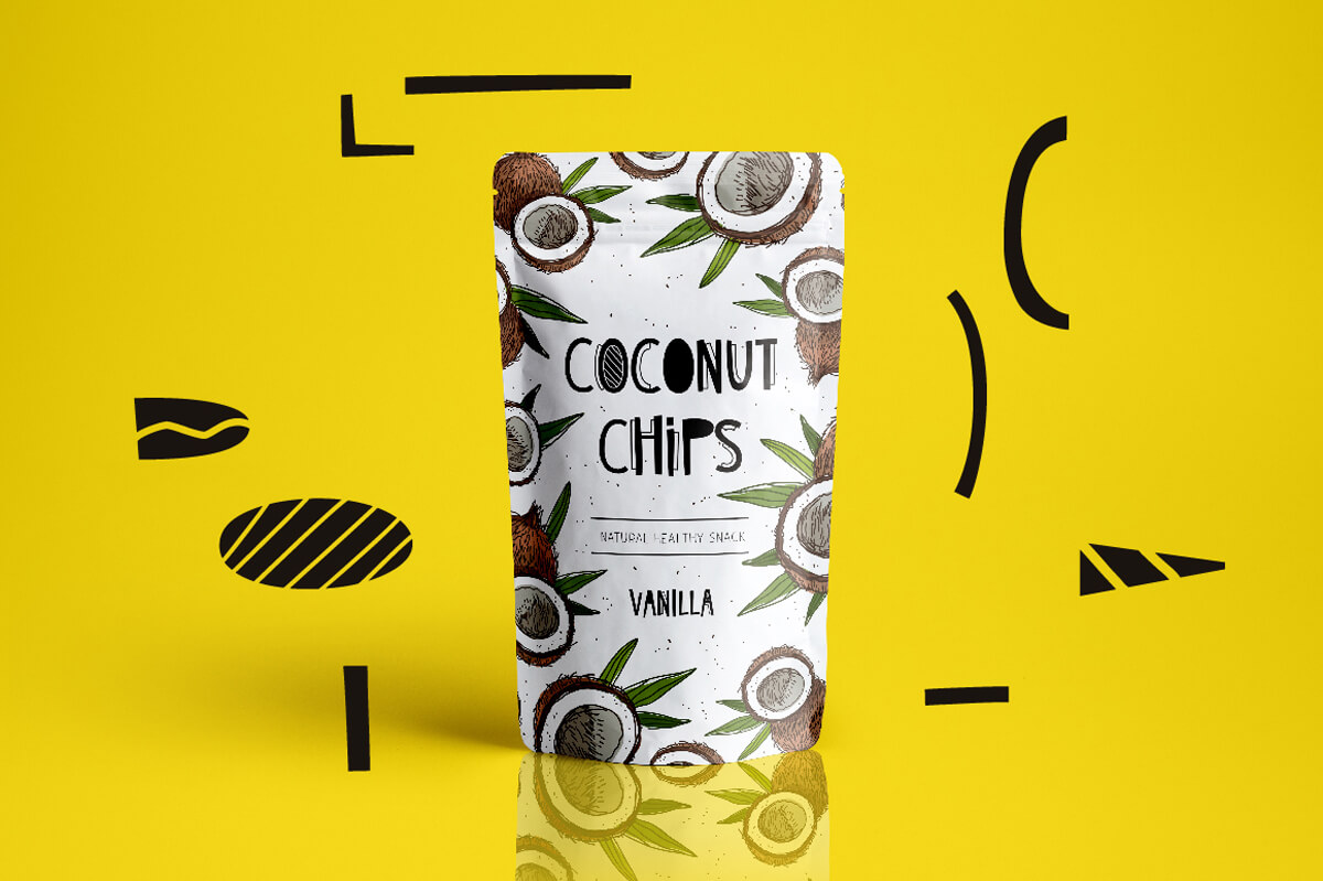
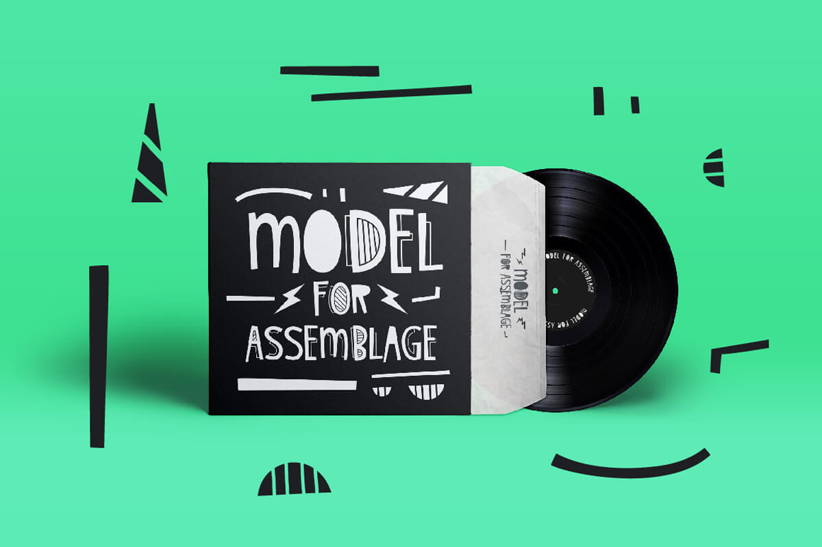
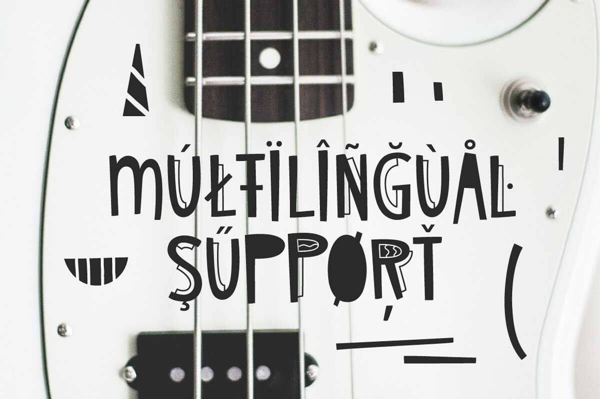
Thirty-One Typeface comes with all caps uppercase and lowercase characters, large range of punctuation, numerals, Cyrillic characters, and multilingual support.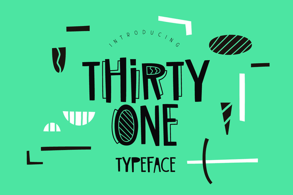


Tino Script (Back to top)
Uppercase and lowercase characters, punctuation glyphs, numerals, ligatures, Cyrillic characters and multilingual support.

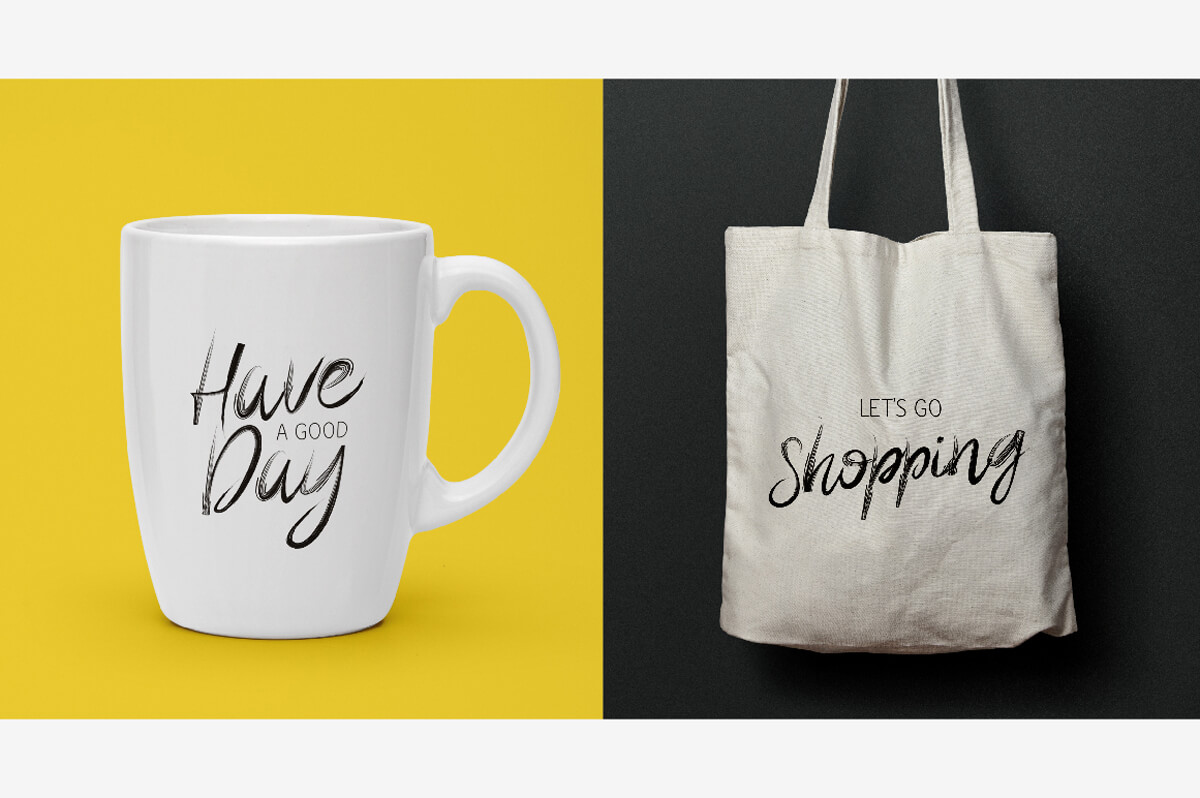

Yoshiko Font Duo (Back to top)
Yoshiko Font Duo is a wonderful tandem of hand brushed script and linear font. It comes with uppercase and lowercase characters, punctuation, numeral, and ligatures.


![]()
A set of 50 icons made with an outline art style, color and clear. The icons are in AI, EPS, SVG, PNG and Iconjar file formats. You can use for personal and Commercial use.
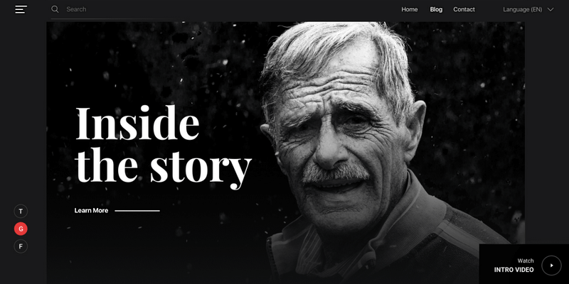
Layered page design on Sketch with a minimal approach, making it perfect to showcase your story without interferences. It has a big hero image on the header and a magazine-like post section where your writings can shine. Published by uinugget.
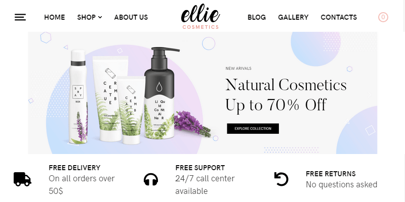
WordPress WooCommerce theme with a clean design. Ellie is perfect to turn your blog into an e-commerce website. It supports Elementor allowing you to easily create static pages with no coding skills. Published by themeszone.
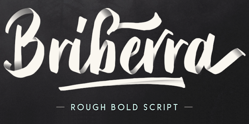
Briberra is hand lettering script typeface that contains stylistic alternates & swashes that will help to create your own customized designs. You can use this font for quotes, t-shirt designs, branding, plus plenty of other projects. This font contains multilingual characters, supports PUA and is available in OTF and TTF formats. Designed by Sarid Ezra.
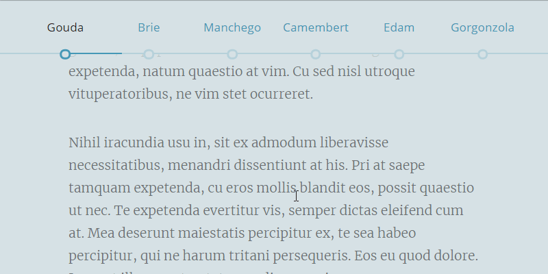
Perfect to show the reading progress while scrolling through a page. It hides when the viewport is too narrow, sticks to the top of the viewport on scroll, displays reading progress by section and also within each section. It can also be used for navigation. Created by Codepen user Ed Hicks.
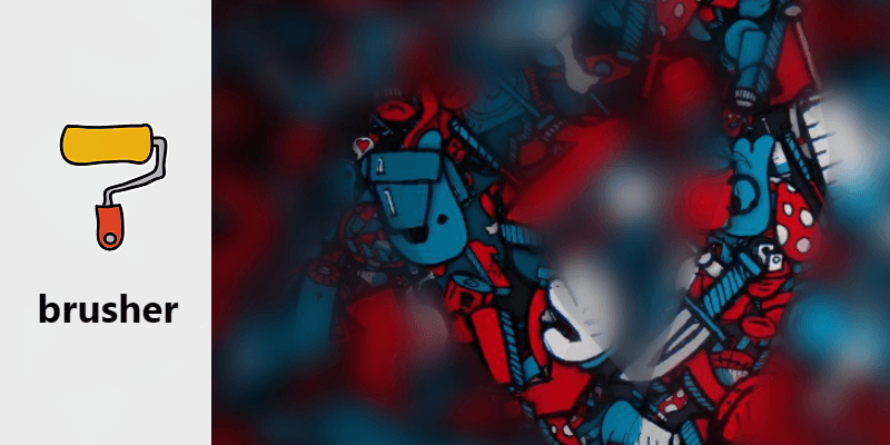
A lightweight JavaScript library to create interactive backgrounds. It turns your mouse into a brush that reveals the background; you choose whether you want it to stay cleared on action or not. You can customize the stroke size, the brush style, and the blur intensity. Created by Kamran Ahmed under MIT License.
![]()
Set of SVG icons designed specifically for web projects with a minimal outline art style. Available as a Ruby gem, a Node.js package and Grunt/Gulp plugins. Just use icon names with your templates and all the rest will be done automatically. Made by Alexander Madyankin and Roman Shamin; free and licensed under MIT.
A freebie pack that features 9 Logo templates with creative and colorful designs for projects, restaurants, tech companies and others businesses, available in Ai and EPS file formats, fully editable and completely free, courtesy of Behance user Afanur Rashid.
Comprehensive Security For Your Website!
MalCare is a complete security solution for WordPress websites offering a wide array of tools that will keep Malware and other threats at bay, and your site secured. It's scanner runs on their own servers, ensuring that there is Zero load on your website, and their proprietary algorithm, developed after analyzing over 240,000 websites, uses over 100 signals to identify even the most complex malware and hacks, without any false-positives. One-Click, automated malware Clean-Up and Removal, login protection that blocks hackers and bots from brute forcing their way in, an easy one-click implementation of best security practices for WordPress Hardening, and a robust web application Firewall to keep malware and threats away. Avoid getting your website blacklisted by Google with MalCare by detecting malware quickly and efficiently. From disabling the file editor to blocking suspicious requests, MalCare covers it all, so you'll be safe from brute force attacks by hackers, bots, and botnets.
With this promo, you can get access to MalCare's Personal Security plan for up to 2 years for $39, and 1 year for $19! The promo codes are non-stackable, and are to be redeemed within 30 days after making the purchase.
Why MalCare, I Hear You Ask. Keep Reading To Find Out!
MalCare Features:
- No False-Positives. Their proprietary algorithm, developed after analyzing over 240,000 websites, uses over 100 signals to identify even the most complex malware and hacks, without any false-positives.
- Automatic Daily Malware Scanning
- Doesn't Slow Your Site. Their remote malware removal causes no load on your server and ensures your site is running at full speed, like before and during cleanup.
- Continuous Website Protection
- Early Malware Detection. Malware causes your website to be Blacklisted by Google or Blocked by Web hosts. MalCare’s automatic scanner ensures you get to act on it before any damage is done
- Detects hard to find Malware. MalCare is good with Needles in Haystacks. It was developed to accurately identify even the most complex malware.
- One-Click Automated Malware Clean-Up and Removal. With MalCare’s One-Click Malware Cleaner, you no longer need to wait endlessly for technical help to clean your WordPress site.
- Minimal False Positives. False alarms cause unnecessary panic. MalCare uses over 100 signals to investigate the code and alerts you about only legitimate malicious instances, rather than ‘possible hacks’.
- Truly Unlimited Plugin. This inclusive plan ensures complete peace of mind giving you unlimited automatic malware detection & removal. No additional Hidden Costs.
- Login Protection. MalCare blocks bots and hackers from entering your site, before they cause any damage to your site, ensuring only authorized users can access your site.
- Web Application Firewall. MalCare Firewall ensures that attacks on your site by even bots are mitigated, without ever overloading your server.
- MalCare offers easy one-click WordPress Hardening and a robust Firewall to keep malware out of your site.
Comprehensive Powerful Malware Scan
Mitigate getting blacklisted by Google, being blocked by Webhosts or any possible security threats from the most complex malware with MalCare’s comprehensive and powerful automatic website malware scanning. Early detection of Malware is possible with their automatic scanner that instantly alerts you of any malware detected on your website. Scan your website from your account's dashboard, whenever you want. MalCare keeps track of all file modifications for an early detection of malware. It can find even the most complicated malware. MalCare intelligently uses more than 100 signals to investigate the website code ensuring that no malware skips its watchful eye.
Instant Malware Clean
Take control of your website and remove the malware as soon as it is identified. No longer be at the mercy of a remote team to help you clean the site. Get rid of malware in your site, with MalCare’s instant one-click malware removal. MalCare is the easiest and fastest way to ensure your site is spotless and contains no malware. Identify and clean out the malware on your own as soon as identified. Take control and weed out the hacks on your website before anyone blacklists or blocks your website. Clean even the most complicated and under-the-radar running malware. MalCare’s intensive cleanup will leave no stones unturned in restoring your site health completely.
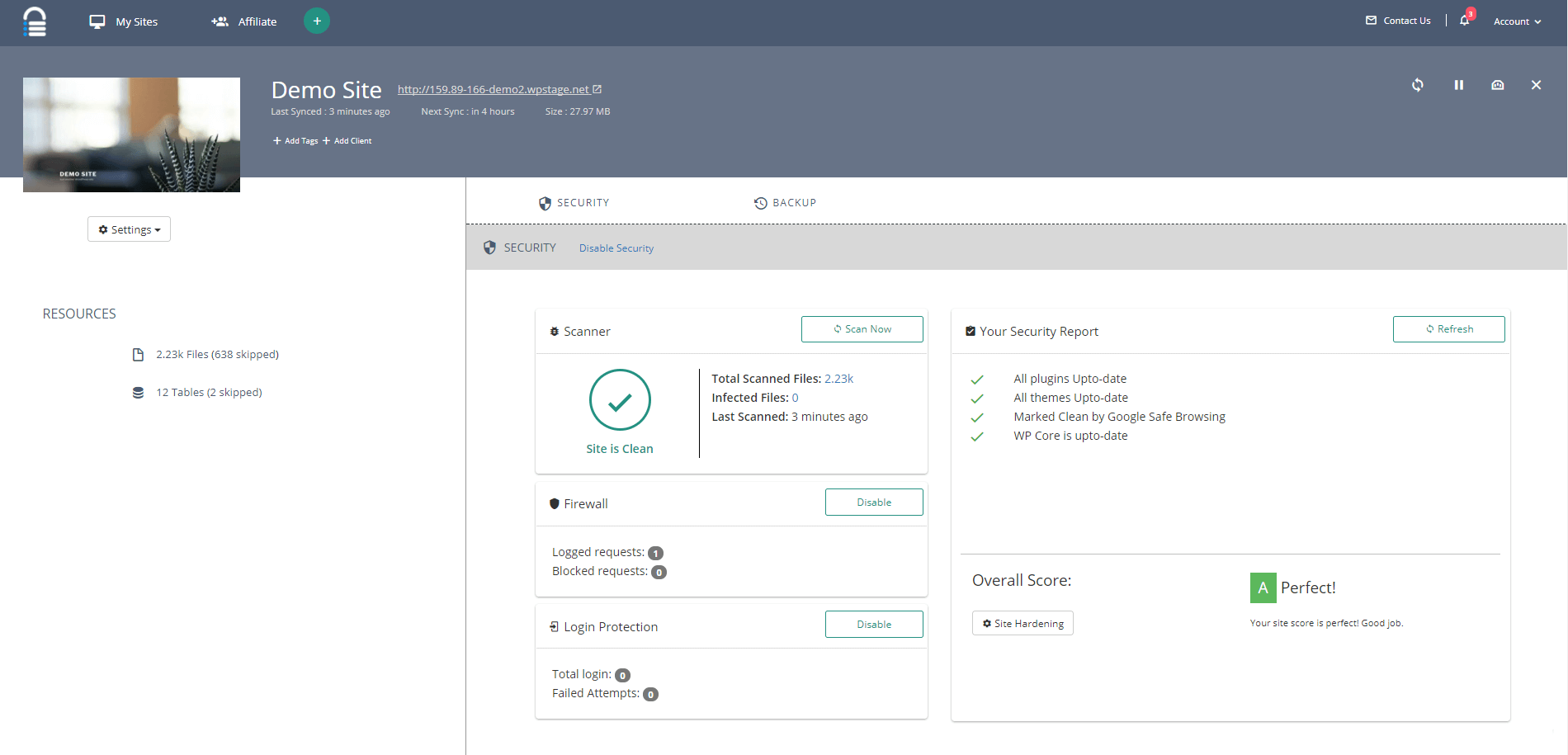
Powerful Malware Protection
Malcare’s protection suite will fortify and protect your site from all malicious attacks. Block brute force login attempts to stop malicious bots from gaining unauthorized access to your site with their specialized Login Protection. MalCare keeps a close watch on such activities and blocks them automatically. MalCare offers an easy one-click implementation of best security practices for WordPress Hardening, and a robust Firewall to keep malware out of your site. From disabling the file editor to blocking suspicious requests, MalCare covers it all, so you'll be safe from brute force attacks by hackers, bots, and botnets.
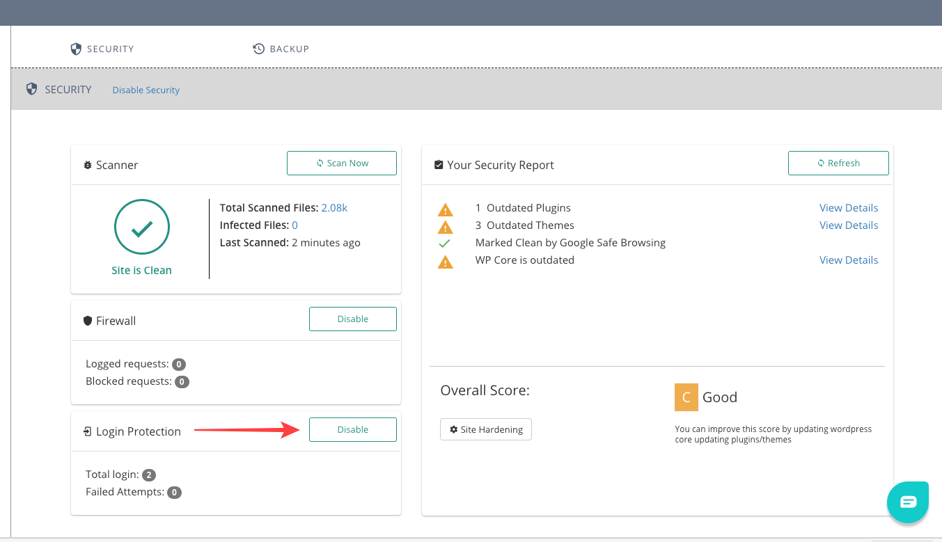
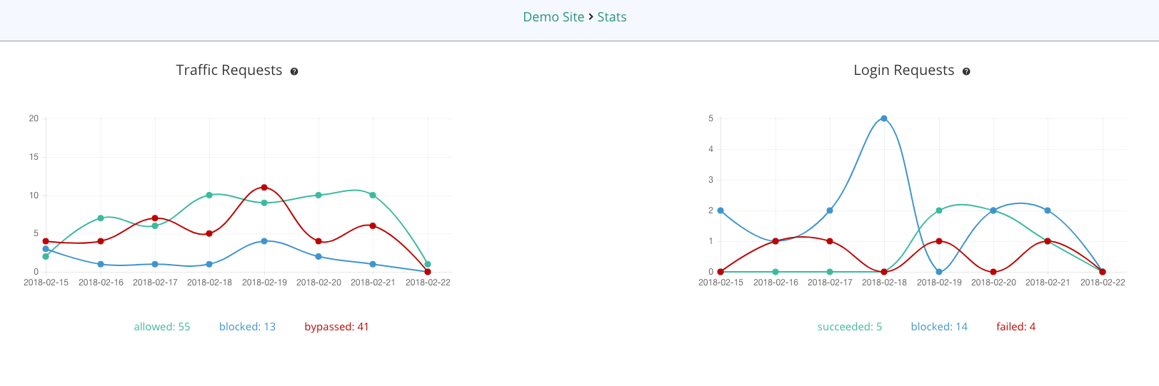
Zero Load with Highest Accuracy
No more false alarms on malware. Never lose a visitor with their Zero load scanners. MalCare’s scanner runs on their own servers, thus ensuring that there is Zero load on your website. Minimalize False Positives and take action on your website only when needed without getting distracted by any false alarms. MalCare alarms you only if a harmful malware has been detected without the false-positives.

MD Tall, designed by Behance user Mariano Diez, is a thin font created for titling with a uniform spacing and distinctly tall character design. It includes Uppercase characters only, as well as numerals and basic grammatical symbols.
Flexible and easy-to-use web typography starter kit. Styles can be made by setting base type size, line-height (leading) and measure (max-width). It is built with Sass and Grunt; fork or download the repository to get started. Gutenberg sets the baseline grid to establish a proper vertical rhythm and makes sure all elements fit into it. Handcrafted by Matej Latin, licensed under Creative Commons 3.0.

Loop animation of a SVG element made without using JavaScript, a perfect fit for a web loader. The total amount of code is minimal and the animation is smooth and fluid. Created by Codepen user Ana Tudor.
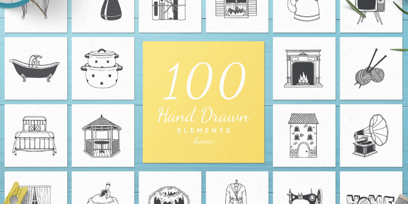
100 hand drawn vector illustrations made with attention to details and bits of love. The pack contains vintage home object Illustrations and are in PSD, AI, EPS and PNG file formats. Created by Michael Rayback.
A small vanilla WebGL javascript library that converts HTML elements containing images into 3D WebGL textured planes, allowing you to animate them via shaders. You can define each plane size and position via CSS, which makes it super easy to add WebGL responsive planes all over your pages. The library was created by Martin Laxenaire and is released under the MIT license.

12 pattern designs similar to donut topping sprinkles, on Illustrator & Sketch file formats. It for sure will take you back to the 90s(momentarily at least). Created by Dribbble user Phil Goodwin.
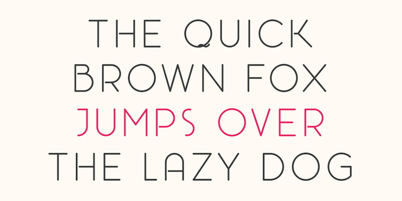
Rosarina is an uppercase minimalist display typeface with rounded corners and a light space between middle segments to give a touch of delicacy to the font. It was designed by Mariano Diez at Antenah Studio. It is simple yet classy enough to appear as headline use it on a book magazine cover design advertising and flyers.

Animated sign up form with an introduction frame and a linear left transition that shows the Log-In/Sing-Up form itself. It looks modern yet clean and it's build using JavaScript, CSS3(SCSS) and HTML5. Created by Codepen user Speresunko.
A nicely animated 404-page design, built out of SVG paths, so it's fully responsive. Created by Codepen user Chris Samuels.
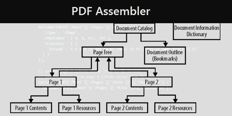
PDF Assembler disassembles PDF files into editable JavaScript objects, then assembles them back into PDF files, ready to save, download, or open. It's built over Mozilla's pdf.js and works by separating the physical structure of a PDF from its logical structure making it somewhat simpler to manage. Created by Github user DevelopingMagic under MIT Licence.
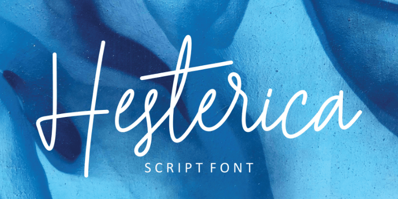
Clean, bouncy, beautiful cursive typeface from Destriart Studio with 3 styles, multilingual support and two font formats .otf & .ttf. Use it to display in a fashionable way quotes, wedding invitations, posters, cards and much more! Shared by Pixel Surplus on Behance.
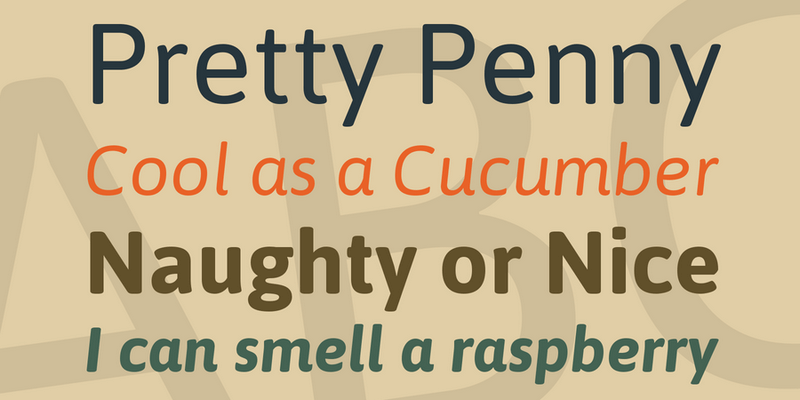
Contemporary sans-serif typeface with slightly rounded corners and great flexibility provided by its 4 weights (Regular, Medium, SemiBold, Bold) as well as real matching italics for a total of 8 fonts, each font featuring over 580 glyphs. It was specially developed for screen and desktop use, offers a standardized character width on all styles, which means lines of text remain the same length. Designed by Pablo Cosgaya and released for free under SIL Open Font License.

A free Sketch plugin that can size layers to common photo dimensions and scale them to fit in rows or columns. It features mainly a tool to apply random aspect ratios to selected layers and a tool to scale and space layers to fit between the furthest left and right layers in the selection. Created by Github user perrysmotors.
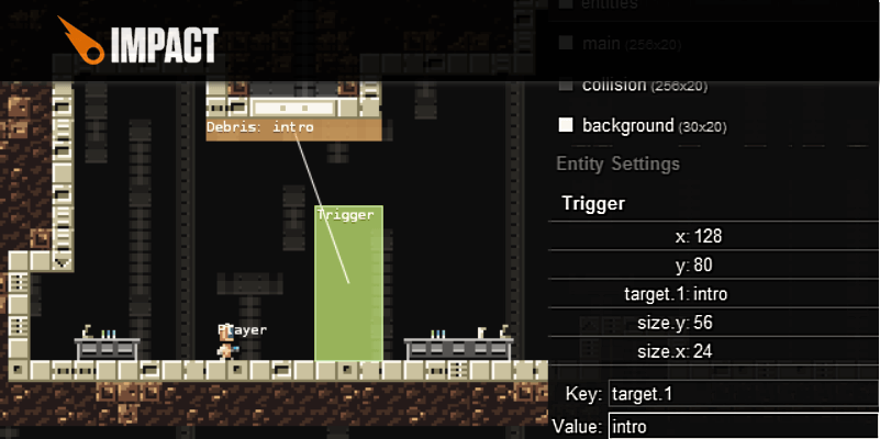
JavaScript Game Engine that allows you to develop stunning HTML5 games for desktop and mobile browser. Impactjs runs on all HTML5 capable browsers. It Comes with a versatile Weltmeister level editor and with a powerful debug tool to help you find performance bottlenecks and see what is exactly going on your game at any time.
Gitea is a community fork of the popular self-hosted Git service Gogs. Its purpose is to provide an easiest and painless way of setting a self-hosted Git service. It is similar to GitHub, Bitbucket, and Gitlab. Gitea is licensed under the MIT License.
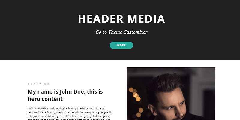
Free personal blog WordPress theme with a clean style, it makes simple to create personal websites and blogs. Features a responsive layout and powerful customizable options. The layout includes a Bio section under the header media, an image grid for recent posts as well as featured content, testimonial slider, and Instagram feed gallery widget by the footer.
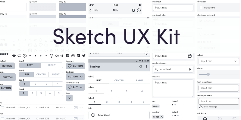
Wireframing and prototyping template with over 300 customisable symbols, 66 premade text styles and 21 screens/examples. Ready for prototyping on web, Android and iOS with tons of premade elements to boost your time and workflow. Created by Mikola Jdobrucki.

Sleek rounded typewriter font created by Lukas Krakora. Contains both uppercase and lowercase as well as numbers and special latin characters. Free for non-commercial use only.
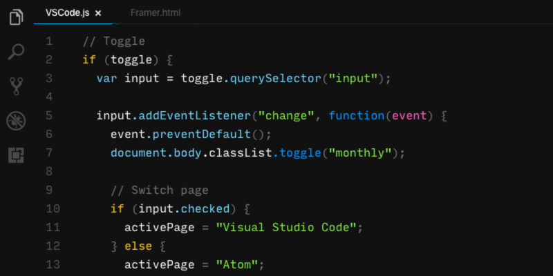
A free minimalist theme for Atom and VS Code text editors inspired by framer's popular code editor. It supports styling for HTML, CSS/SCSS, JavaScript, TypeScript and JSON.
Comprehensive Security For Your Website!
MalCare is a complete security solution for WordPress websites offering a wide array of tools that will keep Malware and other threats at bay, and your site secured. It's scanner runs on their own servers, ensuring that there is Zero load on your website, and their proprietary algorithm, developed after analyzing over 240,000 websites, uses over 100 signals to identify even the most complex malware and hacks, without any false-positives. One-Click, automated malware Clean-Up and Removal, login protection that blocks hackers and bots from brute forcing their way in, an easy one-click implementation of best security practices for WordPress Hardening, and a robust web application Firewall to keep malware and threats away. Avoid getting your website blacklisted by Google with MalCare by detecting malware quickly and efficiently. From disabling the file editor to blocking suspicious requests, MalCare covers it all, so you'll be safe from brute force attacks by hackers, bots, and botnets.
With this promo, you can get access to MalCare's Personal Security plan for up to 2 years for $39, and 1 year for $19! The promo codes are non-stackable, and are to be redeemed within 30 days after making the purchase.
Why MalCare, I Hear You Ask. Keep Reading To Find Out!
MalCare Features:
- No False-Positives. Their proprietary algorithm, developed after analyzing over 240,000 websites, uses over 100 signals to identify even the most complex malware and hacks, without any false-positives.
- Automatic Daily Malware Scanning
- Doesn't Slow Your Site. Their remote malware removal causes no load on your server and ensures your site is running at full speed, like before and during cleanup.
- Continuous Website Protection
- Early Malware Detection. Malware causes your website to be Blacklisted by Google or Blocked by Web hosts. MalCare’s automatic scanner ensures you get to act on it before any damage is done
- Detects hard to find Malware. MalCare is good with Needles in Haystacks. It was developed to accurately identify even the most complex malware.
- One-Click Automated Malware Clean-Up and Removal. With MalCare’s One-Click Malware Cleaner, you no longer need to wait endlessly for technical help to clean your WordPress site.
- Minimal False Positives. False alarms cause unnecessary panic. MalCare uses over 100 signals to investigate the code and alerts you about only legitimate malicious instances, rather than ‘possible hacks’.
- Truly Unlimited Plugin. This inclusive plan ensures complete peace of mind giving you unlimited automatic malware detection & removal. No additional Hidden Costs.
- Login Protection. MalCare blocks bots and hackers from entering your site, before they cause any damage to your site, ensuring only authorized users can access your site.
- Web Application Firewall. MalCare Firewall ensures that attacks on your site by even bots are mitigated, without ever overloading your server.
- MalCare offers easy one-click WordPress Hardening and a robust Firewall to keep malware out of your site.
Comprehensive Powerful Malware Scan
Mitigate getting blacklisted by Google, being blocked by Webhosts or any possible security threats from the most complex malware with MalCare’s comprehensive and powerful automatic website malware scanning. Early detection of Malware is possible with their automatic scanner that instantly alerts you of any malware detected on your website. Scan your website from your account's dashboard, whenever you want. MalCare keeps track of all file modifications for an early detection of malware. It can find even the most complicated malware. MalCare intelligently uses more than 100 signals to investigate the website code ensuring that no malware skips its watchful eye.


Instant Malware Clean
Take control of your website and remove the malware as soon as it is identified. No longer be at the mercy of a remote team to help you clean the site. Get rid of malware in your site, with MalCare’s instant one-click malware removal. MalCare is the easiest and fastest way to ensure your site is spotless and contains no malware. Identify and clean out the malware on your own as soon as identified. Take control and weed out the hacks on your website before anyone blacklists or blocks your website. Clean even the most complicated and under-the-radar running malware. MalCare’s intensive cleanup will leave no stones unturned in restoring your site health completely.


Powerful Malware Protection
Malcare’s protection suite will fortify and protect your site from all malicious attacks. Block brute force login attempts to stop malicious bots from gaining unauthorized access to your site with their specialized Login Protection. MalCare keeps a close watch on such activities and blocks them automatically. MalCare offers an easy one-click implementation of best security practices for WordPress Hardening, and a robust Firewall to keep malware out of your site. From disabling the file editor to blocking suspicious requests, MalCare covers it all, so you'll be safe from brute force attacks by hackers, bots, and botnets.


Zero Load with Highest Accuracy
No more false alarms on malware. Never lose a visitor with their Zero load scanners. MalCare’s scanner runs on their own servers, thus ensuring that there is Zero load on your website. Minimalize False Positives and take action on your website only when needed without getting distracted by any false alarms. MalCare alarms you only if a harmful malware has been detected without the false-positives.
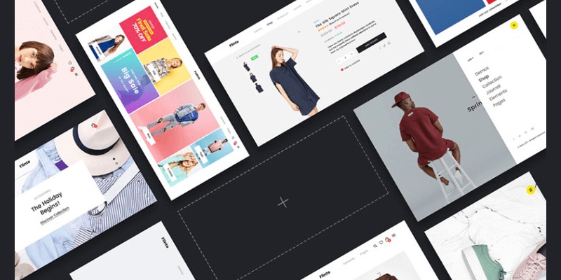
14 unique e-shop templates with a modern look style on PSD and JPEG file formats that can be perfectly used to create a stylish eCommerce website to sell your goods better and faster.
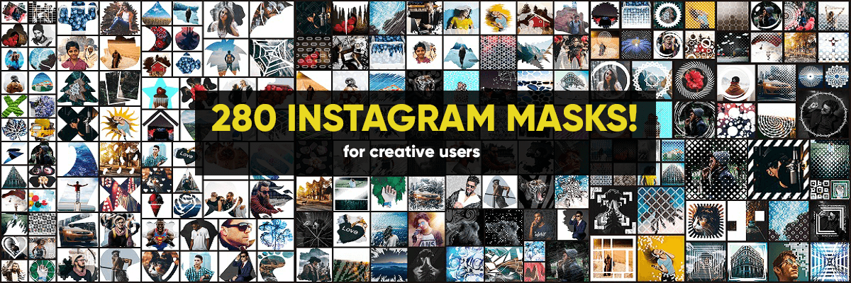
The easiest way to highlight your Instagram profile
Without any special knowledge, even if you are a newbie in Photoshop, enhance your image content and get all the sights over for your Instagram account! They're over 280 fully editable Instagram masks in PSD format. Make beautiful creations in seconds: Just put in your photo, switch on the chosen mask and save as a picture! There's also a tutorial included, guiding you step by step. Normally this full pack worth up to $60, with this limited-time special your could have it all, just $9! A marvelous 85% discount.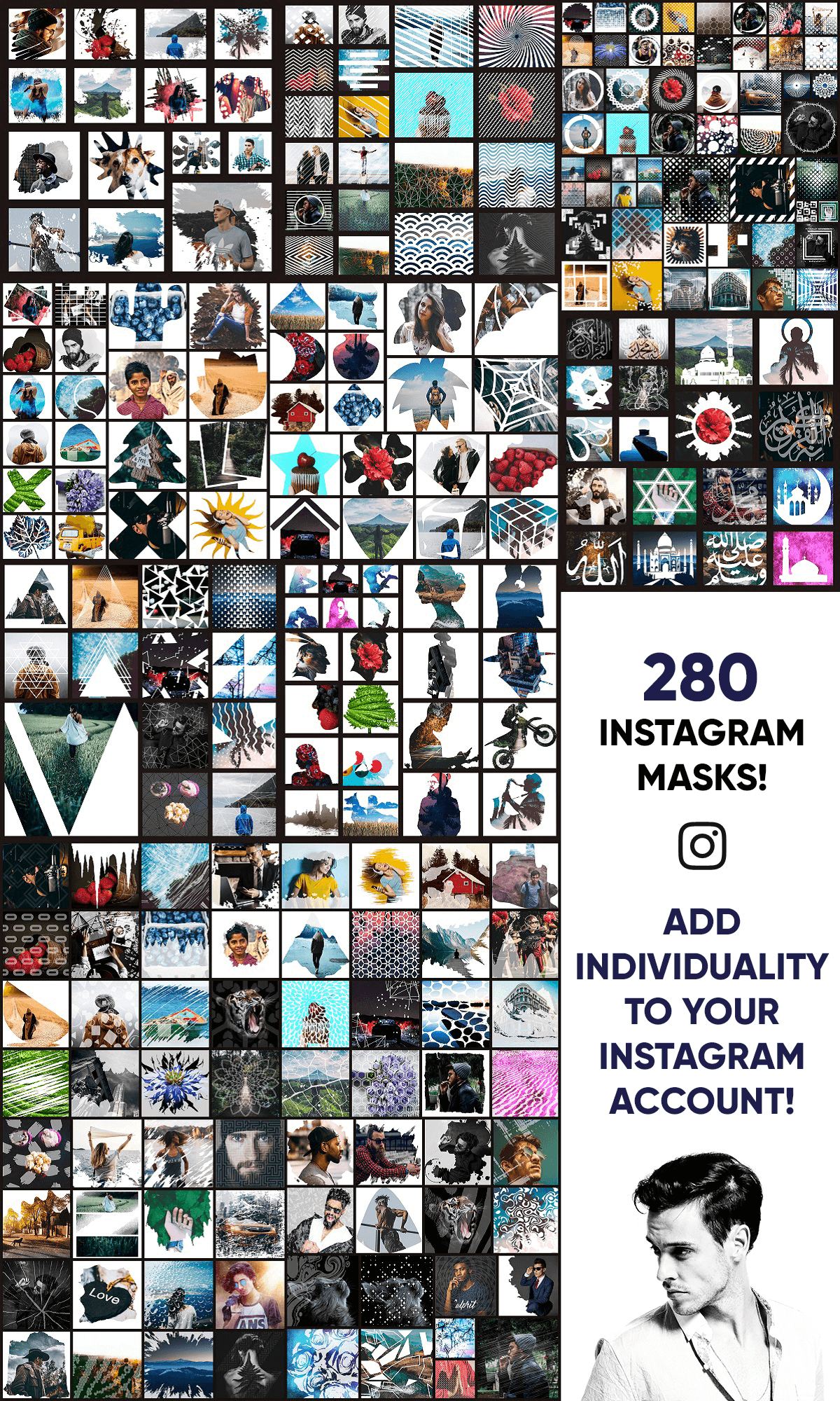
See all the included categories
Abstract (Back to top)

Blots (Back to top)

Circles (Back to top)

Lines (Back to top)

Objects (Back to top)

Religion (Back to top)

Silhouettes (Back to top)

Squares (Back to top)

Triangles (Back to top)

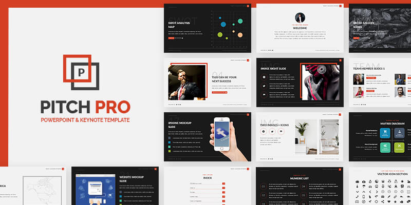
Get the professional look that your business deserves with this trendy and effective Keynote & PowerPoint Templates Pack from our friends at Zacomic Studios: 15 Unique Slides, different color options and two backgrounds based colors: Dark and White. Normally a premium $15 presentation template, get it for free, exclusive from Zacomic Studios & ByPeople!
.Preview all the slides:
Create native desktop applications through a React syntax on all platforms. It works with existing React libraries such as Redux and is compatible with all normal Node.js packages using native components without talking to Electron.

Sansita is a SIL licensed typeface family with a total of 8 font weights and 504 glyphs with each variant. Font designed by Pablo Cosgaya under the development of Omnnibus team and with its concept, it wants to explore the relationship between typography and calligraphy while keeping it elegant.
Mastering Web Development
A stand alone, highly specialized course that will take you from absolute beginner to ninja-tier on the secret arts of Web Development featuring 19+ hours of intensive and comprehensive modules on topics like HTML, CSS, Javascript, jQuery, Bootstrap, PHP, XML, and AJAX, this course will have you developing Dynamic Database Driven Websites like a pro faster than you can say "my cat is doing backflips in the living room again". The syllabus features 20 modules, from introductory content to advanced processes and techniques, install and administer key components such as LAMP Stack, MySQL databases, Security Settings, a remote server using PuTTY, master setup and installations of domain name registration, nameserver and DNS Zone Files configurations, Ubuntu on a Virtual Machine, MAMP for Mac, create unique animations, validation algorithms, testing servers, disk backups and so much more. Access to this specialized course would normally cost $299.00, so get your fighting chance in the web development world with this awesome promo for just $17!
Course Features: (Back to Top)
- 20 Modules.
- Learn everything you need to know to master Web Development.
- Dominate the most important scripting languages:
- HTML.
- CSS.
- JavaScript.
- jQuery.
- Bootstrap.
- PHP.
- XML.
- AJAX.
- Master setup and installations: domain name registration, nameserver and DNS Zone Files configurations, Ubuntu on a Virtual Machine, MAMP for Mac and more!
- Create unique animations, validation algorithms, testing servers, disk backups and so much more.
- Install and administer key components such as LAMP Stack, MySQL databases, Security Settings, a remote server using PuTTY and more.
- Updated to be fully compatible with the latest version of Ubuntu (16.04 LTS).
Web Development Masterclass Syllabus:
Full listing of the topics covered and their duration.
Section 1: Introduction
- 1.- Web Development Masterclass - Introduction - 00:03:05
- 2.- Course Learning Objectives - 00:02:48
- 3.- Locating Assessments and Course Files - 00:01:12
Section 2: How the Internet Works
- 1 - The Internet Overview - 00:05:26
- 2 - The HTTP Protocol - 00:03:34
- 3 - The HTTPS Protocol - 00:03:12
- 4 - The SMTP Protocol and Local Mail Delivery - 00:04:43
- 5 - Outbound Mail Delivery - 00:02:08
- 6 - Network Basics - LAN and WAN - 00:05:56
- 7 - Network Ports and Firewalls - 00:05:01
Section 3: The Web Development Process
- 1 - Web Development Process Overview - 00:02:46
Secton 4: Planning a Website
- 1 - Web Application Planning Overview - 00:04:37
Section 5: Web Hosting and System Requirements
- 1 - Web Hosting Packages Overview - 00:05:19
- 2 - Shared Hosting - 00:04:37
- 3 - Dedicated Hosting - 00:02:03
- 4 - VPS Hosting - 00:01:24
- 5 - Cloud Hosting and Case Study - 00:12:50
Section 6: Domain Names
- 1 - Introduction to Domain Names - 00:02:48
- 2 - Domain Name Registrars - 00:02:41
- 3 - Domain Registration - 00:02:35
- 4 - Registration and Privacy Protection - 00:07:06
- 5 - Control Panel Sign-In - 00:01:43
- 6 - Auto-Renewal and Domain Lock - 00:02:23
- 7 - Domain Forwarding - 00:02:18
- 8 - Nameservers - 00:01:23
- 9 - Update Registration Information - 00:01:15
Section 7: Testing Environment
- 1 - Introduction to Testing Servers - 00:02:48
- 2 - Installing WampServer - WAMP - 00:05:12
- 3 - Installing MampServer - MAMP - 00:10:32
- 4 - WampServer Menu - 00:05:19
- 5 - Localhost File Test - 00:01:42
Section 8: Production Environment
- 1 - Overview - 00:02:24
- 2 - Cloud Hosting Registration - 00:03:54
- 3 - Creating a Virtual Server - 00:03:10
- 4 - Linode Settings and Configuration - 00:01:24
- 5 - Deploying an Image - Ubuntu 14.04 LTS - 00:03:37
- 6 - Linode Dashboard - 00:02:27
- 7 - Remote Access - 00:02:30
- 8 - Download PuTTY and PuTTYgen - Windows - 00:01:00
- 9 - Launch Terminal - MAC - 00:00:29
- 10 - Intro to Command Console - 00:02:09
- 11 - Connecting with PuTTY - Windows - 00:02:01
- 12 - Connecting with Terminal - MAC - 00:01:08
- 13 - Maintenance Commands - 00:02:39
- 14 - File and Directory Commands - 00:02:58
- 15 - Installing LAMP Stack - 00:04:29
- 16 - Server Host Name and Date - 00:03:08
- 17 - Creating a User - Ubuntu - 00:02:56
- 18 - Ubuntu SSH Authentication - Windows - 00:07:46
- 19 - Ubuntu SSH Authentication - MAC - 00:07:57
- 20 - Web Root Permissions - 00:04:06
- 21 - Remote Dekstop Connection - 00:10:48
- 22 - Installing Tight VNC Viewer - Windows - 00:03:28
- 23 - Installing RealVNC Viewer - MAC - 00:02:44
- 24 - Ubuntu Desktop Basics - 00:03:54
- 25 - Disable Root and Password Access - 00:03:51
- 26 - Re-sizing a Linode Server - 00:02:20
- 27 - Creating Backups on Linode - 00:04:05
- 28 - Changing Root Password through Linode - 00:00:34
- 29 - Linode DNS Manager - 00:10:11
- 30 - Amending GoDaddy Name Servers - 00:04:08
Section 9: FTP Setup
- 1 - FTP Client Installation - 00:02:21
- 2 - FileZilla Overview - 00:04:09
- 3 - FileZilla Uploading - 00:03:20
- 4 - FileZilla Interface Basics - 00:01:40
Section 10: HTML Development
- 1 - Introduction to HTML - 00:01:46
- 2 - Basic Structure of a Web Page - 00:03:36
- 3 - HTML Head Tags - 00:07:59
- 4 - HTML Body Tag - 00:03:18
- 5 - HTML Paragraph Spacing - 00:02:57
- 6 - HTML Line Breaks - 00:02:04
- 7 - HTML Non-Breaking Space - 00:02:38
- 8 - HTML Header Tags - 00:01:58
- 9 - HTML Text Formatting and Decoration - 00:05:15
- 10 - HTML Inline Text Formatting - 00:02:05
- 11 - HTML Unordered Lists - 00:02:36
- 12 - HTML Ordered Lists - 00:02:40
- 13 - HTML Image Insertion - 00:03:57
- 14 - HTML Embedding Videos - 00:02:51
- 15 - HTML Absolute vs. Relative File Referencing - 00:02:01
- 16 - HTML Link Creation - 00:06:35
- 17 - HTML Anchor Tags - 00:06:17
- 18 - HTML Tables - 00:11:29
- 19 - HTML Nested Tables - 00:06:27
- 20 - HTML Merging Cells - 00:01:00
- 21 - HTML Text Wrapping - 00:01:17
- 22 - HTML Table Background Image - 00:01:12
- 23 - HTML Table Cell Alignment - 00:00:40
- 24 - HTML - Introduction to Forms - 00:03:30
- 25 - HTML Form Tags and Attributes - 00:04:00
- 26 - HTML Forms - Post vs. Get - 00:02:09
- 27 - HTML Forms - Input Text Fields - 00:03:52
- 28 - HTML Forms - Select Menus - 00:05:32
- 29 - HTML Forms - Check Boxes and Radio Buttons - 00:05:44
- 30 - HTML Forms - Text Areas and Buttons - 00:05:49
- 31 - HTML Iframes - 00:04:04
- 32 - HTML Project - Introduction - 00:01:41
- 33 - HTML Project - Header - 00:03:33
- 34 - HTML Project - Callout - 00:03:19
- 35 - HTML Project - Image Insertion - 00:01:34
- 36 - HTML Project - Text Insertion - 00:01:23
- 37 - HTML Project - Links and Form - 00:03:28
- 38 - HTML Project - Tabular Data - 00:02:24
- 39 - HTML Project - Footer - 00:01:22
Section 11: CSS Development
- 1 - Introduction to CSS - 00:03:31
- 2 - Parts of a CSS Rule - 00:06:31
- 3 - Types of CSS Rules - 00:02:55
- 4 - CSS - Color Names and Codes - 00:02:17
- 5 - CSS Classes and Spans - 00:05:44
- 6 - CSS Divisions - DIVs - 00:02:53
- 7 - CSS IDs - 00:05:54
- 8 - CSS Margins - 00:03:53
- 9 - CSS Padding - 00:02:12
- 10 - CSS Text Properties - 00:08:29
- 11 - CSS Font Properties - 00:03:00
- 12 - CSS Borders - 00:02:19
- 13 - CSS Backgrounds - 00:06:25
- 14 - CSS Transparency - 00:02:53
- 15 - CSS Text on Top of Images - 00:05:10
- 16 - CSS Width and Height Properties - 00:06:04
- 17 - CSS Display Properties - 00:02:10
- 18 - CSS Static Positioning - 00:01:54
- 19 - CSS Relative Positioning - 00:04:03
- 20 - CSS Absolute Positioning - 00:02:12
- 21 - CSS Fixed Positioning - 00:02:08
- 22 - CSS Float Property - 00:02:23
- 23 - CSS Clear Property - 00:01:09
- 24 - CSS Z-Index - 00:01:40
- 25 - CSS Styling Links - 00:02:01
- 26 - CSS Tables - 00:02:16
- 27 - CSS Project - Introduction - 00:01:23
- 28 - CSS Project - CSS Rules - 00:05:36
- 29 - CSS Project - Navigation Rules - 00:02:16
- 30 - CSS Project - Responsive CSS - 00:02:37
- 31 - CSS Project - Page Elements - 00:02:34
Section 12: Document Object Model (DOM)
- 1 - DOM Introduction - 00:03:12
- 2 - DOM Manipulation - 00:01:18
Section 13: JavaScript Development
- 1 - JavaScript - Introduction - 00:05:42
- 2 - JavaScript Placement - 00:02:10
- 3 - External JavaScript - 00:01:50
- 4 - JavaScript Output - 00:01:41
- 5 - JavaScript InnerHTML - 00:01:03
- 6 - JavaScript Commenting - 00:01:49
- 7 - JavaScript Constants - 00:01:34
- 8 - JavaScript Variables Introduction - 00:04:31
- 9 - JavaScript Assignment Operator - 00:01:06
- 10 - JavaScript Arithmetic Operations - 00:03:44
- 11 - JavaScript Arithmetic Operations Continued - 00:03:46
- 12 - JavaScript Operator Precedence - 00:00:58
- 13 - JavaScript Data Types - 00:01:13
- 14 - JavaScript Objects - 00:01:43
- 15 - JavaScript Object Output - 00:01:23
- 16 - JavaScript Strings - 00:03:12
- 17 - JavaScript String Length - 00:00:41
- 18 - JavaScript Special Characters - 00:01:19
- 19 - JavaScript Random Numbers - 00:00:55
- 20 - JavaScript Min and Max Function - 00:01:05
- 21 - JavaScript Math Round Function - 00:01:38
- 22 - JavaScript Arrays - 00:02:15
- 23 - JavaScript Array Attributes - 00:01:28
- 24 - JavaScript Arrays - Pop - Push - Shift - Unshift - 00:02:05
- 25 - JavaScript Changing and Deleting Elements - 00:01:59
- 26 - JavaScript Splicing an Array - 00:01:35
- 27 - JavaScript Sorting an Array - 00:01:24
- 28 - JavaScript Joining Arrays - 00:01:04
- 29 - JavaScript Conditional Statements - 00:06:18
- 30 - JavaScript Comparisons - 00:02:26
- 31 - JavaScript Booleans - 00:01:21
- 32 - JavaScript For Loops - 00:02:40
- 33 - JavaScript For-In Loop - 00:00:47
- 34 - JavaScript While Loops - 00:02:08
- 35 - JavaScript Do-While Loop - 00:01:58
- 36 - JavaScript Break and Continue - 00:01:14
- 37 - JavaScript Functions - 00:01:54
- 38 - JavaScript Events - 00:01:19
- 39 - JavaScript Project 1 - BG Color Changer - 00:02:14
- 40 - JavaScript Project 2 - Photo Gallery - 00:02:24
- 41 - JavaScript Project 2 - Completion - 00:02:38
Section 14: jQuery Library
- 1 - Introduction to jQuery - 00:01:31
- 2 - Embedding jQuery - 00:00:52
- 3 - jQuery Syntax and Selector Intro - 00:03:32
- 4 - jQuery ID Selector - 00:01:36
- 5 - jQuery Class Selector - 00:01:08
- 6 - jQuery Other Selectors - 00:01:54
- 7 - External jQuery File - 00:01:43
- 8 - jQuery Events Intro - 00:02:05
- 9 - jQuery Events - mouseenter and mouseleave - 00:02:07
- 10 - jQuery Events - mousedown and mouseup - 00:01:14
- 11 - jQuery Multiple Event Handlers - 00:01:31
- 12 - jQuery Hiding-Showing - 00:02:09
- 13 - jQuery Toggle - 00:01:24
- 14 - jQuery Fade In-Out - 00:04:09
- 15 - jQuery Fade Toggle - 00:01:27
- 16 - jQuery Fade To - 00:01:19
- 17 - jQuery Slide Down - 00:03:06
- 18 - jQuery Slide Up - 00:00:58
- 19 - jQuery Slide Toggle - 00:00:47
- 20 - jQuery Animate - 00:03:30
- 21 - jQuery Animate - Multiple Params - 00:00:58
- 22 - jQuery Animate - Relative Values - 00:00:42
- 23 - jQuery Animate - Queue Functionality - 00:01:59
- 24 - jQuery Stop Method - 00:01:52
- 25 - jQuery Callback Functions - 00:02:10
- 26 - jQuery Chaining - 00:02:39
- 27 - jQuery Draggables - 00:02:23
- 28 - jQuery Accordian Menu - 00:03:18
- 29 - jQuery Get Content - text and html - 00:02:42
- 30 - jQuery Get Content - Val - 00:01:07
- 31 - jQuery Get Content - attr - 00:01:08
- 32 - jQuery Set Content - text - html - val - 00:02:49
- 33 - jQuery Set Attributes - attr - 00:01:48
- 34 - jQuery Append and Preprend - 00:02:33
- 35 - jQuery - After and Before - 00:01:19
- 36 - jQuery Remove and Empty - 00:01:32
- 37 - jQuery Filter Remove - 00:01:47
- 38 - jQuery Add Class - 00:02:17
- 39 - jQuery Remove Class - 00:01:53
- 40 - jQuery Toggle Class - 00:00:44
Section 15: Bootstrap Framework
- 1 - Introduction to Bootstrap - 00:02:12
- 2 - Embedding Bootstrap - 00:00:50
- 3 - Bootstrap - Basic Page Structure - 00:05:29
- 4 - Bootstrap Grid System - 00:05:32
- 5 - Bootstrap Three Column Layouts - 00:02:24
- 6 - Bootstrap Typography - 00:06:50
- 7 - Bootstrap Tables - 00:03:00
- 8 - Bootstrap Styling Images - 00:02:17
- 9 - Bootstrap Jumbotron - 00:02:28
- 10 - Bootstrap Wells - 00:00:59
- 11 - Bootstrap Alerts - 00:02:25
- 12 - Bootstrap Buttons - 00:07:12
- 13 - Bootstrap Button Groups - 00:01:57
- 14 - Bootstrap Justified Button Groups - 00:02:33
- 15 - Bootstrap Glyphicons - 00:02:52
- 16 - Bootstrap Badges and Labels - 00:03:13
- 17 - Bootstrap Progress Bars - 00:02:54
- 18 - Bootstrap Pagination - 00:02:24
- 19 - Bootstrap Pager Pagination - 00:01:18
- 20 - Bootstrap List Groups - 00:05:10
- 21 - Bootstrap Panels - 00:02:33
- 22 - Bootstrap Dropdown Menus - 00:04:37
- 23 - Bootstrap Collapsibles - 00:03:24
- 24 - Bootstrap Collapse Panel - 00:01:54
- 25 - Bootstrap Collapse List Group - 00:00:57
- 26 - Bootstrap Accordian - 00:05:01
- 27 - Bootstrap Tab Menus - 00:04:47
- 28 - Bootstrap Pill Menus - 00:03:13
- 29 - Bootstrap Dynamic Tabs and Pills - 00:04:03
- 30 - Bootstrap Navigation Bar - 00:06:24
- 31 - Bootstrap Collapsible Navigation Bar - 00:03:31
- 32 - Bootstrap Forms - Vertical and Inline - 00:03:36
- 33 - Bootstrap Inputs - 00:04:28
- 34 - Bootstrap Form Control States - 00:03:42
- 35 - Bootstrap Input Sizing - 00:03:12
- 36 - Bootstrap Carousel - 00:09:23
- 37 - Bootstrap Modal - 00:04:02
- 38 - Bootstrap Tooltip - 00:02:12
- 39 - Bootstrap Popover - 00:02:52
- 40 - Bootstrap Scrollspy - 00:05:41
- 41 - Bootstrap Project - Themes Intro - 00:03:32
- 42 - Bootstrap Project - File Overview - 00:02:15
- 43 - Bootstrap Project - Script Overview - 00:08:47
- 44 - Bootstrap Project - Script Overview Continued - 00:07:50
Section 16: PHP Development
- 1 - PHP Introduction - 00:03:03
- 2 - PHP Preparation - 00:02:56
- 3 - PHP File Test - 00:02:21
- 4 - PHP Syntax - 00:05:37
- 5 - PHP Variables - 00:03:46
- 6 - PHP Variable Scope - 00:03:15
- 7 - PHP Global Keyword - 00:02:04
- 8 - PHP Static Keyword - 00:01:45
- 9 - PHP Echo vs Print - 00:04:02
- 10 - PHP Data Types - 00:05:47
- 11 - PHP Objects - 00:02:59
- 12 - PHP Strings - 00:01:51
- 13 - PHP Constants - 00:03:05
- 14 - PHP Operators - 00:08:53
- 15 - PHP Conditional Statements - 00:02:32
- 16 - PHP ElseIf Statement - 00:03:11
- 17 - PHP Switch Statement - 00:01:45
- 18 - PHP While Loops - 00:04:35
- 19 - PHP For Loops - 00:01:40
- 20 - PHP Functions - 00:03:29
- 21 - PHP Functions Continued - 00:01:50
- 22 - PHP Arrays - 00:04:51
- 23 - PHP Multidimensional Arrays - 00:01:59
- 24 - PHP Sorting Arrays - 00:02:51
- 25 - PHP Superglobal Variables - 00:02:10
- 26 - PHP Forms Introduction - 00:04:06
- 27 - PHP POST vs GET Basics - 00:05:25
- 28 - PHP Form Output and Validation - 00:09:36
- 29 - PHP Form Required Fields - 00:04:40
- 30 - PHP Validation Continued - 00:01:46
Section 17: MySQL Database Integration
- 1 - Introduction to MySQL Databases - 00:02:40
- 2 - Introduction PhpMyAdmin - 00:02:36
- 3 - PhpMyAdmin Interface Overview - 00:01:13
- 4 - MySQL Security and Root Superuser - 00:05:03
- 5 - MySQL Creating a Database and Table - 00:05:24
- 6 - MySQL Creating a New User - 00:05:34
- 7 - MySQL Database and Table Specific Privileges - 00:03:05
- 8 - MySQL Modifying and Deleting a Table - 00:04:31
- 9 - MySQL Modifying and Deleting a Database - 00:04:08
- 10 - Introduction to SQL - 00:01:35
- 11 - SQL Statements in PhpMyAdmin - 00:04:05
- 12 - Connect to MySQL Database using PHP - 00:05:03
- 13 - MySQL Database - Import Data - 00:01:43
- 14 - SQL Select - 00:02:27
- 15 - SQL Distinct Keyword - 00:01:45
- 16 - SQL Where Clause - 00:01:40
- 17 - SQL And Operator - 00:01:43
- 18 - SQL Or Operator - 00:01:01
- 19 - SQL Order By - 00:01:37
- 20 - MySQL Insert Into - 00:06:29
- 21 - MySQL Get Last ID - 00:01:27
- 22 - MySQL Insert Multiple Records - 00:01:44
- 23 - MySQL Prepared Statements - 00:02:45
- 24 - MySQL Delete Records - 00:07:49
- 25 - PHP Header Function - 00:01:17
- 26 - PHP Isset - 00:02:35
- 27 - MySQL Update Records - 00:07:07
Section 18: XML & AJAX
- 1 - Introduction to XML - 00:04:40
- 2 - XML Basics - 00:04:23
- 3 - XML Schema - 00:02:03
- 4 - XML Parsing - 00:02:00
- 5 - XML Parsing Continued - 00:03:58
- 6 - Introduction to AJAX - 00:01:50
- 7 - AJAX - Search Suggest Tutorial - 00:05:28
- 8 - AJAX - Database Select Menu Tutorial - 00:09:18
Section 19: Development Project
- 1 - Development Overview - 00:06:47
- 2 - Project Setup - 00:03:20
- 3 - Index Page Overview - 00:03:06
- 4 - Home Page Mods - 00:04:36
- 5 - About Page Mods - 00:07:33
- 6 - Blog Page Mods - 00:08:05
- 7 - MySQL Database Creation - 00:02:51
- 8 - Creating a Registration Form - 00:07:48
- 9 - Registration Status using JavaScript and AJAX - 00:07:55
- 10 - PHP Validation - Encryption - Session - 00:10:43
- 11 - Login Authentication - Part 1 - 00:01:40
- 12 - Login Authentication - Part 2 - 00:05:41
- 13 - Login Authentication - Part 3 - 00:02:53
- 14 - Login Authentication - Part 4 - 00:03:18
- 15 - Logout - Terminate Session - 00:03:07
- 16 - Contact Page - Google Maps API - 00:05:35
- 17 - Contact Form - AJAX Integration - 00:04:33
- 18 - PHPMailer Installation - 00:02:46
- 19 - PHP Form Validation and Email Transmission - 00:07:06
- 20 - Production Server Migration - 00:10:45
Section 20: Google Apps for Work
- 1 - Google Apps for Work - Introduction - 00:02:07
- 2 - Google Apps for Work - Registration - 00:07:02
- 3 - Google Apps for Work - Admin Console - 00:03:45

JavaScript library that enables face detection on images in only 200 lines of code. It has real-time detection capabilities working over 200 FPS with a practical setting and get to weight only 2Kb when minified.
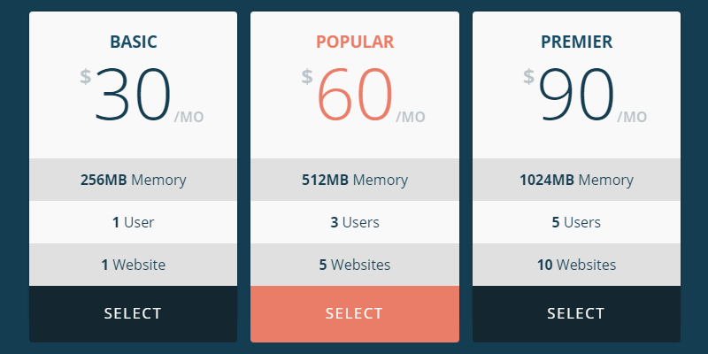
Fully responsive pricing tables with a flat style and nice transitions. With a top switch to change between monthly and yearly subscription plans, both with three tables to showcase your info. Created by Codepen user Pedro Muñoz.
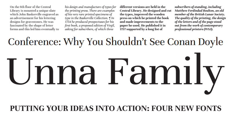
A typeface with delicate serifs and strong stems; it features regular and bold weights as well as matching italics for each, making a total of 370 characters. Designed by Jorge de Buen from the Omnibus-Type Team.
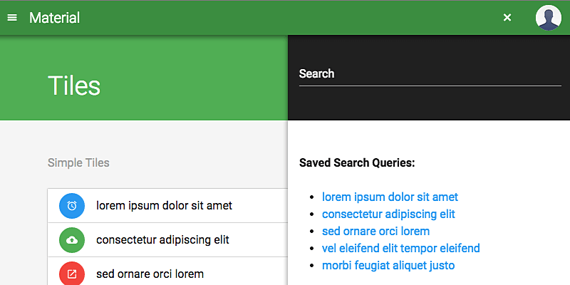
Cross-platform and fully responsive front-end interface based on Google's Material Design, developed using Bootstrap 4. This UI gives all Bootstrap components and elements a Google Material Design look and adds support for some unique Google Material Design components such as floating buttons, pickers, and steppers, to name a few, which cannot be achieved by transforming existing Bootstrap components. Project by Daemon Internet Consultants.
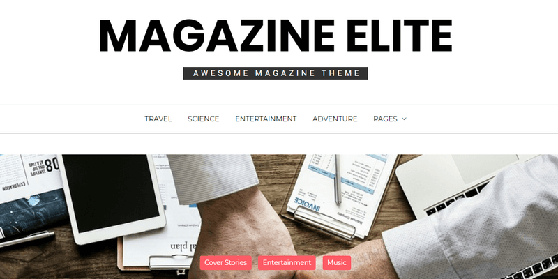
Modern and elegant WordPress Theme, with a clean interface and high customization options. Pinterest-like post sections with animated widgets and a big image slider section on the header. It enables you to make a website from minimal to rich featured and vice versa. Made by Themesaga.
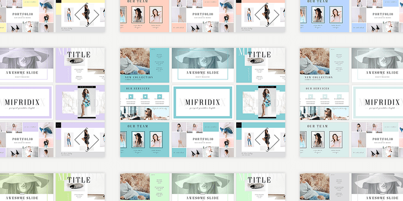
Modern and elegant PowerPoint presentation template. All 21 slides were designed with a variety of great features including creative photo placeholders, overlays, and more! You can edit everything very easy in your PowerPoint Software. Published by Behance user Olga Kuzminikh.
![]()
Set of 170 line art icons for web design created by Webperts, available in sketch file format. Includes essential metaphors for UI interactions, social and e-commerce elements references.
