marcofolio.net - Archives (avril 2013)
design, jquery, programming, webdevelopment, fun, php, html, css, javascript
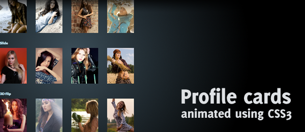
Whoah, been a while since I've posted something! Yet, I wanted to mess around with some fun CSS3 stuff and wanted to share the results with you. Today, we're going to create CSS animated profile cards. Although there are four different kind or animations (Push, Slide, 3D Flip and Explode), they all share the same kind of HTML structure. Simply hover over the images to see the contact details.

The pictures used are created by Belovodchenko Anton, but their profile data is fake. -prefix-free has been used to remove the vendor prefixes in CSS. All animations are done with the help of the transition property.
So, how can you create this effect for yourself? Let's dive into the code, explaining the parts one at the time.

